In this article, we’re going to have a detailed look at the world’s most popular CSS framework, Bootstrap. Now Bootstrap is not just a framework anymore, it is so often considered a standard in modern website coding. The need for a CSS framework derives from the ever-increasing demand for websites that are easy to build and maintain. Another point is standards.
Coders need to be interchangeable, at least on the front-end (client side) programming, which means other people should be able to be handed a web project in a manner that does not affect the progress made up until that point.
Frameworks provide such characteristics that remove the hassle from having to deal with every single component by yourself. In the case of front-end frameworks, the point would be responsiveness, pre-defined element classes for such a wide variety of components like buttons, forms, tables etc, and jQuery plugins like modals, tooltips, dropdowns etc. These features combined, make for the great usability and performance of Bootstrap, especially when you need to get going fast, and want to deal with the back-end which is rather important.
1. Getting Started
We start our Bootstrap journey by explaining the basic steps in order to set up the framework in such a way that fits your very needs. Also, we show the various options Bootstrap offers for downloading its components. Users can choose to customize the packages of the library they want to download.
1.1 Download & Install
There are several ways you can download and install Bootstrap from the official website.
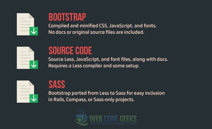
It is obvious that the most useful type of download is just the typical Boostrap files download, that is, the first option. This is because most people developing today depend on the technologies being used on the web project as a whole when choosing the type of Bootstrap download. And as long as the two other options (Source and SASS) are specific cases of development where LESS or SASS is used respectively, the typical CSS-Bootstrap download option is the most preferable.
The source code of Bootstrap is written in LESS (as of version 3.3.6) which is a CSS preprocessor that includes variables, functions, inheritance and other exciting features that make for the great usage and emphasize the programming way of coding in front-end. Bootstrap also offers the option of porting LESS to SASS, to make it compatible with other technologies being used in your project. SASS has the same fundamentals as LESS, but it differs from the syntax and some features. In the case of LESS or SASS download, developers need to use a compiler to turn LESS/SASS code into CSS code, as CSS is the only styling language the browser can compile by default.
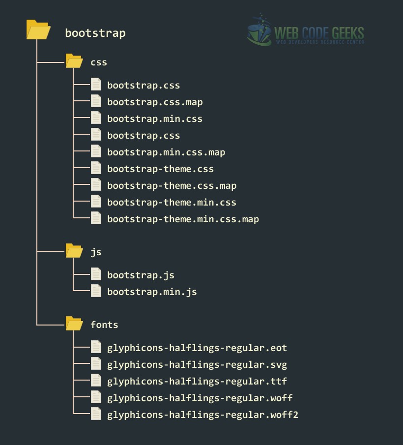
To start using Bootstrap, after downloading the necessary files, make sure you have the following folder/file structure:
The basic template in which you can start coding right after placing the files and folders as above is:
  <!DOCTYPE html>
  <html lang="en">
    <head>
      <meta charset="utf-8">
      <meta http-equiv="X-UA-Compatible" content="IE=edge">
      <meta name="viewport" content="width=device-width, initial-scale=1">
      <title>Bootstrap Basic Template</title>
      <!-- Bootstrap -->
      <link href="css/bootstrap.min.css" rel="stylesheet">
    </head>
    <body>
      <h1>Hello World!</h1>

      <!-- jQuery (necessary for Bootstrap's JavaScript plugins) -->
      <script src="https://www.webcodegeeks.com/wp-content/litespeed/localres/aHR0cHM6Ly9hamF4Lmdvb2dsZWFwaXMuY29tL2FqYXgvlibs/jquery/1.11.3/jquery.min.js"></script>
      <!-- Include all compiled plugins (below), or include individual files as needed -->
      <script src="js/bootstrap.min.js"></script>
    </body>
  </html>
If you want to link Bootstrap files via CDN, head over to the Boostrap CDN site.
1.2 Alternative Installations
Bootstrap provides alternative ways to install the library for developers. Some of them are:
- Bower Install
You can install and manage Bootstrap’s Less, CSS, JavaScript, and fonts using Bower like this:
$ bower install bootstrap
- npm Install
Installing Bootstrap using nrm is as easy as this:
$ npm install bootstrap
require('bootstrap') will actually load all of Bootstrap’s jQuery plugins onto the jQuery object. The bootstrap module itself does not export anything. You can manually load Bootstrap’s jQuery plugins individually by loading the /js/*.js files under the package’s top-level directory.
- Installing with Composer
You can also install and manage Bootstrap’s Less, CSS, JavaScript, and fonts using Composer:
$ composer require twbs/bootstrap
1.3 Compiling CSS and Javascript
Bootstrap uses Grunt, which is a command line build tool for javascript, for its build system, and provides convenient methods for working with the framework. It expresses the way code compilation, tests etc are done.
Installing Grunt
In order to install Grunt, you must first download and install node.js (which includes npm) by following this link. npm stands for node packaged modules and is a way to manage development dependencies through node.js.
Then, from the command line, execute the following commands:
- Install
grunt-cliglobally withnpm install -g grunt-cli. - Navigate to the root
/bootstrap/directory, then runnpm install. npm will look at thepackage.jsonfile and automatically install the necessary local dependencies listed there.
Available Grunt Commands
When Grunt installation has completed, you’ll be able to run some useful Grunt commands from the command line.
- grunt dist (Just compile CSS and JavaScript)
Regenerates the /dist/ directory with compiled and minified CSS and JavaScript files. As a Bootstrap user, this is normally the command you want.
- grunt watch (Watch)
Watches the Less source files and automatically recompiles them to CSS whenever you save a change.
- grunt test (Run Tests)
Runs JSHint and runs the QUnit tests headlessly in PhantomJS.
- grunt docs (Build & test the docs assets)
Builds and tests CSS, JavaScript, and other assets which are used when running the documentation locally via jekyll serve.
- grunt (Build absolutely everything and run tests)
Compiles and minifies CSS and JavaScript, builds the documentation website, runs the HTML5 validator against the docs, regenerates the Customizer assets, and more. Requires Jekyllrb. Usually only necessary if you’re hacking on Bootstrap itself.
2. CSS
The following sections is dedicated to the CSS features Bootstrap offers. An explanation of each of the features regarding CSS is crucial to understanding the importance and usability of the framework. To begin, it is essentail to understand some basic starting points:
- HTML5 Doctype
The framework makes use of such elements and properties in HTML and CSS that do require the HTML5 doctype. So, by default you should always include it at the very start of your web projects like so:
      <!DOCTYPE html>
      <html lang="en">
        ...
      </html>
- Mobile First
With the introduction of Bootstrap 3, the project is more mobile friendly than ever before. Mobile viewports require proper rendering and touch zooming, that can be ensured by adding the following:
<meta name="viewport" content="width=device-width, initial-scale=1">
- Containers
Page elements and also the grid system are housed within containers, which are classes Bootstrap provides. There are two types of containers in Bootstrap.
The .container provides a responsive fixed width container.
      <div class="container">
        ...
      </div>
The .container-fluid provides full-width container, which spans to occupy the width of your viewport.
      <div class="container-fluid">
        ...
      </div>
2.1 The Grid System
Bootstrap’s responsive grid system is one of its most exciting features, enabling for 12 columns to scale according the to device or viewport size. For the grid, Bootstrap includes some predefined classes which makes creating layouts easy and in a semantic manner.
The grid system consists of rows and columns the accomodate content. Let’s see below some of the rules of the grid system and how it works:
- For proper alignment and padding, rows are nested inside a
.containeror.container-fluid. - Rows are used to create horizontal groups of columns.
- Columns are the second level of the grid, and they come exclusively after row elements. All content is placed within columns.
- There are gaps between columns created via
padding. - If you try to use more than 12 columns, placing them within a single row, the group of extra columns will wrap onto a new line.
- An example of columns spanning along the 12 columns grid would be: 4
.col-sm-3elements.
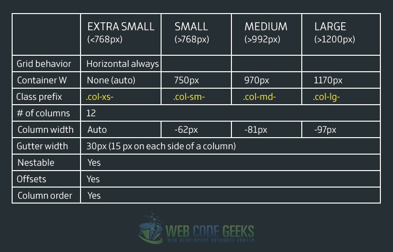
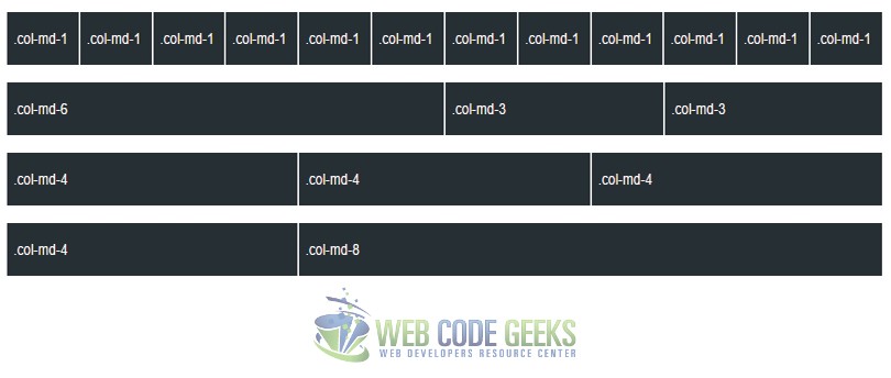
The table below shows how the grid system of Bootstrap works across multiple devices:
Stacked-to-horizontal
A basic grid can be created using a set of .col-md-* classes. Of course, classes are nested inside the .row element. These columns will show as stacked on small devices like phones and tables, but will eventually become horizontal on desktop devices or other larger screen devices. Let’s see some examples:
  <div class="row">
    <div class="col-md-1">.col-md-1</div>
    <div class="col-md-1">.col-md-1</div>
    <div class="col-md-1">.col-md-1</div>
    <div class="col-md-1">.col-md-1</div>
    <div class="col-md-1">.col-md-1</div>
    <div class="col-md-1">.col-md-1</div>
    <div class="col-md-1">.col-md-1</div>
    <div class="col-md-1">.col-md-1</div>
    <div class="col-md-1">.col-md-1</div>
    <div class="col-md-1">.col-md-1</div>
    <div class="col-md-1">.col-md-1</div>
    <div class="col-md-1">.col-md-1</div>
  </div>

  <div class="row">
    <div class="col-md-6">.col-md-6</div>
    <div class="col-md-3">.col-md-3</div>
    <div class="col-md-3">.col-md-3</div>
  </div>

  <div class="row">
    <div class="col-md-4">.col-md-4</div>
    <div class="col-md-4">.col-md-4</div>
    <div class="col-md-4">.col-md-4</div>
  </div>

  <div class="row">
    <div class="col-md-4">.col-md-4</div>
    <div class="col-md-8">.col-md-8</div>
  </div>
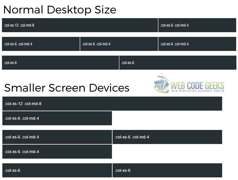
Mobile and Desktop
One can choose to simply not stack columns in smaller devices. Instead, you can use extra small and mediam classes using .col-xs-* and .col-md-*. Examples below give a better understanding:
  <!-- On mobile, stack the columns by making one full-width and the other half-width -->
  <div class="row">
    <div class="col-xs-12 col-md-8">.col-xs-12 .col-md-8</div>
    <div class="col-xs-6 col-md-4">.col-xs-6 .col-md-4</div>
  </div>

  <!-- Columns start at 50% wide on mobile and bump up to 33.3% wide on desktop -->
  <div class="row">
    <div class="col-xs-6 col-md-4">.col-xs-6 .col-md-4</div>
    <div class="col-xs-6 col-md-4">.col-xs-6 .col-md-4</div>
    <div class="col-xs-6 col-md-4">.col-xs-6 .col-md-4</div>
  </div>

  <!-- Columns are always 50% wide, on mobile and desktop -->
  <div class="row">
    <div class="col-xs-6">.col-xs-6</div>
    <div class="col-xs-6">.col-xs-6</div>
  </div>
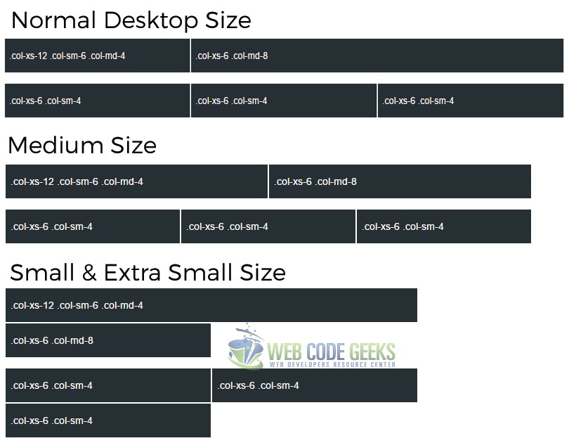
Mobile, Tablet and Desktop
More grid classes can be used to extend the layouts to even more screen sizes. Let’s now see the .col-sm-* classes:
  <div class="row">
    <div class="col-xs-12 col-sm-6 col-md-4">.col-xs-12 .col-sm-6 .col-md-4</div>
    <div class="col-xs-6 col-md-8">.col-xs-6 .col-md-8</div>
  </div>
  <div class="row">
    <div class="col-xs-6 col-sm-4">.col-xs-6 .col-sm-4</div>
    <div class="col-xs-6 col-sm-4">.col-xs-6 .col-sm-4</div>
    <div class="col-xs-6 col-sm-4">.col-xs-6 .col-sm-4</div>
  </div>
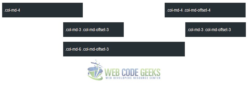
Offseting Columns
The offset classes enable developers to increase the left-margin of columns and move them to the right by as many columns as specified. An example would be:
  <div class="row">
    <div class="col-md-4">.col-md-4</div>
    <div class="col-md-4 col-md-offset-4">.col-md-4 .col-md-offset-4</div>
  </div>
  <div class="row">
    <div class="col-md-3 col-md-offset-3">.col-md-3 .col-md-offset-3</div>
    <div class="col-md-3 col-md-offset-3">.col-md-3 .col-md-offset-3</div>
  </div>
  <div class="row">
    <div class="col-md-6 col-md-offset-3">.col-md-6 .col-md-offset-3</div>
  </div>
The grid system also enables nesting and column ordering capabilities. To nest your content inside the default grid, add a new .row and a set of .col-md-* within an existing .col-md-* column. To change the order of the built-in grid columns, use .col-md-push-* and .col-md-pull-* modifier classes.
Read more about the grid and see live animations of viewport resizing on our Bootstrap Grid Example.
2.2 Typography
The following list gives a clear idea of how Boostrap adjusts typography fonts and sizes.
Headings
The size of Bootstrap haedings are from 12px (for h6) up to 36px (for h1). Example:
      <h1>h1. Bootstrap 36px heading</h1>
      <h2>h2. Bootstrap 30px heading</h2>
      <h3>h3. Bootstrap 24px heading</h3>
      <h4>h4. Bootstrap 18px heading</h4>
      <h5>h5. Bootstrap 14px heading</h5>
      <h6>h6. Bootstrap 12px heading</h6>
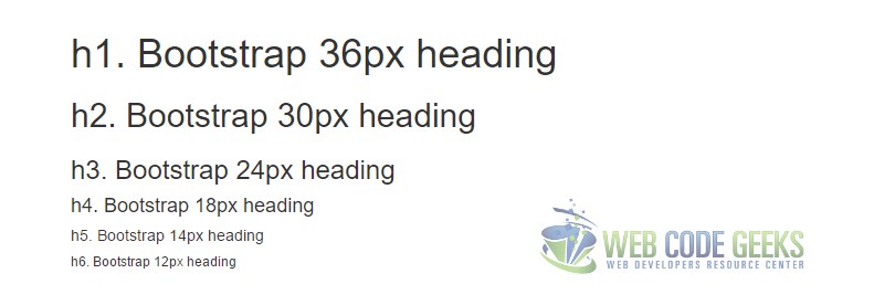
- The heading sizes are also available as classes from h1 to h6.
Body styles
Bootstrap uses a defualt font-size of 14px as well as a line-height of 1.428, which is directly applied to all body elements and paragraphs. There is also a class .lead which makes a paragraph size a bit larger to emphasize it.
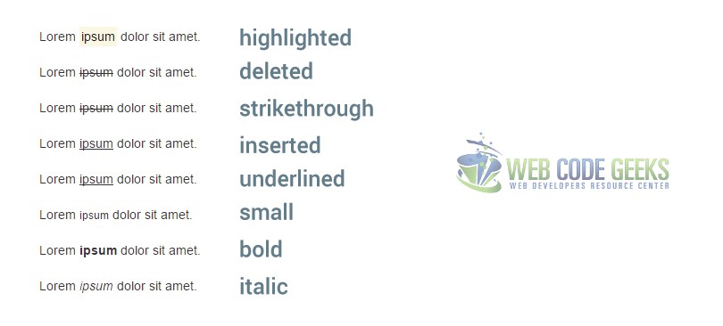
Inline text elements
The following styles can be applied to inline text elements:
<mark> – highlight text
<del> – text that should be treated as deleted
<s> – shows strikethrough text
<ins> – shows text as inserted
<u> – underlines text
<small> – makes text smaller than usual
<strong> – shows the bold effect on text
<em> – applies the italic style to text
An example where we use all of this tags would be:
  <!-- Highlighted text -->
  Lorem <mark>ipsum</mark> dolor sit amet.
  <br/>
  <!-- Deleted text -->
  Lorem <del>ipsum</del> dolor sit amet.
  <br/>
  <!-- Strikethrough text -->
  Lorem <s>ipsum</s> dolor sit amet.
  <br/>
  <!-- Inserted text -->
  Lorem <ins>ipsum</ins> dolor sit amet.
  <br/>
  <!-- Underlined text -->
  Lorem <u>ipsum</u> dolor sit amet.
  <br/>
  <!-- Small text -->
  Lorem <small>ipsum</small> dolor sit amet.
  <br/>
  <!-- Bold text -->
  Lorem <strong>ipsum</strong> dolor sit amet.
  <br/>
  <!-- Italic text -->
  Lorem <em>ipsum</em> dolor sit amet.
In the browser, you’d see:
Alignment classes
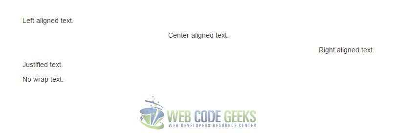
There are four text alignment classes in Bootstrap:
    <p class="text-left">Left aligned text.</p>
    <p class="text-center">Center aligned text.</p>
    <p class="text-right">Right aligned text.</p>
    <p class="text-justify">Justified text.</p>
    <p class="text-nowrap">No wrap text.</p>
The alignment would look like this in the browser:
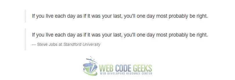
Blockquotes
For inserting a block which comes from another source, you can use the already pre-defined regarding styles of the tag blockquote. You can also have a footer to the blockquote which enables for the author of the quote, the source of the information etc. An example would be:
  <!-- Normal blockquote -->
  <blockquote>
    <p>If you live each day as if it was your last, you'll one day most probably be right.</p>
  </blockquote>

  <!-- Blockquote with source citing -->
  <blockquote>
    <p>If you live each day as if it was your last, you'll one day most probably be right.</p>
    <footer>Steve Jobs at <cite>Standford University</cite></footer>
  </blockquote>
These two blockquotes would look like so:
Lists
Two kind of lists are available for usage in Bootstrap: Ordered and Unordered lists.
  <!-- Ordered List -->
  <ol>
      <li>...</li>
  </ol>

  <!-- Unordered List -->
  <ul>
      <li>...</li>
  </ul>
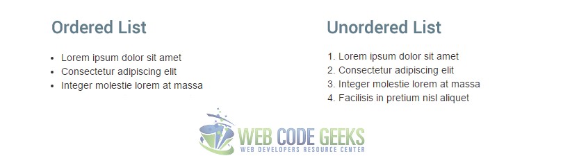
Use .list-unstyled to remove styling elements like bulletpoints and use .list-inline to place list items in the same level horizontally.
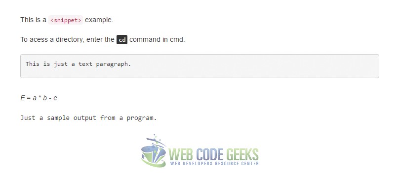
2.3 Code
There are several ways one can utilize Bootstrap to show code snippets. The example below gives you a better idea:
  <!-- Inline using <code> -->
  This is a <code><snippet></code> example.

  <!-- User Input using <kbd> -->
  To acess a directory, enter the <kbd>cd</kbd> command in cmd.

  <!-- Basic Block using <pre> -->
  <pre><p>This is just a text paragraph.</p></pre>

  <!-- Variables using <var> -->
  <var>E</var> = <var>a</var> * <var>b</var> - <var>c</var>

  <!-- Sample Output using <samp> -->
  <samp>Just a sample output from a program.<>;/samp>
The output would be:
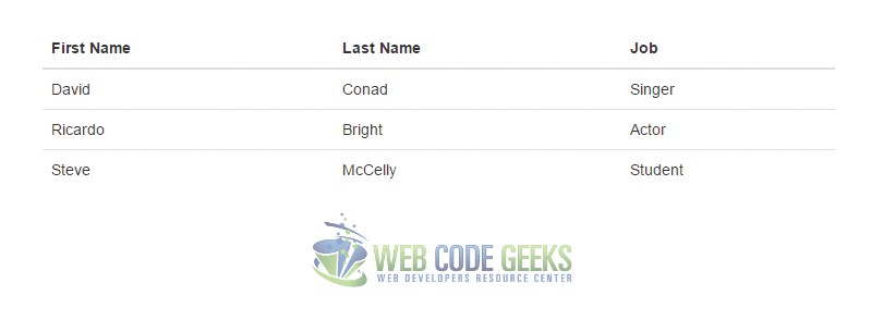
2.4 Tables
Tables are an important element on web pages, especially when you have to deal with a lot of information. Tables help you organize information better. Bootstrap offers several classes to make tables stand out and give the feel of a flat minimalist design. Let’s first see the basic example of a Bootstrap table, where we use the class .table for the <table> element:
  <table class="table">
  <thead>
      <tr>
          <th>First Name</th>
          <th>Last Name</th>
          <th>Job</th>
      </tr>
  </thead>
  <tbody>
      <tr>
          <td>David</td>
          <td>Conad</td>
          <td>Singer</td>
      </tr>
      <tr>
          <td>Ricardo</td>
          <td>Bright</td>
          <td>Actor</td>
      </tr>
      <tr>
          <td>Steve</td>
          <td>McCelly</td>
          <td>Student</td>
      </tr>
  </tbody>
  </table>
This table would look like so:
Other classes available for tables are shown in the graphic below:
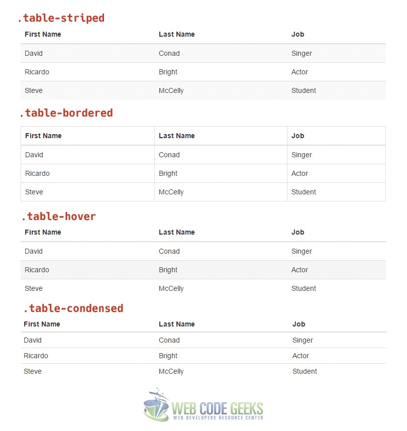
Also, classes for row/cell color are available and include .active, .success, .warning, .danger, .info. Bootstrap tables can easily made responsive by adding the .table-responsive class. Too see these extra features by example, please head over to our Bootstrap Table Article.
2.4 Forms
Bootstrap has already set some styles on form elements like <input>, <textarea>, <select> etc. For optimal spacing, it is recommended to wrap labels and controls in a .form-group. A basic form would have this markup:
  <form>
    <div class="form-group">
      <label for="email-example">Email address</label>
      <input type="email" class="form-control" id="email-example" placeholder="Email">
    </div>
    <div class="form-group">
      <label for="pass-example">Password</label>
      <input type="password" class="form-control" id="pass-example" placeholder="Password">
    </div>
    <div class="form-group">
      <label for="file-example">File input</label>
      <input type="file" id="file-example">
      <p class="help-block">Some kinf od hint/help over here.</p>
    </div>
    <div class="checkbox">
      <label>
        <input type="checkbox"> Check me out
      </label>
    </div>
    <button type="submit" class="btn btn-default">Submit</button>
  </form>
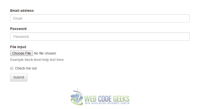
Other features of forms include horizontal forms, inline forms, the various states etc. Have a detailed look over Bootstrap Forms on our dedicated article by following this link.
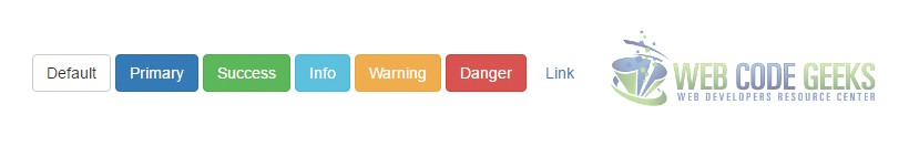
2.6 Buttons
Bootstrap gives you the possibility to use some interesting features while working with buttons like size, color and the various states. There are several HTML element we may want to present just like normal buttons. These include links, inputs etc.
  <button class="btn btn-default" type="submit">Default Button</button>
  <a class="btn btn-default" href="#" role="button">Link</a>
  <input class="btn btn-default" type="button" value="Input">
  <input class="btn btn-default" type="submit" value="Submit">
All buttons were treated the same way regarding the style because of the classes .btn and .btn-default.

However, few would need so simple styles for a button. Instead, we need more colorful buttons and more styles states. The following classes are available for a wider range of styling according to Bootstrap’s official documentation:
  <!-- Default button -->
  <button type="button" class="btn btn-default">Default</button>

  <!-- Provides extra visual weight and identifies the primary action in a set of buttons -->
  <button type="button" class="btn btn-primary">Primary</button>

  <!-- Indicates a successful or positive action -->
  <button type="button" class="btn btn-success">Success</button>

  <!-- Contextual button for informational alert messages -->
  <button type="button" class="btn btn-info">Info</button>

  <!-- Indicates caution should be taken with this action -->
  <button type="button" class="btn btn-warning">Warning</button>

  <!-- Indicates a dangerous or potentially negative action -->
  <button type="button" class="btn btn-danger">Danger</button>

  <!-- Deemphasize a button by making it look like a link while maintaining button behavior -->
  <button type="button" class="btn btn-link">Link</button>
These buttons would look like this:
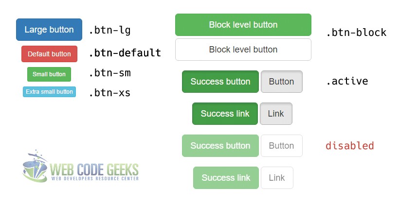
A bunch of other classes enables size options and states. The graphic below shows them all:
2.7 Images
Since Bootstrap 3, images are fully responsive thanks to the .img-responsive class available. The basic line you’d have to write for an image would be:
<img src="images/my-image.png" class="img-responsive" alt="The Responsive Image">
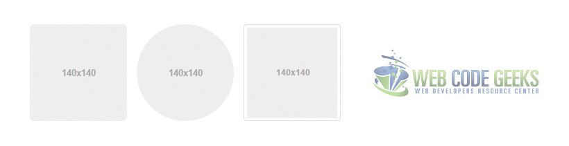
To have a specific shape to an image, use the classes .img-rounded, .img-circle and .img-thumbnail like so:
  <img src="..." alt="..." class="img-rounded">
  <img src="..." alt="..." class="img-circle">
  <img src="..." alt="..." class="img-thumbnail">
The images would look like this:
2.8 Helper Classes
A bunch of helper classes (basically self-explanatory) are available which widen the possibilities to have futher interesting styles on your Bootstrap pages.
Contextual Colors
Contextual color make it easier to identify messages according to the meaning and color they have:
    <!-- Muted means grayed out -->
    <p class="text-muted">...</p>
    <!-- Just normal text in deep blue color -->
    <p class="text-primary">...</p>
    <!-- Green color text -->
    <p class="text-success">...</p>
    <!-- Blue color text -->
    <p class="text-info">...</p>
    <!-- Light yellow color text -->
    <p class="text-warning">...</p>
    <!-- Warning red color text -->
    <p class="text-danger">...</p>
Contextual Backgrounds
These backgrounds have the same styling options as the text above, but the color is now applied to the background. To achieve this, classes beginning with .bg-* are used. Examples would be: .bg-success, .bg-info, .bg-warning, .bg-danger etc.
Close Icon
The close icon is just a simple icon used to dismiss element like alerts or modals. The way we place carets in our HTML markup is:
<button type="button" class="close" aria-label="Close"><span aria-hidden="true">×</span></button>
Carets
Carets (still icons) are small downside triangular icons used to indicate dropdown functionality or even direction. Usage of carets is:
<span class="caret"></span>
Quick Floats
A quick way to place elements right or left within your page is provided by the .pull-left and .pull-right classes:
    <div class="pull-left">...</div>
    <div class="pull-right">...</div>
Center Content Block
Centering a block might be tricky sometimes in CSS. Use Bootstrap’s .center-block class to enable true centering:
<div class="center-block">...</div>
Clearfix
The clearfix property in CSS is used to clear any float of an element. Use clearfix as a class .clearfix like so:
<div class="clearfix">...</div>
Showing and Hiding Content
Use classes .show and .hidden to affect an element visibility:
    <div class="show">...</div>
    <div class="hidden">...</div>
Screen reader and keyboard navigation content
You can hide a specific element to all devices except screen readers (sr) using the .sr-only. Combining .sr-only with .sr-only-focusable shows the element again when it is focused.
<a class="sr-only sr-only-focusable" href="#content">Skip to main content</a>
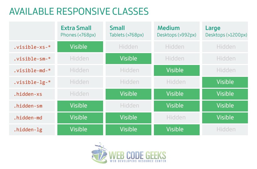
2.9 Responsive Utilities
The following utility classes are used for showing and hiding content by device via media query. This enables developers faster mobile-friendly development. The graphic below gives a better understanding of the classes available for toggling content across the various screen sizes:
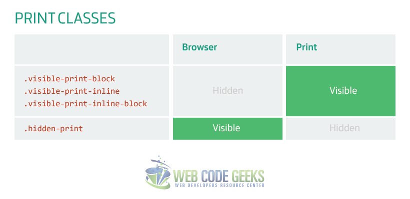
Similar to the classes above, some extra classes are provided for printing content cases:
3. Components
A whole gallery of components makes it easier to fulfill every aspect of your website styling. These incluse icons, navigation facilities, dropdowns, alerts etc. The following sections describes these components that Bootstrap offers one by one and makes sure you’re familliar with each of them for future use.
3.1 Glyphicons
Glyphicons are a set of well curated icons that include the most essesntial illustrations we need for iconography. It is not a free project by default, but the author has provided Bootstrap some of the icons free of charge so that everyone can use. Have a look at the gallery on the official Bootstrap page: Bootstrap’s Glyphicons. But how do we use these icons? The recommended way is encapsulating them inside a span element with a class of .glyphicon and then .glyphicon-* depending on the specific icon, just like this:
<span class="glyphicon glyphicon-star" aria-hidden="true"></span>
We use aria-hidden="true" to avoid unintended output in screen readers.
Let’s now see some examples of glyphicons.
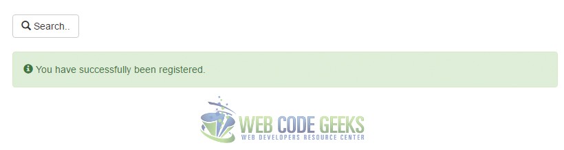
  <!-- A button with left icon example -->
  <button type="buttton" class="btn btn-default"><span class="glyphicon glyphicon-search" aria-hidden="true"></span> Search..</button>

  <!-- A success alert with left info icon example -->
  <div class="alert alert-success" role="alert">
    <span class="glyphicon glyphicon-info-sign" aria-hidden="true"></span>
    <span class="sr-only">Success:</span>
    You have successfully been registered.
  </div>
The output in the browser would be:
3.2 Dropdowns
Dropdown are toggable menus for displaying a list of links. In Bootstrap, dropdowns may also have headers and dividers. An example with all of the dropdown features available would be:
  <div class="dropdown">
    <button class="btn btn-default dropdown-toggle" type="button" id="dropdownMenuExample" data-toggle="dropdown" aria-haspopup="true" aria-expanded="true">
      Dropdown Menu
      <span class="caret"></span>
    </button>
    <ul class="dropdown-menu" aria-labelledby="dropdownMenuExample">
    <!-- Optionally include a dropdown header -->
    <li class="dropdown-header">Dropdown Header</li>
      <li><a href="#">First Link</a></li>
      <li class="disabled"><a href="#">Disabled Link</a></li>
      <li><a href="#">Back to my profile</a></li>
      <!-- Optionally include a separator to make two sections distinct -->
      <li role="separator" class="divider"></li>
      <li><a href="#">Log Out</a></li>
    </ul>
  </div>
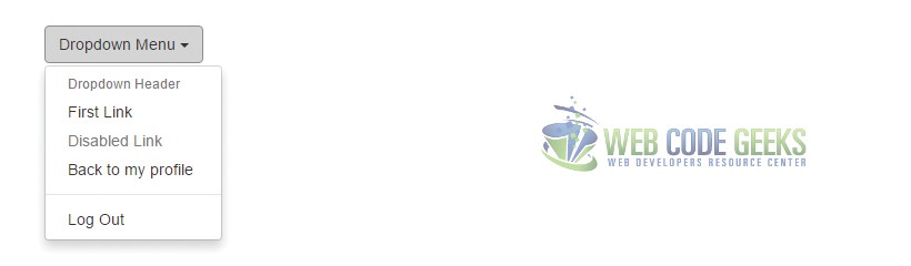
Similar to a dropdown, you can easily have a dropup by replacing the .dropdown class with .dropup. For further information on this topic, read our Bootstrap Dropdown Menu Example.
3.3 Button Groups
As the name suggests, button groups are used to group a series of buttons together. The class used in this case is .btn-group. Furthermore, group button groups into toolbars, for more complex components. Let’s see an example for each of these:
  <!-- A button group series made of 3 buttons -->
  <div class="btn-group" role="group" aria-label="...">
    <button type="button" class="btn btn-default">Button 1</button>
    <button type="button" class="btn btn-default">Button 2</button>
    <button type="button" class="btn btn-default">Button 3</button>
  </div>

  <!-- A toolbar made of button groups -->
  <div class="btn-toolbar" role="toolbar" aria-label="...">
    <div class="btn-group" role="group" aria-label="...">
      <button type="button" class="btn btn-default">1</button>
      <button type="button" class="btn btn-default">2</button>
      <button type="button" class="btn btn-default">3</button>
    </div>
    <div class="btn-group" role="group" aria-label="...">
      <button type="button" class="btn btn-default">a</button>
      <button type="button" class="btn btn-default">b</button>
      <button type="button" class="btn btn-default">c</button>
      <button type="button" class="btn btn-default">d</button>
    </div>
    <div class="btn-group" role="group" aria-label="...">
      <button type="button" class="btn btn-default">i</button>
      <button type="button" class="btn btn-default">ii</button>
    </div>
  </div>
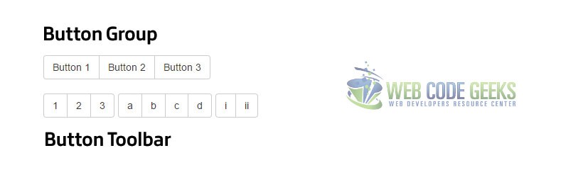
The following characteristics are also available to button groups:
Sizing
Button sizing classes can ba a daunting task when there is a group of buttons. Therefore, there is a better way of sizing all buttons at once inside a button group. Just add the .btn-group-lg class instead of just .btn-group at the start of each button group element. This applies even when button groups are nested within each other.
Nesting
You can nest button groups inside each other and have the type of buttons you need within one big group. For instance, you can have some normal buttons and a dropdown menu in the same button group like so:
    <div class="btn-group" role="group" aria-label="...">
        <!-- buttons markup here -->

      <div class="btn-group" role="group">
        <!-- the dropdown menu markup here.. -->
      </div>
    </div>
Vertical Variation
Similar to the horizontal grouping, there is also a vertical button grouping. This is enabled by the .btn-vertical-group. In this case, the markup would look like this:
      <div class="btn-group-vertical" role="group" aria-label="...">
        ...
      </div>
3.4 Button Dropdowns
Well, we basically saw this when talking about dropdowns, but here let’s show what’s more to dropdown buttons. There are a few things to mention like split buttons dropdown and sizing. A split button dropdown is simply a group of buttons, where one of them is the actual button, and the other is the icon which opens the dropdown menu. In code, this would be done like so:
  <!-- Split button -->
  <div class="btn-group">
    <button type="button" class="btn btn-success">Action</button>
    <button type="button" class="btn btn-success dropdown-toggle" data-toggle="dropdown" aria-haspopup="true" aria-expanded="false">
      <span class="caret"></span>
      <span class="sr-only">Toggle Dropdown</span>
    </button>
    <ul class="dropdown-menu">
      <li><a href="#">Home</a></li>
      <li><a href="#">Profile</a></li>
      <li><a href="#">Settings</a></li>
      <li role="separator" class="divider"></li>
      <li><a href="#">Separated link</a></li>
    </ul>
  </div>
The output in the browser would be:
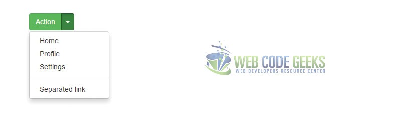
Similar to the dropdown, there is also a .dropup class you can use where links show above the button. Button dropdowns (dropups) are compatible with all sizes of buttons, so feel free to use the sizing classes with your buttons in these cases.
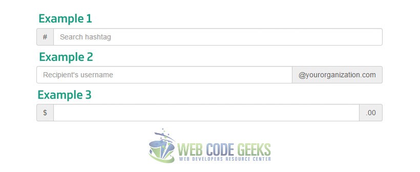
3.5 Input Groups
Input groups represent a set of elements consisting of an input as the main element and adding icons, buttons or other extra styled elements in the left or right side of it. This is enabled by adding an element of type span before or after the input element, with a class of .input-group-addon. Let’s see some examples:
  <!-- Example 1 -->
  <div class="input-group">
    <span class="input-group-addon" id="basic-addon1">#</span>
    <input type="text" class="form-control" placeholder="Search hashtag" aria-describedby="basic-addon1">
  </div>
  <!-- Example 2 -->
  <div class="input-group">
    <input type="text" class="form-control" placeholder="Student username" aria-describedby="basic-addon2">
    <span class="input-group-addon" id="basic-addon2">@yourorganization.com</span>
  </div>
  <!-- Example 3 -->
  <div class="input-group">
    <span class="input-group-addon">$</span>
    <input type="text" class="form-control" aria-label="Amount (to the nearest dollar)">
    <span class="input-group-addon">.00</span>
  </div>
Other options available for input groups include:
Sizing
Input groups are available in all sizes in Bootstrap. Just add the .input-group-lg class to the input group you want to set a size and you’re done.
Checkboxes and Radio Buttons
Remember the .input-group-addon class we added the place elements inside an input like in the left or right side? Well, those addons can even be checkboxes and radio buttons. The idea is to place an input of type checkbox or radio inside the span we use for addons. The markup would be like this:
    <div class="input-group">
        <span class="input-group-addon">
          <input type="checkbox" aria-label="...">
        </span>
        <input type="text" class="form-control" aria-label="...">
    </div><!-- /input-group -->
Similarily, inside the <span class="input-group-addon"> element, the following elements can be put:
- Buttons
- Buttons with dropdowns
- Segmented Buttons
- Multiple Buttons
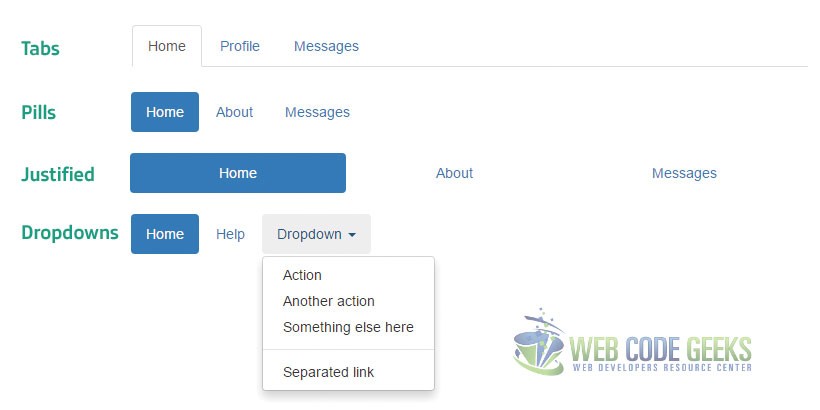
3.6 Navs
Nav means navigation, and it is used in its hsort form in most classes refering to this concept in Bootstrap. There are quite some kinds of navigation presentation that we’ll see below, but they all share the same basic starting markup which is:
  <ul class="nav nav-*">
    <!-- list items with links in here -->
  </ul>
The * there is what we’re changing from example to example.
Tabs
Self-explanatory, these list items show up as tabs in browser in the same row.
    <ul class="nav nav-tabs">
      <!-- list items with links in here -->
    </ul>
Pills
Just another way of tab styling. See the image below.
    <ul class="nav nav-tabs">
      <!-- list items with links in here -->
    </ul>
Justified
As the name suggests, the class .nav-justified makes content equal widths of their parents.
    <ul class="nav nav-tabs nav-justified">
      <!-- list items with links in here -->
    </ul>
    <ul class="nav nav-tabs nav-justified">
      <!-- list items with links in here -->
    </ul>
Dropdowns
A navbar may also have a dropdown menu. In this case, the list item which opens the dropdown will have the class .dropdown and it will be followed by the well-know Bootstrap markup of a dropdown menu that we’ve already seen earlier in this article.
    <ul class="nav nav-pills">
      ...
      <li role="presentation" class="dropdown">
        <a class="dropdown-toggle" data-toggle="dropdown" href="#" role="button" aria-haspopup="true" aria-expanded="false">
          Dropdown <span class="caret"></span>
        </a>
        <ul class="dropdown-menu">
          ...
        </ul>
      </li>
      ...
    </ul>
Use class .disabled in list items to disable certain links.
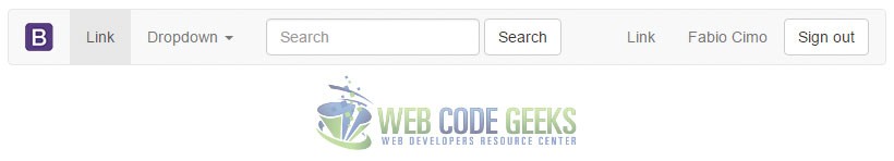
3.7 Navbar
Navbars are navigation headers which appear at the top of you site and contain various navigation links, optionally logos, search boxes etc. The following example shows the most complete navbar you can have which includes links, brand image, search box, buttons etc.
    <nav class="navbar navbar-default">
    <div class="container-fluid">
      <!-- Brand and toggle get grouped for better mobile display -->
      <div class="navbar-header">
        <button type="button" class="navbar-toggle collapsed" data-toggle="collapse" data-target="#bs-example-navbar-collapse-1" aria-expanded="false">
          <span class="sr-only">Toggle navigation</span>
          <span class="icon-bar"></span>
          <span class="icon-bar"></span>
          <span class="icon-bar"></span>
        </button>
        <a class="navbar-brand" href="#">
          <!-- Brand image, can be replaced by just the name of the company -->
          <img alt="Brand" src="logo.png">
        </a>
      </div>

      <!-- Collect the nav links, forms, and other content for toggling -->
      <div class="collapse navbar-collapse" id="bs-example-navbar-collapse-1">
        <ul class="nav navbar-nav">
          <li class="active"><a href="#">Link <span class="sr-only">(current)</span></a></li>
          <li class="dropdown">
            <a href="#" class="dropdown-toggle" data-toggle="dropdown" role="button" aria-haspopup="true" aria-expanded="false">Dropdown <span class="caret"></span></a>
            <ul class="dropdown-menu">
              <li><a href="#">Action</a></li>
              <li><a href="#">Another action</a></li>
              <li><a href="#">Something else here</a></li>
              <li role="separator" class="divider"></li>
              <li><a href="#">Separated link</a></li>
            </ul>
          </li>
        </ul>
        <!-- Optionally include a search box -->
        <form class="navbar-form navbar-left" role="search">
          <div class="form-group">
            <input type="text" class="form-control" placeholder="Search">
          </div>
          <button type="submit" class="btn btn-default">Search</button>
        </form>
        <!-- Indicated the following ul is going to be placed to the right side -->
        <ul class="nav navbar-nav navbar-right">
          <li><a href="#">Link</a></li>
          <!-- Optionally include text using the .navbar-text class -->
          <p class="navbar-text">Fabio Cimo</p>
          <!-- Optionally use buttons in navbar -->
          <button type="button" class="btn btn-default navbar-btn">Sign out</button>
        </ul>
      </div><!-- /.navbar-collapse -->
    </div><!-- /.container-fluid -->
  </nav>
A few other classes are available for navbars. These include:
Fixed to Top
Add the .navbar-fixed-top to fix the navbar to the top of your page like so:
    <nav class="navbar navbar-default navbar-fixed-top">
      <div class="container">
        ...
      </div>
    </nav>
Fixed to Bottom
Add the .navbar-fixed-bottom to fix the navbar to the bottom of your page like so:
    <nav class="navbar navbar-default navbar-fixed-bottom">
      <div class="container">
        ...
      </div>
    </nav>
Static Top
Add the .navbar-fixed-top to make the navbar scroll along with the page and be always in sight:
    <nav class="navbar navbar-default navbar-static-top">
      <div class="container">
        ...
      </div>
    </nav>
Inverse Navbar
Add the .navbar-inverse class to make the navbar colors inverse (that is, the background is black and the text color is white):
    <nav class="navbar navbar-inverse">
      ...
    </nav>
The Bootstrap navbar is fully responsive and you can try resizing your browser after placing the first snippet of code (the full navbar) we introduced in this section.
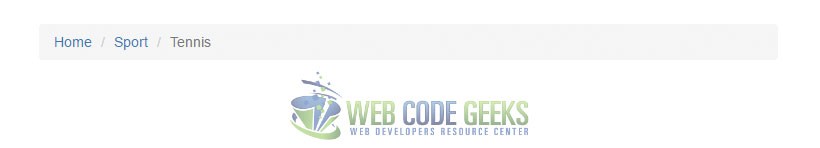
3.8 Breadcrumbs
Use a horizontal hierarchy to indicate the current navigation status by using breadcrumbs like below:
  <!-- Start a <ol> with a class of 'breadcrumb' -->
  <ol class="breadcrumb">
    <li><a href="#">Home</a></li>
    <li><a href="#">Sport</a></li>
    <li class="active">Tennis</li>
  </ol>
3.9 Pagination
At all cases where content is divided into pages in a website, it is necessary to use a pagination row with either page numbers, titles etc. Bootstrap already has a class named .pagination which is applied to a ul and makes links sit in a horizontal position. The markup would be:
  <!-- This is a navigation bar, so it starts with the nav element -->
  <nav>
    <!-- The pagination class is appled to the ul containing the link list items -->
    <ul class="pagination">
      <li> <!-- The first list item serves as the previous icon in the output -->
        <a href="#" aria-label="Previous">
          <span aria-hidden="true">«</span>
        </a>
      </li>
      <!-- List items contain anchor elements for page linking -->
      <li><a href="#">1</a></li>
      <!-- Indicate current being browsed by adding the class 'active' to the li -->
      <li class="active"><a href="#">2</a></li>
      <li><a href="#">3</a></li>
      <li><a href="#">4</a></li>
      <li><a href="#">5</a></li>
      <li><a href="#">6</a></li>
      <li><a href="#">7</a></li>
      <li><a href="#">8</a></li>
      <!-- Add the class 'disabled' to a li to indicate this option is not available -->
      <li class="disabled">
      <!-- The last list item serves as the next icon in the output -->
        <a href="#" aria-label="Next">
          <span aria-hidden="true">»</span>
        </a>
      </li>
    </ul>
  </nav>
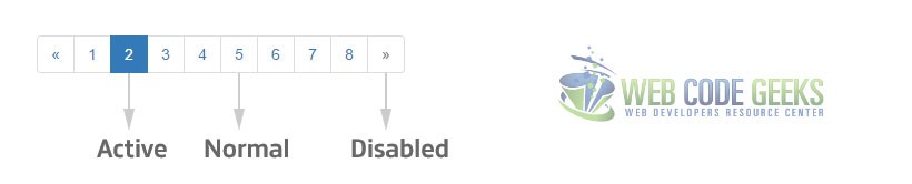
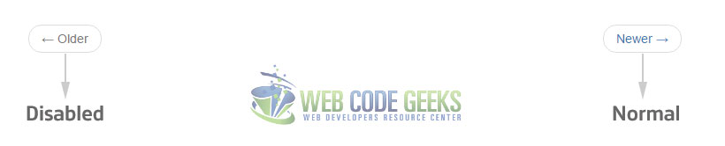
Optionally, increase or decrease the size of the pagination bar by adding .pagination-sm, .pagination-lg, etc. An alternative to pagination, pager is also available. It means you only have two buttons, a previous and next button. The markup in this case would be:
  <nav>
  <!-- Add class 'pager' to have a different paging style compared to pagination -->
    <ul class="pager">
      <!-- Links can optionally be disabled, this is just for demonstration -->
      <li class="previous disabled"><a href="#"><span aria-hidden="true">←</span> Older</a></li>
      <!-- Add the proper 'next' or 'previous' class to the list items -->
      <li class="next"><a href="#">Newer <span aria-hidden="true">→</span></a></li>
    </ul>
  </nav>
3.10 Labels
Labels in Bootstrap represent text with a background. Label classes are applied to span elements like so:
  <!-- Label inside a heading, h3 -->
  <h3>This is a <span class="label label-default">label</span></h3>
  <!-- Variations of the label's backround color -->
  <span class="label label-default">Default</span>
  <span class="label label-primary">Primary</span>
  <span class="label label-success">Success</span>
  <span class="label label-info">Info</span>
  <span class="label label-warning">Warning</span>
  <span class="label label-danger">Danger</span>
The output would be:

3.11 Badges
Badges are used to highlight notifications, whether in the form of highlighting them, or just showing a number next to the text. In Bootstrap, badges are used within a span with a class of .badge like so:
  <!-- Using a pills tablist to present a couple of links -->
  <ul class="nav nav-pills" role="tablist">
    <li role="presentation" class="active"><a href="#">New <span class="badge">24</span></a></li>
    <li role="presentation"><a href="#">Profile</a></li>
    <li role="presentation"><a href="#">Inbox <span class="badge">3</span></a></li>
  </ul>

3.12 Jumbotron
A jumbotron is a component that can span through the width of the viewport. This helps showscase essential content better.
  <div class="jumbotron">
    <h1>A great product here</h1>
    <p>What do you need more than this, people?</p>
    <p><a class="btn btn-success btn-lg" href="#" role="button">Buy Now</a></p>
  </div>

3.13 Page Header
Minimalist page headers which show text, like the title of the page are available in the form below:
  <div class="page-header">
    <h1>About Us <small>Who we are?</small></h1>
  </div>

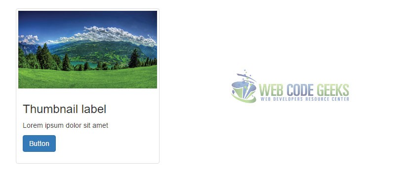
3.14 Thumbnails
Thumbnails are small sized images for displaying specific section on your page. In Bootstrap, the basic markup of a thumbnail is:
  <div class="row">
    <div class="col-xs-6 col-md-3">
      <a href="#" class="thumbnail">
        <img src="image.jpg" alt="Image">
      </a>
    </div>
    ...
  </div>
Adding a little extra markup would complete the image with headings, body paragraphs etc, like so:
  <div class="row">
    <div class="col-sm-6 col-md-4">
      <div class="thumbnail">
        <img src="image.jpg" alt="Image">
        <div class="caption">
          <h3>Thumbnail label</h3>
          <p>Lorem ipsum dolor sit amet</p>
          <p><a href="#" class="btn btn-primary" role="button">Button</a></p>
        </div>
      </div>
    </div>
  </div>
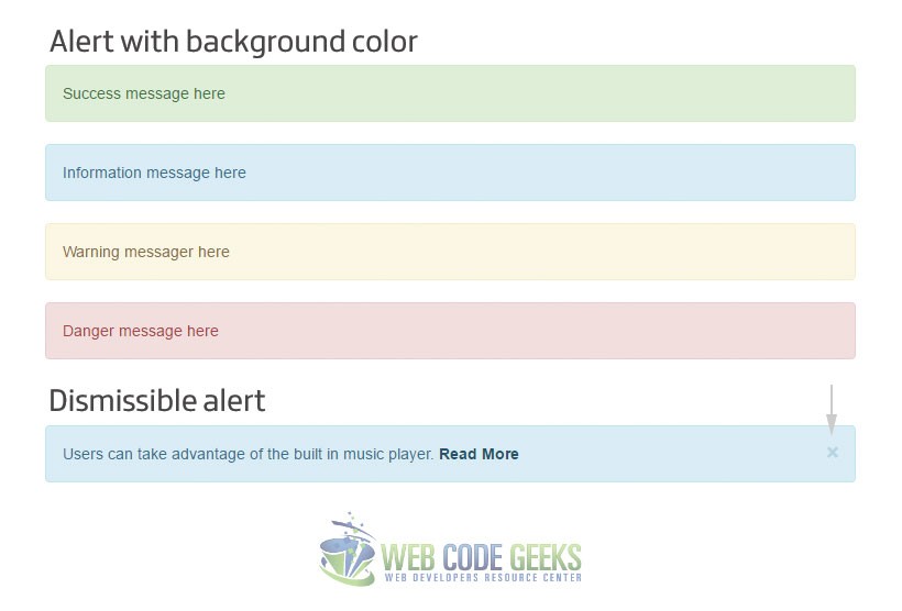
3.15 Alerts
Alerts serve as user actions contextual feedback messages. They are available in all colors (success, info, warning, danger) except the default color which doesn’t seem to be a good combination. Alerts can also be dismissible. Let’s see an example for both of these options:
  <!-- Alert examples with the various background colors -->
  <div class="alert alert-success" role="alert">Success message here</div>
  <div class="alert alert-info" role="alert">Information message here</div>
  <div class="alert alert-warning" role="alert">Warning messager here</div>
  <div class="alert alert-danger" role="alert">Danger message here</div>

  <!-- A dismissible alert is triggered using the 'alert-dismissible' class -->
  <div class="alert alert-info alert-dismissible" role="alert">
    <!-- Close button (icon) standard markup -->
    <button type="button" class="close" data-dismiss="alert" aria-label="Close"><span aria-hidden="true">×</span></button>
    <!-- The actual alert text with a link in the end using class 'alert-link' -->
    Users can take advantage of the built in music player. <a href="#" class="alert-link">Read More</a>
  </div>
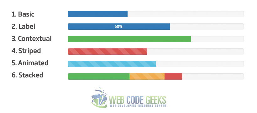
3.16 Progress Bars
Provide progress information using visual progress bars for a process or action. Bootstrap offers progress bars in such a wide variety of styling.
Basic Progress Bar
Progress bars are wrapped inside .progress elements and have a .progress-bar class along with several attributes.
    <!-- Example 1 - Basic Progress Bar -->
    <div class="progress">
      <div class="progress-bar" role="progressbar" aria-valuenow="34" aria-valuemin="0" aria-valuemax="100" style="width: 34%;">
        <span class="sr-only">34% Complete</span>
      </div>
    </div>
Example 2 – Progress Bar with Label
Optionally remove the span which shows only on screen readers and make the progress available to be seen by users.
    <!-- Example 2 - Progress Bar with Label -->
    <div class="progress">
      <div class="progress-bar" role="progressbar" aria-valuenow="58" aria-valuemin="0" aria-valuemax="100" style="width: 58%;">
        58%
      </div>
    </div>
Example 3 – Contextual Progress Bar
Contextual progress bars take advantage of the global background colors offered by Bootstrap
    <!-- Example 3 - Contextual Progress Bar (success in this case) -->
    <div class="progress">
      <div class="progress-bar progress-bar-success" role="progressbar" aria-valuenow="70" aria-valuemin="0" aria-valuemax="100" style="width: 70%">
        <span class="sr-only">70% Complete (success)</span>
      </div>
    </div>
Example 4 – Striped Progress Bar
Optionally add a strip style to the progress bar by adding the class .progress-bar-striped to the inner div.
    <!-- Example 4 - Striped Progress Bar (danger bg used in this case) -->
    <div class="progress">
      <div class="progress-bar progress-bar-danger progress-bar-striped" role="progressbar" aria-valuenow="45" aria-valuemin="0" aria-valuemax="100" style="width: 45%">
        <span class="sr-only">45% Complete (danger)</span>
      </div>
    </div>
Example 5 – Animated Progress Bar
Add a nice smooth animation to the striped proogress bars by adding the .active class to the inner div.
    <!-- Example 5 - Animated Progress Bar (info bg used in this case) -->
    <div class="progress">
      <div class="progress-bar progress-bar-info progress-bar-striped active" role="progressbar" aria-valuenow="50" aria-valuemin="0" aria-valuemax="100" style="width: 50%">
        <span class="sr-only">50% Complete</span>
      </div>
    </div>
Example 6 – Stacked Progress Bars
Multiple progress bars can be placed in the same .progress div and create a horizontal stack like so:
    <!-- Example 6 - Stacked Progress Bar -->
    <div class="progress">
      <div class="progress-bar progress-bar-success" style="width: 35%">
        <span class="sr-only">35% Complete (success)</span>
      </div>
      <div class="progress-bar progress-bar-warning progress-bar-striped" style="width: 20%">
        <span class="sr-only">20% Complete (warning)</span>
      </div>
      <div class="progress-bar progress-bar-danger" style="width: 10%">
        <span class="sr-only">10% Complete (danger)</span>
      </div>
    </div>
The output for each respective example would be:
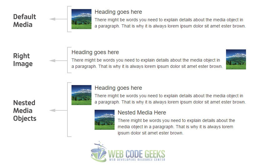
3.17 Media Object
Media objects can be components where users place images, headings, texts, icons etc, and are used in websites like blogs. Media objects have several options which enhance usability. The basic media object markup is:
  <div class="media">
    <div class="media-left">
      <a href="#">
        <img class="media-object" src="image.jpg" alt="Nature">
      </a>
    </div>
    <div class="media-body">
      <h4 class="media-heading">Heading goes here</h4>
      <p>There might be words you need to explain details about the media object in a paragraph. That is why it is always lorem ipsum dolor sit amet ester brown.</p>
    </div>
  </div>
- Use the
.media-rightand place the image div after the body div to show the image on the right side of the media object. - Use the
.media-top/middle/bottomclasses to position the image of the media on the top, middle or bottom of the media object div. - Use the
.media-listclass to create a list of media objects. You can also nest media objects inside one another be adding a the normal markup of a media object inside the the.media-bodyelement of another media object, after its heading and paragraphs.
3.18 List Items
List items represent various components that have the look and feel of a list. The various options list item groups have are commented and shown below:
  <!-- A list item starts with a ul of a class 'list-group' -->
  <ul class="list-group">
    <!-- Every list item has a class of 'list-group-item' -->
    <!-- Add class 'active' to show the currently active list item -->
    <li class="list-group-item active">List Item 1</li>
    <!-- Optionally add badges to list items -->
    <li class="list-group-item"><span class="badge">26</span>List Item 2</li>
    <!-- Add the 'disabled' class to a list item to make it inactive -->
    <li class="list-group-item disabled">List Item 3</li>
    <!-- A normal list item -->
    <li class="list-group-item">List Item 4</li>
    <!-- List items can have contextual backgrounds -->
    <li class="list-group-item list-group-item-success">List Item 5</li>
    <!-- List items can also be in the form of buttons -->
     <button type="button" class="list-group-item">Button list group item</button>
  </ul>
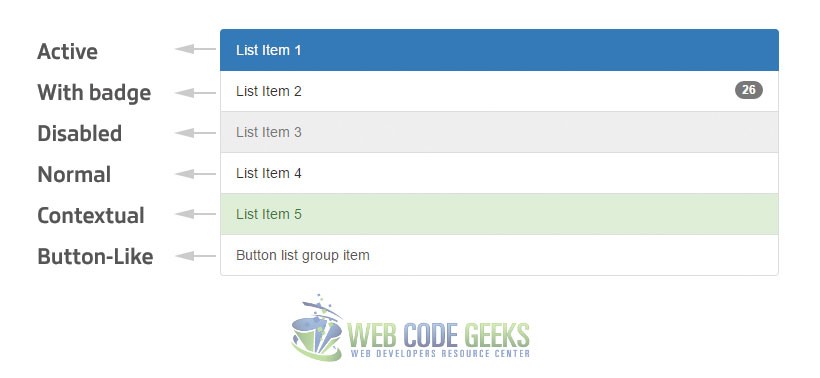
Create a custom list group by adding heading or paragraphs using the classes .list-group-item-heading and .list-group-item-text.
3.19 Panels
Panels are just another way of presenting information on websites. The following snippet shows some of the options you can use on panels:
  <!-- Basic panel uses class 'panel panel-default' -->
  <div class="panel panel-default">
  <!-- Optionally include a heading for the panel using class 'panel-heading' -->
  <div class="panel-heading"><h3 class="panel-title">Panel title</h3></div>
  <!-- Indicate the main content using 'panel-body' -->
    <div class="panel-body">
      Basic panel example
    </div>
  </div>
Additionally, use contextual classes in the form of .panel-primary, .panel-success etc, have a panel footer using class .panel-footer, or include other components like list groups or tables inside panels. Learn more about panels on our Bootstrap Panel Article.
3.20 Responsive Embed
Video or other media dimensions are commonly out of order in usual web pages that don’t use Bootstrap. That is because they’re not responsive, they do not scale along with the browser. Bootstrap enables embed responsiveness by adding the class .embed-responsive to the main div of the media. Additionally, you can determine if you want the embed to be of aspect ratio 16:9 or 4:3 using the following classes:
    <!-- Using 16:9 aspect ratio -->
  <div class="embed-responsive embed-responsive-16by9">
    <iframe class="embed-responsive-item" src="..."></iframe>
  </div>

  <!-- Using 4:3 aspect ratio -->
  <div class="embed-responsive embed-responsive-4by3">
    <iframe class="embed-responsive-item" src="..."></iframe>
  </div>
As you can see, iframe inside the div or other elements like it such as <embed>, <video>, <object> have a class of .embed-responsive-item, which is the actual media/embed element.
3.21 Wells
Wells provide a simple background-ed component with a simple inset effect. To use wells, just add a class of .well to your div like so:
<div class="well">This is a well</div>
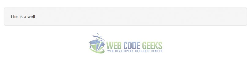
Wells can easily utilize sizing classes in the form: .well .well-lg or .well .well-sm
4. Javascript
The javascript section of Bootstrap is going to be a short description of all js components, as they are more detailed in the official documentation.
4.1 Modal
Modals appear as dialog prompts and show informations, prompts, or other user relation information/action. The essential markup for a modal would be:
    <!-- Button trigger modal -->
  <button type="button" class="btn btn-primary btn-lg" data-toggle="modal" data-target="#myModal">Modal Demo</button>

  <!-- Modal -->
  <div class="modal fade" id="myModal" tabindex="-1" role="dialog" aria-labelledby="myModalLabel">
    <div class="modal-dialog" role="document">
      <div class="modal-content">
        <div class="modal-header">
          <button type="button" class="close" data-dismiss="modal" aria-label="Close"><span aria-hidden="true">×</span></button>
          <h4 class="modal-title" id="myModalLabel">Modal title</h4>
        </div>
        <div class="modal-body">
          Modal text or content over here.
        </div>
        <div class="modal-footer">
          <button type="button" class="btn btn-default" data-dismiss="modal">Close</button>
          <button type="button" class="btn btn-primary">Save changes</button>
        </div>
      </div>
    </div>
  </div>
The output in the browser after clicking the button which triggers the modal would be:
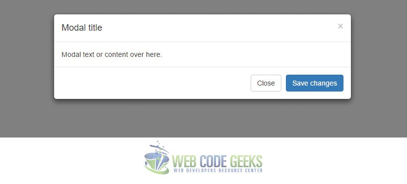
For instance, modals can contain almost all sorts of content that we’ve already seen in Bootstrap, and can be of different sizes. For more information on modals, please refer to our Bootstrap Modal Article to learn more about manually triggering the modal in javascript and other options and methods of modals.
4.2 Dropdown
We’ve already seen this earlier in this article, dropdowns are part of menus on most websites. Basically, there are two ways we can trigger dropdowns in Botostrap:
Via data attributes
Via Javascript
Use the data-toggle="dropdown" to a link or button to trigger a dropdown. Also, use data-target="#" instead of href="#" to keep URLs intact with link buttons.
The dropdown menu can be called using javascript like this:
$('.dropdown-toggle').dropdown()However, even though the dropdown is called with js, the data-toggle="dropdown" is still required.
Read more about dropdowns in Bootstrap by reading our Bootstrap Dropdown Menu Article.
4.3 ScrollSpy
Spyscroll helps you update nav targets according to the scroll position. Again, there are two ways we can trigger this option:
Via data attributes
Via Javascript
Use the data-spy="scroll" to the element you want to spy. Next, use data-target="#example" to indicate the element being spied.
Use method .scrollspy to trigger via javascript.
$('body').scrollspy({ target: '#example' })It is necessary to add the position: relative; in CSS.
4.4 Tabs
Tabs enable transitioning between several panes of content. To enable tab functionality, follow the markup below:
  <div>
    <!-- Nav tabs -->
    <ul class="nav nav-tabs" role="tablist">
      <li role="presentation" class="active"><a href="#tab1" aria-controls="tab1" role="tab" data-toggle="tab">First</a></li>
      <li role="presentation"><a href="#tab2" aria-controls="tab2" role="tab" data-toggle="tab">Second</a></li>
      <li role="presentation"><a href="#tab3" aria-controls="tab3" role="tab" data-toggle="tab">Third</a></li>
      <li role="presentation"><a href="#tab4" aria-controls="tab4" role="tab" data-toggle="tab">Fourth</a></li>
    </ul>

    <!-- Tab panes -->
    <div class="tab-content">
      <div role="tabpanel" class="tab-pane active" id="tab1">...</div>
      <div role="tabpanel" class="tab-pane" id="tab2">...</div>
      <div role="tabpanel" class="tab-pane" id="tab3">...</div>
      <div role="tabpanel" class="tab-pane" id="tab4">...</div>
    </div>
  </div>
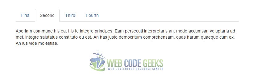
Need more information on tabs, like methods and other options? Follow our article on Bootstrap Tabs Example for further details.
4.5 Tooltips
Tooltips are common GUI elements in the web, which feel like hints or infotips. Below, we’ll show how they are used in buttons, but the same attributes and class is applied to each element you want a tooltip.
  <button type="button" class="btn btn-default" data-toggle="tooltip" data-placement="left" title="Tooltip on left">Tooltip on left</button>

  <button type="button" class="btn btn-default" data-toggle="tooltip" data-placement="top" title="Tooltip on top">Tooltip on top</button>

  <button type="button" class="btn btn-default" data-toggle="tooltip" data-placement="bottom" title="Tooltip on bottom">Tooltip on bottom</button>

  <button type="button" class="btn btn-default" data-toggle="tooltip" data-placement="right" title="Tooltip on right">Tooltip on right</button>
Tooltips are opt-in, meaning you need to initialize them before use in javascript like so:
    </style>
    <script type="text/javascript">
        $(function () {
      $('[data-toggle="tooltip"]').tooltip()
    })
    </script>
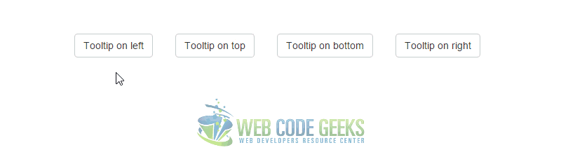
For further information on tooltip options and methods, please refer to our Bootstrap Tooltip Article.
4.6 Popover
Similar to tooltips, popovers contain a rather structured styling which is able to house more content. Popovers are triggered on mouse click.
<button type="button" class="btn btn-success" data-toggle="popover" data-placement="right" title="Popover title" data-content="Here goes your popover text. It shows right here, can you see it?">Popover button</button>
Popovers are also opt-in, meaning you need to initialize them before use in javascript like so:
  </style>
    <script type="text/javascript">
        $(function () {
      $('[data-toggle="popover"]').popover()
    })
    </script>
Change the data-placement attribute to left, right, top, bottom to place the popover in these positions. Also, if you want the popover to be dismissable, add the data-trigger="focus" to the element where the popover is applied.

Need more information on the various options and methods of this component? Read our Bootstrap Popover Article to learn more.
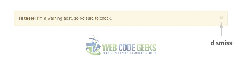
4.7 Alert
Use alert to give feedback to the user by utilizing dissmisible alert functionality. The basic markup of an alert is:
  <!-- Use class 'alert-warning' to indicate the light yellow background color -->
  <!-- Use class 'alert-dismissible' to let the user dismiss the alert -->
  <div class="alert alert-warning alert-dismissible fade in" role="alert">
  <button type="button" class="close" data-dismiss="alert" aria-label="Close"><span aria-hidden="true">×</span></button>
  <strong>Hi there!</strong> I'm a warning alert, so be sure to check.
  </div>
Use the data-dismiss="alert" to give an alert close functionality.
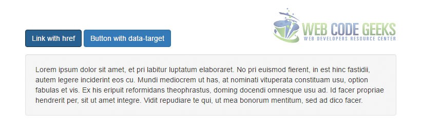
4.8 Collapse
Enable toggle behavior by using Bootstrap collapse.js (which is included if downloaded the full version of Bootstrap). Use a link with the href attribute, or a button with the data-target attribute to trigger a collapse. In both cases, the data-toggle="collapse" is required.
    <button class="btn btn-primary" type="button" data-toggle="collapse" data-target="#collapseExample" aria-expanded="false" aria-controls="collapseExample">
    Button with data-target
  </button>
  <a class="btn btn-primary" role="button" data-toggle="collapse" href="#collapseExample" aria-expanded="false" aria-controls="collapseExample">
    Link with href
  </a>
  <div class="collapse" id="collapseExample">
    <div class="well">
      Lorem ipsum dolor sit amet, et pri labitur luptatum elaboraret. No pri euismod fierent, in est hinc fastidii, autem legere inciderint eos cu. Mundi mediocrem ut has, at nominati vituperata constituam usu, option fabulas et vis. Ex his eripuit reformidans theophrastus, doming docendi omnesque usu ad. Id facer propriae hendrerit per, sit ut amet integre. Vidit repudiare te qui, ut mea bonorum mentitum, sed ad dico facer.
    </div>
  </div>
To read more on the available options and methods, and also how to create an accordion, please refer to the official Bootstrap documentation.
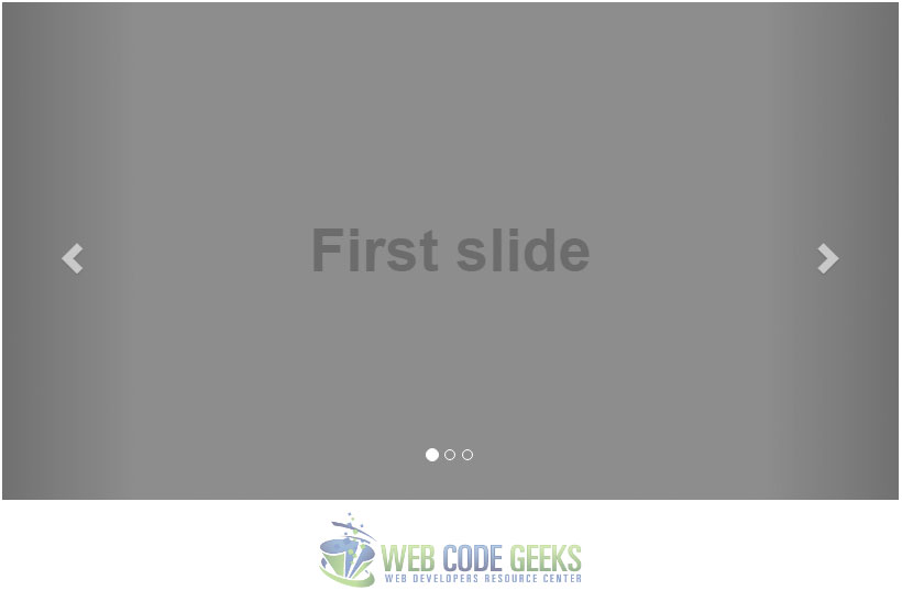
4.9 Carousel
Carousels are nicely animated slideshow components. They are heavily used in websites nowadays, mostly in the beginning of the main pages. The basic markup of a Bootstrpa carousel is:
  <div id="carousel-example-generic" class="carousel slide" data-ride="carousel">
    <!-- Indicators -->
    <ol class="carousel-indicators">
      <li data-target="#carousel-example-generic" data-slide-to="0" class="active"></li>
      <li data-target="#carousel-example-generic" data-slide-to="1"></li>
      <li data-target="#carousel-example-generic" data-slide-to="2"></li>
    </ol>

    <!-- Wrapper for slides -->
    <div class="carousel-inner" role="listbox">
      <div class="item active">
        <img src="..." alt="...">
        <div class="carousel-caption">
          ...
        </div>
      </div>
      <div class="item">
        <img src="..." alt="...">
        <div class="carousel-caption">
          ...
        </div>
      </div>
      ...
    </div>

    <!-- Controls -->
    <a class="left carousel-control" href="#carousel-example-generic" role="button" data-slide="prev">
      <span class="glyphicon glyphicon-chevron-left" aria-hidden="true"></span>
      <span class="sr-only">Previous</span>
    </a>
    <a class="right carousel-control" href="#carousel-example-generic" role="button" data-slide="next">
      <span class="glyphicon glyphicon-chevron-right" aria-hidden="true"></span>
      <span class="sr-only">Next</span>
    </a>
  </div>
The output in the browser would be an accessible slideshow:
5. Conclusion
To conclude, it is important to note that Bootstrap is a responsive mobile-first UI framework for building web pages. The Bootstrap framework, just like other UI frameworks, is a collection of pre-defined CSS classes, UI components and JQuery plug-ins. Bootstrap is considered a lightweight framework. In other words, it uses CSS more than JavaScript to do its work.
Even though Bootstrap is considered lightweight, web pages that use Bootstrap tooling still require more processing to render than a page written specifically for a given form factor. For this reason, performance should be an important consideration when designing, developing and testing pages that use any part of the Bootstrap framework. However, all in all, it is a tool worth using that will save a ton of time and make sure you’re coding on well-known standards.
6. References
That was a long article. To learn more about specific Bootstrap components and examples, as a reference for your future projects, please follow the links below to be redirected to the respective article:
- A walkthrough on how to use Bootstrap templates
- Sample Bootstrap login page
- Creating a gallery with Bootstrap
- Bootstrap Tabs Example
- Bootstrap Popover Example
- Bootstrap Panel Example
- Bootstrap Tooltip Example
- Bootstrap Layout Example
- Bootstrap Form Example
- Bootstrap Dropdown Menu Example
- Bootstrap Table Example
- Bootstrap Navbar Example
- Bootstrap Grid Example
- Bootstrap Modal Example
- Official CSS Guide of Bootstrap
- Official Components Guide of Bootstrap
- Official Javascript Guide of Bootstrap
https://www.webcodegeeks.com/css/bootstrap/tutorial-use-bootstrap-templates/
https://www.webcodegeeks.com/css/bootstrap/bootstrap-login-page-template/
https://www.webcodegeeks.com/css/bootstrap/bootstrap-gallery-example/
https://www.webcodegeeks.com/css/bootstrap/bootstrap-tabs-example/
https://www.webcodegeeks.com/css/bootstrap/bootstrap-popover-example/
https://www.webcodegeeks.com/css/bootstrap/bootstrap-panel-example/
https://www.webcodegeeks.com/css/bootstrap/bootstrap-tooltip-example/
https://www.webcodegeeks.com/css/bootstrap/bootstrap-layout-example/
https://www.webcodegeeks.com/css/bootstrap/bootstrap-form-example/
https://www.webcodegeeks.com/css/bootstrap/boostrap-dropdown-menu-example/
https://www.webcodegeeks.com/css/bootstrap/bootstrap-table-example/
https://www.webcodegeeks.com/css/bootstrap/bootstrap-navbar-example/
https://www.webcodegeeks.com/css/bootstrap/bootstrap-grid-example/
https://www.webcodegeeks.com/css/bootstrap/twitter-bootstrap-modal-example/
http://getbootstrap.com/components/

Very good