In this example, we shall take a closer look at how we can create and style checkbox elements with HTML5 markup and CSS3 styling.
Creating checkboxes will be needed when you want to present the user a set of options they can choose from, which is most likely in surveys.
First we take a basic approach to the html element and then try to style to make it look a bit more interesting than the default styling.
An important part of styling a checkbox is design, so we will have a dedicated section with beautifully designed checkboxes.

1. Prerequisites & Basic Setup
First, go on and create a html file with its basic syntax inside:
<!DOCTYPE html>
<html>
<head>
	<title>Checkbox Example</title>
</head>
<body>

	<!-- STYLE SECTION -->
	<style type="text/css">

  	</style>

	<!-- HTML SECTION -->

</body>
</html>
Now HTML5 has a way of creating a default checkbox. The code below would create a slightly basic checkbox:
<!-- HTML SECTION -->
<input type="checkbox" name="fruit" value="apple" />Red Apple
where the checkbox is explicitly defined by the type="checkbox". That would look like this: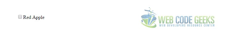
If you want to have several items, you are recommended to create them under a under a form.
That is because you might probably want to make that functional and submit the data somewhere. Look at the code below:
<!-- HTML SECTION -->

<form method="post">	<!-- wrapping these under a form for later submission -->
     <fieldset>	<!-- gives your question (including answers) a nice border -->
       <legend>What is Your Favorite Pet?</legend>		<!-- Your question goes here -->
            <input type="checkbox" name="fruit" value="apple" />Red Apple <br />
            <input type="checkbox" name="fruit" value="banana" />Ecuador Banana<br />
            <input type="checkbox" name="fruit" value="strawberry" />Strawberry<br />
            <input type="submit" value="Submit now" />
            <!-- submit input type, has the view of a button -->
      </fieldset>
</form>
This more complete case would look like this: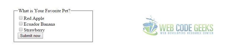
Notice that everything we are doing has no styling at all up until now. But styling is an important part.
2. Styling the Checkbox
Lets begin by styling one of the checkboxes in detail to have a clearer idea.
Below you can see the html and css code for customizing a checkbox with comments attached:
Set up this html element which will be our configuration for the checkbox.
<input type="checkbox" id="1" class="regular-checkbox"/><label for="1"></label>
Now let’s style this checkbox by giving a different background color and check icon:
.regular-checkbox {
	display: none;		/* means 'do not display', refers to the default styled checkbox */
}

.regular-checkbox + label {
	background-color: green;				/* given a green background color */
	border: 1px solid green;				/* given a green border color */
	padding: 15px;							/* given padding not to stick to edges */
	border-radius: 5px;						/* given radius for better view */
	display: inline-block;
	position: relative;						/* positioning facility for the icon */
}
We have just created the base, I mean, the background and first view of the checkbox, which is not yet checkable.
Let’s add the check capability to this box:
.regular-checkbox:checked + label:after {		/* :after meaning after being clicked */
	content: '\2714';							/* the check icon displayed after click */
	font-size: 20px;							/* the size of the font icon */
	position: absolute;							/* positioning facility for the checkbox */
	top: 1px;									/* further top alignment of the icon */
	left: 7px;									/* further left alignment of the icon */
	color: white;								/* color of the font icon */
}
.regular-checkbox:active + label:active {
	background-color: #62b362;				/* different bg color on active state */
}
Now we can say we have a different by design checkbox than the ones you are used to see randomly.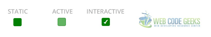
What is different here?
1. Size – size in this checkbox is determined by the font size of the check font icon and also the padding given to it.
2. Colors – both background color of the box and the color of the font icon is different from a normal checkbox here.
3. Border/Radius – border can be customised to any color and thickness and border radius can be adjusted.
4. Check Icon – notice we have a slightly different icon for the check, it is an unicode character.
3. Design Examples
Now lets have a look at some beautifully designed checkboxes over the internet.
3.1 Slider Check Design
This design uses the CSS3 transitions to move a slider from the left to the right to indicate ‘on’ or ‘off’.
Look at the HTML markup below:
<section>
  <h3>CHECKBOX DESIGN 1</h3>
  	<div class="checkbox-design1">
  		<input type="checkbox" value="1" id="checkbox1" name="" />
	  	<label for="checkbox1"></label>
  	</div>
</section>
And all the styling done by CSS would be:
input[type=checkbox] {
	visibility: hidden; /* hide the default checkbox */
}

.checkbox-design1 {
	width: 120px;
	height: 40px;
	background: #333;
	border-radius: 50px;
	position: relative;
}

.checkbox-design1:before {
	content: 'ON';
	position: absolute;
	top: 12px;
	left: 13px;
	height: 2px;
	color: #26ca28;
	font-size: 16px;
}
.checkbox-design1:after {
	content: 'OFF';
	position: absolute;
	top: 12px;
	left: 84px;
	height: 2px;
	color: #111;
	font-size: 16px;
}

.checkbox-design1 label {
	display: block;
	width: 52px;
	height: 22px;
	border-radius: 50px;
	-webkit-transition: all .5s ease;
	-moz-transition: all .5s ease;
	-o-transition: all .5s ease;
	-ms-transition: all .5s ease;
	transition: all .5s ease;
	cursor: pointer;
	position: absolute;
	top: 9px;
	z-index: 1;
	left: 12px;
	background: #ddd;
}
.checkbox-design1 input[type=checkbox]:checked + label {
	left: 60px;
	background: #26ca28;
}
This slider check would look like this: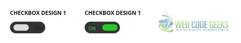
3.2 Background Filled Checkbox on Check
You might have recently seen that a lot of checkboxes come with a filled background color when checked and not an icon.
Look at the HTML markup below:
<div class="checkbox-design2">
	<input type="checkbox" value="None" id="checkbox-design2" name="check" />
	<label for="checkbox-design2"></label>
</div>
The CSS to this is:
.checkbox-design2 {
	width: 28px;
	height: 28px;
	background: #fcfff4;
	background: -webkit-linear-gradient(top, #fcfff4 0%, #dfe5d7 40%, #b3bead 100%);
	background: -moz-linear-gradient(top, #fcfff4 0%, #dfe5d7 40%, #b3bead 100%);
	background: -o-linear-gradient(top, #fcfff4 0%, #dfe5d7 40%, #b3bead 100%);
	background: -ms-linear-gradient(top, #fcfff4 0%, #dfe5d7 40%, #b3bead 100%);
	background: linear-gradient(top, #fcfff4 0%, #dfe5d7 40%, #b3bead 100%);
	margin: 20px auto;
	-webkit-box-shadow: inset 0px 1px 1px white, 0px 1px 3px rgba(0,0,0,0.5);
	-moz-box-shadow: inset 0px 1px 1px white, 0px 1px 3px rgba(0,0,0,0.5);
	box-shadow: inset 0px 1px 1px white, 0px 1px 3px rgba(0,0,0,0.5);
	position: relative;
}

.checkbox-design2 label {
	cursor: pointer;
	position: absolute;
	width: 20px;
	height: 20px;
	left: 4px;
	top: 4px;
	-webkit-box-shadow: inset 0px 1px 1px rgba(0,0,0,0.5), 0px 1px 0px rgba(255,255,255,1);
	-moz-box-shadow: inset 0px 1px 1px rgba(0,0,0,0.5), 0px 1px 0px rgba(255,255,255,1);
	box-shadow: inset 0px 1px 1px rgba(0,0,0,0.5), 0px 1px 0px rgba(255,255,255,1);
	background: -webkit-linear-gradient(top, #222 0%, #45484d 100%);
	background: -moz-linear-gradient(top, #222 0%, #45484d 100%);
	background: -o-linear-gradient(top, #222 0%, #45484d 100%);
	background: -ms-linear-gradient(top, #222 0%, #45484d 100%);
	background: linear-gradient(top, #222 0%, #45484d 100%);

}

.checkbox-design2 label:after {
	opacity: 0;
	content: '';
	position: absolute;
	width: 16px;
	height: 16px;
	background: -webkit-linear-gradient(top, #00bf00 0%, #009400 100%);
	background: -moz-linear-gradient(top, #00bf00 0%, #009400 100%);
	background: -o-linear-gradient(top, #00bf00 0%, #009400 100%);
	background: -ms-linear-gradient(top, #00bf00 0%, #009400 100%);
	background: linear-gradient(top, #00bf00 0%, #009400 100%);
	top: 2px;
	left: 2px;
	-webkit-box-shadow: inset 0px 1px 1px white, 0px 1px 3px rgba(0,0,0,0.5);
	-moz-box-shadow: inset 0px 1px 1px white, 0px 1px 3px rgba(0,0,0,0.5);
	box-shadow: inset 0px 1px 1px white, 0px 1px 3px rgba(0,0,0,0.5);
}

.checkbox-design2 input[type=checkbox]:checked + label:after {
	opacity: 1;
}
This design would look like this: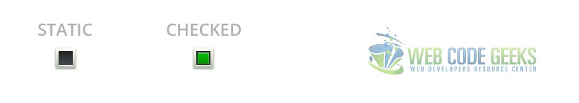
3.3 A Checkcircle? YES
Lets now change the overall thought that checks can only be put inside a box. It can be put everywhere, including a circle.
Look at the HTMl markup below:
<div class="checkcircle-design3">
	<input type="checkbox" value="None" id="checkcircle-design3" name="check" />
	<label for="checkcircle-design3"></label>
</div>
The respective CSS:
input[type=checkbox] {
	visibility: hidden;
}
.checkcircle-design3 {
	width: 28px;
	height: 28px;
	background: #fcfff4;

	background: -webkit-linear-gradient(top, #fcfff4 0%, #dfe5d7 40%, #b3bead 100%);
	background: -moz-linear-gradient(top, #fcfff4 0%, #dfe5d7 40%, #b3bead 100%);
	background: -o-linear-gradient(top, #fcfff4 0%, #dfe5d7 40%, #b3bead 100%);
	background: -ms-linear-gradient(top, #fcfff4 0%, #dfe5d7 40%, #b3bead 100%);
	background: linear-gradient(top, #fcfff4 0%, #dfe5d7 40%, #b3bead 100%);
	filter: progid:DXImageTransform.Microsoft.gradient( startColorstr='#fcfff4', endColorstr='#b3bead',GradientType=0 );
	margin: 20px auto;

	-webkit-border-radius: 50px;
	-moz-border-radius: 50px;
	border-radius: 50px;

	-webkit-box-shadow: inset 0px 1px 1px white, 0px 1px 3px rgba(0,0,0,0.5);
	-moz-box-shadow: inset 0px 1px 1px white, 0px 1px 3px rgba(0,0,0,0.5);
	box-shadow: inset 0px 1px 1px white, 0px 1px 3px rgba(0,0,0,0.5);
	position: relative;
}

.checkcircle-design3 label {
	cursor: pointer;
	position: absolute;
	width: 20px;
	height: 20px;

	-webkit-border-radius: 50px;
	-moz-border-radius: 50px;
	border-radius: 50px;
	left: 4px;
	top: 4px;

	-webkit-box-shadow: inset 0px 1px 1px rgba(0,0,0,0.5), 0px 1px 0px rgba(255,255,255,1);
	-moz-box-shadow: inset 0px 1px 1px rgba(0,0,0,0.5), 0px 1px 0px rgba(255,255,255,1);
	box-shadow: inset 0px 1px 1px rgba(0,0,0,0.5), 0px 1px 0px rgba(255,255,255,1);

	background: -webkit-linear-gradient(top, #222 0%, #45484d 100%);
	background: -moz-linear-gradient(top, #222 0%, #45484d 100%);
	background: -o-linear-gradient(top, #222 0%, #45484d 100%);
	background: -ms-linear-gradient(top, #222 0%, #45484d 100%);
	background: linear-gradient(top, #222 0%, #45484d 100%);
	filter: progid:DXImageTransform.Microsoft.gradient( startColorstr='#222', endColorstr='#45484d',GradientType=0 );
}

.checkcircle-design3 label:after {
	-ms-filter: "progid:DXImageTransform.Microsoft.Alpha(Opacity=0)";
	filter: alpha(opacity=0);
	opacity: 0;
	content: '';
	position: absolute;
	width: 9px;
	height: 5px;
	background: transparent;
	top: 5px;
	left: 4px;
	border: 3px solid #fcfff4;
	border-top: none;
	border-right: none;

	-webkit-transform: rotate(-45deg);
	-moz-transform: rotate(-45deg);
	-o-transform: rotate(-45deg);
	-ms-transform: rotate(-45deg);
	transform: rotate(-45deg);
}

.checkcircle-design3 label:hover::after {
	-ms-filter: "progid:DXImageTransform.Microsoft.Alpha(Opacity=30)";
	filter: alpha(opacity=30);
	opacity: 0.3;
}

.checkcircle-design3 input[type=checkbox]:checked + label:after {
	-ms-filter: "progid:DXImageTransform.Microsoft.Alpha(Opacity=100)";
	filter: alpha(opacity=100);
	opacity: 1;
}
Don’t get afraid of all that, most of it is gradients and cross-browser compatibility.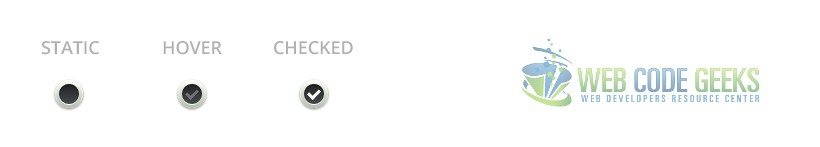
4. Conclusion
To conclude, we can state that creating custom checkboxes can be a difficult task sometimes on personalizing.
It covers some important css properties like position, z-index, gradients and filter.
And it will come handy a lot when creating surveying or poll websites for which the main focus is on these elements.
However, for a normal, non-commercial/non-premium use, you can design your own plain checkboxes using css.
5. Download
You can download the full source code of this example here: HTML5 Checkbox

Nice one mate :D
I like the Check circle, really look great.