The aim of this example is to take into consideration the usage of jQuery UI Slider. jQuery sliders offer a simple, elegant way to add sliders for a wide variety of uses on websites, like price filtering, choosing amount of items, choosing color from RGB channels etc.
While jQuery packs most of the essential functionality that you can and may think of when using sliders, you might also consider other custom sliders made possible by individuals for free on github.
We’ll first focus on what jQuery UI library offers by default in terms of functionality and design of sliders and then explore alternatives that can enhance this element even further.

1. Document Setup
To begin, create a new HTML document and add the basic syntax in it, which obviously includes jQuery UI:
<!DOCTYPE html>
<html>
<head>
	<title>jQuery UI Slider Example</title>
      <link href="http://ajax.googleapis.com/ajax/libs/jqueryui/1.11.4/themes/smoothness/jquery-ui.css" rel="stylesheet" type="text/css"/>
      <script src="http://ajax.googleapis.com/ajax/libs/jquery/1.11.3/jquery.min.js"></script>
      <script src="http://ajax.googleapis.com/ajax/libs/jqueryui/1.11.4/jquery-ui.min.js"></script>
      <link href="style.css" rel="stylesheet" type="text/css"/>
</head>
<body>

<!-- STYLE SECTION  -->
<style type="text/css">

</style>

<!-- HTML SECTION  -->


<!-- JAVASCRIPT SECTION  -->
<script type="text/javascript">

</script>

</body>
</html>
As you can see, all links refer to online sources of jQuery, jQuery UI so you don’t have to have these files downloaded to start off. However, the style.css is linked offline, but don’t worry, that is not going to make a big difference to what we’re doing, because it only contains a font size reduction.
2. jQuery UI Slider Examples
The following sections contain default and basic application of the slider widget.
2.1 Default Functionality
The basic slider is horizontal and has a single handle that can be moved with the mouse or by using the arrow keys. We’d have only one element in HTML:
<div class="slider"></div>
Also, we’d like to make this slider 30% of its original width to see it better. We do this in CSS by refering to .slider
.slider {
    width: 30%;
}
Finally, in the JS section, we enable the slider on our element.
    $(function(){
        $('.slider').slider();
    });
Note that $(function(){}); is equivalent to $(document).ready(function(){});

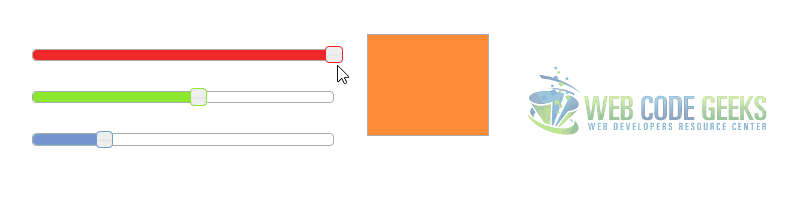
2.2 Colorpicker Example
In this example we will combine three sliders to create a simple RGB colorpicker.
<!-- HTML SECTION  -->
<div id="red"></div>
<div id="green"></div>
<div id="blue"></div>

<div id="swatch" class="ui-widget-content"></div>
In CSS, we style the three sliders to have their specific RGB colors:
#red, #green, #blue {
    float: left;
    clear: left;
    width: 300px;
    margin: 15px;
  }
  #swatch {
    width: 120px;
    height: 100px;
    margin-left: 350px;
    background-image: none;
  }
  #red .ui-slider-range { background: #ef2929; }
  #red .ui-slider-handle { border-color: #ef2929; }
  #green .ui-slider-range { background: #8ae234; }
  #green .ui-slider-handle { border-color: #8ae234; }
  #blue .ui-slider-range { background: #729fcf; }
  #blue .ui-slider-handle { border-color: #729fcf; }
Now the JS part is a bit complicated, but it basically refreshes the swatch as soon as you drag the slider.
    function hexFromRGB(r, g, b) {
    var hex = [
      r.toString( 16 ),
      g.toString( 16 ),
      b.toString( 16 )
    ];
    $.each( hex, function( nr, val ) {
      if ( val.length === 1 ) {
        hex[ nr ] = "0" + val;
      }
    });
    return hex.join( "" ).toUpperCase();
  }
  function refreshSwatch() {
    var red = $( "#red" ).slider( "value" ),
      green = $( "#green" ).slider( "value" ),
      blue = $( "#blue" ).slider( "value" ),
      hex = hexFromRGB( red, green, blue );
    $( "#swatch" ).css( "background-color", "#" + hex );
  }
  $(function() {
    $( "#red, #green, #blue" ).slider({
      orientation: "horizontal",
      range: "min",
      max: 255,
      value: 127,
      slide: refreshSwatch,
      change: refreshSwatch
    });
    $( "#red" ).slider( "value", 255 );
    $( "#green" ).slider( "value", 140 );
    $( "#blue" ).slider( "value", 60 );
  });
2.3 Multiple Sliders Example
Combine horizontal and vertical sliders, each with their own options, to create the UI for a music player. In the HTMl we’d have a div element for the master slider and another div for the other sliders, like so:
<div id="master" style="width:260px; margin:15px;"></div>

<div id="eq">
  <span>88</span>
  <span>77</span>
  <span>55</span>
  <span>33</span>
  <span>40</span>
  <span>45</span>
  <span>70</span>
</div>
Just a margin around the span elements to make space for each of them:
#eq > span {
    height:120px;
    float:left;
    margin:15px
  }
This time, the slider is given options to it, like orientation, range and animate:
$(function() {
    // setup master volume
    $( "#master" ).slider({
      value: 60,
      orientation: "horizontal",
      range: "min",
      animate: true
    });
    // setup graphic EQ
    $( "#eq > span" ).each(function() {
      // read initial values from markup and remove that
      var value = parseInt( $( this ).text(), 10 );
      $( this ).empty().slider({
        value: value,
        range: "min",
        animate: true,
        orientation: "vertical"
      });
    });
  });
2.4 Range Slider Example
Set the range option to true to capture a range of values with two drag handles. The space between the handles is filled with a different background color to indicate those values are selected.
<p>
  <label for="amount">Price range:</label>
  <input type="text" id="amount" readonly style="border:0; color:#f6931f; font-weight:bold;">
</p>

<div id="slider-range"></div>
The JS section, handles the change as soon as we drag the slider, thus updating the price values:
$(function() {
    $( "#slider-range" ).slider({
      range: true,
      min: 0,
      max: 500,
      values: [ 75, 300 ],
      slide: function( event, ui ) {
        $( "#amount" ).val( "$" + ui.values[ 0 ] + " - $" + ui.values[ 1 ] );
      }
    });
    $( "#amount" ).val( "$" + $( "#slider-range" ).slider( "values", 0 ) +
      " - $" + $( "#slider-range" ).slider( "values", 1 ) );
  });

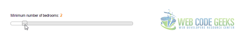
2.5 Range with Fixed Maximum Example
Fix the maximum value of the range slider so that the user can only select a minimum. Set the range option to "max".
<p>
  <label for="amount">Minimum number of bedrooms:</label>
  <input type="text" id="amount" readonly style="border:0; color:#f6931f; font-weight:bold;">
</p>
<div id="slider-range-max"></div>
In the JS section, we first set the options min, max and value, to respectively the minimum, the maximum and the initial value of the slider. Then we update the number of the current value depending on the slider position:
  $(function() {
    $( "#slider-range-max" ).slider({
      range: "max",
      min: 1,
      max: 10,
      value: 2,
      slide: function( event, ui ) {
        $( "#amount" ).val( ui.value );
      }
    });
    $( "#amount" ).val( $( "#slider-range-max" ).slider( "value" ) );
  });
2.6 Range with Fixed Minimum
Fix the minimum value of the range slider so that the user can only select a maximum. Set the range option to "min".
<p>
  <label for="amount">Maximum price:</label>
  <input type="text" id="amount" readonly style="border:0; color:#f6931f; font-weight:bold;">
</p>

<div id="slider-range-min"></div>
Just like in the previous example, here we also have a minimum, a maximum and an inital value pre set.
  $(function() {
    $( "#slider-range-min" ).slider({
      range: "min",
      value: 37,
      min: 1,
      max: 700,
      slide: function( event, ui ) {
        $( "#amount" ).val( "$" + ui.value );
      }
    });
    $( "#amount" ).val( "$" + $( "#slider-range-min" ).slider( "value" ) );
  });

2.7 Slider Bound to Select
How to bind a slider to an existing select element. The select stays visible to display the change. When the select is changed, the slider is updated, too.
<form id="reservation">
  <label for="minbeds">Minimum number of beds</label>
  <select name="minbeds" id="minbeds">
    <option>1</option>
    <option>2</option>
    <option>3</option>
    <option>4</option>
    <option>5</option>
    <option>6</option>
  </select>
</form>
In this case, we add the div element which will add the slider in jQuery and not have it predefined in HTML. We also set min and max values and a simple algorithm that will change the slider position according to the selection.
$(function() {
    var select = $( "#minbeds" );
    var slider = $( "<div id='slider'></div>" ).insertAfter( select ).slider({
      min: 1,
      max: 6,
      range: "min",
      value: select[ 0 ].selectedIndex + 1,
      slide: function( event, ui ) {
        select[ 0 ].selectedIndex = ui.value - 1;
      }
    });
    $( "#minbeds" ).change(function() {
      slider.slider( "value", this.selectedIndex + 1 );
    });
  });

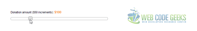
2.8 Snap to Increments Example
Increment slider values with the step option set to an integer, commonly a dividend of the slider’s maximum value. The default increment is 1.
<p>
  <label for="amount">Donation amount ($50 increments):</label>
  <input type="text" id="amount" readonly style="border:0; color:#f6931f; font-weight:bold;">
</p>

<div id="slider"></div>
Now, adding the step to a value of 50, would result in the following:
  $(function() {
    $( "#slider" ).slider({
      value:100,
      min: 0,
      max: 500,
      step: 50,
      slide: function( event, ui ) {
        $( "#amount" ).val( "$" + ui.value );
      }
    });
    $( "#amount" ).val( "$" + $( "#slider" ).slider( "value" ) );
  });
2.9 Vertical Range Slider Example
Change the orientation of the range slider to vertical. Assign a height value via .height() or by setting the height through CSS, and set the orientation option to “vertical.”
<p>
  <label for="amount">Target sales goal (Millions):</label>
  <input type="text" id="amount" readonly style="border:0; color:#f6931f; font-weight:bold;">
</p>

<div id="slider-range" style="height:250px;"></div>
  $(function() {
    $( "#slider-range" ).slider({
      orientation: "vertical",
      range: true,
      values: [ 17, 67 ],
      slide: function( event, ui ) {
        $( "#amount" ).val( "$" + ui.values[ 0 ] + " - $" + ui.values[ 1 ] );
      }
    });
    $( "#amount" ).val( "$" + $( "#slider-range" ).slider( "values", 0 ) +
      " - $" + $( "#slider-range" ).slider( "values", 1 ) );
  });

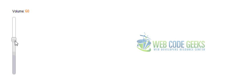
2.10 Vertical Slider Example
Change the orientation of the slider to vertical. Assign a height value via .height() or by setting the height through CSS, and set the orientation option to "vertical".
<p>
  <label for="amount">Volume:</label>
  <input type="text" id="amount" readonly style="border:0; color:#f6931f; font-weight:bold;">
</p>

<div id="slider-vertical" style="height:200px;"></div>
This time, in contrast to the previous example, we have no range, just a normal vertical slider.
  $(function() {
    $( "#slider-vertical" ).slider({
      orientation: "vertical",
      range: "min",
      min: 0,
      max: 100,
      value: 60,
      slide: function( event, ui ) {
        $( "#amount" ).val( ui.value );
      }
    });
    $( "#amount" ).val( $( "#slider-vertical" ).slider( "value" ) );
  });
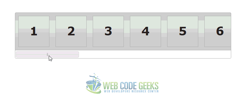
3. Slider Scrollbar Example
This example shows how you can use a slider to manipulate the positioning of content on the page. In this case, it acts as a scrollbar with the potential to capture values if needed.
<!-- HTML SECTION  -->
<div class="scroll-pane ui-widget ui-widget-header ui-corner-all">
  <div class="scroll-content">
    <div class="scroll-content-item ui-widget-header">1</div>
    <div class="scroll-content-item ui-widget-header">2</div>
    <div class="scroll-content-item ui-widget-header">3</div>
    <div class="scroll-content-item ui-widget-header">4</div>
    <div class="scroll-content-item ui-widget-header">5</div>
    <div class="scroll-content-item ui-widget-header">6</div>
    <div class="scroll-content-item ui-widget-header">7</div>
    <div class="scroll-content-item ui-widget-header">8</div>
    <div class="scroll-content-item ui-widget-header">9</div>
    <div class="scroll-content-item ui-widget-header">10</div>
    <div class="scroll-content-item ui-widget-header">11</div>
    <div class="scroll-content-item ui-widget-header">12</div>
    <div class="scroll-content-item ui-widget-header">13</div>
    <div class="scroll-content-item ui-widget-header">14</div>
    <div class="scroll-content-item ui-widget-header">15</div>
    <div class="scroll-content-item ui-widget-header">16</div>
    <div class="scroll-content-item ui-widget-header">17</div>
    <div class="scroll-content-item ui-widget-header">18</div>
    <div class="scroll-content-item ui-widget-header">19</div>
    <div class="scroll-content-item ui-widget-header">20</div>
  </div>
  <div class="scroll-bar-wrap ui-widget-content ui-corner-bottom">
    <div class="scroll-bar"></div>
  </div>
</div>
.scroll-pane { overflow: auto; width: 45%; float:left; }
  .scroll-content { width: 2440px; float: left; }
  .scroll-content-item { width: 100px; height: 100px; float: left; margin: 10px; font-size: 3em; line-height: 96px; text-align: center; }
  .scroll-bar-wrap { clear: left; padding: 0 4px 0 2px; margin: 0 -1px -1px -1px; }
  .scroll-bar-wrap .ui-slider { background: none; border:0; height: 2em; margin: 0 auto;  }
  .scroll-bar-wrap .ui-handle-helper-parent { position: relative; width: 100%; height: 100%; margin: 0 auto; }
  .scroll-bar-wrap .ui-slider-handle { top:.2em; height: 1.5em; }
  .scroll-bar-wrap .ui-slider-handle .ui-icon { margin: -8px auto 0; position: relative; top: 50%; }
$(function() {
    //scrollpane parts
    var scrollPane = $( ".scroll-pane" ),
      scrollContent = $( ".scroll-content" );

    //build slider
    var scrollbar = $( ".scroll-bar" ).slider({
      slide: function( event, ui ) {
        if ( scrollContent.width() > scrollPane.width() ) {
          scrollContent.css( "margin-left", Math.round(
            ui.value / 100 * ( scrollPane.width() - scrollContent.width() )
          ) + "px" );
        } else {
          scrollContent.css( "margin-left", 0 );
        }
      }
    });

    //append icon to handle
    var handleHelper = scrollbar.find( ".ui-slider-handle" )
    .mousedown(function() {
      scrollbar.width( handleHelper.width() );
    })
    .mouseup(function() {
      scrollbar.width( "100%" );
    })
    .append( "<span class='ui-icon ui-icon-grip-dotted-vertical'></span>" )
    .wrap( "<div class='ui-handle-helper-parent'></div>" ).parent();

    //change overflow to hidden now that slider handles the scrolling
    scrollPane.css( "overflow", "hidden" );

    //size scrollbar and handle proportionally to scroll distance
    function sizeScrollbar() {
      var remainder = scrollContent.width() - scrollPane.width();
      var proportion = remainder / scrollContent.width();
      var handleSize = scrollPane.width() - ( proportion * scrollPane.width() );
      scrollbar.find( ".ui-slider-handle" ).css({
        width: handleSize,
        "margin-left": -handleSize / 2
      });
      handleHelper.width( "" ).width( scrollbar.width() - handleSize );
    }

    //reset slider value based on scroll content position
    function resetValue() {
      var remainder = scrollPane.width() - scrollContent.width();
      var leftVal = scrollContent.css( "margin-left" ) === "auto" ? 0 :
        parseInt( scrollContent.css( "margin-left" ) );
      var percentage = Math.round( leftVal / remainder * 100 );
      scrollbar.slider( "value", percentage );
    }

    //if the slider is 100% and window gets larger, reveal content
    function reflowContent() {
        var showing = scrollContent.width() + parseInt( scrollContent.css( "margin-left" ), 10 );
        var gap = scrollPane.width() - showing;
        if ( gap > 0 ) {
          scrollContent.css( "margin-left", parseInt( scrollContent.css( "margin-left" ), 10 ) + gap );
        }
    }

    //change handle position on window resize
    $( window ).resize(function() {
      resetValue();
      sizeScrollbar();
      reflowContent();
    });
    //init scrollbar size
    setTimeout( sizeScrollbar, 10 );//safari wants a timeout
  });
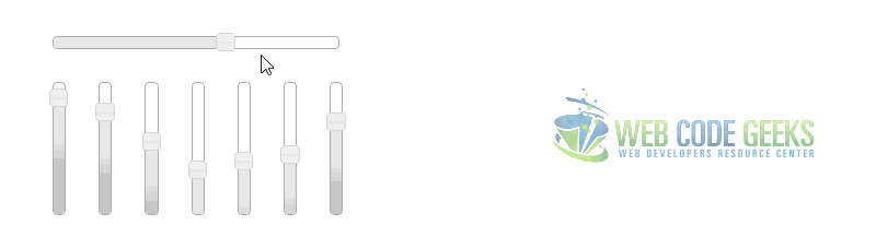
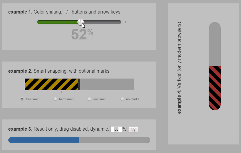
4. Alternative Sliders
In addition to jQuery UI default ways of customization regarding design and functionality, you could have even more sliders from the internet. You can find a wide range of custom sliders beautifully designed in this website: http://www.jqueryrain.com/demo/jquery-range-slider/. Here are some of the alternative sliders you will find on that website:
5. Conclusion
To conclude, it is important to understand that you should consider intuitive ways of representing content and values on your website. For example, you could very well use some select dropdown for all of these values of the examples, but that would be rather unuseful and boring for the users.
As part of a more modern approach of the whole user experience on the web nowadays, jQuery sliders (and those costumized ones based on them) define a great new experience to the end user, which is visually stunning and provides awesome functionality.
6. Download
You can download the full source code of this example here: jQuery UI Slider

Great jquery ui slider example. See this other ui slider that might become useful
http://jqueryplugins.net/jquery-ui-slider-pips/