Coming from a Java back-end background and given the privilege to dive into the front-end space, I was finally able see what it was like to make a web application responsive.
Although there are plenty of other benefits to responsive design, a main benefit is that there is now no need to create an application for every device out there. The use of mobile devices to accomplish what a user can do on a desktop is growing at an considerable pace, so it would be wise for any front-end developer to ensure a web application is ready to adapt to a plethora of screen sizes. I was excited to learn how to do just that, and what better way than the need to create another mobile version of an application.
This won’t be a tutorial on how to use, say, Bootstrap for example, to create a responsive application. There are hundreds of tutorials online and a good start can be found just be directing oneself to the Bootstrap CSS site. Rather, this is a little snippet of some random unforeseen issues a responsive newbie like myself can encounter while developing in the responsive front-end world.
First, let’s start with the iPhone.
Let’s say you create a Bootstrap responsive application with all the bells and whistles to get your application reorganizing and looking great while resizing your screen on a desktop. But this doesn’t work on an iPhone.
Why? I suggest that you ensure a ViewPort Metatag is included in your tag to allow mobile browsers to control the layout. Mobile browsers render pages in a virtual window or viewport. Mobile Safari introduced the ViewPort Metatag to allow developers control of the size and scale of the viewport.
For only portrait view add the following:
<meta name="viewport" content="width=device-width, inital-scale=1.0">
To allow for landscape view as well, add the following:
<meta name="viewport" content="width=device-width, inital-scale=1, maximum-scale=1, user-scalable=0">
Note: The most recent version of Bootstrap actually requires this tag to be included in your responsive application since Bootstrap likes to claim itself as being “mobile first.”
In my current project, a defect (well, more like an annoyance) arose that dealt with iOS devices, particularly iPhones. The defect dealt with the common iOS behavior of zooming in a little when selecting an input box or select option. In this case, once the user leaves focus, it stayed zoomed in and ended up sort of throwing the entire view of the container out of whack.
Since now the user has to horizontally or vertically scroll to see the entire container because of this zoom. It appears, for iPhones, the browser tries to zoom the area since the font size is less than the threshold. Bootstrap’s default font-size is 14px, which causes the zoom effect. A size of 16px or 1em is appropriate to meet this threshold.
Applying the following CSS ironed out all text/number inputs:
input[type='text'],
input[type='number'],
textarea {
  	font-size: 1em;
}
Since dealing with selects on mobile browsers, the text is hidden so we are safe with any unforseen layout issues. I say ‘hidden’ because these selects don’t render the same as selects on desktop browsers. Each mobile OS utilizes its own native view for the user to select a value. Thereby, a work-around for us is to establish the font size to 50px and viola! No more zooming…
select {
	font-size: 50px;
}
To change direction briefly, I have an old Nokia phone with a rinky dinky mobile browser on it and was curious to see what a responsive site looked like. I wasn’t surprised to find out the browser does not support CSS media queries and so it ignored it leaving the site unresponsive and pretty much as is. One of the downfalls of an ever-evolving mobile landscape.
Fortunately, newer versions of iOS, Android, and most mobile browsers all support CSS media queries. There is no way to get some of these old browsers to handle or implement CSS media queries, but an adequate solution would be to check for browser version and then create a simple mobile stylesheet to handle a similar responsive rendering. It won’t look as great as a modern mobile browser, but generally, a responsive theme with backwards compatibility can still be a good thing.
Responsive Datatable
Let’s switch gears a bit and take a look at how one can approach creating a responsive datatable. When dealing with datatables, I did a little research to see what was out there in terms of plugins to handle responsive tables. Boy, I didn’t come up empty-handed. There exists plenty of plugin options to choose from (just to outline a few):
- One could perhaps scale the font which will allow the table to have the same layout but smaller font. (github.com/ghepting/jquery-responsive-tables)
- There is Stackable.js, which formulates a toggle between two tables depending on the browser viewport.
- There is Tablesaw – similar to Stackable.js (https://github.com/filamentgroup/tablesaw)
- There is FooTable – (https://gitbub.com/fooplugins/FooTable), which hides certain columns of data at different resolutions and then rows become expandable to show data that was hidden.
- Let’s not forgot Bootstrap’s Responsive Tables. This is great, however, to see the entire contents of the table, the user still needs to scroll horizontally.
Another method is to use something that doesn’t require the use of a plugin. There are also plenty of CSS tricks that can rearrange the table elements to display/hide certain items.
An Example
For a client, we skipped the plugin route and went ahead with a hide-column-and-display-a-responsive-span option in conjunction with CSS media queries. To put it plainly, as the user switches from a laptop to an iPad to a mobile phone, the datatable hides various data columns and shows the same data under one main column. In other words, as columns disappear to make room, the same data is then grouped as rows under one stationary column.
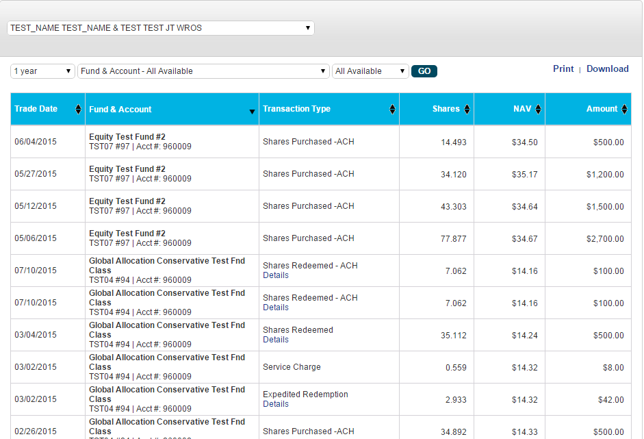
Here is the datatable as seen on a desktop:
Here is the same datatable seen on a mobile device:

Conclusion
Keeping up with a user who switches from a laptop to an iPad to a mobile phone to access the same application can easily be accomplished by a good responsive approach. This approach would consist of a mix of flexible grids and layouts and an intelligent use of CSS media queries.
However, don’t be surprised that some minor quirks will pop up during responsive testing. But, in my opinion, if those didn’t rear their ugly heads, that would take out some of the most enjoyable aspects of UI responsive development!
| Reference: | Approaching Responsive Design from our WCG partner Keyhole Software at the Keyhole Software blog. |
