We recently released an updated UI, focusing on the most important pages within our application and laying the groundwork for future improvements. Ryan Wilke, senior product designer at Codeship, wrote about the design process, our thinking, and how we got to the initial release.
Along with this design process, we also want to share how we handle complex feature rollouts like this one — our strategy for rolling out the new design, how we measure success, analyze feedback, and implement improvements.
Choosing the Right Rollout Strategy for Our Features
In general, at Codeship, we use feature flags to quickly iterate on new features to experience them internally and to share them with beta users as soon as possible.
When it comes to rolling out a new feature, it’s important to decide what rollout strategy is the best for that case. How should it be experienced by our users? What do we want to get out of this release?
Although it was not a complete redesign, enough had changed in our new design that we decided to go with a rollout where we offered the option for users to opt out of the design. Here are some reasons why we chose that strategy:
- Offer a smoother transition and better experience for our users
- Engage with users and receive qualitative feedback to improve upon and be able to segment them based on opt-out state
- Number of opt-outs of active users becomes a success measurement
Managing Feedback
Design updates, by nature, elicit higher than average feature release responses, and our UI rollout was no different. People loved it, people didn’t care, people disliked it. It is important to be able to assess the impact of the changes in order to be able to address how and if to improve on them. The more feedback we received, the more data we had to work with.
We aimed to get as much feedback covering opted-out users as well as users who liked the new design. We appreciated all the reactions we got and the conversations we had.
We carefully processed each and every feedback and made sure we categorized and prioritized them properly. A lot of consideration goes into those decisions:
- How critical is the feedback?
- How many users does it affect?
- How often will this be an issue?
- How does this improvement fit into our overall design plan and future improvements?
- If we don’t do it now but consider it important, how and when will it be addressed?
!Sign up for a free Codeship Account
Deciding When It’s Time to Move All Users to a New Design
It was not an easy decision to make the final call to move all users to a new design, especially when we knew that we have users who preferred the old design. However, we knew we had to make the call eventually. After a lot of improvements to the design we decided to remove the option to opt-out on June 20th, roughly 2 months after introducing the new designs to our users. Doing so will enable us to move forward more efficiently and to provide more improvements to the overall usability of Codeship.
Measuring Success
At Codeship, we define success metrics for every feature we’re building. Especially with a design change, it can be difficult to correlate success directly to business metrics, specifically with a service like Codeship where engagement or page views are not the best criteria for UX performance. A true measure of success comes down to how efficient the usability is; in other words, how fast our users can perform their actions and how we we support their use cases.
We chose both quantifiable and qualitative goals to measure the success and state of the new design, as well as how we’re performing during rollout.
Quantifiable
- How many active users opted out?
- What is the account profile of opted-out users?
- Are there patterns? For example, were the majority of opt-out users from small accounts or big accounts or are they evenly distributed?
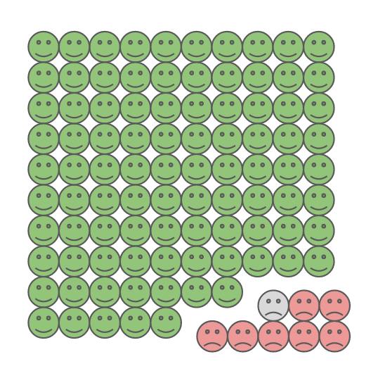
92.35% of active users used the new design
Qualitative
- Did we address and resolve the majority of feedback areas and blockers?
- Did we plan and have a good understanding of the outstanding feedback going forward?
We read and considered all the feedback we received carefully. We addressed most of the common feedback we’ve received, added improvements, removed UX issues and bugs.
We categorized the areas of feedback to identify common patterns which helped with prioritizing the feedback based on what we heard from our users. Some of the feedback that wasn’t directly related to the new design release we carefully planned and are considering for future improvements.
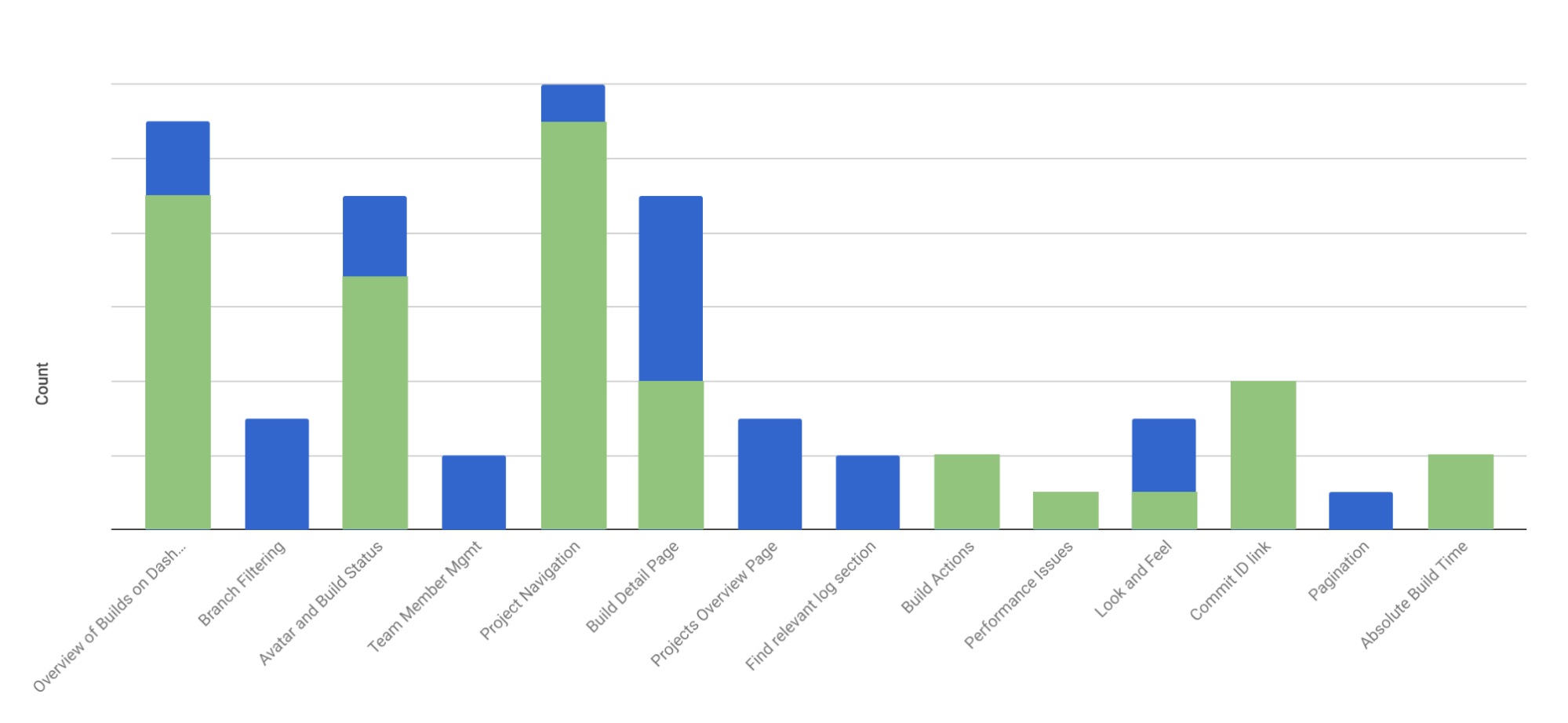
The graph below displays how we categorized the feedback we received (in blue) and what we improved and to what extent (in green).
Of course, we don’t consider our design improvements as finalized. It is only the start, and we carefully listen to and evaluate all the feedback we get. At the same time we feel confident that we are in a good state where we move all users to the new design and are able to deliver an efficient UI and UX.
What’s Next
We are constantly evaluating the feedback we receive and trying to push more improvements to our UX design. There are a lot of things we want to improve on and make more efficient, such as filtering and grouping of branches and builds, build detail page and build log improvements, and improved build interactions.
If you want to give input, please consider filling out the survey around the state of UI and what you are still missing.
We’re very excited for the future improvements to come, and we’re dedicated to continue improving the experience and making it the best we can.
| Reference: | How We Rolled Out Our Recent UI Changes from our WCG partner Alexander Tacho at the Codeship Blog blog. |