I’ve started playing with the new Gutenberg editor in WordPress, and the experience is a lot more modern than the old TinyMCE editor that’s been around for a good 15 years (and I’ve had blogs for almost that long!).
Instead of editing all the content of the post at once, the Gutenberg editor works with blocks of content that can be reordered, with a clean look similar to the Medium editor.
WordPress comes with many blocks by default for standard elements such as list, button or image galleries (see https://gogutenberg.com/blocks/ for all the blocks that comes built-in). You can also save blocks you’ve used in a post to reuse them in other posts.

For a really effective blogging workflow, you’ll need to build new blocks to extent the functionalities of the editor. For another blog I own (https://robotsbench.com/), I wanted to use the HTML <aside> tag that’s not available in the default blocks so I could give it a specific style in my theme.
It involved more code than I expected and there are many steps. A good surprise still, the majority of the code the plugin is in React (JavaScript) instead of the PHP scripts used for standard plugins. You’ll still need a tiny bit of PHP to package it as a WordPress plugin, but it’s mostly boilerplate that can be generated.
This tutorial will walk you through the creation of plugin to use the <aside> tag. We’ll see how to:
- Setting up the right tools to get started.
- Create the boilerplate for the plugin.
- Add a rich text field to add content to the block.
- Add CSS styles to the block.
Setting up the Environment
Before we get started creating the plugin template, you’ll need to install the following on your computer to follow along.
You’ll already have all of this if you’re already developing in JavaScript and own a blog, but here is it for completeness’ sake:
- A code editor to edit PHP, JavaScript and CSS files. Right now, my favorite is Visual Studio Code at https://code.visualstudio.com/.
- npm version 5.3 or more to create the template, get the required dependencies and package the plugin at https://www.npmjs.com/get-npm.
- A live or local installation of WordPress with the Gutenberg editor to test the plugin. The Gutenberg editor now comes enabled by default in WordPress. I used Local by Flywheel to do this.
Generate an Empty Plugin Template
We are going to use a tool called create-guten-block (https://github.com/ahmadawais/create-guten-block) to create a template for our new plugin and upload it to your blog to test the whole process first. It will only contain a single block in this tutorial, but you could add all your custom blocks in a single plugin.
In the command line, use the following command to generate a plugin named cp-aside-gutenberg-block.
npx create-guten-block cp-aside-gutenberg-block
Your newly created plugin will be in a cp-aside-gutenberg-block subfolder of the current folder. To prepare your plugin to upload on your WordPress installation, navigate to the plugin folder and build it.
cd cp-aside-gutenberg-block
npm run build
To deploy the plugin, add the following files in the cp-aside-gutenberg-block folder to a .zip file:
\dist
\src
plugin.php
You could include all the other files for the sake of having the complete source code of your plugin on your blog, but they won’t be used by WordPress. If you do include them, ignore the \node_modules folder: it’s a pretty big folder and you can always download the content again using the npm install command if you need to recreate it.
Deploy it like you would deploy any other plugin, using the Plugins/Add new menu in WordPress and clicking the Upload Plugin button to select the .zip file you just created. Activate it and it should now be shown as active in your list of plugins.

From there on, the new block will appear in the list of blocks when you edit a post.
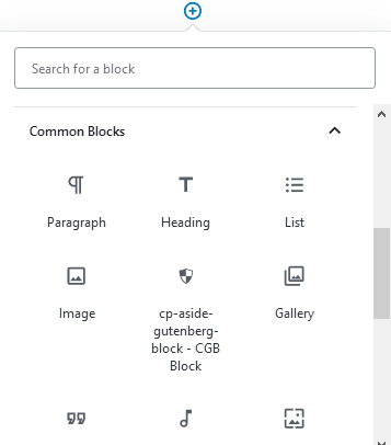
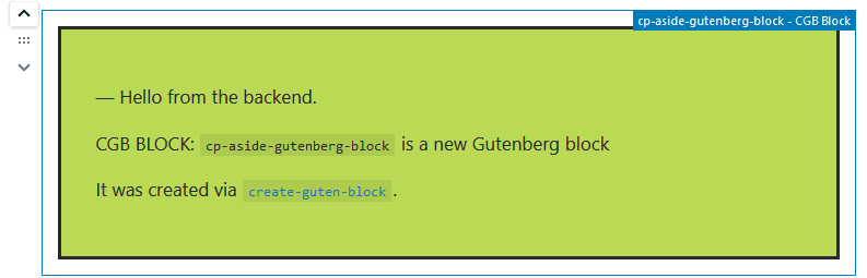
The block can be rendered differently in the editor and in the final blog post. With the boilerplate, it will show up in the editor as the following:
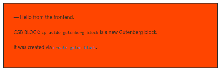
And in the real post (or in the post preview):
What’s in the Boilerplate?
The template has generated many files for the plugin. Here is what’s included in the plugin we just tried out from the generated template:
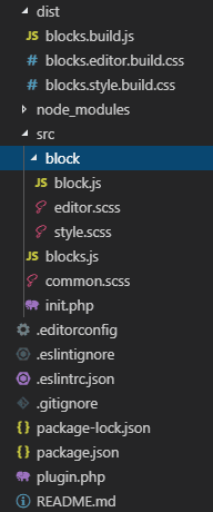
Many things here will be familiar to you if you’ve worked on a React application before. Here are the most interesting parts:
- /dist: The frontend files that we built with the npm run build command and that need to be deployed.
- /src: Contains all the source code of the plugin (both the frontend in JavaScript and backend in PHP).
- package.json: Describes the various dependencies required and commands that can be run. You’ll only need to edit it if you need additional JavaScript dependencies. By default, it only depends on the cgb-script library that pulls everything else.
- plugin.php: The standard file needed for a WordPress plugin.
The most interesting part is the src/block/block.js file that contains the JavaScript for the plugin:
import './style.scss';
import './editor.scss';

const { __ } = wp.i18n;
const { registerBlockType } = wp.blocks;

registerBlockType('cgb/block-cp-aside-gutenberg-block', {
   title: __('cp-aside-gutenberg-block'),
   icon: 'shield', // Icon used for the block from Dashicons
   category: 'common',
   edit: function(props) {
      return (
         <div className={ props.className }>Hello from the backend.</div>
         );
   },
   save: function(props) {
      return (<div>Hello from the frontend.</div>);
   },
} );
The Gutenberg Block API used to extend the editor makes the registerBlockType method available to add your own blocks. The registerBlockType method describes the block and what happens when displaying for the editor or from a post.
It includes metadata about the block such as its title, icon and category in the editor. It also includes the following two functions where most of the logic of the block lives:
- edit: The fields that are shown in the Gutenberg editor to modify the content of the block.
- save: The components that describe how to render the block in the post. The rendered markup is serialized and saved with the rest of the post so React is not needed when displaying the post.
Adding a Rich Text Field
Now that a basic block is available, let’s modify it to display content as an <aside> HTML tag. At the same time, we’ll also add an editable rich text field so we can add this content from the editor.
To add the editable field, the block must now store a value in the block since it needs to render it. In the Block API, values are registered as a list of attributes in the registerBlockType method.
Attributes behave similarly to the state in React, but they contain some extra information so they can be managed by the Block API. The definition of the attribute specifies how to map the rendered content saved into the block to the content.
This block will have only one attribute named content. This attribute will look for the children inside the element described by the .cp-aside-gutenberg-block-content selector. The type of the content is an array because the block will contain many paragraphs (<p>) created by the rich text editor.
attributes: {
    content: {
        type: 'array',
        source: 'children',
        selector: '.cp-aside-gutenberg-block-content'
    }
},
The following documentation includes all the data type supported by the attributes property : https://developer.wordpress.org/block-editor/developers/block-api/block-attributes/.
Editing the Content of the Block
When editing the post in Gutenberg, the edit method will receive the current value of the attributes as a parameter so it can show the controls needed to edit them. It also receives a setAttributes to update the current value of the attributes when the control is edited.
edit: ({ attributes, setAttributes }) => {
    const updateContent = (value) => {
        setAttributes({content: value})
        }

    return (
        <RichText tagName="aside"
                  multiline="p"
                  value={attributes.content}
                  className="cp-aside-gutenberg-block-content"
                  onChange={updateContent} />
    );
}
Those values will be used to initialize the RichText control already available with Gutenberg (see the complete example at the bottom of the post to see how to import it in your block) .
Since it’s a React control, the name of the attribute for CSS class of the control is className instead of class in HTML. You can also specify which tag type is the parent of the control, so in that case we’ll use <aside> to get the result we wish.
When the content of the editor change, the method specified in the onChange attribute of the RichText control is called and the current value is updated.
Saving the Content of the Block
When the save method is called to render the control and save the result, it also receives the current value of the attributes as a parameter (but not the setAttributes method since it won’t change the current value).
save: (props) => {
    return (
        <RichText.Content tagName="aside"
                          value={props.attributes.content}
                          className="cp-aside-gutenberg-block-content" />
    );
}
It then uses the RichText.Content control to render the value correctly as rich text so it can be displayed later, so the parameters are similar to the RichText editor control.
CSS for the Block
To complete the plugin, let’s add this little bit of CSS in src\block\style.scss to show a small border around the aside block. I’ve kept it simple since it will be most likely edited at the theme level.
This style is applied in the editor and in the post preview; there is also a src\block\editor.scss file already created for styles specific to the editor.
.cp-aside-gutenberg-block-content {
  border:3px dashed #160c28;
  margin: 1.5em 3em 1.5em 3em;
  padding: 1em;
  background-color: #e1efe6;
}
Final Version of the Block
Here is the complete plugin. Notice the import to be able to use the RichText control that I mentioned earlier.
import './style.scss';
import './editor.scss';

const { __ } = wp.i18n; // Import __() from wp.i18n
const { registerBlockType } = wp.blocks;
const { RichText } = wp.editor;

registerBlockType('com-cindypotvin/cp-aside-gutenberg-block', {
    title: 'Aside Box',
    description: 'Block showing a <aside> HTML element.',
    icon: 'editor-justify',
    category: 'formatting',
    attributes: {
      content: {
          type: 'array',
          source: 'children',
          selector: '.cp-aside-gutenberg-block-content'}
    },
    edit: ({ attributes, setAttributes }) => {
        const updateContent = (value) => {
            setAttributes({content: value})
            }
        return (
            <RichText tagName="aside"
                      multiline="p"
                      value={attributes.content}
                      className="cp-aside-gutenberg-block-content"
                      onChange={updateContent} />
        );
    },
    save: (props) => {
        return (
            <RichText.Content tagName="aside"
                              value={props.attributes.content}
                              className="cp-aside-gutenberg-block-content" />
        );
    }
});
Here is a GitHub repository with the full code of the plugin and more comments: https://github.com/CindyPotvin/cp-aside-gutenberg-block.
Published on Web Code Geeks with permission by Cindy Potvin, partner at our WCG program. See the original article here: Create a Minimal Custom Gutenberg Block in WordPress Opinions expressed by Web Code Geeks contributors are their own. |

Hi. Why would I use this plug-in when Gutenberg has reusable and customizable blocks? It looks good but I can’t figure out the benefits.