The aim of this example is to create and use Bootstrap panels. While not always necessary, sometimes you need to put your DOM in a box. A panel in bootstrap is a bordered box with some padding around its content.
So, why do you need it? It’s always necessary to find ways to organize information inside a webpage. It helps maintain user interaction and enhance experience, as well as gives your page a systematic look.
Panels are another simple and clean way of showing content. Panels may have headers and footers, and also include tables or list groups. For more creativity, contextual panels can be used.
1. Project Setup
The following requirements need to be met in order to continue adding panels with Bootstrap.
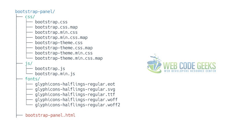
1.1 Project Folder Setup
Create a new HTML file, which will be your main one, and make sure you have the following folder structure after downloading Boostrap.
1.2 Main HTML Setup
Bootstrap already provides a base HTML, which contains links and references to all its’ libraries, including a CDN version of jQuery. Your main HTML file should have the following basic syntax inside:
<!DOCTYPE html>
<html lang="en">
  <head>
    <meta charset="utf-8">
    <meta http-equiv="X-UA-Compatible" content="IE=edge">
    <meta name="viewport" content="width=device-width, initial-scale=1">
    <title>Bootstrap Panel Example</title>

    <!-- Bootstrap -->
    <link href="css/bootstrap.min.css" rel="stylesheet">
  </head>
  <body>

    <!-- jQuery (necessary for Bootstrap's JavaScript plugins) -->
    <script src="https://ajax.googleapis.com/ajax/libs/jquery/1.11.3/jquery.min.js"></script>
    <!-- Include all compiled plugins (below), or include individual files as needed -->
    <script src="js/bootstrap.min.js"></script>
  </body>
</html>
2. Default Example
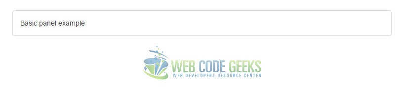
Panels are created with the .panel class, and content inside the panel has a .panel-body class. By default, all the .panel does is apply some basic border and padding to contain some content:
<div class="panel panel-default">
    <div class="panel-body">
        Basic panel example
    </div>
</div>
The result in the browser would be:
3. Cases and Examples
The following sections introduces a series of examples of how you can customize and use the panel in Bootstrap.
3.1 Panel with Heading
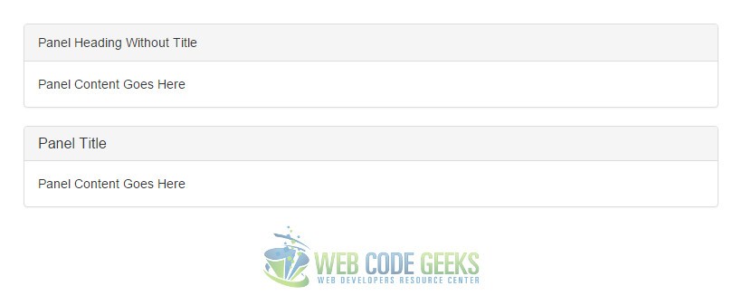
Easily add a heading container to your panel with .panel-heading. You may also include any h1-h6 with a .panel-title class to add a pre-styled heading. However, the font sizes of <h1>-<h6> are overridden by .panel-heading.
For proper link coloring, be sure to place links in headings within .panel-title.
<div class="panel panel-default">
  <div class="panel-heading">Panel Heading Without Title</div>
  <div class="panel-body">
    Panel Content Goes Here
  </div>
</div>

<div class="panel panel-default">
  <div class="panel-heading">
    <h3 class="panel-title">Panel Title</h3>
  </div>
  <div class="panel-body">
    Panel Content Goes Here
  </div>
</div>
The result would be:
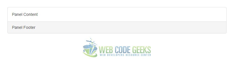
3.2 Panel with Footer
Wrap buttons or secondary text in .panel-footer. Note that panel footers do not inherit colors and borders when using contextual variations as they are not meant to be in the foreground.
<div class="panel panel-default">
  <div class="panel-body">
    Panel Content
  </div>
  <div class="panel-footer">Panel Footer</div>
</div>
The result would be:
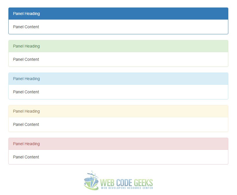
3.3 Contextual Alternatives
Like other components, easily make a panel more meaningful to a particular context by adding any of the contextual state classes.
<div class="panel panel-primary">...</div>
<div class="panel panel-success">...</div>
<div class="panel panel-info">...</div>
<div class="panel panel-warning">...</div>
<div class="panel panel-danger">...</div>
The contextual classes would result in the following:
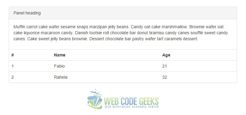
3.4 Panels with Tables
Add any non-bordered .table within a panel for a seamless design. If there is a .panel-body, we add an extra border to the top of the table for separation.
<div class="panel panel-default">
  <!-- Default panel contents -->
  <div class="panel-heading">Panel heading</div>
  <div class="panel-body">
    <p>...</p>
  </div>

  <!-- Table -->
  <table class="table">
    ...
  </table>
</div>
The panel with a table in it would look like this:
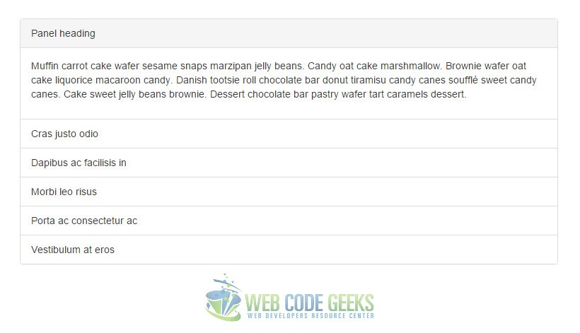
3.5 Panels with List Groups
In addition to tables, Bootstrap also
<div class="panel panel-default">
  <!-- Default panel contents -->
  <div class="panel-heading">Panel heading</div>
  <div class="panel-body">
    <p>...</p>
  </div>

  <!-- List group -->
  <ul class="list-group">
    <li class="list-group-item">Cras justo odio</li>
    <li class="list-group-item">Dapibus ac facilisis in</li>
    <li class="list-group-item">Morbi leo risus</li>
    <li class="list-group-item">Porta ac consectetur ac</li>
    <li class="list-group-item">Vestibulum at eros</li>
  </ul>
</div>
The panel with list group would look like so:
4. Conclusion
To conclude, panels in Bootstrap are just another tool pre-styled and in harmony with other elements of this framework. It helps you show information in a clean and elegant way, so you don’t have to worry about organizing content. Contextual classes add extra design to the panels. All modifications are as easy as 1,2,3 meaning that you just have to add classes to div elements.
5. Download
You can download the full source code of this example here: Bootstrap Panel
