The aim of this example is to show the various Bootstrap tables that you can use in your web projects. Unless you’ve been living under a rock, you already know what a table is.
Tables are used to represent a set of data systematically displayed, especially in columns. That makes it easier for us to see and understand each cell’s information in a practical manner.
What Bootstrap adds to traditional tables of HTML, is certainly styling, which is the key to make a difference in layout and design. It uses simple syntax by using default tags and added classes to modify the style.
1. Initial Setup
The following initial setup is required in order to continue with tables demonstration.
1.1 Bootstrap Setup
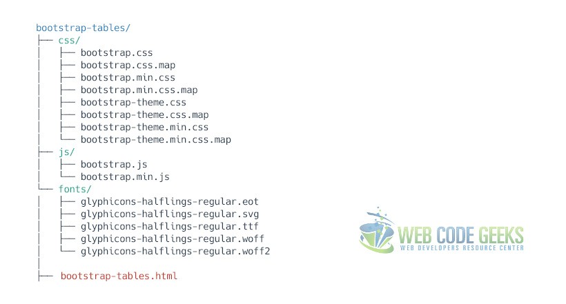
To begin, make sure you’ve set up Bootstrap files and your HTML file in the following structure:
1.2 HTML Setup
As you might already know, Bootstrap basic syntax, which links all necessary files and libraries together is:
<!DOCTYPE html>
<html lang="en">
  <head>
    <meta charset="utf-8">
    <meta http-equiv="X-UA-Compatible" content="IE=edge">
    <meta name="viewport" content="width=device-width, initial-scale=1">
    <title>Bootstrap Tables Example</title>

    <!-- Bootstrap -->
    <link href="css/bootstrap.min.css" rel="stylesheet">
  </head>
  <body>

    <!-- jQuery (necessary for Bootstrap's JavaScript plugins) -->
    <script src="https://ajax.googleapis.com/ajax/libs/jquery/1.11.3/jquery.min.js"></script>
    <!-- Include all compiled plugins (below), or include individual files as needed -->
    <script src="js/bootstrap.min.js"></script>
  </body>
</html>
2. Basic Example
For basic styling—light padding and only horizontal dividers we add the base class .table to any <table>. It may seem super redundant, but given the widespread use of tables for other plugins like calendars and date pickers, it’s opted to isolate Bootstrap’s custom table styles. The basic markup would look like this:
  <table class="table">
    ...
  </table>
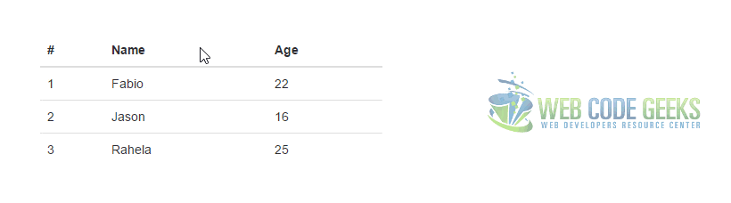
For this first example, let’s fill the table with information to make it feel more practical to you:
  <table class="table">
  <thead>
  <tr>
    <th>#</th>
    <th>Name</th>
    <th>Age</th>
  </tr>
  </thead>
  <tbody>
  <tr>
    <td>1</td>
    <td>Fabio</td>
    <td>22</td>
  </tr>
    <tr>
    <td>2</td>
    <td>Jason</td>
    <td>16</td>
  </tr>
    <tr>
    <td>3</td>
    <td>Rahela</td>
    <td>25</td>
  </tr>
  </tbody>
  </table>
The result in the browser would be:

Notice that by default the table will display full page width (or container width), but here I’ve set a reduced body width for demonstration purposes.
3. Table Examples
The following section is a collection of other ways of styling tables rather than the default one.
3.1 Striped Rows
Use .table-striped to add zebra-striping to any table row within the <tbody> like so:
   <table class="table table-striped">
      ...
   </table>
The content represented with “…” is and will be the same as the default example. The view in this case would be:

3.2 Bordered Table
Add .table-bordered for borders on all sides of the table and cells like so:
   <table class="table table-bordered">
      ...
   </table>
Now the table has borders on all sides and even between the cells:

3.3 Hover Rows
Add .table-hover to enable a hover state on table rows within a <tbody>.
   <table class="table table-hover">
      ...
   </table>
Now the table has borders on all sides and even between the cells:
3.4 Condensed table
Add .table-condensed to make tables more compact by cutting cell padding in half.
   <table class="table table-condensed">
      ...
   </table>
The result would be a more compact table with minimal styling:

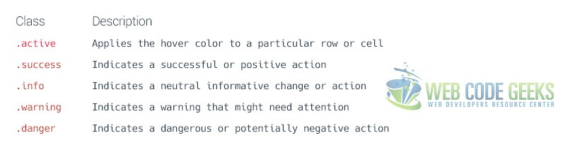
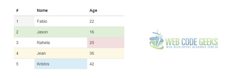
3.5 Contextual Classes
Use contextual classes to color table rows or individual cells. The following graphic defines each of the classes you can use:
For this example, let’s once again show the table information with these classes added in some cases to table rows and in other cases to specific table data:
  <table class="table">
  <thead>
  <tr>
    <th>#</th>
    <th>Name</th>
    <th>Age</th>
  </tr>
  </thead>
  <tbody>
  <tr>
    <td class="active">1</td>
    <td>Fabio</td>
    <td>22</td>
  </tr>
  <tr class="success">
    <td>2</td>
    <td>Jason</td>
    <td>16</td>
  </tr>
  <tr>
    <td>3</td>
    <td>Rahela</td>
    <td class="danger">25</td>
  </tr>
  <tr class="warning">
    <td>4</td>
    <td>Jean</td>
    <td>36</td>
  </tr>
  <tr>
    <td>5</td>
    <td class="info">Kristos</td>
    <td>42</td>
  </tr>
  </tbody>
  </table>
The result in the browser would be:
4. Conclusion
Bootstrap has a simple but clean table design concept that will enhance your overall information organization. Just like every other element in Bootstrap, tables are also responsive. You can create responsive tables by wrapping any .table inside a .table-responsive to make them scroll horizontally on small devices (under 768px). When viewing on anything larger than 768px wide, you will not see any difference in these tables.
5. Download
You can download the full source code of this example here: Bootstrap Tables
