In this example, we will be going through CSS3 text animations. CSS animations make it possible to animate transitions from one CSS style configuration to another. Animations consist of two components, a style describing the CSS animation and a set of keyframes that indicate the start and end states of the animation’s style, as well as possible intermediate waypoints.
There are three key advantages to CSS animations over traditional script-driven animation techniques:
1. They’re easy to use for simple animations; you can create them without even having to know JavaScript.
2. The animations run well, even under moderate system load. Simple animations can often perform poorly in JavaScript (unless they’re well made). The rendering engine can use frame-skipping and other techniques to keep the performance as smooth as possible.
3. Letting the browser control the animation sequence lets the browser optimize performance and efficiency by, for example, reducing the update frequency of animations running in tabs that aren’t currently visible.
1. Basics
1.1 Initial Document Setup
Go ahead and create a new html document and add the basic sytnax in it like so:
<!DOCTYPE html>
<html>
<head>
	<title>HTML5 & CSS3 Text Animation Example</title>
</head>
<body>

<!-- STYLE SECTION -->

<style type="text/css">

</style>

<!-- HTML SECTION -->

</body>
</html>
Because we’re considering only text animation in this example, the HTML section will only contain text elements inside respective tags, while the animation itself will be triggered in CSS where we’ll be working with animation and keyframes properties.
1.2 Understanding CSS Animations
To create a CSS animation sequence, you style the element you want to animate with the animation property or its sub-properties. This lets you configure the timing, duration, and other details of how the animation sequence should progress. This does not configure the actual appearance of the animation, which is done using the @keyframes at-rule as described in Defining the animation sequence using keyframes below.
The sub-properties of the animation property are:
animation-delay
Configures the delay between the time the element is loaded and the beginning of the animation sequence.
animation-direction
Configures whether or not the animation should alternate direction on each run through the sequence or reset to the start point and repeat itself.
animation-duration
Configures the length of time that an animation should take to complete one cycle.
animation-iteration-count
Configures the number of times the animation should repeat; you can specify infinite to repeat the animation indefinitely.
animation-name
Specifies the name of the @keyframes at-rule describing the animation’s keyframes.
animation-play-state
Lets you pause and resume the animation sequence.
animation-timing-function
Configures the timing of the animation; that is, how the animation transitions through keyframes, by establishing acceleration curves.
animation-fill-mode
Configures what values are applied by the animation before and after it is executing.
Defining the animation sequence using keyframes
Once you’ve configured the animation’s timing, you need to define the appearance of the animation. This is done by establishing two or more keyframes using the @keyframes at-rule. Each keyframe describes how the animated element should render at a given time during the animation sequence.
Since the timing of the animation is defined in the CSS style that configures the animation, keyframes use a percentage to indicate the time during the animation sequence at which they take place. 0% indicates the first moment of the animation sequence, while 100% indicates the final state of the animation. Because these two times are so important, they have special aliases: from and to. Both are optional. If from/0% or to/100% is not specified, the browser starts or finishes the animation using the computed values of all attributes.
1.3 A Basic Application
Let’s now show a basic text animation using the knowledge above. Firstly, add a line of code containing text in HTML.
<!-- HTML SECTION  -->
<div>This is just modified text.</div>
In CSS, as you can see below, I’ve added a simple color change animation from green to red:
<!-- STYLE  SECTION -->
<style type="text/css">
body {
    font-family: "BarnaulGrotesk";
}
div {
    font-size: 2em; /*increased font size*/
    color: green;   /*set a font color to green*/
    -webkit-animation-name: basic; /* Chrome, Safari, Opera */
    -webkit-animation-duration: 4s; /* Chrome, Safari, Opera */
    animation-duration: 4s; /*set how long will the animation run*/
    animation-name: basic;  /*give the animation a name to refer later in keyframes*/
}
@keyframes basic {         /*refer to our current keyframe: basic*/
    from {color: green;}    /*start animation with this property and value*/
    to {color: red;}        /*end the animation with this property and value*/
}
</style>
Well, you can see the real animation in an image, but the transition looks like this: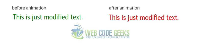
2. Cases and Examples
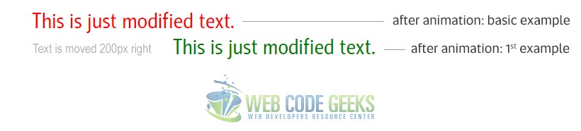
2.1 Changing Text Position
Text position animation can be a useful one on pages. Let’s see how we can implement it in CSS.
<!-- HTML SECTION  -->
<div class="ex1">This is just modified text.</div>
.ex1 {
    font-size: 2em;
    color: green;
    position: relative;         /*changed position to relative*/
    -webkit-animation-name: example-1;
    -webkit-animation-duration: 4s;
    animation-duration: 4s;
    animation-name: example-1;
}
@keyframes example-1 {
    from {left: 0px;}   /*defined left value to 0px initially*/
    to {left: 200px;}   /*defined left value to 200px to move the text*/
}
2.2 Using Percentage Keyframes
Alternatively to the from–to keywords used inside keyframes, you could also use percentages to define the different states. Look at the example below, where we use 0%, 25%, 75%, and 100% to define different behaviour to the color of the text:
@keyframes example-2 {
    0%   {color: red;}
    25%  {color: yellow;}
    50%  {color: blue;}
    100% {color: green;}
}
You can see a live preview here of how this looks like (the live view contains a rectangular, but it is basically the same animation on text), as you might imagine images cannot illustrate animations).
2.3 Multiple Animations at Once
Not only can you have various text animations one by one, but also a group of them in one single run of the animation. Here we’re considering an animation of two positions and color at the same time. Set up a new example on your html with the class of ex3 and give it the following CSS properties:
 .ex3 {
    font-size: 2em;
    color: green;
    position: relative;
    -webkit-animation-name: example-3;
    -webkit-animation-duration: 4s;
    animation-duration: 3s; /*changed duration to 3s*/
    animation-name: example-3;
}

@keyframes example-3 {  /*applying multiple animations*/
    0%   {color: indianred; left: 0px; top: 0px;}
    25%  {color: magenta; left: 50px; top: 10px;}
    50%  {color: peru; left: 100px; top: 15px;}
    100% {color: forestgreen; left: 150px; top: 20px;}
}
Below is a gif where you can see all our four examples in action!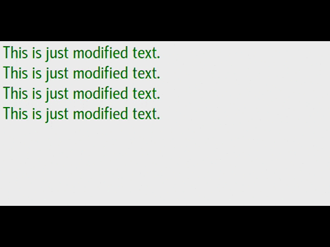
2.4 animation-property variations
There are also some fancy animation properties you can play with. These are properties that we’ve exaplained above:
.ex4 {
    font-size: 2em;
    margin-top: 1em;
    color: black;
    position: relative;
    animation-name: example-4;
    -webkit-animation-name: example-4;
    animation-duration: 5s;
    animation-timing-function: linear; /*how the animation transitions through keyframes*/
    animation-delay: 1s;        /*delay the start of an animation*/
    animation-iteration-count: 2; /*play the animation two times*/
    animation-direction: alternate;  /*alternate direction on each run through the sequence*/
}

@keyframes example-4 {  /*applying multiple animations*/
    0%   {left: 0px; top: 0px;}
    30%  {left: 100px; top: 0px;}
    60%  {left: 100px; top: 50px;}
    90%  {left: 0px; top: 50px;}
    100%  {left: 0px; top: 0px;}
}
The result would be (look at the last text element):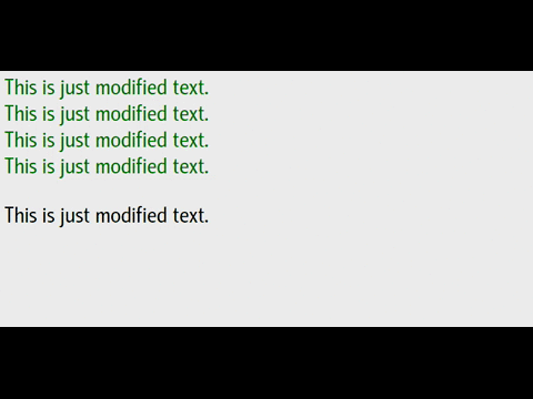
2.5 Animation Shorthand Property
The same animation effect as above can be achieved by using the shorthand animation property:
.class {
    animation: example 5s linear 2s infinite alternate;
}
Notice the order in which vlaues are applied is name, duration, timing-function, delay, iteration-count and direction.
3. Conclusion
To conclude, CSS3 animations are an important part of CSS3, which account for various elements transitions. Text animations are among the most used ones, because of its usability. It is in general easy to animate text using the animate properties we talked in this article. Possibilities are endless on the aspect of what you can create/animate using simple properties like left/right/top/bottom, margins, padding, color, bg-color, alignment etc. Keyframes, on the other hand, make it possible to track your animations on as many timeframes as you need. Setting percentages will help you have a better control over the animation. Try out and see what you can come up with!
4. Download
You can download the full source code of this example here: HTML5 & CSS3 Text Animation

Hey Fabio,
you have a typo in your ‘About’:
a passionate student in web tehnologies
should be
a passionate student in web technologies