EDITORIAL NOTE: In this post, we feature a comprehensive HTML5 Dropdown menu example with CSS3. A dropdown menu is a toggleable menu that allows the user to choose one value from a predefined list.
Introduction
The web has evolved into something more than just linked documents; pages behave increasingly these days like apps. Even a few years ago we would be looking at using JavaScript to create interactive, attractive menus.
With HTML5 and CSS3 now standard in most modern browsers, web developers can easily and quickly create attractive and responsive menus. Today we will see how we can leverage HTML5 and CSS3 to create a simple navigation menu.

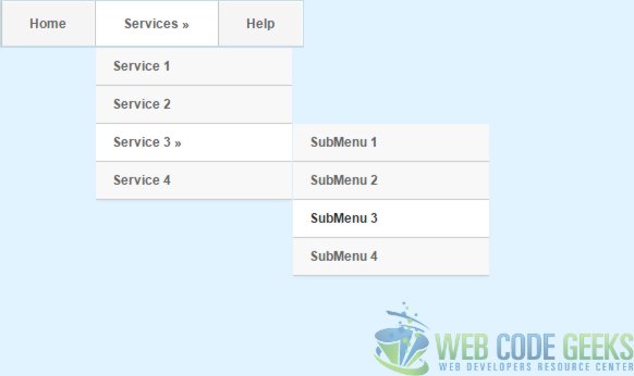
Here’s a screenshot of what we’ll be creating in this tutorial:
This following browser versions or higher are supported by this example
- Google Chrome 6.0
- Internet Explorer 9.0
- Mozilla Firefox 4.0
- Safari 5.0
- Opera 11.1
HTML
HTML5 has many new elements/tags for creating navigation menu like <menu> & <menuitems>. Owing to lack of support in major browsers for these new elements <menu> & <menuitems> we will be using the <nav>.
An important part of creating a site navigation is understanding that the navigation is a list of links around your site which means that we will use an unordered list to store your links, not a table! We will also see how we can use the html character code (») to our advantage. Alternately, you can use a image to display as arrow.
The <head> html tag act as container to include the title,scripts , meta information and also link the relevant external resource. The <meta> tag is used to provide metadata about the HTML document. It will not be displayed on the page, but will be used by browsers , search engines , or other web services.We will use the <link> tag to link the external style sheet which is preferred approach as you can change the look of an entire site by changing one file and also helps in promoting reuse from architecture standpoint.
<head>
    <title>HTML5 / CSS3 Navigation Menu</title>
    <meta charset="UTF-8">
    <meta name="description" content="Free Web tutorials">
    <meta name="keywords" content="HTML,CSS">
    <meta name="author" content="WebCodeGeeks.com">
    <link rel="stylesheet" href="MenuStyle.css">
</head>
Although not mandatory, it’s always a good practice to assign an id in your the <div> and <nav> element so that you can refer them in in your scripting.
<body>
<div id="wrapper">
The <div> tag defines a division or a section in an HTML document and group them together. The<nav> element is new in HTML5 and defines a set of navigation links and support the Global and Event Attributes in HTML. We will use the <ul> tag in conjunction with the <li> tag to create unordered lists of menu and submenu. For simplicity we have added only one level of submenu. In reality, you can add as many as you want by adding a
<li><a href="#" >YourNewMenu Item</a></li>
under <ul> element. You would like to replace the “#” in the href attribute to a real document link in your implementation.
<div id="wrapper"> <nav id="nav"> <ul id="navigation"> <li><a href="#">Home</a></li> <li><a href="#">Services &raquo;</a> <ul> <li><a href="#">Service 1</a></li> <li><a href="#">Service 2</a></li> <li><a href="#">Service 3 &raquo;</a> <ul> <li><a href="#">SubMenu 1</a></li> <li><a href="#">SubMenu 2</a></li> <li><a href="#">SubMenu 3</a></li> <li><a href="#">SubMenu 4</a></li> </ul> </li> <li><a href="#">Service 4</a></li> </ul> </li> <li><a href="#">Help</a></li> </ul> </nav> </div><!--end wrapper-->
CSS
For this example we will be using the following body styling:
body {
line-height: 1;
font:12px/20px Arial;
background:#e0f3ff ;
}
We will style our nav & div element as follows. Depending on the target device (mobile browsers have less display area) and space requirement, you will alter the values.
#wrapper{
    width:620px;
    margin:0 auto;
    margin-top:100px;
}

#nav {
    position:relative;
    width:620px;
    margin:0 auto;
}
Then we will style each <ul> element as per their position in the navigation chain.
ul#navigation {
    margin:0px auto;
    position:relative;
    float:left;
    border-left:1px solid #c4dbe7;
    border-right:1px solid #c4dbe7;
}

ul#navigation li {
    display:inline;
    font-size:12px;
    font-weight:bold;
    margin:0;
    padding:0;
    float:left;
    position:relative;
    border-top:1px solid #c4dbe7;
    border-bottom:2px solid #c4dbe7;
}
Here is how to achieve transition using CSS3 only which are effects that let an element gradually change from one style to another
In this example we have used same declaration for multiple selectors. You may want to have individual declaration for each selector. Depending on the screen rendering preference, modify the timing in transition declaration from 0.2s. Note , how there are different declaration for different browsers.
ul#navigation ul, ul#navigation ul li ul {
list-style: none;
margin: 0;
padding: 0;
visibility:hidden;
position: absolute;
z-index: 99999;
width:180px;
background:#f8f8f8;
box-shadow:0 2px 2px -1px rgba(0, 0, 0, 0.055);
opacity:0;
-webkit-transition:opacity 0.2s linear, visibility 0.2s linear; ///* Chrome &amp; Safari*/
-moz-transition:opacity 0.2s linear, visibility 0.2s linear; // /*Mozilla Firefox*/
-o-transition:opacity 0.2s linear, visibility 0.2s linear; // /* Opera */
transition:opacity 0.2s linear, visibility 0.2s linear;
}
In order to have the dropdown navigation we need to set the following property:
ul#navigation li a:hover {
    background:#f8f8f8;
    color:#282828;
}

ul#navigation li:hover > a {
    background:#fff;
}

/* Drop-Down Navigation */
ul#navigation li:hover > ul
{
    visibility:visible;
    opacity:1;
}

ul#navigation ul, ul#navigation ul li ul {
    list-style: none;
    margin: 0;
    padding: 0;
    visibility:hidden;
    position: absolute;
    z-index: 99999;
    width:180px;
    background:#f8f8f8;
    box-shadow:0 2px 2px -1px rgba(0, 0, 0, 0.055);
    opacity:0;
    -webkit-transition:opacity 0.2s linear, visibility 0.2s linear;
    -moz-transition:opacity 0.2s linear, visibility 0.2s linear;
    -o-transition:opacity 0.2s linear, visibility 0.2s linear;
    transition:opacity 0.2s linear, visibility 0.2s linear;
}

ul#navigation ul {
    top: 43px;
    left: 1px;
}

ul#navigation ul li ul {
    top: 0;
    left: 181px;
}

ul#navigation ul li {
    clear:both;
    width:100%;
    border:0 none;
    border-bottom:1px solid #c9c9c9;
}

ul#navigation ul li a {
    background:none;
    padding:7px 15px;
    color:#616161;
    text-shadow:1px 1px 0px #fff;
    text-decoration:none;
    display:inline-block;
    border:0 none;
    float:left;
    clear:both;
    width:150px;
}

ul#navigation li a.first {
    border-left: 0 none;
}

ul#navigation li a.last {
    border-right: 0 none;
}
Let’s go through some of the CSS 3 important styles in there:
- Box-shadow: Add a nice shadow around our element. Syntax – box-shadow: h-shadow v-shadow blur spread color inset;
- RGBA: RGB simply means Red, Green, Blue, it’s an alternative to using HEX colours. By having RGBA we’ve specified an “Alpha” or opacity value to our shadow
- Margin: Done using the web developers compass (top, right, bottom, left), it specifies the “gap” around the element
- Transition: The transition properties allow elements to change values over a specified duration, animating the property changes, rather than having them occur immediately. For compatibility in all supporting browsers, vendor prefixes are required, with the standard syntax declared last
Download the source code
This was an example of creating simple navigation menu using HTML5 and CSS3.
You can download the full source code of this example here : HTML5Menu

This is interesting; I need to read me up on CSS3. I have resently converted my site to HTML5.
Same here, the code seems more streamlined than the original HTML.
It’s really nice and simple, thanks.
Sarah
cool bro………..thanks a lot
:)
more examples please….
Thank for book
Very Nice…
very good one
Hi,
Very nice!!
Quick Question:- I want to make the last li at the top level float to the far right of the screen (its a search box). Can you tell me how please?
Steve
Got it, was missing a width declaration :)
Thanks guys, I can use all the help I can get, or.. git that is.