In this example, we aim to have a closer look at slideshows with HTML5.
Slideshows are a good way to present a set of images within a part of the website. HTML5 doesn’t have a native tag or set of tags to make a slideshow, but you can achieve it using other provided tags.
As you can imagine, javascript needs to be used to make transitions smooth and nice, but notice that we can use CSS3 transitions to begin.
As long as we are not using any specific tag related to slideshow, all we are doing will be compatible with all browsers out there.

1. Basic Setup
To begin, go on and create a html file with its basic syntax inside like so:
<!DOCTYPE html>
<html>
<head>
	<title>HTML5 Slideshow Example</title>
</head>
<body>

<!-- STYLE SECTION -->

<style type="text/css">

</style>

<!-- HTML SECTION -->

</body>
</html>
Done that, we can start adding html and css towards creating the slideshow.
2. Creating the Slideshow
In this section we are going to set up dhe html and css for the slideshow.
2.1 HTML Setup
The html structure is going to be like this:
1. A div will wrap the whole slideshow, lets give this div a class of css-slideshow.
2. A figure tag will wrap one image of the slideshow, it will contain an img tag and a figcaption tag inside.
3. An img tag will specify the image for each slide, it will also have a defined width and height.
4. A figcaption tag will contain caption for the image being displayed.
So the structure of our slideshow would be:
<div class="css-slideshow">
<figure>
	<img src="image.jpg" width="495" height="370" />
	<figcaption>Caption here</figcaption>
</figure>
</div>
Now lets populate that with more slides:
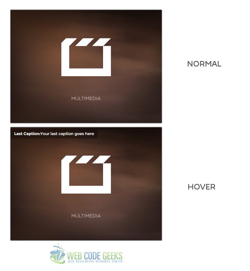
<!-- HTML SECTION  -->
<div class="css-slideshow">
<figure>
	<img src="images/img1.jpg" width="495" height="370" />
	<figcaption><strong>CSS3:</strong>Yourr first caption goes here </figcaption>
</figure>
<figure>
	<img src="images/img2.jpg" width="495" height="370" />
	<figcaption><strong>Slideshow:</strong> Your second caption goes here</figcaption>
</figure>
<figure>
	<img src="images/img3.jpg" width="495" height="370" />
	<figcaption><strong>Offline:</strong> Your third caption goes here</figcaption>
</figure>
<figure>
	<img src="images/img4.jpg" width="495" height="370" />
	<figcaption><strong>Cloud:</strong> Your fourth caption goes here</figcaption>
</figure>
<figure>
	<img src="images/img5.jpg" width="495" height="370" />
	<figcaption><strong>Server:</strong> Your fifth caption goes here</figcaption>
</figure>
<figure>
	<img src="images/img6.jpg" width="495" height="370" />
	<figcaption><strong>Shopping:</strong>Your sixth caption goes here</figcaption>
</figure>
<figure>
	<img src="images/img7.jpg" width="495" height="370" />
	<figcaption><strong>Smartphone:</strong> Your seventh caption goes here</figcaption>
</figure>
<figure>
	<img src="images/img8.jpg" width="495" height="370" />
	<figcaption><strong>Last Caption:</strong>Your last caption goes here</figcaption>
</figure>

</div>
For now, you can only see this in the browser:

2.2 CSS3 Styling
An important part of creating the slideshow is CSS, which gives it a dynamic look. Lets start with the basics:
Below I have set up some styling for the main elements, look at the code below:
.css-slideshow {
     position: relative;			/* positioning facilities */
     max-width: 495px;			/* maximum width of the image */
     height: 370px;
     margin: 1em auto .5em auto;				/* some margin */
     font-family: "Montserrat", sans-serif;	/* just a custom font */
     font-weight: 300;						/* font-weight, semibold */
}

.css-slideshow figure {
     margin: 0;					/* ensuring there is no margin */
     max-width: 495px;
     height: 370px;
     background: #fff;			  /* white background */
     position: absolute;			/* positioning facilities */
}

.css-slideshow img {				/* a shadow for our box wrapper */
    -webkit-box-shadow: 0 0 2px #666;
     box-shadow: 0 0 2px #666;
}

/* Give the figcaption a 0% opacity at first */
.css-slideshow figcaption {
    position: absolute;
	top: 5px;
	color: #fff;
	background: rgba(0,0,0, .3);
	font-size: .8em;
	padding: 8px 12px;
	-ms-filter: "progid:DXImageTransform.Microsoft.Alpha(Opacity=0)";
	filter: alpha(opacity=0);
	opacity: 0;
	-webkit-transition: opacity .5s;
	-moz-transition: opacity .5s;
	-o-transition: opacity .5s;
	-ms-transition: opacity .5s;
	transition: opacity .5s;	/* transition duration */
}

/* Give the figcaption a 100% opacity now */
.css-slideshow:hover figure figcaption {
    -webkit-transition: opacity .5s;
	-moz-transition: opacity .5s;
	-o-transition: opacity .5s;
	-ms-transition: opacity .5s;
	transition: opacity .5s;		/* transition duration */
	-ms-filter: "progid:DXImageTransform.Microsoft.Alpha(Opacity=100)";
	filter: alpha(opacity=100);
	opacity: 1;
}
Now we got the nice view of the caption over the image that comes with a smooth fade:
Time to animate the images when it comes to changing from one image to another. We do that using the nth-child selector which will give every element of the parent div specified some specific attributes. Look at the code below:
/* Here every child of css-transition gets animated */

.css-slideshow figure:nth-child(1) {
	-webkit-animation: xfade 48s 42s  infinite;
	-moz-animation: xfade 48s 42s  infinite;
	-ms-animation: xfade 48s 42s infinite;
	-o-animation: xfade 48s 42s infinite;
	animation: xfade 48s 42s infinite;
}
.css-slideshow figure:nth-child(2) {
	-webkit-animation: xfade 48s 36s infinite;
	-moz-animation: xfade 48s 36s infinite;
	-ms-animation: xfade 48s 36s infinite;
	-o-animation: xfade 48s 36s infinite;
	animation: xfade 48s 36s infinite;
}
.css-slideshow figure:nth-child(3) {
	-webkit-animation: xfade 48s 30s infinite;
	-moz-animation: xfade 48s 30s infinite;
	-ms-animation: xfade 48s 30s infinite;
	-o-animation: xfade 48s 30s infinite;
	animation: xfade 48s 30s infinite;
}
.css-slideshow figure:nth-child(4) {
	-webkit-animation: xfade 48s 24s infinite;
	-moz-animation: xfade 48s 24s infinite;
	-ms-animation: xfade 48s 24s infinite;
	-o-animation: xfade 48s 24s infinite;
	animation: xfade 48s 24s infinite;
}
.css-slideshow figure:nth-child(5) {
	-webkit-animation: xfade 48s 18s infinite;
	-moz-animation: xfade 48s 18s infinite;
	-ms-animation: xfade 48s 18s infinite;
	-o-animation: xfade 48s 18s infinite;
	animation: xfade 48s 18s infinite;
}
.css-slideshow figure:nth-child(6) {
	-webkit-animation: xfade 48s 12s infinite;
	-moz-animation: xfade 48s 12s infinite;
	-ms-animation: xfade 48s 12s infinite;
	-o-animation: xfade 48s 12s infinite;
	animation: xfade 48s 12s infinite;
}
.css-slideshow figure:nth-child(7) {
	-webkit-animation: xfade 48s 6s infinite;
	-moz-animation: xfade 48s 6s infinite;
	-ms-animation: xfade 48s 6s infinite;
	-o-animation: xfade 48s 6s infinite;
	animation: xfade 48s 6s infinite;
}
.css-slideshow figure:nth-child(8) {
	-webkit-animation: xfade 48s 0s infinite;
	-moz-animation: xfade 48s 0s infinite;
	-ms-animation: xfade 48s 0s infinite;
	-o-animation: xfade 48s 0s infinite;
	animation: xfade 48s 0s infinite;
}
Well, it might seem such a long code, but it is just the css3 xfade attribute value and compatibility for all browsers.
You don’t see any changes after this code? It is obvious, because we animated images, but did not tell them when to do so and for how long one image should be on screen. Here is where CSS3 keyframes make a huge difference.
You declare a keyframe using @keyframe and then enter the attribute value you want keyframes on like "xfade".
@keyframes "xfade" {
 0% {
    -ms-filter: "progid:DXImageTransform.Microsoft.Alpha(Opacity=100)";
   	filter: alpha(opacity=100);
   	opacity: 1;
 }
14.67% {
	-ms-filter: "progid:DXImageTransform.Microsoft.Alpha(Opacity=100)";
	filter: alpha(opacity=100);
	opacity: 1;
}
16.67% {
	-ms-filter: "progid:DXImageTransform.Microsoft.Alpha(Opacity=0)";
	filter: alpha(opacity=0);
	opacity: 0;
}
 98% {
    -ms-filter: "progid:DXImageTransform.Microsoft.Alpha(Opacity=0)";
   	filter: alpha(opacity=0);
   	opacity: 0;
 }
 100% {
    -ms-filter: "progid:DXImageTransform.Microsoft.Alpha(Opacity=100)";
   	filter: alpha(opacity=100);
   	opacity: 1;
 }
}
@-moz-keyframes xfade {
 0% {
   filter: alpha(opacity=100);
   opacity: 1;
 }
14.67% {
	filter: alpha(opacity=100);
	opacity: 1;
}
16.67% {
	filter: alpha(opacity=0);
	opacity: 0;
}
 98% {
   filter: alpha(opacity=0);
   opacity: 0;
 }
 100% {
   filter: alpha(opacity=100);
   opacity: 1;
 }
}
The percentages you see above represent the animation duration. You can have as many as you like.
To make keyframes cross-browser compatible note the following:
@-webkit-keyframes, @-ms-keyframes, @-o-keyframes
Looks like we’re done, now we have an eight image slideshow preprogrammed to show slides on certain timeframes.
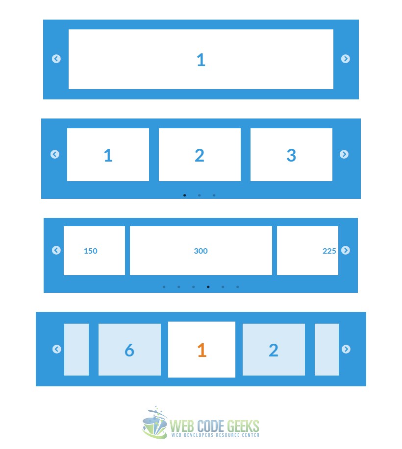
The slideshow won’t look like below, this is just the images/slides that show (more than 3):

That was it, now you have to try it in your browser to see the real result.
3. Javascript Alternative Slideshows
Well, javascript makes it ultimate with slideshows. There are a lot of beautifully designed slideshows on the internet and one page I would suggest is http://kenwheeler.github.io/slick/.
There, you can find some of the following slideshow designs:
4. Conclusion
To conclude, slideshows are a smart way to show several images within a page and let them show time after time.
However, depending on the type you need, you might have to use javascript to beautify some things in it.
For a normal, maybe blog use of the slideshow, I would recomment the HTML5 and CSS3 slideshow with no extra js.
It is not that good to load your page with a lot of js, however if this is the only element who needs it, just use it.
5. Download
You can download the full source code of this example here: HTML5 Slideshow
