In this article we will take a look at what the Viewport is and how we can tweak it using the meta tag. To demonstrate the concept we will be building a sample application. I will take things one step at a time by first listing the tools & technologies used before moving on to other details. Finally ending with a working copy of the application towards the end of this post. So, let’s get started then.

1. Tools & Technologies
To build the example application, I have used the following toolset. Some of them are required whilst others could be replaced by tools of your own choice.
Node.js in essence is JavaScript on the server-side. We use it along with the Express module to create a barebones web server to serve files and resources to the browser. I am comfortable with using Visual Studio Code IDE but you can choose any text editor of your choice.
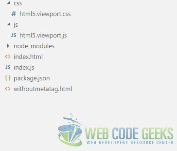
2. Project Layout
The project structure of our example application is as follows:
3. Viewport
3.1. What is Viewport?
A viewport, in web development parlance, is the screen area in which the web browser displays content. The viewport is closely tied to the concept of responsive design. When we attempt to build websites that adapts themselves to the device being used to view it, in essence, is called a responsive design. To build a website that is responsive we utilize media queries which allow us to enable different layouts for different screen sizes or browser viewports.
But an issue with the media query approach is that they do not fire on the devices they are meant for. The reason being that the browser renders the web page in a virtual window and then displays the results shrunk to fit the viewport. Although mobile users were able to zoom into the area of interest on the page, the usability of webpages left a lot to be desired.
To prevent the mobile devices from shrinking web pages we can leverage the meta tag to configure the viewport. A typical viewport meta tag looks like below:
<head>
...
<meta name="viewport" content="width=device-width, initial-scale=1">
...
</head>
What this does is tell the browser to not shrink the page. Which allows our media queries to fire and take effect. The css applied as a result of media queries firing leads to a world of improvement in user experience.
The meta tag used to configure the viewport accepts the following key-value pairs, separated by commas.
| Key | Values | Description |
|---|---|---|
| width | Size in pixels or the special value device-width | Sets the width of the page to the width of the screen |
| initial-scale | Numeric value | Sets the initial zoom level of the page |
| maximum-scale | Numeric value | Sets the maximum zoom level of the page, Avoid specifying this value and leave the user in charge of the same. |
| minimum-scale | Numeric value | Sets the value indicating how much the user can zoom out. Avoid specifying this value. |
| height | Size in pixels to set the height of the viewport. Although support for this is scant at best. | Avoid using or setting a value for this as it is not supported widely. |
| user-scalable | Can be set to no | When set to no it prevents the user from zooming in. Absolutely avoid setting this value. |
In the next section we will build an application to demonstrate these concepts.
3.2. Using meta tag to tweak Viewport
In our application we create two pages, namely, index.html & withoutmetatag.html. The first page will have the Viewport meta tag whereas the second one will not. We will try to create layout with three breakpoints using media queries. Meaning that the UI layout will adapt itself to three screen sizes by modifying its layout to adjust to the screen sizes. First of all let us look at the markup we need to add to our two html files.
index.html
<!DOCTYPE html>
<html lang="en">
    <head>
    <meta charset="utf-8">
    <meta http-equiv="X-UA-Compatible" content="IE=edge">
    <meta name="viewport" content="width=device-width, initial-scale=1">
<!-- The above 3 meta tags *must* come first in the head; any other head content must come *after* these tags -->
    <title>WCG -- HTML5 Viewport Example</title>

    <link rel="Stylesheet" href="css/html5.viewport.css"/>
<!-- HTML5 shim and Respond.js for IE8 support of HTML5 elements and media queries -->
<!-- WARNING: Respond.js doesn't work if you view the page via file:// -->
<!--[if lt IE 9]>
<script src="https://oss.maxcdn.com/html5shiv/3.7.3/html5shiv.min.js"></script>
<script src="https://oss.maxcdn.com/respond/1.4.2/respond.min.js"></script>
<![endif]-->
    </head>
    <body>
        <h1>WCG -- HTML5 Viewport Example</h1>

        <div class="column red"></div>
        <div class="column green"></div>
        <div class="column blue"></div>

        <script src="js/html5.viewport.js"></script>

    </body>
</html>
withoutmetatag.html
<!DOCTYPE html>
<html lang="en">
    <head>
        <meta charset="utf-8">
        <meta http-equiv="X-UA-Compatible" content="IE=edge">

<!-- The above 2 meta tags *must* come first in the head; any other head content must come *after* these tags -->
        <title>WCG -- HTML5 Viewport Example</title>

        <link rel="Stylesheet" href="css/html5.viewport.css"/>
<!-- HTML5 shim and Respond.js for IE8 support of HTML5 elements and media queries -->
<!-- WARNING: Respond.js doesn't work if you view the page via file:// -->
<!--[if lt IE 9]>
<script src="https://oss.maxcdn.com/html5shiv/3.7.3/html5shiv.min.js"></script>
<script src="https://oss.maxcdn.com/respond/1.4.2/respond.min.js"></script>
<![endif]-->
    </head>
    <body>
        <h1>WCG -- HTML5 Viewport Example</h1>

        <div class="column red"></div>
        <div class="column green"></div>
        <div class="column blue"></div>

        <script src="js/html5.viewport.js"></script>

    </body>
</html>
Now we create our html5.viewport.css to create the layout with breakpoints using media queries.
html5.viewport.css
@media screen and (min-width: 1024px ){
    .column{
        width: 30%;
        margin: 5px;
        display: inline-block;
    }
}
@media screen and (max-width: 768px) and (min-width: 425px ){
    .column{
        width: 45%;
        margin: 5px;
        display: inline-block;
    }
}
@media screen and (max-width: 425px ){
    .column{
        width: 96%;
        margin: 5px;
        display: inline-block;
    }
}
.red{
    background-color: red;
    height: 150px;
}
.blue{
    background-color: blue;
    height: 150px;
}
.green{
    background-color: green;
    height: 150px;
}
As you can see in the above css and markup, we have added three breakpoints in css to apply for three different screen sizes, viz., Laptop & above, Tablets & Smartphones. We have added three div which appear in the same row on a laptop and spill into two rows on a tablet screen and three rows on a smartphone. Now, we are all set so let us run the application and see the results in the next section.
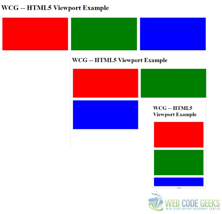
3.3. Results
The index.html looks like below on the three screen sizes.
The withoutmetatag.html looks like below on the three screen sizes.
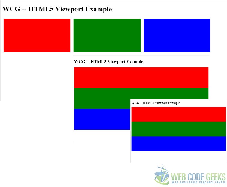
As we can see from the above screen grabs on the three screen sizes, the results are quite dramatic with the use of Viewport Meta tag. Overall the meta tag allows us to provide a much better experience across devices with varying screen sizes.
4. Running the Project
To run the project you need to execute the following commands at the root of the project.
> npm install
then
> node index.js
Now, navigate to the URL http://localhost:8090/index.html and http://localhost:8090/withoutmetatag.html
5. Download the Source Code
This wraps up this post on the HTML5 Viewport Meta Tag.
You can download the full source code of this example here: WCG — HTML5 Viewport Example
