Although the internals of Angular 2 are still changing a lot, the public API for building components is already quite stable. In this post we will go through on how we can build components with this new version of Angular, based on some code examples (the code is available here).
In this post we will learn the essentials of how to build Angular 2 components, and a bit also on how not to build them:
- Angular 2 – where to start?
- Components – the component public API
- Internals of Components – the Controller
- Properties and how bindings work
- Do’s and dont’s of Properties
- Events
- Do’s and dont’s of Events
- Conclusions
Where to start – Browser components
Let’s start by looking into how browser components work, taking for example the browser native component select:
<select>
    <option value="volvo">Volvo</option>
    <option value="saab">Saab</option>
    <option value="audi">Audi</option>
</select>
This component like all browser components has some interesting properties:
- we don’t need to be aware of it’s internal structure in order to be able to reason about the component. We only need to know its public API.
- we don’t need to look at other parts of the application to know what this component is doing and how it will behave
Angular 2 allows us to build UI components that are in every way similar to native browser components: encapsulated, reusable, and easy to reason about.
The Angular 2 component API in a nutshell
This is an example of an Angular component: a dropdown component, similar to the select native component but for example with support for disabled elements and other extra features:
<dropdown dropdown-height="200px" dropdown-width="200px"
   [options]="refData.COUNTRIES"
   (selection)="onSelection($event)"
</dropdown>
Here is what is going on here:
- this component has an input property
options, via which we provide a list of countries. Properties are the input that a component receives, and we use them to pass in an input model into the component. Based on the model the view will be built accordingly. - the component emits an output event named
selectionwhen a new option is selected. Events are the output that a component produces. They report to the outside world a relevant change of the component internal state.
The internal structure of a component
Every component has two main internal parts:
- An internal Html/CSS tree that encapsulates how the component view is built
- a Controller class, which coordinates the interaction between the view and the input model
Given this, let’s now go through the 2 main component concepts (properties and events) with examples.
Understanding Properties
Let’s start with properties, and for that let’s introduce the color-me component, which can be used like this:
<div class='container'>
    <color-me [sample-color]="'blue'"></color-me>
</div>
And here is what the component looks live:
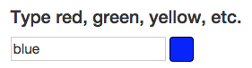
As we can see the color-me component is just an input box where we can type the name of a color and see it painted in a sample square.
How properties work
The component looks like a native browser component, with the exception of the [sample-color] notation. This means that the string blue is passed as an input property to the component.
The input property will be automatically binded to a controller property, so we can use it inside the component.
The Component Controller
This is how the controller of the color-me component is implemented:
@Component({
    selector: "color-me",
    properties: ['color: sampleColor']
})
@View({
    templateUrl: 'color-me.html'
})
export class ColorMe {
}
As we can see, the sampleColor input property is binded to the controller, and renamed to color. This property is generally available inside the controller via this.color. It’s used for example to startup the view with an initial color.
The component View
This is how the component view is internally implemented in color-me.html:
<div class='color-me'>
    <h4>Type red, green, yellow, etc.</h4>
    <input type="text" #input (keyup) [value]="color">
    <div class='color-panel' [style.background]="input.value"></div>
</div>
A bit more is going on here:
- a local variable input is defined using
#input - The input property
valueof the input box is being filled in with the color name via[value]="color" - The background CSS property is binded to the value of the input box via
[style.background]="input.value"
So here we see that properties are not only a mechanism for passing data inside a component. They can be generally used to write to any valid DOM element property, such as for example the property input.value, which contains the input text field value, or style.background which contains the color of the sample rectangle.
When is the color applied
In this case the color is applied as the user types into the input box. This only happens because there is an event listener hooked inside the component on the keyup event, which causes change detection to be triggered when the user types.
Try to remove the empty (keyup) listener, and the color will no longer be applied.
How NOT to use properties
Properties are meant to pass input data to a component, that preferably might change over time.Properties should be avoided in these cases:
- when passing constant string values to the component, such as for example
[width]="100px". For that, use the Attribute annotation instead. - when trying to pass a command to the component, instructing the component to trigger a given action. This is to be avoided because it creates a tight coupling between the caller of the command and the component itself. Ideally the component should only receive input data and react to it. The provider of the data should have no information of how the data gets rendered or which actions it triggers.
Events
The second main concept of the component API is Events. Let’s start by introducing the scroll-me component:
<div class='container'>
    <h3>Component events example</h3>
    <scroll-me></scroll-me>
</div>
And here is how the component looks like:
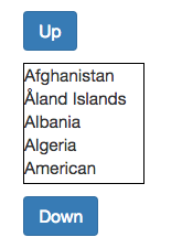
The component just scrolls a list up and down, when the corresponding buttons are clicked. This is the template of the component, and we can see the click event being binded on the down button with the (click)="expression" syntax:
<div class='scroll-me' >
    <button id='scroll-up' class='btn btn-primary scroll-btn'>Up</button>
    <div class='selection' [scroll-top]="scroll">
        <div *ng-for="#country of countries;">
        {{country.description}}
    </div>
    </div>
    <button class='btn btn-primary scroll-btn' (click)="onClick()">Down</button>
</div>
Again in this example we are binding directly to a DOM property via the [scroll-top] binding. This binding allows to write directly to the Javascript scrollTop property of the selection div, which is another example of how Angular 2 encourages direct use of the DOM API.
But did you see it it? the Up button does not have a (click) binding, but the component still works! Let’s take a look at the controller code to see what is going on:
@Component({
  selector: "scroll-me"
})
@View({
  templateUrl: 'scroll-me.html',
  directives: [NgFor]
})
class ScrollMe {
  countries: Array<Object> = new ReferenceData().COUNTRIES;
  scroll:number = 0;

  constructor() {
    document.getElementById('scroll-up').addEventListener('click',
        () => this.scroll -= 30 );
  }

  onClick() {
    this.scroll += 30;
  }
}
We can see that in the constructor of the component an event listener is being manually added to the up button. There is nothing special about that code, it’s just the pure DOM API event subscription API.
The angular syntax for binding events via (click) is mainly an abbreviated way to do the same as this code.
How does the event get detected then?
The event gets detected via the Angular 2 change detection mechanism, which runs at the end of each virtual machine turn. This mechanism is based on the notion of Zones, see this previous post for more about it.
Do’s and dont’s of Events
The event mechanism is easier to misuse than the properties mechanism. With properties we really have to go out of our way to pass in a command object of some sort to trigger an action inside the object.
With events, its very easy to fall into the situation of using an event to trigger an action in an external component. The key thing to bear in mind about events, is that in order to keep the event emitter decoupled from the subscriber, the emitter should only report about changes on it’s internal state: for example a selection occurred in a dropdown component.
This way the emitting component stays decoupled from the event subscribers, and does not have any information on what the event is being used for.
Conclusions
The Angular 2 API is much simpler to learn and use correctly than the Angular 1 API: there are a lot less concepts and they are much simpler to reason about.
The components are better isolated and if the notions of properties and events are well applied, its simpler to write truly reusable components that can be understood just by looking at an html template.
To start trying out the Angular 2 component API, you can find all the running code from this post here, or clone the angular2-seed repository to start with a clean and ready to use project.
| Reference: | Introduction to Angular 2 – The fundamentals of Components from our WCG partner Aleksey Novik at the The JHades Blog blog. |
