In this tutorial, we will show you how to create an accordion widget with Bootstrap. The accordion is a feature which allows you to show and hide components with a nice transition. To follow, all you need is a text editor. I will be using Notepad++; you are free of course to use one of your choice.
1. Project setup
Let’s start by creating a sample Bootstrap project in a file called Bootstrap accordion.html. You will need to include the Bootstrap CSS and JavaScript libraries, as well as jQuery. I have chosen to use Bootstrap 3.3.7 and jQuery 3.1.1.
Bootstrap accordion.html
<!DOCTYPE html>
<html>
<head>
    <link rel="stylesheet" href="https://maxcdn.bootstrapcdn.com/bootstrap/3.3.7/css/bootstrap.min.css"></link>
    <script src="http://code.jquery.com/jquery-3.1.1.min.js"></script>
    <script src="https://maxcdn.bootstrapcdn.com/bootstrap/3.3.7/js/bootstrap.min.js"></script>
</head>
<body>

</body>
</html>
Now, let’s add a group of panels and a button to our page.
Bootstrap accordion.html
<!DOCTYPE html>
<html>
<head>
    <link rel="stylesheet" href="https://maxcdn.bootstrapcdn.com/bootstrap/3.3.7/css/bootstrap.min.css"></link>
    <script src="http://code.jquery.com/jquery-3.1.1.min.js"></script>
    <script src="https://maxcdn.bootstrapcdn.com/bootstrap/3.3.7/js/bootstrap.min.js"></script>
</head>
<body>
    <div class="panel-group">
        <div class="panel panel-default">
            <div class="panel-heading">
                <div class="panel-title">
                    Panel 1 header
                </div>
            </div>
            <div>
                <div class="panel-body">
                    Panel 1 content
                </div>
            </div>
        </div>
        <div class="panel panel-default">
            <div class="panel-heading">
                <div class="panel-title">
                    Panel 2 header
                </div>
            </div>
            <div>
                <div class="panel-body">
                    Panel 2 content
                </div>
            </div>
        </div>
    </div>

    <button type="button" class="btn">My button</button>
</body>
</html>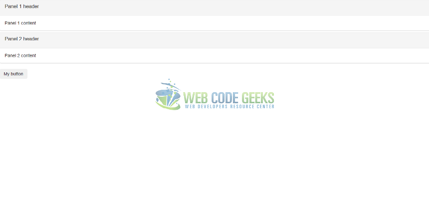
Fig. 1: Setup
2. Adding the accordion
2.1 Panel group
To add the accordion to the panel group, we’ll follow these steps:
- Add an ID to the group of panels.
- Configure each panel body to be collapsed.
- Configure the title of each panel to collapse the panel body when pressed.
First off, we’ll give our group of panels a clear ID we can easily associate with it.
<div id="parentPanelGroup" class="panel-group">
Now, let’s configure our first panel’s body for collapsing by giving it an ID and assigning it to a class called collapse.
<div id="panel1BodyWrapper" class="collapse">

<div class="panel-body">
    Panel 1 content
</div>

</div>
And to wrap it up, let’s add a paragraph tag in our first panel’s title. We will give this paragraph the following attributes:
- data-parent=”#parentPanelGroup”: The parent attribute is used to identify all the elements which belong to the same collapsible group. When an element inside a collapsible group is shown, all the other collapsible elements are hidden. In our case, the parent is the panel group.
- data-target=”#panel1BodyWrapper”: The target attribute refers to the element to be collapsed (in our case, the panel body).
- data-toggle=”collapse”: This tells Bootstrap to toggle the element referred to in the data-target, and hide all other elements inside the data-parent.
Repeat those three steps for the second panel. Our group of panels is now fully collapsible. The final code is as follows.
Bootstrap accordion.html
<!DOCTYPE html>
<html>
<head>
    <link rel="stylesheet" href="https://maxcdn.bootstrapcdn.com/bootstrap/3.3.7/css/bootstrap.min.css"></link>
    <script src="http://code.jquery.com/jquery-3.1.1.min.js"></script>
    <script src="https://maxcdn.bootstrapcdn.com/bootstrap/3.3.7/js/bootstrap.min.js"></script>
</head>
<body>
    <div id="parentPanelGroup" class="panel-group">
        <div class="panel panel-default">
            <div class="panel-heading">
                <div class="panel-title">
                    Panel 1 header
                </div>
            </div>
            <div id="panel1BodyWrapper" class="panel-collapse collapse">
                <div class="panel-body">
                    Panel 1 content
                </div>
            </div>
        </div>
        <div class="panel panel-default">
            <div class="panel-heading">
                <div class="panel-title">
                        Panel 2 header
                </div>
            </div>
            <div id="panel2-body-wrapper" class="panel-collapse collapse">
                <div class="panel-body">
                    Panel 2 content
                </div>
            </div>
        </div>
    </div>

    <button type="button" class="btn">My button</button>
</body>
</html>
2.2 Button
Let’s now try to hide or show some text every time we click the button.
We’ll be following these steps to do so:
- Add a div under the button containing some text, and configure it for collapsing
- Configure the button to collapse the div every time it’s pressed.
We will configure the div for collapsing the same way we configure the panel bodies:
- Give the div an ID
- Give it an attribute called class with value=“collapse”.
This is the code for the div:
<div id="textDiv" class="collapse">
Some Lorem Ipsum, or other deep text.
</div>
Finally, let’s configure the button to collapse the div. Notice that we omit the data-parent attribute, because it is not needed; we will however add the data-toggle and data-target attributes.
<button type="button" class="btn collapsed" data-toggle="collapse" data-target="#textDiv">My button</button>
When the button is pressed, it will now alternatively show and hide the text div.
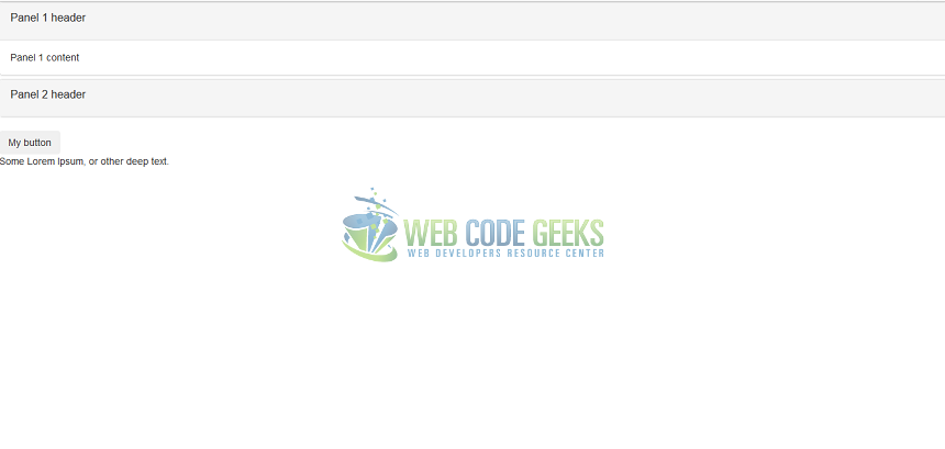
Fig. 2: Our final page
3. Options
Here are a few options you can make use of.
- collapse in: If you want your collapsible element to be shown by default, set its class to “collapse in” instead of just “collapse”.
- collapsing: An element which is in the process of being shown or hidden has a class called “collapsing”. You can use this to tweak the animation. See below.
Bootstrap accordion.html
<!DOCTYPE html>
<html>
<head>
    <link rel="stylesheet" href="https://maxcdn.bootstrapcdn.com/bootstrap/3.3.7/css/bootstrap.min.css"></link>
    <script src="http://code.jquery.com/jquery-3.1.1.min.js"></script>
    <script src="https://maxcdn.bootstrapcdn.com/bootstrap/3.3.7/js/bootstrap.min.js"></script>

    <style>
	.collapsing {
	    opacity: 0.5
	}
    </style>
</head>
<body>
    <button type="button" class="btn collapsed" data-toggle="collapse" data-target="#textDiv">My button</button>

    <div id="textDiv" class="collapse">
        Some Lorem Ipsum, or other deep text.
    </div>
</body>
</html>
Set opacity to 0.5 when an element is showing/hiding.
- Collapse methods: you can use JavaScript to collapse a collapsible element.
Bootstrap accordion with JavaScript.html
<!DOCTYPE html>
<html>
<head>
    <link rel="stylesheet" href="https://maxcdn.bootstrapcdn.com/bootstrap/3.3.7/css/bootstrap.min.css"></link>
    <script src="http://code.jquery.com/jquery-3.1.1.min.js"></script>
    <script src="https://maxcdn.bootstrapcdn.com/bootstrap/3.3.7/js/bootstrap.min.js"></script>

    <script>
	function doToggle() {
		$(".collapse").collapse("toggle");
	}

	function doShow() {
		$(".collapse").collapse("show");
	}

	function doHide() {
		$(".collapse").collapse("hide");
	}
    </script>
</head>
<body>
    <button onclick="doToggle()" >Toggle</button>
    <button onclick="doShow()">Show</button>
    <button onclick="doHide()">Hide</button>

<div id="textDiv" class="collapse">
        Some Lorem Ipsum, or other deep text.
    </div>

</body>
</html>
3. Summary
That covers our quickstart guide to the Bootstrap accordion. We have learnt the fundamentals of the accordion functionality in Bootstrap and know how to add it to different HTML elements. We have also seen how we can use JavaScript to interact with the accordion.
4. Download the source code
You can download the full code here: Bootstrap accordion
