The majority of the web sites have a page where they display a great amount of images. These pages are the well known gallery or portfolio pages. In this example I’m going to show you how you can use a bootstrap template to those pages.

1. Get a template
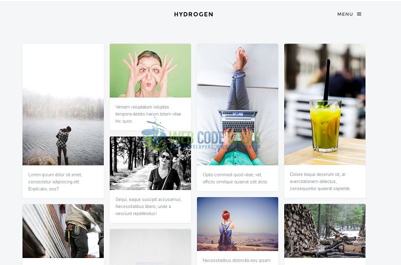
In this example we are going to use hydrogen template. This template has an images grid. Each image has a description below it. You can see the full-size image and navigate across all the gallery on a modal window. Below we see how this looks like:
2. Items structure
Each element on the gallery is defined inside a div with class="item". It has two divs inside which correspond to image and description. The structure is the following:
<div class="item">
  <div class="animate-box">
     <a href="" class="image-popup fh5co-board-img" title="">
     <img src="" alt=""></a>
  </div>
  <div class="fh5co-desc">
  </div>
</div>
3. Set an Item
3.1 Image
The image is set twice:
- The
img srcindicates what image will be shown on the gallery - The
a hrefindicates the full-size image which will be displayed when the user clicks on the gallery’s image.
I added the same image on both of them. You don’t need to worry about the image’s size on the gallery view because it’s resized automatically.
3.2 Title and subtitle
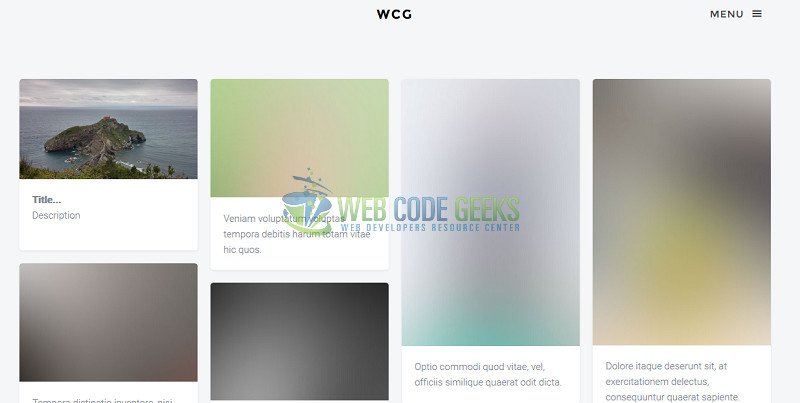
The title is displayed when the user puts the cursor on the image and in a footer is displayed when the image is shown on a modal window. I set it and added a paragraph with title and description; my final structure looks like this:
<div class="item">
  <div class="animate-box">
    <a href="images/sanJuan.jpg" class="image-popup fh5co-board-img" title="Title...">
    <img src="images/sanJuan.jpg" ></a>
  </div>
  <div class="fh5co-desc">
     <p><strong>Title...</strong>
        </br>Description
     </p>
  </div>
</div>
Note: In this structure, you need to set the title twice in order for the user to see it on a gallery and modal view. This structure is only a suggestion, you can experiment as you like.
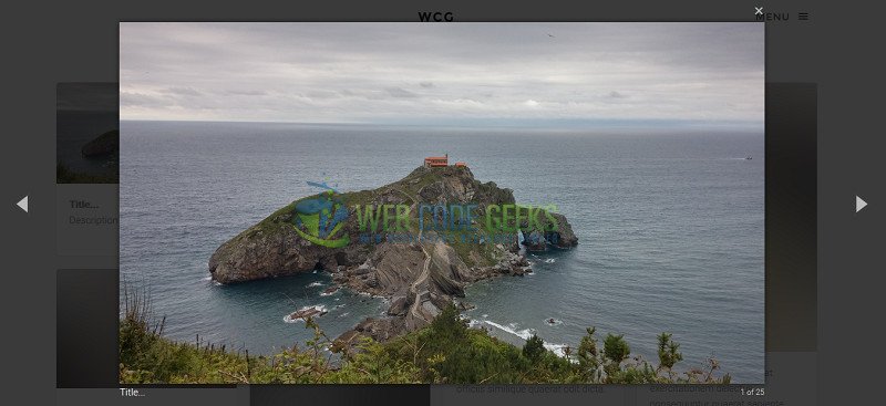
4. Full-size view
If you have the structure like the previous one, you don’t need to do anything. The images will be distributed on the page correctly and the modal view with the navigation will be working good. Then enjoy the magic! ;)
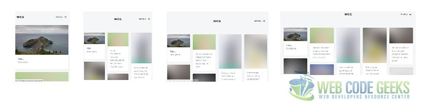
5. Grid columns
You can change the number of columns to be displayed on the grid. The corresponding properties to do it are on salvattore.css file.
I created a rule to define 5 columns on the grid. The width property is set to 20% (100% screen size divided by 5 = 20%)
.size-1of5 {
    width: 20%;
}
This template uses responsive web design, which means that the number of columns will be decreasing according to the screen size. You can define how much columns will be displayed on each screen size. You need to create a group of rules, these rules will be applied when the condition is true.
The example below indicates the rules to apply when the screen size is smaller than 450px.
@media screen and (max-width: 450px) {s
    #fh5co-board[data-columns]::before {
        content: '1 .column.size-1of1';
    }
}
You can see all the column rules on salvattore.css
salvattore.css
/* Base styles */
.column {
    float: left;
}
@media screen and (max-width: 480px) {
    .column {
        float: none;
        position: relative;
        clear: both;
    }
}
.size-1of4 {
    width: 25%;
}
.size-1of3 {
    width: 33.333%;
}
.size-1of2 {
    width: 50%;
}

.size-1of5 {
    width: 20%;
}


#fh5co-board[data-columns]::before {
    content: '5 .column.size-1of5';
}

/* Configurate salvattore with media queries */
@media screen and (max-width: 450px) {
    #fh5co-board[data-columns]::before {
        content: '1 .column.size-1of1';
    }
}

@media screen and (min-width: 451px) and (max-width: 700px) {
    #fh5co-board[data-columns]::before {
        content: '3 .column.size-1of3';
    }
}

@media screen and (min-width: 701px) and (max-width: 850px) {
    #fh5co-board[data-columns]::before {
        content: '4 .column.size-1of4';
    }
}

@media screen and (min-width: 851px) {
    #fh5co-board[data-columns]::before {
        content: '5 .column.size-1of5';
    }
}
With these rules the gallery will show 1, 3, 4 or 5 columns, depending on the screen size. The results resemble the following:
6. Download
This was a Bootstrap gallery example.
