The aim of this example is to explain and use Bootstrap forms. Just as an introduction, a web form or HTML form on a web page allows a user to enter data that is sent to a server for processing.
Forms can resemble paper or database forms because web users fill out the forms using checkboxes, radio buttons, or text fields.
Bootstrap, just like other front-end frameworks, gives forms extra styling to enhance design and user experience while using them. Here, we’ll have a look at different variations of forms (meaning several input types from which a form is made up) and the necessary syntax to achieve this in Bootstrap.

1. Project Folder Setup
The following requirements are necessary to be present in order to continue.
1.1 Folder Structure
After downloading Bootstrap and creating a new empty HTML document, make sure you have the folder structure like this:
1.2 HTML Document
Your HTML file should have all Bootstrap links and libraries needed, and the syntax shall basically look like this:
<!DOCTYPE html>
<html lang="en">
  <head>
    <meta charset="utf-8">
    <meta http-equiv="X-UA-Compatible" content="IE=edge">
    <meta name="viewport" content="width=device-width, initial-scale=1">
    <title>Bootstrap Form Example</title>

    <!-- Bootstrap -->
    <link href="css/bootstrap.min.css" rel="stylesheet">
  </head>
  <body>

    <!-- jQuery (necessary for Bootstrap's JavaScript plugins) -->
    <script src="https://ajax.googleapis.com/ajax/libs/jquery/1.11.3/jquery.min.js"></script>
    <!-- Include all compiled plugins (below), or include individual files as needed -->
    <script src="js/bootstrap.min.js"></script>
  </body>
</html>
2. Basic Example
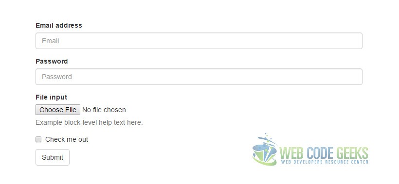
Individual form controls automatically receive some global styling. All textual <input>, <textarea>, and <select> elements with .form-control are set to width: 100%; by default. Wrap labels and controls in .form-group for optimum spacing. So a basic first example would be:
  <form>
  <div class="form-group">
    <label for="exampleInputEmail1">Email address</label>
    <input type="email" class="form-control" id="exampleInputEmail1" placeholder="Email">
  </div>
  <div class="form-group">
    <label for="exampleInputPassword1">Password</label>
    <input type="password" class="form-control" id="exampleInputPassword1" placeholder="Password">
  </div>
  <div class="form-group">
    <label for="exampleInputFile">File input</label>
    <input type="file" id="exampleInputFile">
    <p class="help-block">Example block-level help text here.</p>
  </div>
  <div class="checkbox">
    <label>
      <input type="checkbox"> Check me out
    </label>
  </div>
  <button type="submit" class="btn btn-default">Submit</button>
</form>
What you’d see in the browser is:
3. Cases and Examples
The following section gives examples of Bootstrap’s varius form elements.
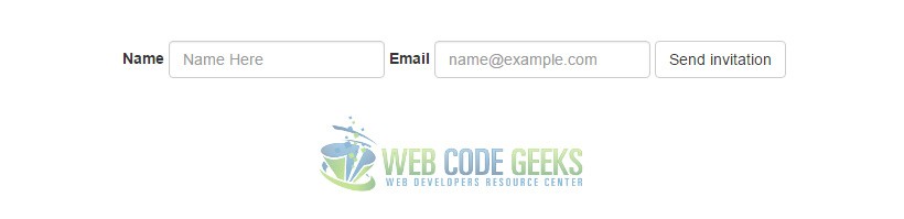
3.1 Inline Form
Add .form-inline to your form (which doesn’t have to be a <form>) for left-aligned and inline-block controls.
<form class="form-inline">
  <div class="form-group">
    <label for="exampleInputName2">Name</label>
    <input type="text" class="form-control" id="exampleInputName2" placeholder="Name Here">
  </div>
  <div class="form-group">
    <label for="exampleInputEmail2">Email</label>
    <input type="email" class="form-control" id="exampleInputEmail2" placeholder="name@example.com">
  </div>
  <button type="submit" class="btn btn-default">Send invitation</button>
</form>
This would produce the following result in the browser window:
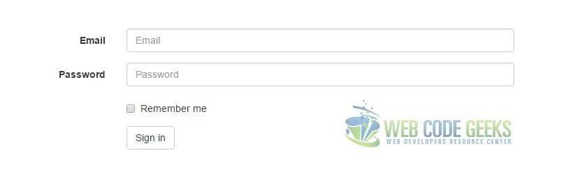
3.2 Horizontal Form
Use Bootstrap’s predefined grid classes to align labels and groups of form controls in a horizontal layout by adding .form-horizontal to the form (which doesn’t have to be a <form>). Doing so changes .form-groups to behave as grid rows, so no need for .row.
<form class="form-horizontal">
  <div class="form-group">
    <label for="inputEmail3" class="col-sm-2 control-label">Email</label>
    <div class="col-sm-10">
      <input type="email" class="form-control" id="inputEmail3" placeholder="Email">
    </div>
  </div>
  <div class="form-group">
    <label for="inputPassword3" class="col-sm-2 control-label">Password</label>
    <div class="col-sm-10">
      <input type="password" class="form-control" id="inputPassword3" placeholder="Password">
    </div>
  </div>
  <div class="form-group">
    <div class="col-sm-offset-2 col-sm-10">
      <div class="checkbox">
        <label>
          <input type="checkbox"> Remember me
        </label>
      </div>
    </div>
  </div>
  <div class="form-group">
    <div class="col-sm-offset-2 col-sm-10">
      <button type="submit" class="btn btn-default">Sign in</button>
    </div>
  </div>
</form>
3.3 Supported Controls
Examples of standard form controls supported in an example form layout.
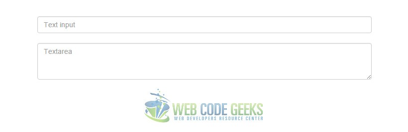
Inputs
Most common form control, text-based input fields. Includes support for all HTML5 types: text, password, datetime, datetime-local, date, month, time, week, number, email, url, search, tel, and color.
<!-- <input type="text" class="form-control" placeholder="Text input">
Textarea
Form control which supports multiple lines of text. Change rows attribute as necessary.
<textarea class="form-control" placeholder="Textarea" rows="3"></textarea> -->
These two elements look like this:
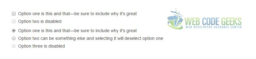
Checkboxes and Radios
<div class="checkbox">
  <label>
    <input type="checkbox" value="">
    Option one is this and that—be sure to include why it's great
  </label>
</div>
<div class="checkbox disabled">
  <label>
    <input type="checkbox" value="" disabled>
    Option two is disabled
  </label>
</div>

<div class="radio">
  <label>
    <input type="radio" name="optionsRadios" id="optionsRadios1" value="option1" checked>
    Option one is this and that—be sure to include why it's great
  </label>
</div>
<div class="radio">
  <label>
    <input type="radio" name="optionsRadios" id="optionsRadios2" value="option2">
    Option two can be something else and selecting it will deselect option one
  </label>
</div>
<div class="radio disabled">
  <label>
    <input type="radio" name="optionsRadios" id="optionsRadios3" value="option3" disabled>
    Option three is disabled
  </label>
</div>
Inline checkboxes and radios
Use the .checkbox-inline or .radio-inline classes on a series of checkboxes or radios for controls that appear on the same line.
<label class="checkbox-inline">
  <input type="checkbox" id="inlineCheckbox1" value="option1"> 1
</label>
<label class="checkbox-inline">
  <input type="checkbox" id="inlineCheckbox2" value="option2"> 2
</label>
<label class="checkbox-inline">
  <input type="checkbox" id="inlineCheckbox3" value="option3"> 3
</label>
<br/><br/>
<label class="radio-inline">
  <input type="radio" name="inlineRadioOptions" id="inlineRadio1" value="option1"> 1
</label>
<label class="radio-inline">
  <input type="radio" name="inlineRadioOptions" id="inlineRadio2" value="option2"> 2
</label>
<label class="radio-inline">
  <input type="radio" name="inlineRadioOptions" id="inlineRadio3" value="option3"> 3
</label>

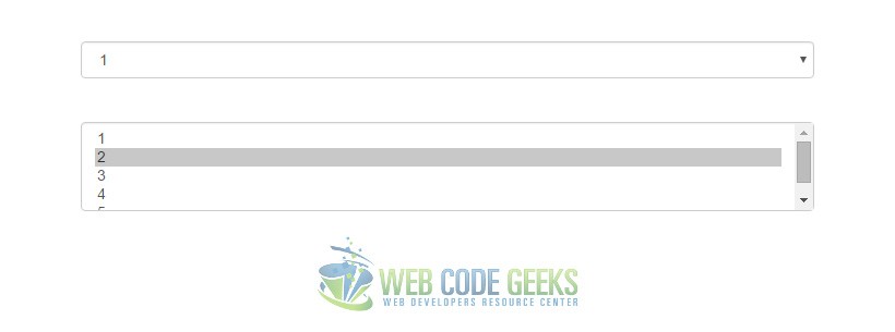
Selects
Note that many native select menus—namely in Safari and Chrome—have rounded corners that cannot be modified via border-radius properties.
<select class="form-control">
  <option>1</option>
  <option>2</option>
  <option>3</option>
  <option>4</option>
  <option>5</option>
</select>

<select multiple class="form-control">
  <option>1</option>
  <option>2</option>
  <option>3</option>
  <option>4</option>
  <option>5</option>
</select>
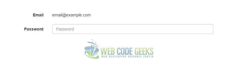
3.4 Static Control
When you need to place plain text next to a form label within a form, use the .form-control-static class on a <p>.
<form class="form-horizontal">
  <div class="form-group">
    <label class="col-sm-2 control-label">Email</label>
    <div class="col-sm-10">
      <p class="form-control-static">email@example.com</p>
    </div>
  </div>
  <div class="form-group">
    <label for="inputPassword" class="col-sm-2 control-label">Password</label>
    <div class="col-sm-10">
      <input type="password" class="form-control" id="inputPassword" placeholder="Password">
    </div>
  </div>
</form>
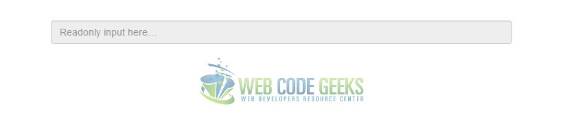
3.5 Readonly State
Add the readonly boolean attribute on an input to prevent modification of the input’s value. Read-only inputs appear lighter (just like disabled inputs), but retain the standard cursor:
<input class="form-control" type="text" placeholder="Readonly input here…" readonly>
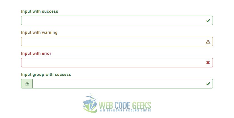
3.6 Validation States
Bootstrap includes validation styles for error, warning, and success states on form controls. To use, add .has-warning, .has-error, or .has-success to the parent element. Any .control-label, .form-control, and .help-block within that element will receive the validation styles.
<div class="form-group has-success has-feedback">
  <label class="control-label" for="inputSuccess2">Input with success</label>
  <input type="text" class="form-control" id="inputSuccess2" aria-describedby="inputSuccess2Status">
  <span class="glyphicon glyphicon-ok form-control-feedback" aria-hidden="true"></span>
  <span id="inputSuccess2Status" class="sr-only">(success)</span>
</div>
<div class="form-group has-warning has-feedback">
  <label class="control-label" for="inputWarning2">Input with warning</label>
  <input type="text" class="form-control" id="inputWarning2" aria-describedby="inputWarning2Status">
  <span class="glyphicon glyphicon-warning-sign form-control-feedback" aria-hidden="true"></span>
  <span id="inputWarning2Status" class="sr-only">(warning)</span>
</div>
<div class="form-group has-error has-feedback">
  <label class="control-label" for="inputError2">Input with error</label>
  <input type="text" class="form-control" id="inputError2" aria-describedby="inputError2Status">
  <span class="glyphicon glyphicon-remove form-control-feedback" aria-hidden="true"></span>
  <span id="inputError2Status" class="sr-only">(error)</span>
</div>
<div class="form-group has-success has-feedback">
  <label class="control-label" for="inputGroupSuccess1">Input group with success</label>
  <div class="input-group">
    <span class="input-group-addon">@</span>
    <input type="text" class="form-control" id="inputGroupSuccess1" aria-describedby="inputGroupSuccess1Status">
  </div>
  <span class="glyphicon glyphicon-ok form-control-feedback" aria-hidden="true"></span>
  <span id="inputGroupSuccess1Status" class="sr-only">(success)</span>
4. Conclusion
To conclude, forms are important HTML elements (but not only) which are given a lot of styles by Bootstrap. Forms and their various elements have a default size (i.e. width and height). If you want a smaller or bigger size, include respective classes .input-sm and .input-lg to change the size. Forms can also be customized in a few other ways not mentioned here, but you can find these (and a lot more) in the official Bootstrap site.
5. Download
You can download the full source code of this example here: Boostrap Form Example

Thanks for the tutorial. I have a question regarding the Horizontal form (3.2). How to reduce the space between the label and the input controls?