In this tutorial we’re considering a very fundamental concept of front-end frameworks, the grid system and we’re doing so using Bootstrap. Bootstrap is the most popular HTML, CSS, and JS framework for developing responsive, mobile first projects on the web.
Bootstrap includes a responsive, mobile first fluid grid system that appropriately scales up to 12 columns as the device or viewport size increases. It includes predefined classes for easy layout options, as well as powerful mixins for generating more semantic layouts.
Below, we’ll have a look at how the grid works and the necessary syntax for several layout cases.
1. Introduction and Basic Setup
1.1 Introduction
• For proper alignment and padding, rows must be wrapped within a .container or .container-fluid respectively for fixed-width and full-width.
• Use rows to create horizontal groups of columns.
• Only columns may be immediate children of rows, and content should be placed within columns.
• Bootstrap offers a lot of classes to set up layouts fast, classes like .row to create a new row or .col-xs-4 to create a small sized column equal to 1/3 of the container.
• Gutters between columns are created via padding.
• The negative margin is why the examples below are outdented. It’s so that content within grid columns is lined up with non-grid content.
• Grid columns are created by specifying the number of twelve available columns you wish to span. It could wither be 12 columns by using for example .col-sm-1 or three .col-sm=4 or six .col-sm-2 etc.
• When trying to add more than 12 columns within a row, the extra columns will automatically wrap onto a new line.
1.2 Document Setup
Before we start writing code, create a new HTML document and add the following Bootstrap’s basic syntax inside:
<!DOCTYPE html>
<html lang="en">
  <head>
    <meta charset="utf-8">
    <meta http-equiv="X-UA-Compatible" content="IE=edge">
    <meta name="viewport" content="width=device-width, initial-scale=1">
    <title>Bootstrap Basic Template</title>

    <!-- Bootstrap -->
    <link href="css/bootstrap.min.css" rel="stylesheet">
  </head>
  <body>

    <!-- jQuery (necessary for Bootstrap's JavaScript plugins) -->
    <script src="https://ajax.googleapis.com/ajax/libs/jquery/1.11.3/jquery.min.js"></script>
    <!-- Include all compiled plugins (below), or include individual files as needed -->
    <script src="js/bootstrap.min.js"></script>
  </body>
</html>
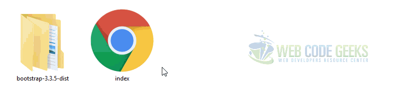
If you haven’t downloaded Bootstrap, click here and extract the bootstrap folder of the archive and then add the index.html inside like so:
2. Grid Options and Examples
2.1 The Grid Across Multiple Devices
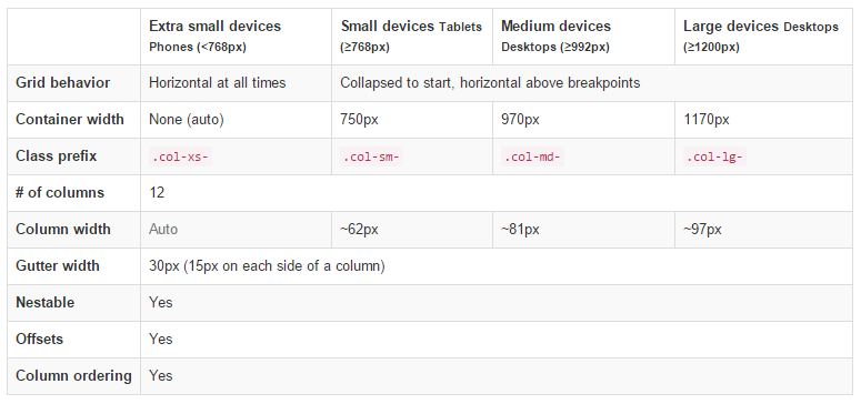
The following table lets you understand the aspects of how Bootstrap creates the key breakpoints in the grid system:
2.2 Example 1: Stacked to Horizontal
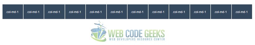
In this example we’re going to use the class .col-md-* where * represents a number and show different layouts. First, let’s show how to create a 12 column row. To begin, create a new row by adding a new div element with a class of row. Inside the row, add 12 div elements with the class col-md-1. This will create 12 columns.
<div class="container">
<div class="row">
  <div class="col-md-1">.col-md-1</div>
  <div class="col-md-1">.col-md-1</div>
  <div class="col-md-1">.col-md-1</div>
  <div class="col-md-1">.col-md-1</div>
  <div class="col-md-1">.col-md-1</div>
  <div class="col-md-1">.col-md-1</div>
  <div class="col-md-1">.col-md-1</div>
  <div class="col-md-1">.col-md-1</div>
  <div class="col-md-1">.col-md-1</div>
  <div class="col-md-1">.col-md-1</div>
  <div class="col-md-1">.col-md-1</div>
  <div class="col-md-1">.col-md-1</div>
</div>
</div>
In order to have some visual results, add the following CSS to emphasize the grid:
    <style type="text/css">
    .col-md-1, .col-md-2, .col-md-3, .col-md-4, .col-md-6, .col-md-8 {
      background-color: #34495e;
      color: white;
      line-height: 5em;
      border: 1px solid white;
      height: 5em;
    }
    </style>
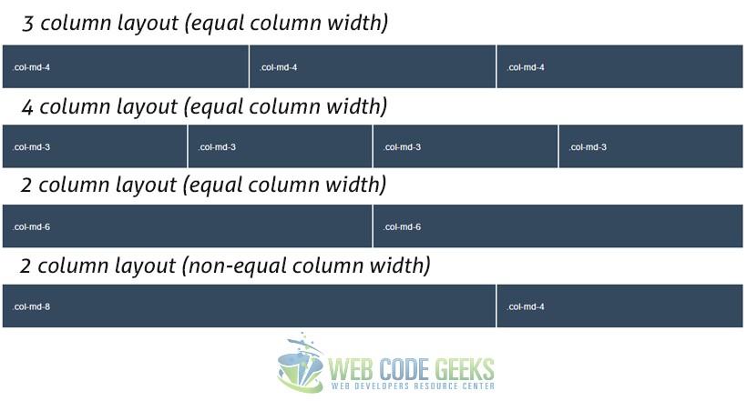
In the same way, we can define 2, 3, 4 ,6 or combinations like 8 and 4 columns like below:
<div class="container">
<div class="row">
  <div class="col-md-4">.col-md-4</div>
  <div class="col-md-4">.col-md-4</div>
  <div class="col-md-4">.col-md-4</div>
</div>

<div class="row">
  <div class="col-md-3">.col-md-3</div>
  <div class="col-md-3">.col-md-3</div>
  <div class="col-md-3">.col-md-3</div>
  <div class="col-md-3">.col-md-3</div>
</div>

<div class="row">
  <div class="col-md-6">.col-md-6</div>
  <div class="col-md-6">.col-md-6</div>
</div>

<div class="row">
  <div class="col-md-8">.col-md-8</div>
  <div class="col-md-4">.col-md-4</div>
</div>
</div>
Notice how we separate each set of columns to define new rows. The view of this code would be:
2.3 Example 2 – Multi Device Support
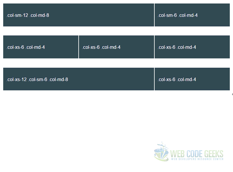
You can define multiple different behaviours based on the device you want to have the grid for. Look at the following example:
<div class="row">
  <div class="col-sm-12 col-md-8">.col-sm-12 .col-md-8</div>
  <div class="col-sm-6 col-md-4">.col-sm-6 .col-md-4</div>
</div>

<div class="row">
  <div class="col-xs-6 col-md-4">.col-xs-6 .col-md-4</div>
  <div class="col-xs-6 col-md-4">.col-xs-6 .col-md-4</div>
  <div class="col-xs-6 col-md-4">.col-xs-6 .col-md-4</div>
</div>

<div class="row">
  <div class="col-xs-12 col-sm-6 col-md-8">.col-xs-12 .col-sm-6 .col-md-8</div>
  <div class="col-xs-6 col-md-4">.col-xs-6 .col-md-4</div>
</div>
In the first row, we have defined a 2 column layout made of 8 columns (.col-md-8) and 4 columns (.col-md-4) to divide width for the medium sized devices. Then we’ve also added another class defining the lyout of each column on small sized devices, in this case, the first column will fill up the whole row (.col-sm-12) and consequently the send columns will end up on a new line with a half width of a row (.col-sm-6). It goes the same way for the two other cases, ecen when using three classes, to define three different layouts based on the grid breakpoints. If a column or some of them fill up the whole row with columns (12), the remaining ones (if any) will normally enter a new line.
3. Offsetting and Nesting Columns
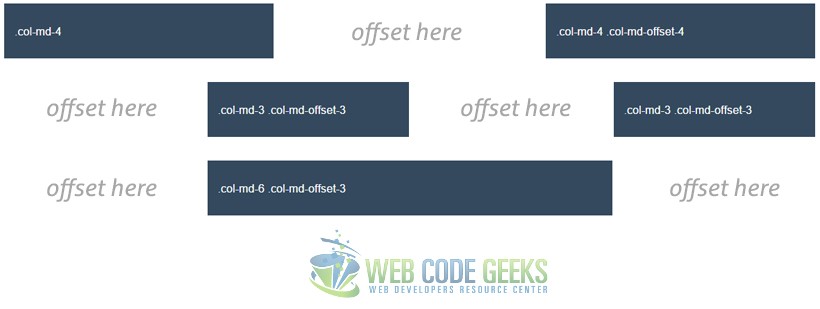
3.1 Example 3 – Offsetting Columns
What if you didn’t want a clear layout that fills up all the row? Well, you can set up columns just the way you want by using column offsets. For example, if you wanted to create a .col-md-3 and move it to the right leaving left just the same space that equals the width of the column, you can just write: .col-md-3 .col-md-offset-3.
Look at the examples below for a better understanding:
<div class="row">
  <div class="col-md-4">.col-md-4</div>
  <div class="col-md-4 col-md-offset-4">.col-md-4 .col-md-offset-4</div>
</div>
<div class="row">
  <div class="col-md-3 col-md-offset-3">.col-md-3 .col-md-offset-3</div>
  <div class="col-md-3 col-md-offset-3">.col-md-3 .col-md-offset-3</div>
</div>
<div class="row">
  <div class="col-md-6 col-md-offset-3">.col-md-6 .col-md-offset-3</div>
</div>
In the browser you’d now see columns positioned in various places using the offsets.
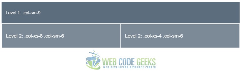
3.2 Example 4 – Nesting Columns
You can easily nest columns withing one another by just adding a row and then the nested columns. The example below gives you a clearer understanding:
<div class="row">
  <div class="col-md-8">
  .col-md-8
    <div class="row">
      <div class="col-sm-8 col-md-6">.col-sm-8 .col-md-6</div>
      <div class="col-sm-4 col-md-6">.col-sm-4 .col-md-6</div>
    </div>
  </div>
</div>
As you can expect, now the .col-md-8 is considered as the row of the new columns nested:
4. Conclusion
To conclude, Bootstrap’s grid is a powerful system, fully responsive designed for a wide range of uses and compatible with many devices. Setting up your own layout is easy with the basic knowledge. If you want to create you layout full-width, you’d have to use the container-fluid class instead of container which will keep the content inside a fixed width. For more information on Bootstrap grid, please refer to the official documentation here.
5. Download
You can download the full source code of this example here: Bootstrap Grid Tutorial

Good article for understanding Bootstrap grid system. Thanks to the author
Thanks – It’s helped my understanding (as a back-end developer) of Bootstrap grid no end.