The aim of this example is to create and use a layout with Bootstrap. Layouts are the very base model of your upcoming website. A layout usually contains the skeleton of the page, meaning how it is divided into rows and columns, the height of each section, how content is organized and overall appearance.
As you might already know, Bootstrap makes it easy to create custom layouts using pre-defined styling on so many elements. And then, what’s left for you, is really few aspects like colors, fonts and images that are unique to your site. A good layout enhances user experience and makes it more convenient for users to browse the page you’re building, so with a little effort in the beginning you can have a great and long-term layout.

1. Project Setup
The following requirements need to be met in order to continue creating a new page layout with Bootstrap.
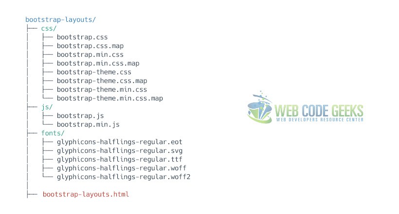
1.1 Project Folder Setup
Create a new HTML file, which will be your main one, and make sure you have the following folder structure after downloading Boostrap.
1.2 Main HTML Setup
Bootstrap already provides a base HTML, which contains links and references to all its’ libraries, including a CDN version of jQuery. Your main HTML file should have the following basic syntax:
<!DOCTYPE html>
<html lang="en">
  <head>
    <meta charset="utf-8">
    <meta http-equiv="X-UA-Compatible" content="IE=edge">
    <meta name="viewport" content="width=device-width, initial-scale=1">
    <title>Bootstrap Layout Example</title>

    <!-- Bootstrap -->
    <link href="css/bootstrap.min.css" rel="stylesheet">
  </head>
  <body>

    <!-- jQuery (necessary for Bootstrap's JavaScript plugins) -->
    <script src="https://ajax.googleapis.com/ajax/libs/jquery/1.11.3/jquery.min.js"></script>
    <!-- Include all compiled plugins (below), or include individual files as needed -->
    <script src="js/bootstrap.min.js"></script>
  </body>
</html>
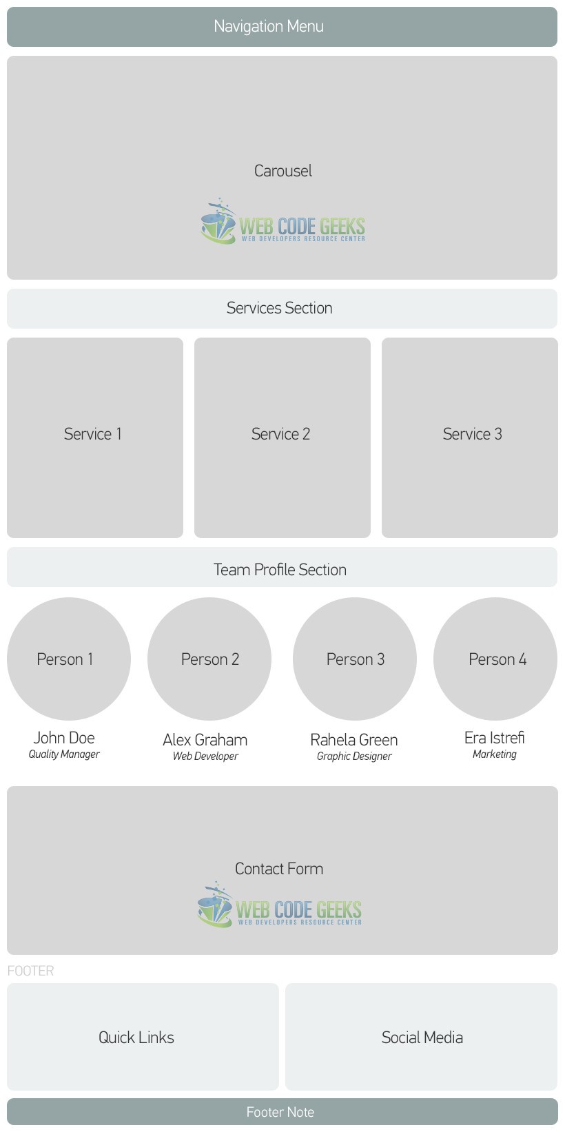
2. What is to be done?
Below is a general view of the layout we are going to create and populate with Bootstrap.
3. Coding the Layout with Bootstrap
The following sections will contain the real code to achieve the layout we want.
3.1 Coding the Navigation Menu
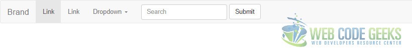
To create your basic navbar, follow the default Bootstrap syntax and you’ll get:
<div class="container">
<nav class="navbar navbar-default">
  <div class="container-fluid">
    <!-- Brand and toggle get grouped for better mobile display -->
    <div class="navbar-header">
      <button type="button" class="navbar-toggle collapsed" data-toggle="collapse" data-target="#bs-example-navbar-collapse-1" aria-expanded="false">
        <span class="sr-only">Toggle navigation</span>
        <span class="icon-bar"></span>
        <span class="icon-bar"></span>
        <span class="icon-bar"></span>
      </button>
      <a class="navbar-brand" href="#">Brand</a>
    </div>

    <!-- Collect the nav links, forms, and other content for toggling -->
    <div class="collapse navbar-collapse" id="bs-example-navbar-collapse-1">
      <ul class="nav navbar-nav">
        <li class="active"><a href="#">Link <span class="sr-only">(current)</span></a></li>
        <li><a href="#">Link</a></li>
        <li class="dropdown">
          <a href="#" class="dropdown-toggle" data-toggle="dropdown" role="button" aria-haspopup="true" aria-expanded="false">Dropdown <span class="caret"></span></a>
          <ul class="dropdown-menu">
            <li><a href="#">Action</a></li>
            <li><a href="#">Another action</a></li>
            <li><a href="#">Something else here</a></li>
            <li role="separator" class="divider"></li>
            <li><a href="#">Separated link</a></li>
            <li role="separator" class="divider"></li>
            <li><a href="#">One more separated link</a></li>
          </ul>
        </li>
      </ul>
      <form class="navbar-form navbar-left" role="search">
        <div class="form-group">
          <input type="text" class="form-control" placeholder="Search">
        </div>
        <button type="submit" class="btn btn-default">Submit</button>
      </form>
    </div><!-- /.navbar-collapse -->
  </div><!-- /.container-fluid -->
</nav>
</div>
We just created the navbar. It looks like this in the browser:
3.2 Coding the Carousel
The carousel is another exciting feature of Bootstrap, and you can set it up in minutes:
<div class="container" style="margin-top:-1.5em">
  <div id="myCarousel" class="carousel slide" data-ride="carousel">
    <!-- Indicators -->
    <ol class="carousel-indicators">
      <li data-target="#myCarousel" data-slide-to="0" class="active"></li>
      <li data-target="#myCarousel" data-slide-to="1"></li>
      <li data-target="#myCarousel" data-slide-to="2"></li>
    </ol>

    <!-- Wrapper for slides -->
    <div class="carousel-inner" role="listbox">
      <div class="item active">
        <img src="http://i.imgur.com/ELwJbNq.jpg?1" alt="Image1" width="1170" height="658">
      </div>

      <div class="item">
        <img src="http://i.imgur.com/tI844yf.jpg?1" alt="Image2" width="1170" height="658">
      </div>

      <div class="item">
        <img src="http://i.imgur.com/rMqPvig.jpg?1" alt="Image3" width="1170" height="658">
      </div>
    </div>

    <!-- Left and right controls -->
    <a class="left carousel-control" href="#myCarousel" role="button" data-slide="prev">
      <span class="glyphicon glyphicon-chevron-left" aria-hidden="true"></span>
      <span class="sr-only">Previous</span>
    </a>
    <a class="right carousel-control" href="#myCarousel" role="button" data-slide="next">
      <span class="glyphicon glyphicon-chevron-right" aria-hidden="true"></span>
      <span class="sr-only">Next</span>
    </a>
  </div>
</div>
The carousel will look like this:

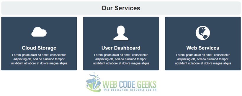
3.3 Coding the Services Section
This section will contain 3 columns in a row which will then hold content for services. Here, we’re also adding some styling and new elements that are not necessarily part of Bootstrap.
  <style type="text/css">
  .section-title {
    text-align:center;
    margin-top: 1em;
    background-color: #ecf0f1;
    padding: .5em 0;
    border-radius: .3em;
  }

  .service {
    border-radius: .3em;
    background-color: #34495e;
    text-align: center;
    padding: 3em 2em 1em 2em;
    color: white;
  }

  .service .glyphicon {
    font-size: 5em;
  }
  </style>
<div class="container">
<h2 class="section-title"><strong>Our Services</strong></h2>
  <div class="row">
    <div class="col-md-4">
      <div class="service">
      <span class="glyphicon glyphicon-cloud" aria-hidden="true"></span>
      <h3><strong>Cloud Storage</strong></h3>
      <p>Lorem ipsum dolor sit amet, consectetur adipiscing elit, sed do eiusmod tempor incididunt ut labore et dolore magna aliqua</p>
      </div>
    </div>
    <div class="col-md-4">
      <div class="service">
      <span class="glyphicon glyphicon-user" aria-hidden="true"></span>
      <h3><strong>User Dashboard</strong></h3>
      <p>Lorem ipsum dolor sit amet, consectetur adipiscing elit, sed do eiusmod tempor incididunt ut labore et dolore magna aliqua</p>
      </div>
    </div>
    <div class="col-md-4">
      <div class="service">
      <span class="glyphicon glyphicon-globe" aria-hidden="true"></span>
      <h3><strong>Web Services</strong></h3>
      <p>Lorem ipsum dolor sit amet, consectetur adipiscing elit, sed do eiusmod tempor incididunt ut labore et dolore magna aliqua</p>
      </div>
    </div>
</div>
The services section would look like this:
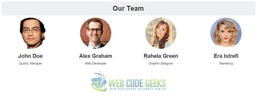
3.4 Coding the Team Section
The team section utilizes bootstrap .img-circle class to make images round. The row is divided in 4 columns.
<div class="container">
<h2 class="section-title"><strong>Our Team</strong></h2>
  <div class="row">
    <div class="col-md-3" style="text-align:center;">
      <img src="http://goo.gl/1nWwbc" alt="Team" class="img-circle">
      <h3><strong>John Doe</strong></h3>
      <em>Quality Manager</em>
    </div>
    <div class="col-md-3" style="text-align:center;">
      <img src="http://goo.gl/Q2qUtg" alt="Team" class="img-circle">
      <h3><strong>Alex Graham</strong></h3>
      <em>Web Developer</em>
    </div>
    <div class="col-md-3" style="text-align:center;">
          <img src="https://goo.gl/xbDwGV" alt="Team" class="img-circle">
          <h3><strong>Rahela Green</strong></h3>
          <em>Graphic Designer</em>
        </div>
    <div class="col-md-3" style="text-align:center;">
          <img src="https://goo.gl/ivMjuD" alt="Team" class="img-circle">
          <h3><strong>Era Istrefi</strong></h3>
          <em>Marketing</em>
        </div>
</div>
The team section will look like this in the browser:
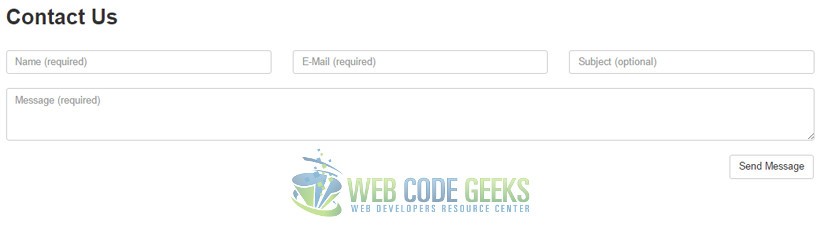
3.5 Coding the Contact Form
This section consists of a contact form:
<h2><strong>Contact Us</strong></h2>
<br/>
  <form class="contact-form">
     <div class="container">
       <div class="row">
         <div class="col-sm-4" style="padding-left: 0;">
           <input type="name" class="form-control" placeholder="Name (required)">
         </div>
         <div class="col-sm-4">
           <input type="email" class="form-control" placeholder="E-Mail (required)">
         </div>
         <div class="col-sm-4" style="padding-right: 2em;">
           <input type="subject" class="form-control" placeholder="Subject (optional)">
         </div>
       </div>
       <br/>
       <div class="row">
         <div class="message" style="padding-right: 2em;"><textarea rows="3" style="max-height:8em;"class="form-control" id="message" placeholder="Message (required)"></textarea></div>
       </div>
     </div>
     <br/>
      <div class="btn btn-default pull-right">Send Message</div>
     </form>
This section would have this view in the browser:
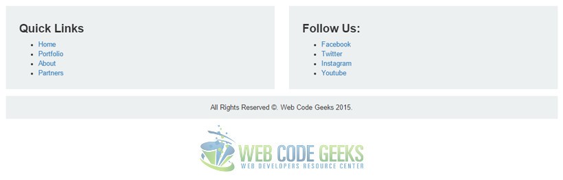
3.6 Coding the Footer Section
Our footer has two columns which will hold quick links and social media respectively:
<footer class="footer" style="margin: 5em 0em 1em 0em;">
<div class="container" style="padding-left: 0">
  <div class="row">
    <div class="col-md-6">
    <div class="wrapper" style="background-color:#ecf0f1; padding: 1em 2em;">
      <h3><strong>Quick Links</strong></h3>
      <ul>
        <li><a href="#">Home</a></li>
        <li><a href="#">Portfolio</a></li>
        <li><a href="#">About</a></li>
        <li><a href="#">Partners</a></li>
      </ul>
    </div>
    </div>
    <div class="col-md-6">
    <div class="wrapper" style="background-color:#ecf0f1; padding: 1em 2em;">
      <h3><strong>Follow Us:</strong></h3>
      <ul>
        <li><a href="#">Facebook</a></li>
        <li><a href="#">Twitter</a></li>
        <li><a href="#">Instagram</a></li>
        <li><a href="#">Youtube</a></li>
      </ul>
    </div>
    </div>
  </div>
  <div class="row" style="text-align: center; padding: 1em; margin: 1em 0; background-color:#ecf0f1;">
    All Rights Reserved ©. Web Code Geeks 2015.
  </div>
</div>
</footer>
And the last view for this layout would look like this:
4. Conclusion
To conclude, it is important to mention that you have such an infinite number of choices when it comes to designing layouts for your web pages, and layouts vary from page to page depending on the type of content that is going to be put there. Bootstrap helps you code fast by providing a very comprehensive help with the grid system and wide range of styled elements for you to populate your layout. You can see the whole page that we built in the download files.
5. Download
You can download the full source code of this example here: Bootstrap Layout
