In this example, we’ll be creating and using Bootstrap popovers. The Popover plugin is similar to tooltips, it is a pop-up box that appears when the user clicks on an element. The difference is that the popover can contain much more content. Plugin dependency: Popovers require the tooltip plugin (tooltip.js) to be included in your version of Bootstrap.
They enable you to add small overlays of content, like those on the iPad, to any element for housing secondary information. Here, we’re having a look at creating popovers and then looking at what methods or options can be added to this plugin.
1. Project Setup
The following requirements need to be met in order to continue adding popovers with Bootstrap.
1.1 Project Folder Setup
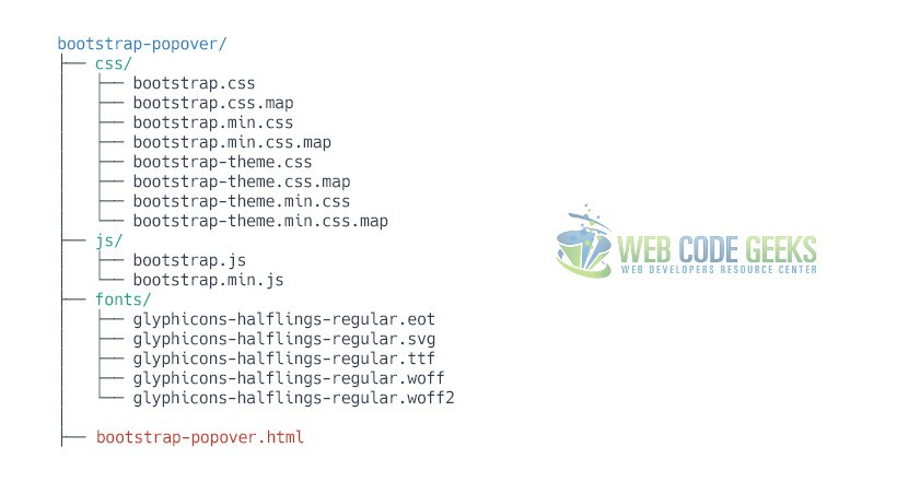
Create a new HTML file, which will be your main one, and make sure you have the following folder structure after downloading Boostrap.
1.2 Main HTML Setup
Bootstrap already provides a base HTML, which contains links and references to all its’ libraries, including a CDN version of jQuery. Your main HTML file should have the following basic syntax inside:
<!DOCTYPE html>
<html lang="en">
  <head>
    <meta charset="utf-8">
    <meta http-equiv="X-UA-Compatible" content="IE=edge">
    <meta name="viewport" content="width=device-width, initial-scale=1">
    <title>Bootstrap Popover Example</title>

    <!-- Bootstrap -->
    <link href="css/bootstrap.min.css" rel="stylesheet">
  </head>
  <body>

    <!-- jQuery (necessary for Bootstrap's JavaScript plugins) -->
    <script src="https://ajax.googleapis.com/ajax/libs/jquery/1.11.3/jquery.min.js"></script>
    <!-- Include all compiled plugins (below), or include individual files as needed -->
    <script src="js/bootstrap.min.js"></script>
  </body>
</html>
2. Cases and Examples
2.1 A Default Popover
The default popover will be shown on the right of a button (which is the element we’re adding a popover) and will need initialization like in the following code:
<button type="button" class="btn btn-primary" data-toggle="popover" title="Popover title" data-content="And here's some amazing content. It's very engaging. Right?">Click to toggle popover</button>
<script type="text/javascript">
   $(function () {
     $('[data-toggle="popover"]').popover()
   })
</script>
In the browser, the popover would show up this way:
2.2 Four Directions on Popovers
Just like tooltips, even popovers can be placed on top, bottom and right, left. This is achieved using the data-placement attribute in the HTML element.
<button type="button" class="btn btn-default" data-container="body" data-toggle="popover" data-placement="left" data-content="Vivamus sagittis lacus vel augue laoreet rutrum faucibus.">
  Popover on left
</button>

<button type="button" class="btn btn-default" data-container="body" data-toggle="popover" data-placement="top" data-content="Vivamus sagittis lacus vel augue laoreet rutrum faucibus.">
  Popover on top
</button>

<button type="button" class="btn btn-default" data-container="body" data-toggle="popover" data-placement="bottom" data-content="Vivamus sagittis lacus vel augue laoreet rutrum faucibus.">
  Popover on bottom
</button>

<button type="button" class="btn btn-default" data-container="body" data-toggle="popover" data-placement="right" data-content="Vivamus sagittis lacus vel augue laoreet rutrum faucibus.">
  Popover on right
</button>
Similarly, the view would be: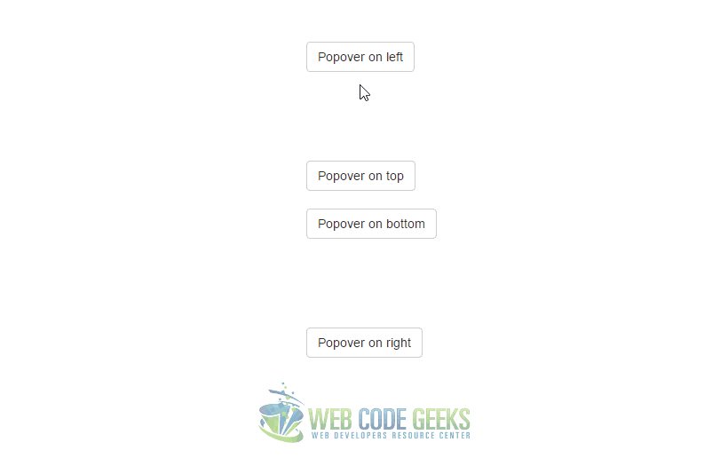
2.3 Dismissable Popover
Use the focus trigger to dismiss popovers on the next click that the user makes.
<a tabindex="0" class="btn btn-lg btn-danger" role="button" data-toggle="popover" data-trigger="focus" title="Dismissible popover" data-content="And here's some amazing content. It's very engaging. Right?">Dismissible popover</a>
On the next click, the popover is going to fade out: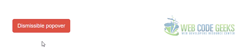
3. Options
Options can be passed via data attributes or JavaScript. For data attributes, append the option name to data-, as in data-animation="".
3.1 animation
Type: Boolean
Default: True
Description: Apply a CSS fade transition to the popover.
3.2 container
Type: String
Default: False
Description: Appends the popover to a specific element. Example: container: 'body'. This option is particularly useful in that it allows you to position the popover in the flow of the document near the triggering element – which will prevent the popover from floating away from the triggering element during a window resize.
3.3 content
Type: String | Function
Default: ”
Description: Default content value if data-content attribute isn’t present. If a function is given, it will be called with its this reference set to the element that the popover is attached to.
3.4 delay
Type: Number | Object
Default: 0
Description: Delay showing and hiding the popover (ms) – does not apply to manual trigger type. If a number is supplied, delay is applied to both hide/show. Object structure is: delay: { "show": 500, "hide": 100 }
3.5 html
Type: Boolean
Default: False
Description: Insert HTML into the popover. If false, jQuery’s text method will be used to insert content into the DOM. Use text if you’re worried about XSS attacks.
3.6 placement
Type: Boolean
Default: Right
Description: How to position the popover – top | bottom | left | right | auto.
When “auto” is specified, it will dynamically reorient the popover. For example, if placement is “auto left”, the popover will display to the left when possible, otherwise it will display right.
When a function is used to determine the placement, it is called with the popover DOM node as its first argument and the triggering element DOM node as its second. The this context is set to the popover instance.
3.7 selector
Type: String
Default: False
Description: If a selector is provided, popover objects will be delegated to the specified targets. In practice, this is used to enable dynamic HTML content to have popovers added.
3.8 title
Type: String | Function
Default: ”
Description: Default title value if title attribute isn’t present. If a function is given, it will be called with its this reference set to the element that the popover is attached to.
3.9 trigger
Type: String
Default: “click”
Description: How popover is triggered – click | hover | focus | manual. You may pass multiple triggers; separate them with a space. manual cannot be combined with any other trigger.
3.10 viewport
Type: String | Object | Function
Default: { selector: ‘body’, padding: 0 }
Description: Keeps the popover within the bounds of this element. Example: viewport: '#viewport' or { "selector": "#viewport", "padding": 0 }
If a function is given, it is called with the triggering element DOM node as its only argument. The this context is set to the popover instance.
4. Methods
$().popover(options) – Initializes popovers for an element collection.
4.1 .popover(‘show’)
Reveals an element’s popover. Returns to the caller before the popover has actually been shown (i.e. before the shown.bs.popover event occurs). This is considered a “manual” triggering of the popover. Popovers whose both title and content are zero-length are never displayed.
$('#element').popover('show')
4.2 .popover(‘hide’)
Hides an element’s popover. Returns to the caller before the popover has actually been hidden (i.e. before the hidden.bs.popover event occurs). This is considered a “manual” triggering of the popover.
$('#element').popover('hide')
4.3 .popover(‘toggle’)
Toggles an element’s popover. Returns to the caller before the popover has actually been shown or hidden (i.e. before the shown.bs.popover or hidden.bs.popover event occurs). This is considered a “manual” triggering of the popover.
$('#element').popover('toggle')
4.4 .popover(‘destroy’)
Hides and destroys an element’s popover. Popovers that use delegation (which are created using the selector option) cannot be individually destroyed on descendant trigger elements.
$('#element').popover('destroy')
5. Events
show.bs.popover – This event fires immediately when the show instance method is called.
shown.bs.popover – This event is fired when the popover has been made visible to the user (will wait for CSS transitions to complete).
hide.bs.popover – This event is fired immediately when the hide instance method has been called.
hidden.bs.popover – This event is fired when the popover has finished being hidden from the user (will wait for CSS transitions to complete).
inserted.bs.popover – This event is fired after the show.bs.popover event when the popover template has been added to the DOM.
Example:
$('#myPopover').on('hidden.bs.popover', function () {
  // do something…
})
6. Conclusion
To conclude, I would just like to add that this is yet another elegant way to place content in your web pages, allowing clean interface and quite good design that you would otherwise need to start from scratch.
7. Download
You can download the full source code of this example here: Boostrap Popover
