This article discusses the responsive feature of the Bootstrap Framework. We will start with taking a look at what is Responsiveness in terms of websites and web applications and what all the buzz is about. Once we gain an understanding of responsive designs and terms, we will, progress with creating a web page of our own which is needless to say responsive. By the end of this article, you will start to appreciate the Bootstrap Framework for all the baked-in goodies in the framework itself to enable responsive layouts.

1. Tools
Following tools will be used to build this example:
Bootstrap is a front-end framework for designing responsive websites. We also include JQuery since Bootstrap needs it. The JQuery library makes writing JavaScript a breeze. Node.js in essence is JavaScript on the server-side. The Express module is used to create a server to serve files and resources to the browser.
2. What makes a website Responsive?
By responsive it is intended, in case of web development, that a website is able to adapt its layout to the viewer’s viewport or screen size. As there is an array of devices of varying sizes with capability to allow the user to browse the web, this particular way of designing layout becomes more significant. Building different versions of a site for each individual screen size is not palatable nor feasible and that is where Bootstrap Framework shines. We can build a single website targeting all screen sizes and devices leveraging Bootstrap.
3. How to make a site Responsive?
Responsive does not mean that we shrink the elements on a page to fit onto smaller device. In fact that is exactly what happens when we open a site on a mobile device that is not responsive, the page shrinks to fit the viewport rendering it nearly unusable. The Bootstrap Framework works around this by making changes to the layout of the page to keep the UI usable and functional in all aspects regardless of the viewport or screen size. We do not need to add code for this to happen, all we need to do is use the CSS classes from Bootstrap to layout our site and then Bootstrap framework manages it from there.
Another concept I would like to briefly go over is Media Query. This is essential for designing any responsive website or a framework for responsive websites too. Media Query is part of CSS3 and essentially allows detection of Media Type and Media Features, meaning that we can detect the type of device and other attributes like max-width and others. This allows us to adapt the layout to the detected Media Type and its capabilities. We can do this by using what is called a @media rule onto our web page. It looks like below:
1 2 3 | @media not|only mediatype and (media feature) { CSS-Code;} |
Here the domain of values that can be used in place of mediatype are screen, print and all. Whereas the list of values used for media feature are many but the one we need is the max-width one.
CSS3 also allows us to add particular stylesheets based on Media Type and Features as well. Let us look at a couple of examples below:
1 2 3 4 5 | @media screen and (max-width: 480px) { body { background-color: blue; }} |
What this media rule does, on devices with screen width of 480px or less, is that it applies a background-color of blue to the body element.
4. Project Structure
Let us attempt to build a small application to demonstrate the concept of responsive design using Bootstrap Framework. The project structure of this application would be as follows:
5. Html Markup
We add the following markup to the index.html file of our application:
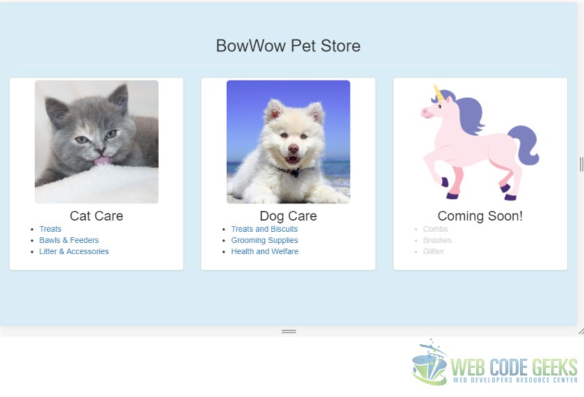
001 002 003 004 005 006 007 008 009 010 011 012 013 014 015 016 017 018 019 020 021 022 023 024 025 026 027 028 029 030 031 032 033 034 035 036 037 038 039 040 041 042 043 044 045 046 047 048 049 050 051 052 053 054 055 056 057 058 059 060 061 062 063 064 065 066 067 068 069 070 071 072 073 074 075 076 077 078 079 080 081 082 083 084 085 086 087 088 089 090 091 092 093 094 095 096 097 098 099 100 101 102 | <!DOCTYPE html><html lang="en"><head> <meta charset="utf-8"> <meta http-equiv="X-UA-Compatible" content="IE=edge"> <meta name="viewport" content="width=device-width, initial-scale=1"><!-- The above 3 meta tags *must* come first in the head; any other head content must come *after* these tags --> <title>Bootstrap Responsive Example - Web Code Geeks</title><!-- Latest compiled and minified CSS --> <link rel="stylesheet" href="/css/bootstrap.min.css"><!-- Optional theme --> <link rel="stylesheet" href="/css/bootstrap-theme.min.css"> <!-- HTML5 shim and Respond.js for IE8 support of HTML5 elements and media queries --><!-- WARNING: Respond.js doesn't work if you view the page via file:// --><!--[if lt IE 9]> <script src="https://www.webcodegeeks.com/wp-content/litespeed/localres/aHR0cHM6Ly9vc3MubWF4Y2RuLmNvbS8=html5shiv/3.7.3/html5shiv.min.js"></script> <script src="https://www.webcodegeeks.com/wp-content/litespeed/localres/aHR0cHM6Ly9vc3MubWF4Y2RuLmNvbS8=respond/1.4.2/respond.min.js"></script><![endif]--></head><body class="bg-info"><!--container div to hold the store name--> <div class="container"> <div class="row"> <div class="col-xs-12 text-center page-header"> <h2>BowWow Pet Store</h2> </div> </div> </div><!--container div to hold main content of the page--> <div class="container-fluid"> <div class="row"> <div class="col-sm-4 col-lg-3 col-lg-push-1"> <div class="thumbnail"> <img src="/images/cat.jpg" class="img-rounded thumb"/> <div class="caption"> <div class="text-center"> <span class="h3">Cat Care</span> </div> <ul> <li><a href="#">Treats</a></li> <li><a href="#">Bawls & Feeders</a></li> <li><a href="#">Litter & Accessories</a></li> </ul> </div> </div> </div> <div class="col-sm-4 col-lg-3 col-lg-push-1"> <div class="thumbnail"> <img src="/images/puppy.jpg" class="img-rounded thumb" /> <div class="caption"> <div class="text-center"> <span class="h3">Dog Care</span> </div> <ul> <li><a href="#">Treats and Biscuits</a></li> <li><a href="#">Grooming Supplies</a></li> <li><a href="#">Health and Welfare</a></li> </ul> </div> </div> </div> <div class="col-sm-4 col-lg-3 col-lg-push-1"> <div class="thumbnail"> <img src="/images/unicorn.png" class="img-rounded thumb" /> <div class="caption"> <div class="text-center"> <span class="h3">Coming Soon!</span> </div> <ul > <li class="disabled">Combs</li> <li class="disabled">Brushes</li> <li class="disabled">Glitter</li> </ul> </div> </div> </div> </div> </div><!-- jQuery (necessary for Bootstrap's JavaScript plugins) --><script src="https://www.webcodegeeks.com/wp-content/litespeed/localres/aHR0cHM6Ly9hamF4Lmdvb2dsZWFwaXMuY29tL2FqYXgvlibs/jquery/1.12.4/jquery.min.js"></script><!-- Include all compiled plugins (below), or include individual files as needed --><!-- Latest compiled and minified JavaScript --><script src="./js/bootstrap.min.js"></script><script src="./js/bootstrap.responsive.js"></script> <style type="text/css"> .thumb{ max-height: 220px; } li.disabled{ color: lightgrey; } </style></body></html> |
The resulting UI of the above page looks like below on a laptop screen.
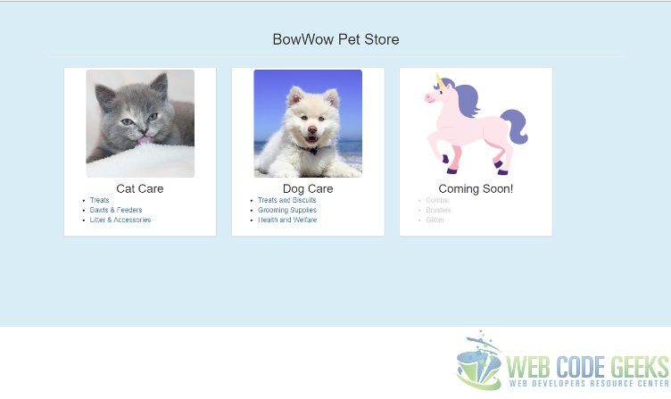
In the above UI we use the container css class to create a container, which in turn, has rows of columns. Our content sits in the individual columns in each row. We specify a row with row css class. The css class for columns is a bit more involved, for example, a div decorated with css class col-sm-4 means the div would span 4 columns on small screen sizes and above. This also means that the breaking point is small screen, so for screen size extra small the content can be stacked one on top of the other columns. We will take a look into checking this in the next section.
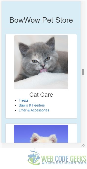
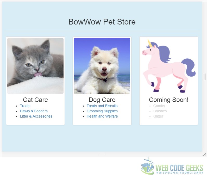
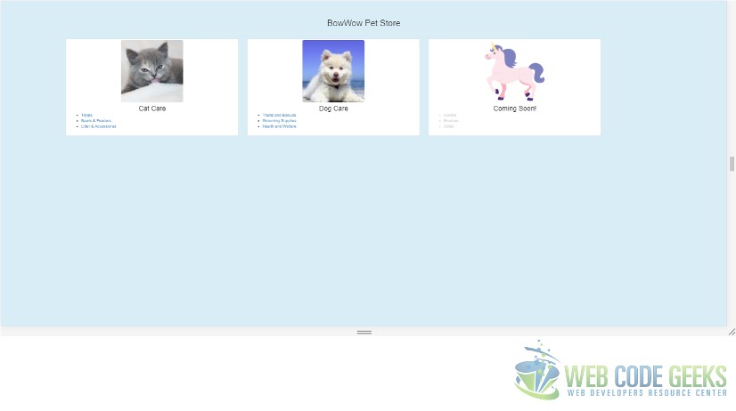
6. Responsiveness Check
Let us check the responsiveness of the UI we built in the previous section. To startup the application and view it in a browser we need to run the following commands at the root of the application
1 | >npm install |
1 | >node index.js |
Now, let us navigate to the following URL in the Chrome browser: http://localhost:3010. Hit the F12 Key to bring up the developer tools so that we can emulate various screen sizes. The results for each screen size are as in the below screens:
7. Download the Source Code
This was an example of Bootstrap Responsive design.
You can download the full source code of this example here : Bootstrap Responsive Example
Really Nice Article explained in a very easy way.
Thanks