In this example we will explore the Navbar component from Bootstrap. One of the key aspect of any website is ease of navigation and this component makes it easier to implement this crucial feature. So, let us try and learn how to best and effectively use the Navbar component. This component also needs to be Responsive, meaning that it adjusts itself according to the viewport of the device used to view it. On the smaller devices it collapses and can be toggled with a button but on larger screens it is expanded horizontally to display all the contents.
We will build a webpage in this example to test out and configure the many aspects of this component.

1. Tools
We will use the following set of tools to build this example:
1. Bootstrap v3.3.7
2. JQuery v1.12.4
3. Node.js v6.3.0
4. Express
5. Visual Studio Code IDE
Bootstrap is a popular framework for building responsive websites in quick time and JQuery library makes it a lot easier for all programmers writing JavaScript for the front-end. This library is also required by Bootstrap to do its job. A supported version needs to included ahead of Bootstrap.
Node.js is basically JavaScript running on the Server as opposed to the browser. We will use Node with Express to build a simple Web-Server that serves our example page and required assets. Visual Studio Code IDE is my personal choice but it is not binding and you can choose an editor that you are comfortable with.
2. Project Structure
The example has the following folder structure:
css
This css files from Bootstrap package reside in this folder. All the css stylesheets created by us would reside here as well.
fonts
All the font files that came with Bootstrap are located in this folder.
js
The Bootstrap JavaScript files are placed here along with the file we will create, namely, bootstrap.navbar.js
bootstrap.navbar.js
This file will hold our JavaScript code that will make our example tick.
index.html
This is the file which holds the HTML markup and is our landing page. All the other files are referenced in this one and they come together in the browser and make things happen.
index.js
Our barebones web server built using Node.js and Express module resides in this file.
3. Navbar Component
The Navbar component from Bootstrap is used to contain the navigation links of our website. It is quite flexible and with mere switch of css classes we can create a variety of layout options. The example we build will provide us with options to switch between these and explore each of those options. We will write JavaScript to switch css classes and view the resulting changes to the layout of our index.html page. But before we start writing code let us see the different options we have with the Navbar component from Bootstrap.
3.1 Default Navbar
To build a default navbar we need to create the following skeletal Html structure to hold our navigation links:
<nav class="navbar navbar-default">
    <div class="container-fluid">
        <div class="navbar-header">
<!--Holds branding and collapse toggling button-->

        </div>
        <div class="collapse navbar-collapse">
<!--Holds navigation links and other contents which are toggled in and out of view-->

        </div>
    </div>
</nav>
It looks as below:

3.2 Inverse Navbar
To setup a Navbar in inverted mode which considerably modifies its looks, we need to replace the navbar-default css class with navbar-inverse css class.
It looks as below:

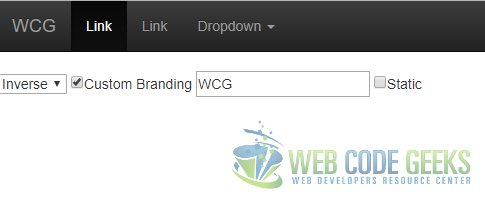
3.3 Custom Branding
To use a custom image or branding text for the navbar we need to place the content in the div decorated with the navbar-header css class.
It looks as below:
3.4 Adding other elements
We can add just about any control we want in the navbar. Some of the frequently used controls and the manner in which they can be included is as follows:
Form
To place a form control we need to decorate it with the navbar-form css class as in the snippet.
<form class="navbar-form">

...

</form>
Button
Any buttons outside of the form control needs to be decorated with the navbar-btn css class as below:
<button class="navbar-btn">
...
</button>
Links
For any regular links appearing in the navigation bar we need to decorate the same with the css class like so:
<a class="navbar-link" href="#">
...
</a>
Text
Free flowing text in paragraphs need to have the navbar-text css class decoration as below:
<p class="navbar-text">

...

</p>
4. Making all of this dynamic
Let’s write some JavaScript in the bootstrap.navbar.js file now to make switching between different options and to be able to switch them on or off without having to reload the page.
The JavaScript basically just switches out the existing css classes with the ones corresponding to the user selection causing the page layout to change dynamically.
First of all we bind to the change event of our select tag which switches the navbar between default and inverse color schemes. Next, we bind to the click event of the checkbox control which controls the switch to any custom brand name we provide and the default one.
bootstrap.navbar.js
$(document).ready(function(){

//Switching between default and inverse modes of a navbar
    $("#navbar-type").on("click",function(event){

        if($(this).val() ==="inverse"){
            $("nav.navbar").removeClass("navbar-default");
            $("nav.navbar").addClass("navbar-inverse");
        }else{
            $("nav.navbar").removeClass("navbar-inverse");
            $("nav.navbar").addClass("navbar-default");
        }
    });

//Using custom branding text provided by user or default one
    $("#custom-branding").on("click",function(event){

        if($(this).is(":checked")){
            $("a.navbar-brand").text($("#custom-brand-name").val());
        }else{
            $("a.navbar-brand").text("Brand");
        }
    });

//Switching between static and fixed mode, also making sure body contents are padded in fixed mode
    $("#navbar-mode").on("click",function(event){

        if($(this).is(":checked")){
            $("nav.navbar").removeClass("navbar-fixed-top");
            $("nav.navbar").addClass("navbar-static-top");
            $(document.body).removeClass("body-style");
        } else{
            $("nav.navbar").removeClass("navbar-static-top");
            $("nav.navbar").addClass("navbar-fixed-top");
            $(document.body).addClass("body-style");
        }
    });
});
index.html
 <!DOCTYPE html>
 <html lang="en">
 <head>
     <meta charset="utf-8">
     <meta http-equiv="X-UA-Compatible" content="IE=edge">
     <meta name="viewport" content="width=device-width, initial-scale=1">
 <!-- The above 3 meta tags *must* come first in the head; any other head content must come *after* these tags -->
     <title>Bootstrap Responsive Navbar Example - Web Code Geeks</title>

<!-- Latest compiled and minified CSS -->
         <link rel="stylesheet" href="/css/bootstrap.min.css">

<!-- Optional theme -->
         <link rel="stylesheet" href="/css/bootstrap-theme.min.css">
         <style>
             .body-style { padding-top: 70px; };
             body { height: 1200px; };
         </style>

<!-- HTML5 shim and Respond.js for IE8 support of HTML5 elements and media queries -->
 <!-- WARNING: Respond.js doesn't work if you view the page via file:// -->
 <!--[if lt IE 9]>
 <script src="https://www.webcodegeeks.com/wp-content/litespeed/localres/aHR0cHM6Ly9vc3MubWF4Y2RuLmNvbS8=html5shiv/3.7.3/html5shiv.min.js"></script>
 <script src="https://www.webcodegeeks.com/wp-content/litespeed/localres/aHR0cHM6Ly9vc3MubWF4Y2RuLmNvbS8=respond/1.4.2/respond.min.js"></script>
 <![endif]-->
 </head>
 <body class="body-style">
 <!--Navbar component from Bootstrap-->
     <nav class="navbar navbar-default navbar-fixed-top">
         <div class="container-fluid">
             <div class="navbar-header">
                 <button type="button" class="navbar-toggle collapsed" data-toggle="collapse" data-target=".navbar-collapse" aria-expanded="false">
                     <span class="sr-only">Toggle</span>
                     <span class="icon-bar"></span>
                     <span class="icon-bar"></span>
                     <span class="icon-bar"></span>
                 </button>
                 <a class="navbar-brand" href="#">B</a>
             </div>
             <div class="collapse navbar-collapse">
                 <ul class="nav navbar-nav">
                     <li class="active"><a href="#">Link <span class="sr-only">
                     (current)</span></a></li>
                     <li><a href="#">Link</a></li>
                     <li class="dropdown">
                         <a href="#" class="dropdown-toggle" data-toggle="dropdown" role="button" aria-haspopup="true" aria-expanded="false">Dropdown <span class="caret"></span></a>
                         <ul class="dropdown-menu">
                             <li><a href="#">Action</a></li>
                             <li><a href="#">Another action</a></li>
                             <li><a href="#">Something else here</a></li>
                             <li role="separator" class="divider"></li>
                             <li><a href="#">Separated link</a></li>
                             <li role="separator" class="divider"></li>
                             <li><a href="#">One more separated link</a></li>
                         </ul>
                     </li>
                 </ul>
             </div>
         </div>
     </nav>

<!--Fields provide customization options for the above displayed Navbar-->
     <select id="navbar-type" >
         <option value="default">Default</option>
         <option value="inverse">Inverse</option>
     </select>
     <input id="custom-branding" type="checkbox">Custom Branding</input>
     <input id="custom-brand-name" type="text" placeholder="Enter custom brand name" />
     <input id="navbar-mode" type="checkbox">Static</input>
     <!-- jQuery (necessary for Bootstrap's JavaScript plugins) -->
 <script src="https://www.webcodegeeks.com/wp-content/litespeed/localres/aHR0cHM6Ly9hamF4Lmdvb2dsZWFwaXMuY29tL2FqYXgvlibs/jquery/1.12.4/jquery.min.js"></script>
 <!-- Include all compiled plugins (below), or include individual files as needed -->
 <!-- Latest compiled and minified JavaScript -->
 <script src="./js/bootstrap.min.js"></script>
 <script src="./js/bootstrap.navbar.js"></script>

 </body>
 </html>
5. Running the code
To run the code in the example you need to run the following two commands in order using a command prompt from the root of the project.
project root>npm install
project root>node index.js
Navigate to http://localhost:8090 in a browser.
6. Download the Source Code
You can download the full source code of this example here : WCG — Bootstrap Responsive Navbar Example
