The aim of this example is to explain and use Bootstrap Tabs. Tabs are used to separate content into different panes where each pane is viewable one at a time. They enable you to add quick, dynamic tab functionality to transition through panes of local content, even via dropdown menus.
Bootstrap uses CSS to style tabs and content inside them and Javascript to switch to the desired tab whenever you click over it. Tabs are a great way to easily navigate to distinct content without having to scroll or switch web pages.
Many websites nowadays use tabs to organize information better and add animations to tabs to have a better user interaction.

1. Project Setup
The following requirements need to be met in order to continue creating tabs with Bootstrap.
1.1 Project Folder Setup
Create a new HTML file, which will be your main one, and make sure you have the following folder structure after downloading Boostrap.
1.2 Main HTML Setup
Bootstrap already provides a base HTML, which contains links and references to all its’ libraries, including a CDN version of jQuery. Your main HTML file should have the following basic syntax inside:
<!DOCTYPE html>
<html lang="en">
  <head>
    <meta charset="utf-8">
    <meta http-equiv="X-UA-Compatible" content="IE=edge">
    <meta name="viewport" content="width=device-width, initial-scale=1">
    <title>Bootstrap Tabs Example</title>

    <!-- Bootstrap -->
    <link href="css/bootstrap.min.css" rel="stylesheet">
  </head>
  <body>

    <!-- jQuery (necessary for Bootstrap's JavaScript plugins) -->
    <script src="https://ajax.googleapis.com/ajax/libs/jquery/1.11.3/jquery.min.js"></script>
    <!-- Include all compiled plugins (below), or include individual files as needed -->
    <script src="js/bootstrap.min.js"></script>
  </body>
</html>
2. The Main Example
The default example is the most important one to consider when using tabs. The markup follows a logic way of organizing code. First the markup for the titles of the tabs are created, together with their respective HTML attributes. Then, tab content is added and one of them is assigned as active to be the first active tab to be shown to the user.
2.1 The Markup
<ul id="myTabs" class="nav nav-tabs" role="tablist">
  <li role="presentation" class="active"><a href="#home" id="home-tab" role="tab" data-toggle="tab" aria-controls="home" aria-expanded="true">Home</a></li>
  <li role="presentation" class=""><a href="#profile" role="tab" id="profile-tab" data-toggle="tab" aria-controls="profile" aria-expanded="false">Profile</a></li>
  <li role="presentation" class="dropdown"> <a href="#" id="myTabDrop1" class="dropdown-toggle" data-toggle="dropdown" aria-controls="myTabDrop1-contents" aria-expanded="false">Dropdown <span class="caret"></span></a>
  <ul class="dropdown-menu" aria-labelledby="myTabDrop1" id="myTabDrop1-contents">
    <li class=""><a href="#dropdown1" role="tab" id="dropdown1-tab" data-toggle="tab" aria-controls="dropdown1" aria-expanded="false">Dropdown1</a></li>
    <li><a href="#dropdown2" role="tab" id="dropdown2-tab" data-toggle="tab" aria-controls="dropdown2" aria-expanded="false">Dropdown2</a></li>
    </ul>
  </li>
</ul>

<div id="myTabContent" class="tab-content">
  <div role="tabpanel" class="tab-pane fade active in" id="home" aria-labelledby="home-tab">
    <p>Raw denim you probably haven't heard of them jean shorts Austin. Nesciunt tofu stumptown aliqua, retro synth master cleanse. Mustache cliche tempor, williamsburg carles vegan helvetica. Reprehenderit butcher retro keffiyeh dreamcatcher synth. Cosby sweater eu banh mi, qui irure terry richardson ex squid. Aliquip placeat salvia cillum iphone. Seitan aliquip quis cardigan american apparel, butcher voluptate nisi qui.</p>
  </div>
  <div role="tabpanel" class="tab-pane fade" id="profile" aria-labelledby="profile-tab">
    <p>Food truck fixie locavore, accusamus mcsweeney's marfa nulla single-origin coffee squid. Exercitation +1 labore velit, blog sartorial PBR leggings next level wes anderson artisan four loko farm-to-table craft beer twee. Qui photo booth letterpress, commodo enim craft beer mlkshk aliquip jean shorts ullamco ad vinyl cillum PBR. Homo nostrud organic, assumenda labore aesthetic magna delectus mollit. Keytar helvetica VHS salvia yr, vero magna velit sapiente labore stumptown.</p>
    </div>
  <div role="tabpanel" class="tab-pane fade" id="dropdown1" aria-labelledby="dropdown1-tab">
    <p>Etsy mixtape wayfarers, ethical wes anderson tofu before they sold out mcsweeney's organic lomo retro fanny pack lo-fi farm-to-table readymade. Messenger bag gentrify pitchfork tattooed craft beer, iphone skateboard locavore carles etsy salvia banksy hoodie helvetica. DIY synth PBR banksy irony. Leggings gentrify squid 8-bit cred pitchfork. Williamsburg banh mi whatever gluten-free, carles pitchfork biodiesel fixie etsy retro mlkshk vice blog. Scenester cred you probably haven't heard of them, vinyl craft beer blog stumptown. Pitchfork sustainable tofu synth chambray yr.</p>
    </div>
  <div role="tabpanel" class="tab-pane fade" id="dropdown2" aria-labelledby="dropdown2-tab">
    <p>Trust fund seitan letterpress, keytar raw denim keffiyeh etsy art party before they sold out master cleanse gluten-free squid scenester freegan cosby sweater. Fanny pack portland seitan DIY, art party locavore wolf cliche high life echo park Austin. Cred vinyl keffiyeh DIY salvia PBR, banh mi before they sold out farm-to-table VHS viral locavore cosby sweater. Lomo wolf viral, mustache readymade thundercats keffiyeh craft beer marfa ethical. Wolf salvia freegan, sartorial keffiyeh echo park vegan.</p>
    </div>
</div>
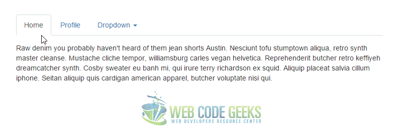
2.2 The Result
Now the tabs are created, and they look like so:
3. Methods & Events
3.1 Methods
$().tab – Activates a tab element and content container. Tab should have either a data-target or an href targeting a container node in the DOM. In the above examples, the tabs are the <a>s with data-toggle="tab" attributes.
.tab('show') – Selects the given tab and shows its associated content. Any other tab that was previously selected becomes unselected and its associated content is hidden. Returns to the caller before the tab pane has actually been shown (i.e. before the shown.bs.tab event occurs).
Example:
$('#someTab').tab('show')
3.2 Events
When showing a new tab, the events fire in the following order:
1. hide.bs.tab (on the current active tab)
2. show.bs.tab (on the to-be-shown tab)
3. hidden.bs.tab (on the previous active tab, the same one as for the hide.bs.tab event)
4. shown.bs.tab (on the newly-active just-shown tab, the same one as for the show.bs.tab event)
If no tab was already active, then the hide.bs.tab and hidden.bs.tab events will not be fired.
show.bs.tab – This event fires on tab show, but before the new tab has been shown. Use event.target and event.relatedTarget to target the active tab and the previous active tab (if available) respectively.
shown.bs.tab – This event fires on tab show after a tab has been shown. Use event.target and event.relatedTarget to target the active tab and the previous active tab (if available) respectively.
hide.bs.tab – This event fires when a new tab is to be shown (and thus the previous active tab is to be hidden). Use event.target and event.relatedTarget to target the current active tab and the new soon-to-be-active tab, respectively.
hide.bs.tab – This event fires after a new tab is shown (and thus the previous active tab is hidden). Use event.target and event.relatedTarget to target the previous active tab and the new active tab, respectively.
Example:
$('a[data-toggle="tab"]').on('shown.bs.tab', function (e) {
  e.target // newly activated tab
  e.relatedTarget // previous active tab
})
4. Conclusion
To conclude, tab based navigations provides an easy and powerful mechanism to handle huge amount of content within a small area through separating content into different panes where each pane is viewable one at a time. The user can quickly access the content through switching between the panes without leaving the page.
5. Download
You can download the full source code of this example here: Bootstrap Tabs
