In this post we will learn about Bootstrap’s Thumbnail component through an example. This component enables us to layout images, videos etc. in a grid layout. A thumbnail is a reduced size version of the original image or video. To enable such layouts Bootstrap provides a set of CSS rules.
The application we will build here will layout images on a page in a grid. To demonstrate different options we will allow the user to select the number of images they would like to see in a row and switch between different values.

1. Tools
We will use the following tools for this example
1. Bootstrap v3.3.7
2. JQuery v1.12.4
3. Node.js v6.3.0
4. Express
5. Visual Studio Code IDE
Bootstrap is a popular framework for building responsive websites in quick time. JQuery library makes it a lot easier for all programmers writing JavaScript for the front-end. This library is also required by Bootstrap to do its job. A supported version needs to included ahead of Bootstrap.
Node.js is basically JavaScript running on the Server as opposed to the browser. We will use Node with Express to build a simple Web-Server that serves our example page and required assets. Visual Studio Code IDE is my personal choice but it is not binding and you can choose an editor that you are comfortable with.
Apart from these, I have borrowed a few images from the folks over at Pexels for use in this article. These images are free for commercial use and do not require any attribution or fee.
2. Project Structure
Let’s get building our example, for starters, here is the layout of the project folders and their purpose:
css
This css files from Bootstrap package reside in this folder. All the css stylesheets created by us would reside here as well.
fonts
All the font files that came with Bootstrap are located in this folder.
js
The Bootstrap JavaScript files are placed here along with the file we will create, namely, bootstrap.thumbnails.js
images
The image files used in this example reside in this folder. I have lent these files for use from Pexelar. They have been shared with the general public under Creative Commons License and thus are free to use even for commercial purpose.
bootstrap.thumbnails.js
This file will hold our JavaScript code that will make our example tick.
index.html
This is the file which holds the HTML markup and is our landing page. All the other files are referenced in this one and they come together in the browser and make things happen.
index.js
Our barebones web server built using Node.js and Express module resides in this file.
3. Approach
To start with, we will leverage the Grid System provided by Bootstrap. This grid system splits the real estate into 12 columns. We will place our thumbnails inside a container. There are several css classes through which we can indicate or control at what screen size we want the content to start stacking. This is enabled through the use of media queries, that detect the screen size of the device, and creating classes specific to each screen size. For reference have a look at the below chart with the various screen sizes and corresponding classes we can use to indicate the point of stacking.

In our example we will load a dozen images onto a page as individual thumbnails. We will place a select at the top to allow us to switch between the number of thumbnails we want in a row. Any changes to this will redo the layout and change according to our choice.
Before we get down to working on this, I would like to say that the example is almost all HTML markup decorated with css classes. The JavaScript and the select box is added for the purpose of enabling changes without having to stop the application, make the changes to the css classes and reload the page.
4. Markup
We will start with the template provided at Bootstrap site building atop it as required. To start off, let’s add a div decorated with the container class and another descendant div decorated with the row class. Inside this div reside all our images as separate thumbnails. The markup to add each image will be the same and as shown below:
<div>
    <a class="thumbnail" href="#">
        <img src="./images/Image_1.jpg" alt=""/>
        <div class="caption">Image 1</div>
    </a>
</div>
What we are doing here is adding columns to our row, we will add 12 instances of this, one after the other, as siblings. Each of these divs’ will be decorated with the Bootstrap css class indicating our choice of layout. These divs’ will hold an a tag decorated with the thumbnail class and attribute href pointing to #. Now, let us add a img tag with src attribute pointing to an image and another div with our custom caption.
One final item is the select tag and its label right at the top in our container div before the row div. This select tag would allow us to switch between various layout options. Now our Html should look like this:
index.html contents
<!DOCTYPE html>
<html lang="en">
<head>
    <meta charset="utf-8">
    <meta http-equiv="X-UA-Compatible" content="IE=edge">
    <meta name="viewport" content="width=device-width, initial-scale=1">
<!-- The above 3 meta tags *must* come first in the head; any other head content must come *after* these tags -->
    <title>Bootstrap Calendar Example - Web Code Geeks</title>

<!-- Latest compiled and minified CSS -->
    <link rel="stylesheet" href="/css/bootstrap.min.css">

<!-- Optional theme -->
    <link rel="stylesheet" href="/css/bootstrap-theme.min.css">

<!-- HTML5 shim and Respond.js for IE8 support of HTML5 elements and media queries -->
<!-- WARNING: Respond.js doesn't work if you view the page via file:// -->
<!--[if lt IE 9]>
<script src="https://oss.maxcdn.com/html5shiv/3.7.3/html5shiv.min.js"></script>
<script src="https://oss.maxcdn.com/respond/1.4.2/respond.min.js"></script>
<![endif]-->
</head>
<body>
    <div class="panel panel-info"><div class="panel-heading">WebCodeGeeks -- Bootstrap Thumbnails
    Example</div>
    <div class="panel-body">
        <label for="imgCount">Select the number of images per row</label>
        <select id="imgCount"></select>
        <div class="container-fluid">
            <div class="row">
                <div>
                    <a class="thumbnail" href="#">
                        <img src="./images/Image_1.jpg" alt=""/>
                        <div class="caption">Image 1</div>
                    </a>
                </div>
                <div>
                    <a class="thumbnail" href="#">
                        <img src="./images/Image_2.jpg" alt=""/>
                        <div class="caption">Image 2</div>
                    </a>
                </div>
...


                <div>
                    <a class="thumbnail" href="#">
                        <img src="./images/Image_11.jpeg" alt=""/>
                        <div class="caption">Image 11</div>
                    </a>
                </div>

                <div>
                    <a class="thumbnail" href="#">
                        <img src="./images/Image_12.jpeg" alt=""/>
                        <div class="caption">Image 12</div>
                    </a>
                </div>

            </div>
        </div>
    </div>
    </div>
<!-- jQuery (necessary for Bootstrap's JavaScript plugins) -->
    <script src="https://ajax.googleapis.com/ajax/libs/jquery/1.12.4/jquery.min.js"></script>
<!-- Include all compiled plugins (below), or include individual files as needed -->
<!-- Latest compiled and minified JavaScript -->
    <script src="./js/bootstrap.min.js"></script>
    <script src="./js/bootstrap.thumbnails.js"></script>

</body>
</html>
5. JavaScript
We will write our JavaScript in the file named bootstrap.thumbnails.js that is placed in the js folder. In the document ready callback of JQuery we populate the select list, we placed at the top of the thumbnails, with valid values. We need to bear in mind that the sum of columns occupied needs to be exactly 12 and each column has to be of equal width here for our desired layout.
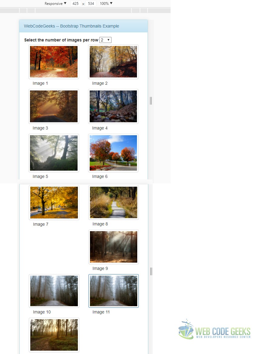
Initially, we decorate each of our thumbnail with the proper css class based on the screen size so that all images appear in a stacked fashion. The user can increase the number of images to be accommodated in each row by selecting a value in the dropdown select. The layout with 2 images in a row on all screen sizes would look as below:
6. Clearing Fixes
I know, I know I saw it too. In fact it was deliberate on my part to use this screenshot with the glaring issue. In case you did not notice there is an issue with the row 5, the Image 9 seems to have drifted away. Well this is a known issue when your content is of uneven size. In our case the images are not exactly the same size giving rise to this issue. But since Bootstrap folks already know about it, they do provide a solution for such situations. Let us take a look at how to use the clearfix class to fix this issue with the layout.
We have to place a div between the 8th and 9th image and decorate it with the clearfix class along with visible-* for all the screen sizes we encounter problems with. In our case I checked all the screen sizes and the problem is their with all of them so we will use a div like
<div class="clearfix visible-sm visible-md visible-xs visible-lg" ></div>
to fix the issues at all of them. To check how the layout looks at different screen sizes, I am using the developer tools in Google Chrome to switch from a 4k screen size to smaller Mobile screen sizes.
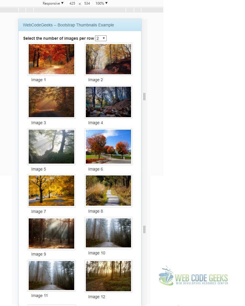
After placing the div with the clearfix class between the 8th and 9th image we also need to place it between the 10th and 11th image since the same issue arises with those two as well. Please note that the location of the clearfix divs would vary depending upon the value selected in the dropdown above, which here is 2. If you go with a 3 or 4 thumbnails per row layout the fix remains the same but the location of clearfix divs will vary.
Now our completed layout should look all fixed and ready like below:
7. Running the code
To run this project after download you need to run the following two commands at the root of the project.
npm install
node index.js
This wraps up the example of using Bootstrap Thumbnails Component.
8. Download the Source Code
You can download the full source code of this example here: Bootstrap Thumbnails Example
