In this example we’re going through Bootstrap tooltips. The tooltip or infotip or a hint is a common graphical user interface element. It is used in conjunction with a cursor, usually a pointer. The user hovers the pointer over an item, without clicking it, and a tooltip may appear—a small “hover box” with information about the item being hovered over.
In other words, a tooltip is a message which appears when a cursor is positioned over an icon, image, hyperlink, or other element in a graphical user interface. Tooltips do not usually appear on mobile operating systems, because there is no cursor. Bootstrap has quite good support of tooltips and makes them available to everyone to use such styled and animated elements.
1. Project Setup
The following requirements need to be met in order to continue adding tooltips with Bootstrap.
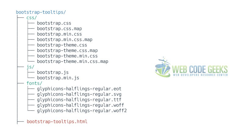
1.1 Project Folder Setup
Create a new HTML file, which will be your main one, and make sure you have the following folder structure after downloading Boostrap.
1.2 Main HTML Setup
Bootstrap already provides a base HTML, which contains links and references to all its’ libraries, including a CDN version of jQuery. Your main HTML file should have the following basic syntax inside:
<!DOCTYPE html>
<html lang="en">
  <head>
    <meta charset="utf-8">
    <meta http-equiv="X-UA-Compatible" content="IE=edge">
    <meta name="viewport" content="width=device-width, initial-scale=1">
    <title>Bootstrap Tooltip Example</title>

    <!-- Bootstrap -->
    <link href="css/bootstrap.min.css" rel="stylesheet">
  </head>
  <body>

    <!-- jQuery (necessary for Bootstrap's JavaScript plugins) -->
    <script src="https://ajax.googleapis.com/ajax/libs/jquery/1.11.3/jquery.min.js"></script>
    <!-- Include all compiled plugins (below), or include individual files as needed -->
    <script src="js/bootstrap.min.js"></script>
  </body>
</html>
2. Usage & Examples
In order to use a tooltip in HTML, it must be initialized in Javascript. For performance reasons, the Tooltip and Popover data-apis are opt-in, meaning you must initialize them yourself. One way to initialize all tooltips on a page would be to select them by their data-toggle attribute:
$(function () {
  $('[data-toggle="tooltip"]').tooltip()
})
In general, the tooltip plugin generates content and markup on demand, and by default places tooltips after their trigger element. A more general way to initialize tooltips is the following:
$('#example').tooltip(options)
2.1 Tooltips on Links
Wouldn’t it be great to have some extra information for bits of text (words) or links? This is how you do it in a link:
<a href="#" data-toggle="tooltip" title="" data-original-title="Link Tooltip">Link</a>
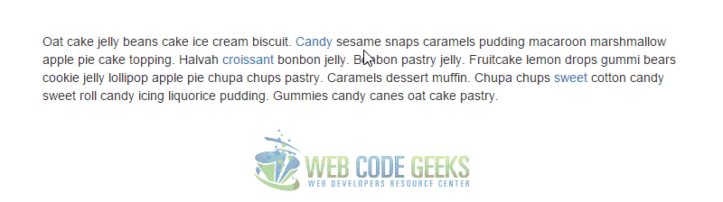
In a more real-world scenario, where a paragraph could have tooltips, we’d have for example:
<div class="myText">
    <p>Oat cake jelly beans cake ice cream biscuit.
    <a href="#" data-toggle="tooltip" title="" data-original-title="Here's a Candy Tooltip">Candy</a>
    sesame snaps caramels pudding macaroon marshmallow apple pie cake topping. Halvah
    <a href="#" data-toggle="tooltip" title="" data-original-title="Whoa! A Croissant Tooltip">croissant</a>
    bonbon jelly. Bonbon pastry jelly. Fruitcake lemon drops gummi bears cookie jelly lollipop apple pie chupa chups pastry. Caramels dessert muffin. Chupa chups
    <a href="#" data-toggle="tooltip" title="" data-original-title="Another Sweet Tooltip">sweet</a>
    cotton candy sweet roll candy icing liquorice pudding. Gummies candy canes oat cake pastry.</p>
    </div>
Don’t forget to initialize the tooltip like we did in the section above, otherwise no tooltip will appear.
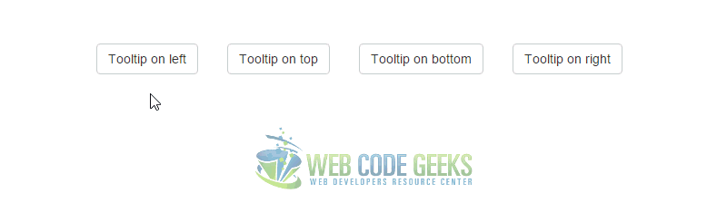
2.2 Tooltips on Buttons
Not only can we also set tooltips on buttons, but also place them in a different direction, rather than the random top position. We can do so using the data-placement attribute inline along with the other tooltip attributes, like so:
<button type="button" class="btn btn-default" data-toggle="tooltip" data-placement="left" title="Tooltip on left">Tooltip on left</button>
<button type="button" class="btn btn-default" data-toggle="tooltip" data-placement="top" title="Tooltip on top">Tooltip on top</button>
<button type="button" class="btn btn-default" data-toggle="tooltip" data-placement="bottom" title="Tooltip on bottom">Tooltip on bottom</button>
<button type="button" class="btn btn-default" data-toggle="tooltip" data-placement="right" title="Tooltip on right">Tooltip on right</button>
Now you’d see tooltips on all sides of a button:
3. Options
Options can be passed via data attributes or JavaScript. For data attributes, append the option name to data-*.
3.1 animation
Type: boolean
Default: true
Description: Apply a CSS fade transition to the tooltip
3.2 container
Type: string
Default: false
Description: Appends the tooltip to a specific element. Example: container: 'body'. This option is particularly useful in that it allows you to position the tooltip in the flow of the document near the triggering element – which will prevent the tooltip from floating away from the triggering element during a window resize.
3.3 delay
Type: number/object
Default: 0
Description: Delay showing and hiding the tooltip (ms) – does not apply to manual trigger type. If a number is supplied, delay is applied to both hide/show. Object structure is: delay: { "show": 500, "hide": 100 }
3.4 html
Type: boolean
Default: false
Description: Insert HTML into the tooltip. If false, jQuery’s text method will be used to insert content into the DOM. Use text if you’re worried about XSS attacks.
3.5 placement
Type: string/function
Default: “top”
Description: How to position the tooltip – top | bottom | left | right | auto.
When “auto” is specified, it will dynamically reorient the tooltip. For example, if placement is “auto left”, the tooltip will display to the left when possible, otherwise it will display right.
3.5 selector
Type: string
Default: false
Description: If a selector is provided, tooltip objects will be delegated to the specified targets. In practice, this is used to enable dynamic HTML content to have tooltips added. See this and an informative example.
3.7 title
Type: string/function
Default: ”
Description: Default title value if title attribute isn’t present. If a function is given, it will be called with its this reference set to the element that the tooltip is attached to.
3.8 trigger
Type: string
Default: ‘hover focus’
Description: How tooltip is triggered – click | hover | focus | manual. You may pass multiple triggers; separate them with a space. manual cannot be combined with any other trigger.
4. Methods
Additionally, you can add methods to the tooltip in javascript.
4.1 .tooltip(‘show’)
Reveals an element’s tooltip. Returns to the caller before the tooltip has actually been shown (i.e. before the shown.bs.tooltip event occurs). This is considered a “manual” triggering of the tooltip. Tooltips with zero-length titles are never displayed.
$('#element').tooltip('show')4.2 .tooltip(‘hide’)
Hides an element’s tooltip. Returns to the caller before the tooltip has actually been hidden (i.e. before the hidden.bs.tooltip event occurs). This is considered a “manual” triggering of the tooltip.
$('#element').tooltip('hide')4.3 .tooltip(‘toggle’)
Toggles an element’s tooltip. Returns to the caller before the tooltip has actually been shown or hidden (i.e. before the shown.bs.tooltip or hidden.bs.tooltip event occurs). This is considered a “manual” triggering of the tooltip.
$('#element').tooltip('toggle')4.4 .tooltip(‘destroy’)
Hides and destroys an element’s tooltip. Tooltips that use delegation (which are created using the selector option) cannot be individually destroyed on descendant trigger elements.
$('#element').tooltip('destroy')5. Events
The following events can be considered using with the tooltip:
1. show.bs.tooltip – This event fires immediately when the show instance method is called.
2. shown.bs.tooltip – This event is fired when the tooltip has been made visible to the user.
3. hide.bs.tooltip – This event is fired immediately when the hide instance method has been called.
4. hidden.bs.tooltip – This event is fired when the tooltip has finished being hidden from the user (will wait for CSS transitions to complete).
5. inserted.bs.tooltip – This event is fired after the show.bs.tooltip event when the tooltip template has been added to the DOM.
For example:
$('#myOwnTooltip').on('inserted.bs.tooltip', function () {
  // do something…
})
6. Conclusion
To conclude, tooltips are a simple and nice way to add extra information to a link, button etc. Inspired by the excellent jQuery.tipsy plugin, tooltips are an updated version, which don’t rely on images, use CSS3 for animations, and data-attributes for local title storage. Tooltips with zero-length titles are never displayed.
7. Download
You can download the full source code of this example here: Bootstrap Tooltip

Hello,
In proposing books to share in this page and the similar pages; if one is already subscribed but enters his/her email and clicks sign up button a message appears below the relevant frame informing about his/her being already signed up. So far so good! However; the message font is small and in red.
Please see if it might appear in a more prominent way as in bolder/larger letters or some hovering dissolved frame on top of the main frame.
Thank you for your cooperation and,
Sincerely,
B. Ghassemie