The aim of this tutorial is to get you up and running with Twitter Bootstrap framework quickly. Twitter Bootstrap has soared in popularity over the years and continues to be the go-to resource for front-end development. Let us explore the most common and frequently used components, features and css classes of this framework to get you up to speed.
We will also look at responsive web design and the fluid grid layout of Bootstrap.
Table of Content
1. Introduction
Bootstrap is a popular framework for developing responsive, mobile first front ends for web applications and websites. It owes its popularity in part to the speed of development possible when using Bootstrap. But the critical aspects are responsiveness and mobile first approach. Let us discuss each of these two terms and what is implied by them.
1.1 Responsive Design
A responsive UI is, one that is, able to detect the user’s screen size & device orientation and adjust the layout of UI elements accordingly. To enable this, Bootstrap uses media queries. A media query is a CSS3 technique for applying a block of css rules if a condition is true.
1.2 Grid Layout
The grid system applied by Bootstrap divides the layout into a grid with 12 columns in each row. We place our content in the columns of each row. As the screen width decreases so does the width of each column, till user specified breakpoint is reached and then the content starts to stack.
1.3 Tools
The tools used while working on this demo application are the followings:
1. Bootstrap v3.3.7
2. JQuery v1.12.4
3. Node.js v6.3.0
4. Express
5. Visual Studio Code IDE
2. Grid Layout System
Let us see, through an example, how the fluid grid layout system of Bootstrap works. A clear understanding of the same will help us leverage it in any project.
To create a grid layout we need to use the css classes .container, .row, .col-screen size-number of columns and place our contents in the cells. So our basic grid would look like the below snippet:
<div class="container">
    <div class="row">
        <div class="col-md-3"></div>
...

    </div>
</div>
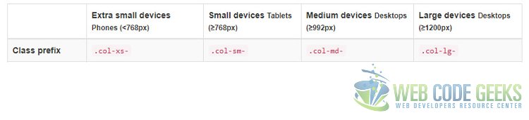
In the grid created above, our content shall rest in one of div decorated with col-*-* classes. Take a close look at the css class on the innermost div, it has 3 components in its css class name. First implies that it is a column and the next md implies the break point or in other words at any screen size below md this column can be stacked. The third component “3” tells bootstrap that this column would span across 3 columns of the layout grid. One thing to note here, is that the sum of the number on all columns in a row must add up to 12, otherwise things can get awry leading to unexpected results. Lastly the below figure gives us an overview of the breakpoints used for the Fluid Grid Layout of Bootstrap.
3. CSS Classes
The Bootstrap CSS library boasts of a large set of css classes to enable us to create impressive UIs really quickly. Let us take a look at some of the most used ones quickly. These classes can be classified into the following categories pointing to their purpose and intended use.
3.1 Typography & Code CSS Classes
By typography we mean the visual aspect or the display style of written words. These classes do not alter the content itself but provide assistance and options to manipulate their visual rendering. Classes for Html headers from h1...h6 are available which match text size yet the content itself appears inline. The font size is set to 14px which is the default for the body. There are classes for showing text as deleted, strikethrough, inserted, underlined, capitalized, lowercase or uppercase, left-aligned, right-aligned, justified, without wrapping or marked style. A summary of these classes and their effects is displayed in the images below:

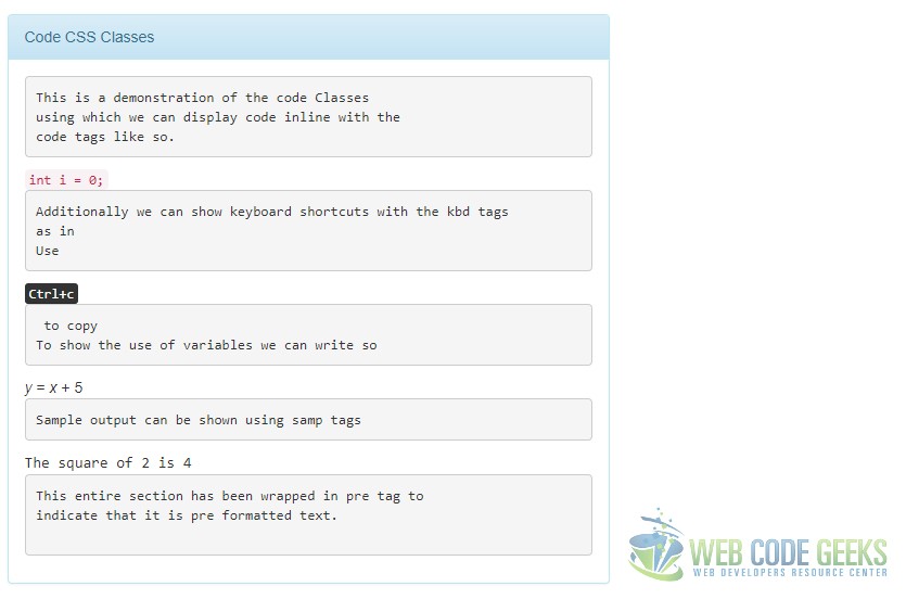
Classes are available and allow us to display text as computer program snippets or keyboard shortcuts. A summary of such classes is provided in the screenshot below:
The Html markup for the above looks like below:
index.html
...
<div class="container">
    <div class="row">
        <div class="col-md-6">
            <div class="panel panel-info">
                <div class="panel-heading">
                    Heading Classes
                </div>
                <div class="panel-body">
                    <div class="h1">h1 Heading</div>
                    <div class="h2">h2 Heading</div>
                    <div class="h3">h3 Heading</div>
                    <div class="h4">h4 Heading</div>
                    <div class="h5">h5 Heading</div>
                    <div class="h6">h6 Heading</div>
                </div>
            </div>
    </div>
    <div class="col-md-6">
        <div class="panel panel-info">
            <div class="panel-heading">More Typography Classes</div>
            <div class="panel-body">
                <div class="container">
                    <div class="row">
                        This is a <mark>marked</mark> text.
                    </div>
                    <div class="row">
                        This text appears <del>deleted</del>.
                    </div>
                    <div class="row">
                        This is a <sk>strikethrough</s> text.
                    </div>
                    <div class="row">
                        This is a <ins>inserted</ins> text.
                    </div>
                    <div class="row">
                        This is <u>underlined</u> text.
                    </div>
                    <div class="row">
                        This is a <small>small</small> text.
                    </div>
                    <div class="row">
                        This is <em>italic</em> text.
                    </div>
                    <div class="row">
                        This is <strong>bold</strong> text.
                    </div>
                    <div class="row">
                        <p class="text-uppercase">This is effect of .text-upperclass class</p>
                    </div>
                    <div class="row">
                        <p class="text-lowercase">This is effect of .text-lowercase class</p>
                    </div>
                    <div class="row">
                        <p class="text-capitalize">This is how .text-capitalize works</p>
                    </div>
                </div>
            </div>
        </div>
    </div>
</div>
<div class="row">
    <div class="col-md-6">
        <div class="panel panel-info">
            <div class="panel-heading">More Typography Classes</div>
                <div class="panel-body">

                    <p class="text-left">This is the effect of .text-left class</p>

                    <p class="text-right"> This is the effect of .text-right class</p>

                    <p class="text-center">This is the effect of .text-center class</p>

                    <p class="text-justify">This is the effect of .text-justify class</p>

                    <p class="text-nowrap">This is the effect of .text-nowrap Class</p>

                </div>
            </div>
        </div>
        <div class="col-md-6">
            <div class="panel panel-info">
                <div class="panel-heading">More Typography Classes</div>
                    <div class="panel-body">
                        <abbr title="Ordered Lists">Lists Ord.</abbr>
                        <ul>
                            <li>One</li>
                            <li>Two</li>
                            <li>Three</li>
                        </ul>
                        <abbr title="Unordered Lists">Lists Un.</abbr>
                        <ol>
                            <li>One</li>
                            <li>Two</li>
                            <li>Three</li>
                        </ol>
                    </div>
                </div>
            </div>
        </div>
        <div class="row">
            <div class="col-md-6">
                <div class="panel panel-info">
                     <div class="panel-heading">Code CSS Classes</div>
                     <div class="panel-body">
<pre>
This is a demonstration of the code Classes
using which we can display code inline with the
code tags like so.</pre>
<code>int i = 0;</code>
<pre>
Additionally we can show keyboard shortcuts with the kbd tags
as in
Use </pre><kbd>Ctrl+c</kbd><pre> to copy
To show the use of variables we can write so</pre>
<var>y</var> = <var>x</var> + 5
<pre>Sample output can be shown using samp tags</pre>
<samp>The square of 2 is 4</samp>
<pre>This entire section has been wrapped in pre tag to
indicate that it is pre formatted text.
</pre>
            </div>
        </div>
    </div>
</div>
...
3.2 Html widgets
Bootstrap provides a whole host of stylized versions of the simple Table, Form, Button, Image tags in Html.
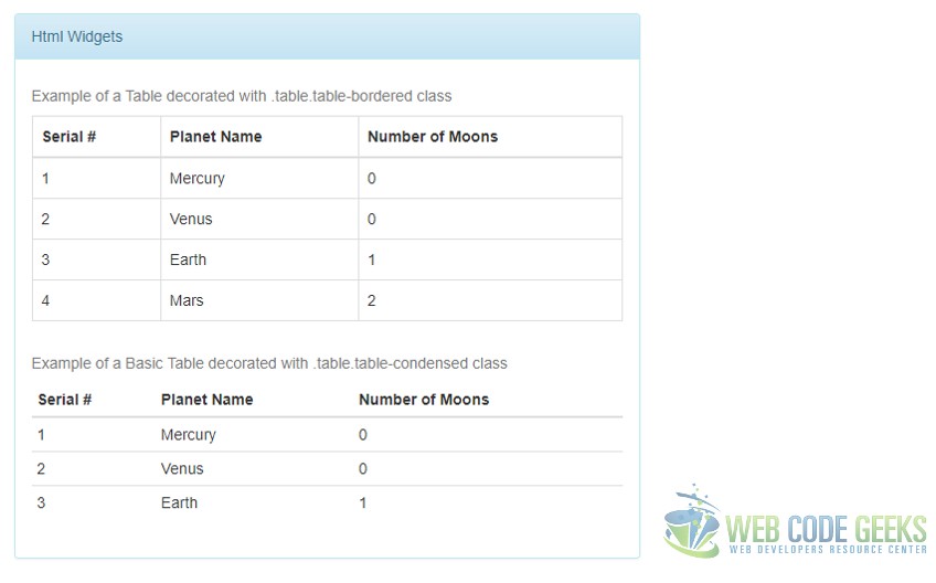
The below screenshot demonstrates these tags and the possibilities that Bootstrap can make happen with very little effort. The first couple of Screenshots demonstrate the different table styles including Simple, Striped, Bordered, Condensed using classes .table, .table.table-striped, .table.table-bordered, .table.table-condensed respectively.

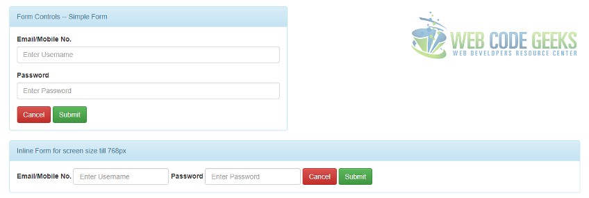
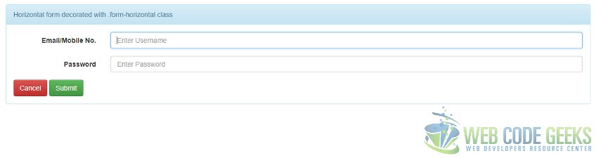
We can leverage the Forms classes to layout forms and their controls in various fashion as per our need. Some examples of how the .form, .form-inline, .form-horizontal CSS classes for forms and .form-group, .form-control CSS classes for contained controls work is displayed in the screenshots below:
The Html markup for the above looks as below:
index.html
...
<div class="col-md-6">
    <div class="panel panel-info">
        <div class="panel-heading">Html Widgets
        </div>
        <div class="panel-body">

            <table class="table">
                <caption>Example of a Basic Table decorated with .table class</caption>
                <thead>
                    <tr><th>Serial #</th>
<th>Planet Name</th><th>Number of Moons</th></tr>
                </thead>
                <tbody>
                    <tr><td>1</td><td>Mercury</td><td>0</td></tr>
                    <tr><td>2</td><td>Venus</td><td>0</td></tr>
                    <tr><td>3</td><td>Earth</td><td>1</td></tr>
                    <tr><td>4</td><td>Mars</td><td>2</td></tr>
                </tbody>
            </table>
            <table class="table table-striped">
                <caption>Example of a Basic Table decorated with .table.table-striped class</caption>
                <thead>
                    <tr><th>Serial #</th>
<th>Planet Name</th><th>Number of Moons</th></tr>
                </thead>
                <tbody>
                    <tr><td>1</td><td>Mercury</td><td>0</td></tr>
                    <tr><td>2</td><td>Venus</td><td>0</td></tr>
                    <tr><td>3</td><td>Earth</td><td>1</td></tr>

                </tbody>
            </table>
        </div>
    </div>
</div>
<div class="row">
    <div class="col-md-6">
        <div class="panel panel-info">
            <div class="panel-heading">Html Widgets
        </div>
        <div class="panel-body">

            <table class="table table-bordered">
                <caption>Example of a Table decorated with .table.table-bordered class</caption>
                <thead>
                    <tr><th>Serial #</th>
<th>Planet Name</th><th>Number of Moons</th></tr>
                </thead>
                <tbody>
                    <tr><td>1</td><td>Mercury</td><td>0</td></tr>
                    <tr><td>2</td><td>Venus</td><td>0</td></tr>
                    <tr><td>3</td><td>Earth</td><td>1</td></tr>
                    <tr><td>4</td><td>Mars</td><td>2</td></tr>
                </tbody>
            </table>
            <table class="table table-condensed">
                <caption>Example of a Basic Table decorated with .table.table-condensed class</caption>
                <thead>
                    <tr><th>Serial #</th>
<th>Planet Name</th><th>Number of Moons</th></tr>
                </thead>
                <tbody>
                    <tr><td>1</td><td>Mercury</td><td>0</td></tr>
                    <tr><td>2</td><td>Venus</td><td>0</td></tr>
                    <tr><td>3</td><td>Earth</td><td>1</td></tr>

                </tbody>
            </table>
        </div>
    </div>
</div>
<div class="col-md-6">
    <div class="panel panel-info">
        <div class="panel-heading">Form Controls -- Simple Form
    </div>
    <div class="panel-body">
        <form class="form">
            <div class="form-group">
                <label for="username">Email/Mobile No.</label>
                <input type="text" class="form-control" id="username" placeholder="Enter Username" />
            </div>
            <div class="form-group">
                <label for="password">Password</label>
                <input type="password" class="form-control" id="password" placeholder="Enter Password" />
            </div>
            <button class="btn btn-danger">Cancel</button>
            <input class="btn btn-success" type="submit" value="Submit" />


        </form>
    </div>
</div>
</div>
</div>
<div class="row">
    <div class="col-md-12">
        <div class="panel panel-info">
            <div class="panel-heading">Inline Form for screen size till 768px</div>
            <div class="panel-body">
                <form class="form-inline">
                    <div class="form-group">
                        <label for="username">Email/Mobile No.</label>
                        <input type="text" class="form-control" id="username" placeholder="Enter Username" />
                        <label for="password">Password</label>
                        <input type="password" class="form-control" id="password" placeholder="Enter Password" />
                    </div>
                    <button class="btn btn-danger">Cancel</button>
                    <input class="btn btn-success" type="submit" value="Submit" />


                 </form>
             </div>
         </div>
</div>
<div class="row">
    <div class="col-md-12">
        <div class="panel panel-info">
            <div class="panel-heading">Horizontal form decorated with .form-horizontal class
        </div>
        <div class="panel-body">
            <form class="form-horizontal">
                <div class="form-group">
                    <label for="username" class="control-label col-sm-2">Email/Mobile No.</label>
                    <div class="col-sm-10">
                        <input type="text" class="form-control" id="username" placeholder="Enter Username" />
                    </div>
                </div>
                <div class="form-group">
                    <label for="password" class="control-label col-sm-2">Password</label>
                        <div class="col-sm-10">
                            <input type="password" class="form-control" id="password" placeholder="Enter Password" />
                        </div>
                    </div>
                    <button class="btn btn-danger">Cancel</button>
                    <input class="btn btn-success" type="submit" value="Submit" />


                </form>
            </div>
        </div>
    </div>
</div>
...
3.3 Helper & Utility Classes
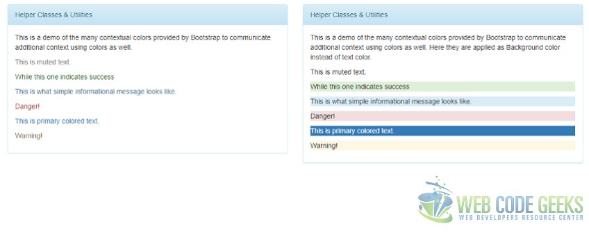
Bootstrap provides quite a few CSS classes that help with displaying text in different colors to indicate the context of the text like if it is a warning message or just information that needs attention etc. Not only this, there are classes to color the entire background with contextual colors, as they are called. Then there are classes to fix issues with the grid layout system or to customize it further, like classes to pull or push columns by a few places. These classes are demonstrated in the screenshots below.
The Html markup for the above is a follows:
index.html
...
<div class="col-md-6">
    <div class="panel panel-info">
        <div class="panel-heading">
            Helper Classes & Utilities
        </div>
        <div class="panel-body">
            <p>This is a demo of the many contextual colors
            provided by Bootstrap to communicate additional
            context using colors as well.
            </p>
            <p class="text-muted">This is muted text.</p>
            <p class="text-success">While this one indicates success</p>
            <p class="text-info">This is what simple informational message looks like.</p>
            <p class="text-danger">Danger!</p>
            <p class="text-primary">This is primary colored text.</p>
            <p class="text-warning">Warning!</p>
        </div>
    </div>
</div>
<div class="col-md-6">
    <div class="panel panel-info">
        <div class="panel-heading">
            Helper Classes & Utilities
        </div>
        <div class="panel-body">
            <p>This is a demo of the many contextual colors
            provided by Bootstrap to communicate additional
            context using colors as well. Here they are applied as
            Background color instead of text color.
            </p>
            <p class="bg-muted">This is muted text.</p>
            <p class="bg-success">While this one indicates success</p>
            <p class="bg-info">This is what simple informational message looks like.</p>
            <p class="bg-danger">Danger!</p>
            <p class="bg-primary">This is primary colored text.</p>
            <p class="bg-warning">Warning!</p>
        </div>
    </div>
</div>
...
Apart from Helper classes there are certain Utility classes that help with turn visibility on or off for content at specific screen sizes. This is the reason they are referred to as Responsive Utilities since they have to do with the screen or viewport size. For example, to ensure an element is only visible on Tablets we can use the following CSS Class.
visible-sm-*
Similarly, we can ensure an element is always hidden on Mobile device by decorating with the following CSS Class.
hidden-xs
4. Components
Bootstrap provides quite a few components for immediate use. Let us see these components, namely Glyphicons, Dropdowns, Nav, Breadcrumbs, Pagination, Jumbotrons and others in action.
There are a couple of hundred or more glyphs available for free usage with Bootstrap. We need to decorate a span tag with the appropriate CSS Class to use them. For example to use the cloud glyph we need to use the following markup:
...
<span class="glyphicon glyphicon-cloud" aria-hidden="true"></span>
...
Moving on to the next component, namely Dropdowns, we can build one using a div decorated with dropdown class. This div contains the list of options enclosed in an unordered list. The final markup ought to look like:
Component.html
...
<div class="dropdown">
    <button class="btn btn-default dropdown-toggle" type="button" id="ddMenu" data-toggle="dropdown" aria-haspopup="true" aria-expanded="true">
        Dropdown
        <span class="caret"></span>
    </button>
    <ul class="dropdown-menu" aria-labelledby="ddMenu">
        <li><a href="#">First Action</a></li>
        <li><a href="#">Second Action</a></li>
        <li role="separator" class="divider"></li>
        <li><a href="#">Separator above this one</a></li>
    </ul>
</div>
...
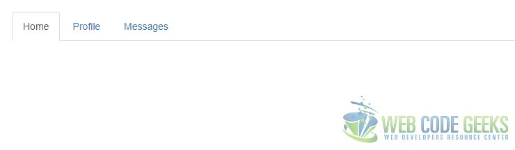
Navigation bars are an absolute must on every sites with multiple pages or even SPAs. Bootstrap has a CSS class nav that provide us a really flexible navigation bar option. The image below shows a tabbed nav in action.
The Html markup to create the above is as simple as below:
Component.html
...

    <ul class="nav nav-tabs">
        <li role="presentation" class="active"><a href="#">Home</a></li>
        <li role="presentation"><a href="#">Nav-pills</a></li>
        <li role="presentation"><a href="#">Navbar</a></li>
    </ul>

...
Another option with navs is the nav-pills which looks as below:
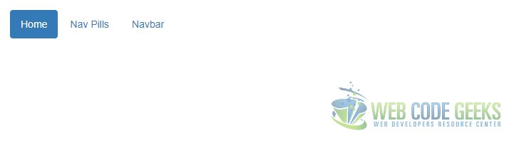
The Html markup for the same is provided below:
Component.html
...
<ul class="nav nav-pills">
    <li role="presentation" class="active"><a href="#">Home</a></li>
    <li role="presentation"><a href="#">Nav Pills</a></li>
    <li role="presentation"><a href="#">Navbar</a></li>
</ul>
...
There are many options and possibilities with nav class. Now let us take a look at the Breadcrumbs component which is basically a compass for the user as they navigate around a site to know exactly where they are within the site and the path taken to reach where they are and allow them to navigate back if they so choose.
The Screenshot below shows a demo of the Breadcrumbs component from Bootstrap:
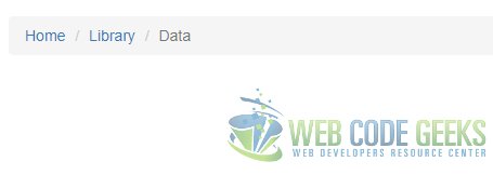
Html markup for the above is as below:
Component.html
<ol class="breadcrumb">
    <li><a href="#">Home</a></li>
    <li><a href="#">Library</a></li>
    <li class="active">Data</li>
</ol>
The Pagination component comes in handy when we need to split up the information to show across multiple pages, for example in case of search results. The screenshot below shows the pagination component in action.
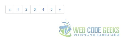
Html markup for above is simple and looks like below:
Component.html
...
<ul class="pagination">
<li>
<a href="#" aria-label="Previous">
<span aria-hidden="true">«</span>
</a>
</li>
<li><a href="#">1</a></li>
<li><a href="#">2</a></li>
<li><a href="#">3</a></li>
<li><a href="#">4</a></li>
<li><a href="#">5</a></li>
<li>
<a href="#" aria-label="Next">
<span aria-hidden="true">»</span>
</a>
</li>
</ul>
Jumbotron Component as the name suggests is used to highlight key information about the web page across the top of the page. It looks as follows:
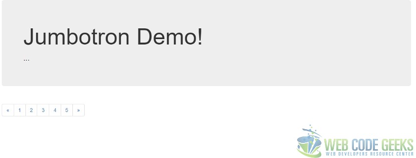
The Html markup for a Jumbotron is as follows:
Component.html
<div class="jumbotron">
    <h1>Jumbotron Demo!</h1>
    <p>...</p>
</div>
Run the project using following command at the root of the project:
npm install
node index.js
5. Download the source code
This was a tutorial on how to learn Twitter Bootstrap Quickly.
You can download the full source code of this example here: WCG — Tutorial Learn Bootstrap Quickly
