The bootstrap templates are a set of CSS and Javascript files. These files customize the pre-define components provided by the bootstrap framework. In this example I am going to show you how can you use it to your own projects.
In this example we will use:
- Creative theme (based on Bootstrap v3.3.6
1. Get a template
You need to search a little bit on internet to find a good bootstrap free template because almost all required a payment.
You can try on google searching “bootstrap free template”, “bootstrap free theme”. Be careful because sometimes the pages mix the free with the payment templates.
You can check out this pages where the templates are free:
In every page you will find a preview where we will show all the components that we can use.
I choose Creative theme, it’s a github template created by David Miller; please support the project if you found any issue add it to the issues page.

1.1 Download and unzip
After you download the template, you should unzip it and make sure that the structure looks like this:
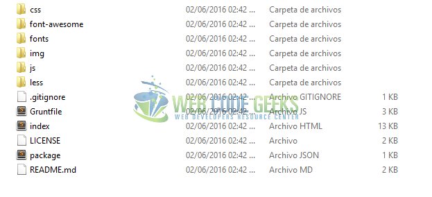
This template has the css and javacript bootstrap files on the corresponding folders. You do not need to worry about it.
You may skip identify the structure and jump directly to beginning of the example below.
2. Identify and customize
When you choose a template it’s so important that you can identify all the page structure and the elements inside.
In this case I’m going to indicate the structure that I identified and how to costumize it.
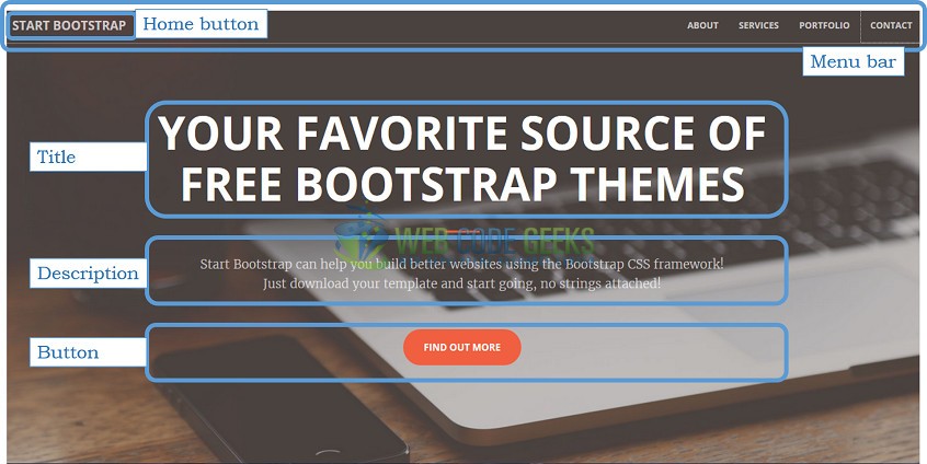
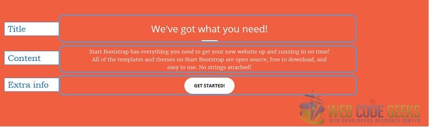
2.1 Home
The home page contains:
- The principal menu which is fixed to the screen, that means that you can see it across all the navigation; The menu has the link to the other sections of the page and the home button.
- Space content, title, description and extra information or link content.
The first thing that we are going to do is to change the picture on the home page, and then we need to find where the picture is set.
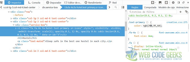
If you don’t know which CSS rules are applying to a specific component, do a right click on it and select “inspect element”. It shows a panel where you specify all the rules and the corresponding file and line. I selected the header component and find the image link.
On the image below, we see the header component selected, the line of CSS rule and the link image.
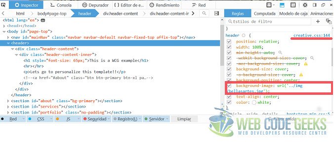
To change the image you can delete the actual, and paste a new one with the same name and extension or add the new image and edit the rule; I prefer the second one.
I added the bellasrtes.jpg image to \startbootstrap-creative-1.0.4\img\ and edit the creative.css file which looks like this:
header{
position: relative;
width: 100%;
min-height: auto;
-webkit-background-size: cover;
-moz-background-size: cover;
background-size: cover;
-o-background-size: cover;
background-position: center;
background-image: url('../img/bellasartes.jpg');
text-align: center;
color: white;
}
I recommend to you to add the pictures in the same size like the originals because this was already tested.
To modify the home button, you need to find the “a” tag with the “href” sets with “·page-top”
<a class="navbar-brand page-scroll" href="#page-top">Home</a>
The menu links are inside of “ul” element, you can change the text or the reference as you want. This part of the HTML looks like this:
<ul class="nav navbar-nav navbar-right">
<li><a class="page-scroll" href="#about">About us</a></li>
<li><a class="page-scroll" href="#services">Services</a></li>
<li><a class="page-scroll" href="#portfolio">Gallery</a></li>
<li><a class="page-scroll" href="#contact">Contact</a></li>
</ul>
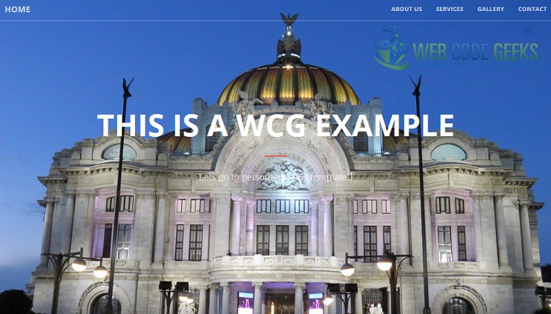
The title and the description on the home page is inside div with class set to “header-content” you can modify it as you want; I think the button on the main page isn’t useful. Next I put these code inside comments, you can delete or use it.
<header>
<div class="header-content">
<div class="header-content-inner">
<h1>This is a WCG example</h1>
<hr>
<p>Lets go to personalize this template!!</p>
<!-- <a href="#about" class="btn btn-primary btn-xl page-scroll">This button refer to ABOUT menu</a>!-->
</div>
</div>
</header>
The result is the next one
2.2 About us
Everyone knows the “About us page”; I think this doesn’t need explanation; the section has a title, content and extra info elements.
All the sections in the page are identified by an ID tag. In this case is “about” you can edit the text by the well known tags; I wanted to have a link to gallery section then, I modified the “href” property to “#portfolio” you can change this to go another section, either an external site or anything that you need.
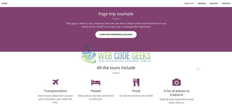
<section class="bg-primary" id="about">
<div class="container">
<div class="row">
<div class="col-lg-8 col-lg-offset-2 text-center">
<h2 class="section-heading">Page trip example</h2>
<hr class="light">
<p class="text-faded">This page is about a trip company; here you can find a cheap travels and excursions to any contry in the world! Let us give you a unforgettable experience</p>
<a href="#portfolio" class="page-scroll btn btn-default btn-xl sr-button">Look our experiences gallery!</a>
</div>
</div>
</div>
</section>
2.3 Services
In this section you can show the services that the web offer (or anything that your imaginations or necessities required)
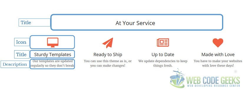
I think the first thing that you want to change in this section is the icon of each category, but in this case it isn’t an image.
When you inspect the element it has a color specified and rules from font-awesome.min.css. It’s really interesting because you can use icons as a font and set the color or size like a letter. In this case it’s used the font awesome; All the list of icons are available here.
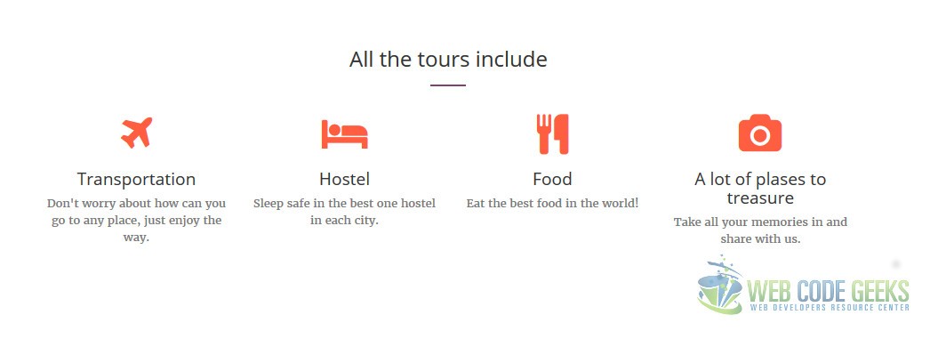
Each icon has an identifier, this is used on “i” tag; I want my first element to have an airplane icon, the identifier of these is “plane” then the “i” tag should have the class fa- plus identifier looks like “fa-plane” in this case. To be clear, this should be like this:
<div class="col-lg-3 col-md-6 text-center">
<div class="service-box">
<i class="fa fa-4x fa-plane text-primary sr-icons"></i>
<h3>Transportation</h3>
<p class="text-muted">Don't worry about how can you go to any place, just enjoy the way.</p>
</div>
</div>
The result after change all the icons is
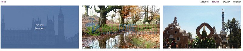
2.4 Gallery
Almost all the web pages have a gallery section; this template shows your images in a nice way and implement the hover function.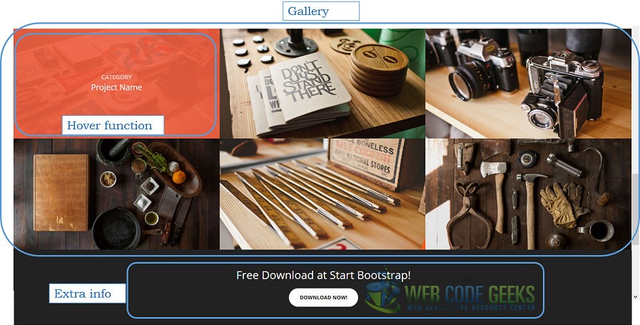
All the images which you want to add to gallery section should be inside the div with class sets to “popup-gallery”
The gallery HTML indicates that each element has two images:
- One in img/portfolio/thumbnails where are the little images which are used on preview gallery.
- One in img/portfolio/fullsize where are the images on complete size
I added the news images to each folder and delete the previous; Be careful with the thumbnails images height because if the size isn’t the same you will have a horrible blank space under the images.
If you have add/remove element in the gallery, you should add/remove a similar block code like this:
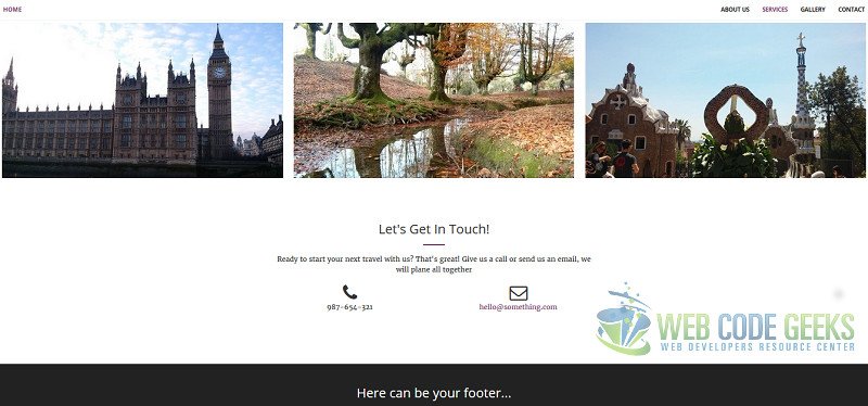
<div class="row no-gutter popup-gallery">
<div class="col-lg-4 col-sm-6">
<a href="img/portfolio/fullsize/bigBen.jpg" class="portfolio-box">
<img src="img/portfolio/thumbnails/bigBen.jpg" class="img-responsive" alt="">
<div class="portfolio-box-caption">
<div class="portfolio-box-caption-content">
<div class="project-category text-faded">
Big Ben
</div>
<div class="project-name">
London
</div>
</div>
</div>
</a>
</div>
You should set the name and description on each image; this will appear when the function hover is called.
I only have 3 images on my gallery and look like this:
You can move any section; I moved the dark container to the end of the page like a footer.
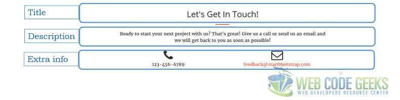
2.5 Contact
Usually the contact section has a form where you can send a little message to the staff web; In this case this section only has information about how you can contact with. I only change the information in this section, but you can add a link to a form or add the form directly in this section.
2.6 Change the colors
You can modify the color of each element. Give right click on the element that you want and select “Inspect element” you can see a little circle with a color, change it directly there and see the change on the page. This is useful because you don’t need to modify the CSS file, save the changes and refresh the page. If you modify something “for error” nothing happens and you only need to press “F5”. Nice isn’t it?
If you are a little tricky like me, inspect one element and select the color that you want to change then, go to CSS file on a text editor and “replace all” this color for another one; all the element will change; In this case I replaced the orange color for a purple, this is part of the result:
The gallery hover div doesn’t change the color, this is in RGBA format; modify the .portfolio-box .portfolio-box-caption
.portfolio-box .portfolio-box-caption {
  color: white;
  opacity: 0;
  display: block;
  background: rgba(80, 111, 158, 0.9);
  position: absolute;
  bottom: 0;
  text-align: center;
  width: 100%;
  height: 100%;
  -webkit-transition: all 0.35s;
  -moz-transition: all 0.35s;
  transition: all 0.35s;
}

And then looks like this

2.7 Min files
The .min file is the result of removing all the unnecessary characters (line breaks, indentation, extra spaces, etc.) in order to make the file size smaller, exist a lot of software that can hel you; link this file on the HTML and remove the another one.
3. Conclusion
The bootstrap templates are so useful, that help us to save time; choose the best one for your site and leave your imagination fly. Customize all the things that you want or need.
Comment and share the modifications that you do to this or another template; let us know your doubts, contributions or anything that you want to share.
4. Download
