The aim of this example is to explain how to create a CSS accordion menu.
Accordion menus are menus whose content can be expanded in width or height, usually with a smooth wipe effect, to show more of something.
Until now, this has been achieved using mostly javascript (jQuery), but as you may have realised by now, those are far less practical than css.
As long as these kind of menus will be coded using only CSS and HTML, it is supported by all modern browsers and you can use whatever you want.
Let us see a full example of the creation and then some code snippets.
1. Basic Setup
Go ahead and create a new html document and add the basic syntax in it like so:
<!DOCTYPE html>
<html>
<head>
	<title>CSS Accordion Menu Example</title>
</head>
<body>

<!-- STYLE SECTION -->

<style type="text/css">

</style>

<!-- HTML SECTION -->

</body>
</html>
2. Creating the Accordion Menu
In this section, we will see in detail how we can set up the html and css for an accordion menu.
2.1 Setting up the HTML
We will be going through an example that uses checkboxes where no content section is open by default (the input doesn’t need to be ‘checked’). Everything will be wrapped in a container with the class ac-container. For each item, we will have a checkbox, a label and an article which is the content section of that item. Lets also add the content of the tabs.
<!-- HTML SECTION  -->
<div class="container">
<section class="ac-container">
<div>
	<input id="ac-1" name="accordion-1" type="checkbox" />
	<label for="ac-1">About us</label>
	<article class="ac-small">
		<p>Well, the way they make shows is, they make one show. That show's called a pilot. Then they show that show to the people who make shows, and on the strength of that one show they decide if they're going to make more shows.</p>
	</article>
</div>
<div>
	<input id="ac-2" name="accordion-1" type="checkbox" />
	<label for="ac-2">How we work</label>
	<article class="ac-medium">
		<p>Like you, I used to think the world was this great place where everybody lived by the same standards I did, then some kid with a nail showed me I was living in his world, a world where chaos rules not order, a world where righteousness is not rewarded. That's Cesar's world, and if you're not willing to play by his rules, then you're gonna have to pay the price. </p>
	</article>
</div>
<div>
	<input id="ac-3" name="accordion-1" type="checkbox" />
	<label for="ac-3">References</label>
	<article class="ac-large">
		<p>You think water moves fast? You should see ice. It moves like it has a mind. Like it knows it killed the world once and got a taste for murder. After the avalanche, it took us a week to climb out. Now, I don't know exactly when we turned on each other, but I know that seven of us survived the slide... and only five made it out. Now we took an oath, that I'm breaking now. We said we'd say it was the snow that killed the other two, but it wasn't. Nature is lethal but it doesn't hold a candle to man. </p>
	</article>
</div>
<div>
	<input id="ac-4" name="accordion-1" type="checkbox" />
	<label for="ac-4">Contact us</label>
	<article class="ac-large">
		<p>You see? It's curious. Ted did figure it out - time travel. And when we get back, we gonna tell everyone. How it's possible, how it's done, what the dangers are. But then why fifty years in the future when the spacecraft encounters a black hole does the computer call it an 'unknown entry event'? Why don't they know? If they don't know, that means we never told anyone. And if we never told anyone it means we never made it back. Hence we die down here. Just as a matter of deductive logic. </p>
	</article>
</div>
</section>
</div>
Note that we need to give each input an ID which we will then use in the for attribute of the label. We need this in order to check the checkbox when clicking on the label. Each article will have a class that will help us determine to which height we it to expand to. (Optimally, we could use ‘auto’ as the expanded height value, but unfortunately it will not animate like that.)
Well, because no css has been going on until now the view would be pretty creepy: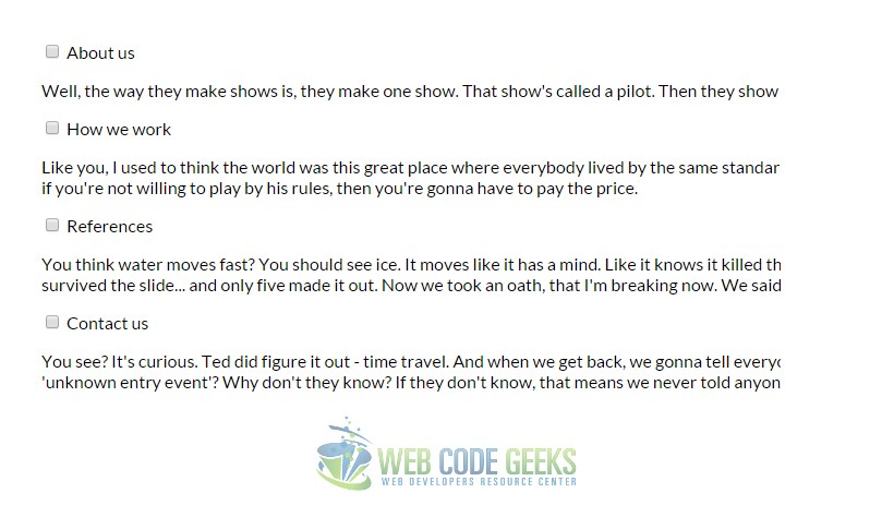
Let’s have a look at the style.
2.2 Setting up the CSS
Let’s define a width for the accordion and center it:
.ac-container{
	width: 400px;	/* width of the container */
	margin: 10px auto 30px auto;
	text-align: left;
}
Next, we’ll make the labels appear as clickable buttons by giving them some slick background gradient. With multiple box
shadows, we’ll create a subtle border and an inset effect.
.ac-container label{
	padding: 5px 20px;
	position: relative;
	display: block;
	color: #777;
	line-height: 33px;
	font-size: 19px;
	background: #ffffff;
	/* gradient applied on tabs of the accordion menu */
	background: -moz-linear-gradient(top, #ffffff 1%, #eaeaea 100%);
	background: -webkit-gradient(linear, left top, left bottom, color-stop(1%,#ffffff), color-stop(100%,#eaeaea));
	background: -webkit-linear-gradient(top, #ffffff 1%,#eaeaea 100%);
	background: -o-linear-gradient(top, #ffffff 1%,#eaeaea 100%);
	background: -ms-linear-gradient(top, #ffffff 1%,#eaeaea 100%);
	background: linear-gradient(top, #ffffff 1%,#eaeaea 100%);
	box-shadow:
		0px 0px 0px 1px rgba(155,155,155,0.3),
		1px 0px 0px 0px rgba(255,255,255,0.9) inset,
		0px 2px 2px rgba(0,0,0,0.1);
}
.ac-container label:hover{
	background: #fff;	/* hover on tabs, white color */
}
When we click on a label, the checkbox get’s checked and when that happens we want the respective label to have the
following “selected” style, it is what we call the expanded tab styling:
/* styling of the expanded tab text */
.ac-container input:checked + label,
.ac-container input:checked + label:hover{
	background: #c6e1ec;
	color: #3d7489;
	text-shadow: 0px 1px 1px rgba(255,255,255, 0.6);
	box-shadow:
		0px 0px 0px 1px rgba(155,155,155,0.3),
		0px 2px 2px rgba(0,0,0,0.1);
}
As you can see, we are using the adjacent sibling combinator to select the label since it is directly preceded by the checkbox
input. Let’s add a little arrow icon on hover. For that we’ll simply use the pseudo-class “after” so that we don’t add
unecessary markup in our document:
.ac-container label:hover:after,
.ac-container input:checked + label:hover:after{
	content: '';
	position: absolute;
	width: 24px;
	height: 24px;
	right: 13px;
	top: 7px;
	background: transparent url(arrow_down.png) no-repeat center center;
}
For the “selected” item, we want to show the up-pointing arrow:
.ac-container input:checked + label:hover:after{
	background-image: url(arrow_up.png);
}
And since we don’t want the inputs to show, we’ll hide them:
.ac-container input{
	display: none;	/* there is no real input */
}
The content area will have an initial height of 0px and any overflow will be hidden. We’ll add a transition for the height and for the box shadow. The transition that we are adding here will act upon “closing” the item. We define another transition for the selected item. So, we can basically control the two behaviors by doing this. As you can see, we will make the closing
a bit faster than the opening.
.ac-container article{
	background: rgba(255, 255, 255, 0.5);	/* text bg color */
	margin-top: 0px;	/* no top margin, just padding */
	overflow: hidden;	/* do not overlay text */
	height: 0px;		/* initial height */
	position: relative;
	-webkit-transition: height 0.3s ease-in-out, box-shadow 0.6s linear;
	-moz-transition: height 0.3s ease-in-out, box-shadow 0.6s linear;
	-o-transition: height 0.3s ease-in-out, box-shadow 0.6s linear;
	-ms-transition: height 0.3s ease-in-out, box-shadow 0.6s linear;
	transition: height 0.3s ease-in-out, box-shadow 0.6s linear;
}
.ac-container input:checked ~ article{
	transition:
		height 0.5s ease-in-out,
		box-shadow 0.1s linear;
	     box-shadow: 0px 0px 0px 1px rgba(155,155,155,0.3);
}
Let’s style the content a bit:
.ac-container article p{	/* just styling the paragraphs */
	font-style: italic;
	color: #777;
	margin: 0;		/* no margin, we have used padding */
	line-height: 23px;
	font-size: 14px;
	padding: 15px;
	text-shadow: 1px 1px 1px rgba(255,255,255,0.8);
}
Now we define the three classes for the different heights. These are the heights that an item’s content will animate to:
.ac-container input:checked ~ article.ac-small{
	height: 140px;
}
.ac-container input:checked ~ article.ac-medium{
	height: 180px;
}
.ac-container input:checked ~ article.ac-large{
	height: 230px;
}
As already mentioned, “auto” height would of course be the best option here, but since we can’t animate to that, we need to set some heights for the transition. Now the final result of the accordion menu in the browser would be:
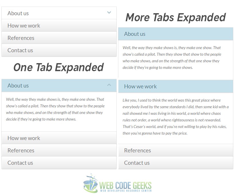
Note that up and down arrows appear only on hovers, that is why you don’t see them in the third image.
3. Conclusion
To conclude, we can say that the accordion menu is a very good way to organize your content better inside the webpage, making it easier to include more information into expandable tabs that smoothly go under the tab name. Considering the coding aspect, CSS is the best way to make this element available for users, as other ways like javascript would probably be slower or unavailable if some user has javascript turned off in his/her browser. Feel free to play around with css.
6. Download
You can download the full source code of this example here: CSS Accordion Menu
