In this example we are going to have a look at multiple classes
that you can apply on an element of html.
It has become more and more useful declaring some standard classes in CSS (actually referring to them, even though they do not exist) and using these classes whenever we need in our elements.
It basically is the inverse process of giving an element a class on html and then referring to that element in css to give attributes. In this case, you predefine some classes (that is, give them attributes) and then include them in your elements.
1. Predefine Classes & Attributes in CSS
In this step, let’s create different kind of classes and give attributes to them to set up a group of classes that we can later use in html. So, first create a basic html file with a style tag in it where we can add the css, like below:
<!DOCTYPE html>
<html>
<head>
	<title>Multiple Classes on Elements</title>
</head>
<body>

	<!-- STYLE SECTION -->

	<style type="text/css">

  	</style>

	<!-- HTML SECTION -->

</body>
</html>
1.1 Alignment Classes
Creating alignment classes will enable us to easy align elements on the web page. Let’s name two alignment classes:
.pull-left – this will align an element to the left
.pull-right – this will align an element to the right
The respective CSS code for these classes would be:
<style type="text/css">

  body{
   font-family: "Arial", "sans-serif";  }      /* just added custom font */

  /* ALIGNMENT CLASSES */

  .pull-left {                    /* pull-left class referred and given attributes */
    float: left !important;
  }

  .pull-right {                   /* pull-right class referred and given attributes */
    float: right !important;
  }

</style>
1.2 Color Classes
Creating color classes will let us color elements/backgrounds on the web page easier.
Let’s name four color classes and three background color classes:
.red – this will give a text element or the border of a shape the red color.
.green – this will give a text element or the border of a shape the green color.
.blue – this will give a text element or the border of a shape the blue color.
.white – this will give a text element or the border of a shape the white color.
.bg-red – this will give an element a red background color.
.bg-green – this will give an element a green background color.
.bg-blue – this will give an element a blue background color.
The respective CSS code for these classes would be:
  /* COLOR CLASSES */

  .red, .red li, .red a {               /* red class referred and given color attribute */
    color: #e85139;
  }

  .green, .green li, .green a {         /* green class referred and given color attribute */
    color: #4ca640;
  }

  .blue, .blue li, .blue a {            /* green class referred and given color attribute */
    color: #319cd6;
  }

  .white, .white li, .white a {           /* green class referred and given color attribute */
    color: white;
  }

  .bg-red     {                  /* bg-red class referred and given backgrounf color attr */
      background-color: #e85139;
    }

  .bg-green  {                  /* bg-green class referred and given background color attr */
      background-color: #4ca640;
    }

  .bg-blue   {                  /* bg-blue class referred and given background color attr */
      background-color: #319cd6;
    }
Note that we also added the color attributes for li or a tags on the html.
That is so we can access li’s or a’s directly with these classes.
1.3 Size Classes
Creating size classes will let you control the elements sizes on the web page. Let’s name three size classes:
.small – this will make an element look small on the screen.
.normal – this will make an element look medium on the screen.
.large – this will make an element look large on the screen.
The respective CSS code for these classes would be:
   /* SIZE CLASSES */

   .small {                     /* small class referred and given sizing attributes */
      font-size: 1em;
      padding: 0.2em;
      width: 50%;
      height: 50%;
   }

   .normal {                    /* normal class referred and given sizing attributes */
      font-size: 1.5em;
      padding: 0.4em;
      width: 100%;
      height: 100%;
   }

   .large {                     /* large class referred and given sizing attributes */
      font-size: 2em;
      padding: 0.6em;
      width: 150%;
      height: 150%;
   }
1.4 Text Classes
Creating text classes will make it easier to control text appearance. Let’s name four text classes:
.decor1 – this will make the text underline and uppercase.
.decor2 – this will make the text overline and lowercase.
.decor3 – this will make the text line-through and capitallize.
.center – this will make the text align center.
The respective CSS code for these classes would be:
   /* TEXT CLASSES */

   .decor1 {                        /* decor1 class referred and given text attributes */
    text-decoration: underline;
    text-transform: uppercase;
    font-weight: bold;
   }

   .decor2 {                        /* decor2 class referred and given text attributes */
    text-decoration: overline;
    text-transform: lowercase;
    font-weight: bold;
   }

   .decor3 {                         /* decor3 class referred and given text attributes */
    text-decoration: line-through;
    text-transform: capitalize;
    font-weight: bold;
   }

    .center {                       /* center class referred and given attributes */
    position: relative;
    bottom: 0px;
    text-align: center;
   }
1.5 Elements Classes
It is time to create some specific elements classes, which will represent the initial attributes of the elements we are going to give several classes. Here is what we will create:
.button – a very popular element which will be used to demonstrate.
.menu – a four links menu with very little prestyled attributes.
.rectangular – a prestyled fixed width and height element as example.
The respective CSS code for these classes would be:
   /* ELEMENTS CLASSES */

   .button {                     /* refers to a button class, given several attributes */
    border: 0.1em solid;
    border-radius: 0.3em;
    width: 5em;
    height: 2em;
    line-height: 2em;
    margin-top: 5em;
    margin-bottom: 2em;
   }

   .menu li {                   /* refers to a menu class, given several attributes */
    display: inline;
    padding-right: 1em;
    text-decoration: none;
   }

   .menu {
    margin-bottom: 2em;         /* just a margin for better view of the elements */
   }

   .rectangular {               /* refers to a rectangular class, given several attributes */
    border: 0.1em solid;
    width: 10em;
    height: 5em;
    line-height: 5em;
    margin-bottom: 2em;
   }
2. Application of Multiple Classes in HTML
Here is where the magic happens, we will first create the basic elements structure in html
and then continue adding appropriate classes to each elements to see the results of what we;ve done so far!
2.1 Set up the HTML
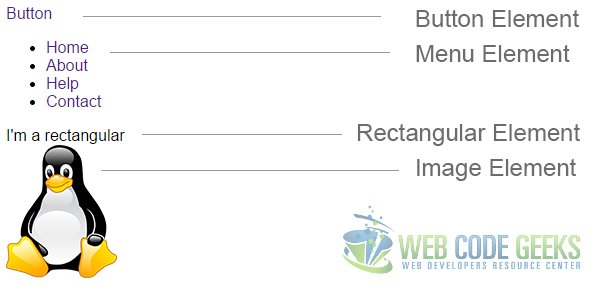
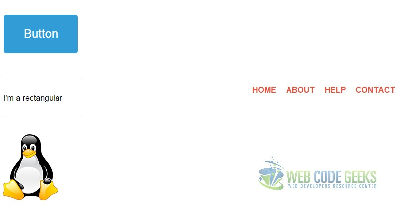
Under your tag start the html code. Add four elements: a button, a menu, a rectangular and an image like so:
(Do not give these elements classes, we will do that next)
  <!-- HTML SECTION -->

  <!-- button element -->
  <div class=""><a href="#">Button</a></div>

  <!-- menu element -->
  <div class="">
  <ul>
    <li class=""><a href="#">Home</a></li>
    <li class=""><a href="#">About</a></li>
    <li class=""><a href="#">Help</a></li>
    <li class=""><a href="#">Contact</a></li>
  </ul>
  </div>

  <!-- rectangular element -->
  <div class="">I'm a rectangular</div>

  <!-- image element -->
  <img src="images/image.png">
Because none of these elements is styled (or better say, not given a class) the view we would get is this:
Now let’s give them the respective classes like this:
  <!-- HTML SECTION -->

  <!-- button element -->
  <div class="button"><a href="#">Button</a></div>

  <!-- menu element -->
  <div class="menu">
  <ul>
    <li class=""><a href="#">Home</a></li>
    <li class=""><a href="#">About</a></li>
    <li class=""><a href="#">Help</a></li>
    <li class=""><a href="#">Contact</a></li>
  </ul>
  </div>

  <!-- rectangular element -->
  <div class="rectangular">I'm a rectangular</div>

  <!-- image element -->
  <img src="images/image.png">
Note that the img element doesn’t still have a class, because we did not create attributes especially for it.
Now lets see what we’ve got in the browser.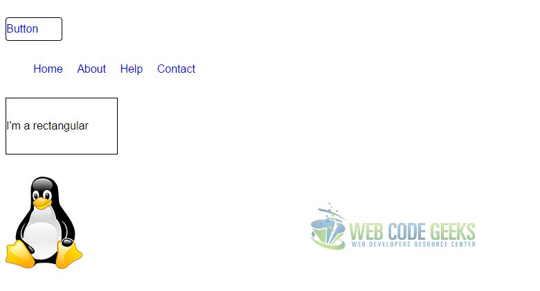
We’ve created the most basic version of our final html.
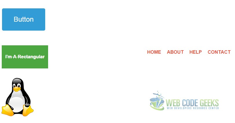
2.2 Add multiple classes
Now lets go ahead and add classes that we’ve already given attributes to in css to make elements look better.
The way you apply multiple classes to an element is just by seperating them with a space inside the quotes like this:
class="example class1 class2 class3 class4 class5"
1. Adding Classes to the Button
I will add 4 more classes to our button element:
center – add this class to make the text align center.
bg-blue – this class will make the button background blue.
white – this will change the color of the text to white.
large – add this class to make the whole element larger.
And this is how the code will look like:
  <!-- button element -->
  <div class="button center bg-blue white large"><a href="#">Button</a></div>
Now look at this nice button view we get:
2. Adding Classes to the Menu
Lets add 3 more classes, 2 of them to the menu and 1 to the li‘s:
red – gives the text of this element a red color.
pull-right – alignes the whole element on the right side of the screen.
decor1 – makes the text in the list underlined, uppercase and bold.
This is how it should be in the code:
  <!-- menu element -->
  <div class="menu red pull-right ">
  <ul>
    <li class="decor1"><a href="#">Home</a></li>
    <li class="decor1"><a href="#">About</a></li>
    <li class="decor1"><a href="#">Help</a></li>
    <li class="decor1"><a href="#">Contact</a></li>
  </ul>
  </div>
And the expected view in the browser would be like this:
Note that the decor1 attributes also define underlined text, but you don’t see it because of this code I added when dealing with the button element, which had the browser pre-styled any-link underlined attribute:
  a:-webkit-any-link {
  color: -webkit-link;
  text-decoration: none;
  }
It means do not underline any links by default, and that was needed for our button.
3. Adding Classes to the Rectangular
For the rectangular element, lets add 5 more classes after the rectangular basic class:
center – this will center the text inside the rectangular.
bg-green – this will give it a green background color.
white – this will make the text color white
decor3 – this decor will make the text line-through, capitallize and bold.
normal – this will adjust the size of the rectangular to what we defined normal.
By now you should have learned how to add these classes, it will look like this in the code:
  <!-- rectangular element -->
  <div class="rectangular center bg-green white decor3 normal">I'm a rectangular</div>
Now notice the rectangular view:
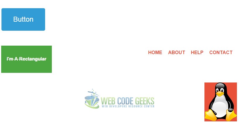
4. Adding Classes to the Image
There is not too much (from what we’ve done in css) that we can add to the image element, however lets see these:
bg-red – this will give the image (which is png) a red background color.
pull-right – this will align the image on the right like the menu.
In the image element, first add a class tag and then add classes inside:
  <!-- image element -->
  <img class="bg-red pull-right" src="images/image.png">
  <!-- added a class tag and then classes -->
And our final element would look this way:
You now have the concept of using multiple classes on elements that have been previously styled in css.
3. Some Considerations
The mupltiple classes application seems a great method for saving time and creating some standards for yourself, and it is, but there are also certain aspects and considerations you should keep in mind.
3.1 Do not Overwrite
Given the element specific classes for various types of look, alignment, color ect you want, do not write other/extra classes of the same property you have previously used. Depending on the case, it will sometimes apply the first/second class, or none of them at some cases. The code like below would be logically wrong:
  <!-- rectangular element -->
  <div class="rectangular center bg-green bg-white white red blue decor3 decor1 normal">
And guess what, the rectangular is still the same in the browser view, nothing has changed.
So there is no reason to use multiple classes to apply the same property.
3.2 Avoid Cluttered Code
You might have noticed that we did not use all of the classes we referred to in html.
For example, we didn’t use pull-left because by default all our elements were aligned on the left, we didn’t also use the small class because it made elements we needed too small, and so on and so forth with come color classes. Knowing that, you are recommended to follow one of the practices below:
1. Do not use classes that you think will never be needed on the elements you are going to use.
2. Use any class you like or think will be needed, and clean up the unused classes when you finish your project.
Done that, you will have a more organised code suited to your needs.
3.3 Consider using Frameworks
You might get deep into this and create a set of classes (like, a lot of them) and this would be the approach of a css framework. If you have reached a level of professionalism that you feel you can do that, go ahead.
Otherwise, feel free to use popular and productive frameworks like Bootstrap (http://getbootstrap.com/) which have thousands of predefined classes you can use to get your project going.
4. Conclusion
To conclude, there is a lot you can do using multiple classes on elements, like easier and faster create forms, menus,buttons, tables, align, color elements ect, and there are advantages to using it in your projects, but always remember to give them names according to the main function they do, so that you won’t get stuck in long code projects and have it easier to understand what has been used each class for, without having to search in the css code.
Play around with it to see how this works by yourself.
You can download the full source code of this example here: Multiple Classes Example
