Fabio CimoApril 20th, 2015Last Updated: January 9th, 2018
0 504 7 minutes read
In this article, we’re going through CSS Buttons. As we all know, buttons are important elements on pages and we use them to visually beautify common actions like download, upload, log in/out, submit and so on. A good button design enhances usability.
Before we explain how to style buttons, keep in mind that buttons are not links. The main purpose of a link is to navigate between pages and
views, whereas buttons allow you to perform an action (such as submit).
Make sure to follow each step to get the intended results. In the end you will be able to create your own custom styled buttons.
Want to be a CSS Ninja?
Subscribe to our newsletter and download the CSS Programming Cookbook right now!
In order to get you prepared for your CSS development needs, we have compiled numerous recipes to help you kick-start your projects. Besides reading them online you may download the eBook in PDF format!
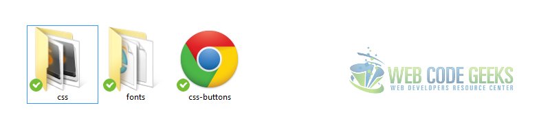
Before we start creating and styling buttons please consider downloading Font Awsome icon font pack. These icons will be attached to buttons later when we have created the basics.
After downloading, add the folders css and fonts inside your project folder like this: Folder View after adding the Font Awesome Folders
Also, create your basic HTML file that looks like this:
In this section, we’re going to create a basic button using html and css.
2.1 Setting up the HTML
There are 3 main ways you can create a button starting from html.
1. Use the a (anchor) tag to create the link and give it a class, which by default if not styled as a button.
2. Use the button tag that html5 offers and you have a basic styled button with no css at all.
3. Use the input tag and give it a class of button and a type of submit. That will create a pre-styled button.
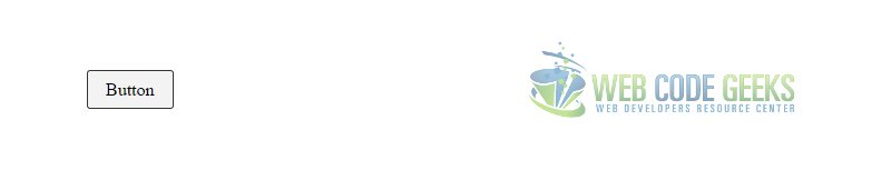
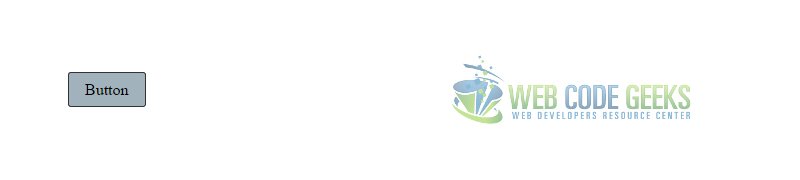
This is what the basic buttons would look like with no css properties applied. HTML – Basic Buttons
But for the sake of creating a button from scratch, we will only use the first method that is using an anchor tag, but add a div tag with a class of btn-wrapper because it will be useful as some properties cannot be applied over the anchor tag.
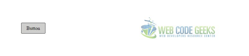
Given these attributes, we have created a basic styled button that looks like this in the browser: Basic Styled Button
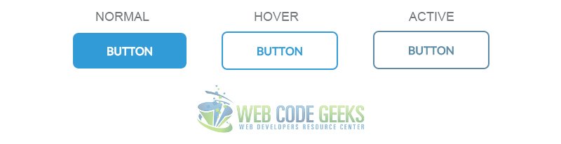
2.3 Button States
In addition to the default state, buttons can have two other states: hover and active, which respectively mean ‘mouse over’ and ‘clicked/pressed’. Below we will show the button how to act/change when the cursor is over it and when it is pressed.
1. Hover State
The hover state can be achieved by adding :hover pseudo class like below:
.button:hover {
	background-color: #cececc;  /* added an intense gray color in active state */
}
This would be the pressed button view: Hover State of Button
2. Active State
The active state can be achieved by adding :active pseudo class like below:
.button:active {
	background-color: #a2b2bc;  /* added a blue color in active state */
}
This would be the active state (clicked) view of the button: Active State of the Button
Note that when entering attributes about the other states rather than the default, you should only write attributes that are going to change when the button will be pressed, so it is not necessary to write again the padding or border-radius, these attributes will remain as the previous state.
As you can see, I gave it only the background-color attribute because that was what I needed to change, but you can also change the text color or border color when considering these states.
3. It’s all about design!
From now on, we are going to use a custom font that is Lato and font icons we downloaded.
Let’s add the necessary links in the head section:
Also, add the css code to have one font for everything:
* {											/* means apply to everything on the page */
	font-family: "Lato", "sans-serif";		/* added cutsom font lato in css */
}
3.1 Start Small
You can have a pretty nice button view with color alternation in aspects of background and text.
One first advice is, you don’t always need border for the default state.
Have a look at the following attributes:
	.button{
		border-radius: 0.5em;			/* increased border-radius */
		text-decoration: none;
		color: white;					/* changed text color to white */
		padding: 1em 3em;  				/* increased padding for a larger button */
		background-color: #329bd8;		/* changed background color to a nice blue */
		text-transform: uppercase;		/* made the text uppercase */
		font-weight: bold;				/* gave the text a bold look */
	}

	.button:hover {
		background-color: transparent;  /* changed the bg-color to transparent */
		border: 0.15em #329bd8 solid;	/* set a border to a blue color */
		color: #329bd8;					/* set a text color to the same color */
	}

	.button:active {
		background-color: transparent;
		border: 0.15em #5e8ca5 solid;
		color: #5e8ca5;					/* minor text color change in a deeper blue */
	}
This nice button would look this way in its 3 states: Simple Button Design
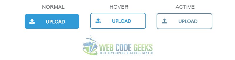
3.2 Icons on Buttons
Going further into what’s called a good user experience, this time with buttons, we will add an icon next to the text which will indicate what the button is for.
Icons are very easy to add, just find the one you want from here and copy the html code of the icon and paste it before the button text to make it sit right next to the text.
You will also need a few lines of css to make this look fine:
(only the commented lines are new or edited)
.button{
border-radius: 0.5em;
text-decoration: none;
color: white;
padding: 1em; /* removed the right and left padding value */
padding-right: 3em; /* added only padding-right to align the icon left */
background-color: #329bd8;
text-transform: uppercase;
font-weight: bold;
}
.fa-upload {
padding-right: 2em; /* added padding-right to space it from the text */
font-size: 1.2em; /* increased font-size to fit the button */
}
The button view in the browser: Button with Icon Attached
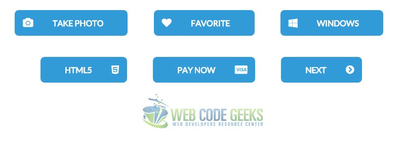
Icons can be a good point to consider for buttons. These are just some other buttons with icons:
You can change icon fonts attributes just like you do with text.
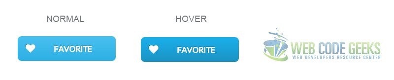
3.3 Gradients on Buttons
Just like you apply background colors to buttons, you can also apply gradients on them.
Gradients make buttons look more like 3D rather than flat like we’ve seen until now.
Creating gradients yourselves is just time-wasting, so I suggest you generate gradients online in this website
Feel free to choose any gradient you like and copy the css. To be coherent with what we’ve started Imma choose a blue gradient.
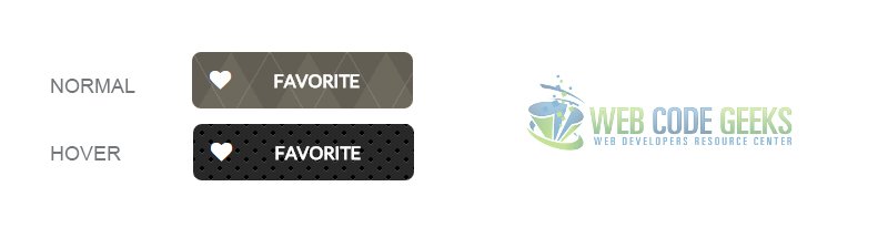
In this code I just added pattern backgrounds for the normal and hover state of the button.
This is how the pattern styled button would look like:
Gradients on Buttons
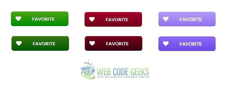
You can play around with these and see a lot of good looking buttons you can create.
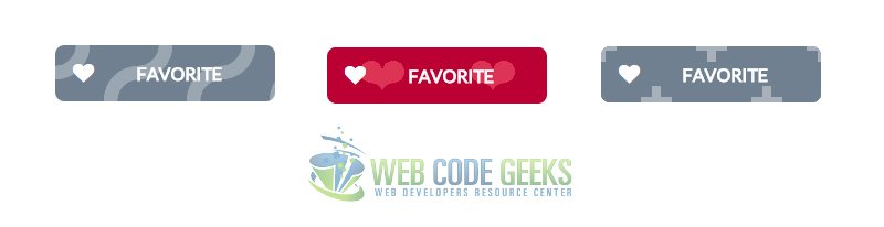
Here are a few I created for you: Getting Creative with Patterns on Buttons
4. Conclusion
To conclude, we can state that there are various ways you can style and fit buttons according to your needs.
You can add png images instead of icons or images as backgrounds into a button, but after some time practicing you will understand that keeping it simple and nice is a combinations you can achieve by trying either flat or gradient design, which will also make your project less cluttery from images on each button.
Below you can find some pre-styled and good designed buttons that you can use for your own projects.
5. Download
Download
You can download the full source code of this example here: CSS Buttons
Do you want to know how to develop your skillset to become a Web Rockstar?
Subscribe to our newsletter to start Rocking right now!
To get you started we give you our best selling eBooks for FREE!
Fabio is a passionate student in web tehnologies including front-end (HTML/CSS) and web design. He likes exploring as much as possible about the world wide web and how it can be more productive for us all. Currently he studies Computer Engineering, at the same time he works as a freelancer on both web programming and graphic design.


