In this example, we’re having a look at the display property of css.
Specifically, lets see the inline-block value that can be given to it.
You could previously use float to make elements stretch throughout the browser width, while now it is all easier with the inline-block value.
Basically, it’s a way to make elements inline, preserving their block capabilities such as width and height, margins and paddings etc.
It is supported by all browsers and you do not need any extra piece of code like you do in some cases to make it functional like -ms, -moz etc.

1. Basic Setup
Go ahead and create a new html document and add the basic sytnax in it like so:
<!DOCTYPE html>
<html>
<head>
	<title>CSS Display Inline Block</title>
</head>
<body>

<!-- STYLE SECTION -->

<style type="text/css">

</style>

<!-- HTML SECTION -->

</body>
</html>
2. Application and Cases
To see the property in action, first add some lines of elements in html:
<!-- HTML SECTION  -->

<div class="item">Element 1</div>
<div class="item">Element 2</div>
<div class="item">Element 3</div>
<div class="item">Element 4</div>
<div class="item">Element 5</div>
Now add some border, width and height properties to the item class to create a view of boxes.
Also add the display: inline-block. Look at the code below:
<!-- STYLE  SECTION -->

<style type="text/css">
.item {
	width: 8em;
	height: 3em;
	border: 0.3em solid #ccc;
	display: inline-block;
}
</style>
You would get the following view: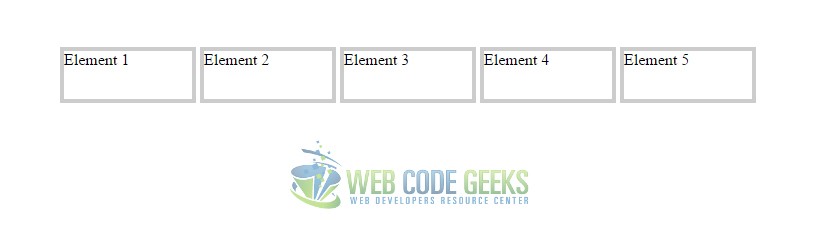
But to show the real advantage of using inline-block, lets give elements different widths and heights and see how it handles.
Now give elements in html distinct classes like item1, item2, item3 etc:
<!-- HTML SECTION  -->

<div class="item1">Element 1</div>
<div class="item2">Element 2</div>
<div class="item3">Element 3</div>
<div class="item4">Element 4</div>
<div class="item5">Element 5</div>
Next, change widths and heights of different elements so that you do not have same size boxes:
<!-- STYLE  SECTION -->

<style type="text/css">
.item1 {
	width: 6em;
	height: 3em;
	border: 0.3em solid #ccc;
	display: inline-block;
}

.item2 {
	width: 7em;
	height: 4em;
	border: 0.3em solid #ccc;
	display: inline-block;
}

.item3 {
	width: 8em;
	height: 5em;
	border: 0.3em solid #ccc;
	display: inline-block;
}

.item4 {
	width: 9em;
	height: 6em;
	border: 0.3em solid #ccc;
	display: inline-block;
}

.item5 {
	width: 10em;
	height: 7em;
	border: 0.3em solid #ccc;
	display: inline-block;
}
</style>
That’s it, the view would maintain its positioning and align elements one after the other: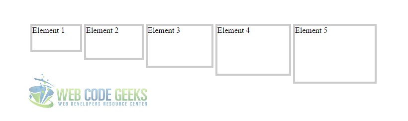
3. Conclusion
To conclude, we can say that it is better to use display: inline-block property and value rather than float.
You can work around different elements and see its applications in many more cases on your own.
Do remember that elements will be inline just as the browser width, so consider even mobile browsers when coding.
4. Download
You can download the full source code of this example here: CSS Display Inline Block
