In this example, we will go through performing hover effects on CSS.
You see hover effects on almost every webpage nowadays, it seems to be a good way to make elements eye-catching and enhance usability.
In a more functional note, it lets you know that (in most cases) something is clickable, like a link, an image or anything else.
The application is generally easy, and it is compatible with all modern browsers like Chrome, Firefox, Safari, Opera etc.
Lets first see how we can apply basic hover effects and then expand to more advanced usage with cases and examples.
1. Basic Setup & Application
First, go ahead and create a blank html document and then add the basic syntax inside like so:
<!DOCTYPE html>
<html>
<head>
	<title>CSS3 Hover Effects Example</title>
</head>
<body>
<!-- STYLE  SECTION -->
<style type="text/css">

</style>

<!-- HTML SECTION  -->

</body>
</html>
</pre>
To apply hover effects, you add :hover after the tag or class of html and then open the brackets:
-HTML (create an element, i.e a button, so that we can apply hover)
<button>This is me</button>
-CSS (respect the syntax class/tag:hover { attributtes } to apply hover effect)
<style type="text/css">
button:hover {
	background-color: red;
	color: white;
}
</style>
We expect this button to change background color to red and text color to white when the mouse is over it: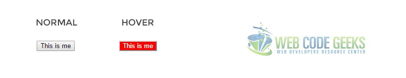
So that is the most basic application of hover in a button, but there are more examples and elements that you can apply it.
2. Cases and Examples
Below, we will take elements of html, style them and give different hover effects to show examples.
2.1 Button Hover Effects
There are three most important aspects you should remember when stlying buttons with hovers:
1. Choose a light bg color on normal state and a deeper bg color on hover state or vice versa, that will look great.
2. Be careful to notice how the text inside the button looks like while on hover. If not right, change its color.
3. Always add a transition property with a value of .5s to make the hover effect animate (fade) beautifully.
Below, I have added three buttons on the HTML section, those will have the same styling but different hovers.
<!-- HTML SECTION  -->
<button class="btn1">button 1</button>
<button class="btn2">button 2</button>
<button class="btn3">button 3</button>
Now notice that I have given same styling by selecting the button tag and different hovers using the respective classes:
<!-- STYLE  SECTION -->

<style type="text/css">
button {
	width: 8em;
	height: 3em;
	border: none;
	border-radius: 0.5em;
	background-color: #919191;
	font-family: "Montserrat";
	text-transform: uppercase;
	color: white;
	margin-right: 2em;
	transition: .5s;
}

.btn1:hover {
	background-color:#8a3f3f;	/* deep red color */
	text-decoration: underline;
}

.btn2:hover {
	background-color: transparent; /* no background color */
	text-transform: lowercase;
	border: 0.2em solid #ccc;	/* added border color */
	color: black;
}

.btn3:hover {
	background-color:#3f708a;		/* deep blue color */
	box-shadow: .1em .1em 1em #ccc;	/* added box shadow */
}
</style>
See how the buttons look in normal and hover state in the browser: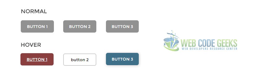
2.2 Other Elements Hovers
Lets take for example a simple html menu, and give the menu items hover effects:
<div class="menu2">
    <a href="#1">Home</a>
    <a href="#2" class="current">Profile</a>
    <a href="#3">About</a>
    <a href="#4">Contact</a>
    <a href="#5">Sth Else Here</a>
</div>
Notice how you can add image effects using hover to the menu, in this case a gradient image:
div.menu2
{
    text-align:center;
    background-image: url(bg1.gif);
    border:1px solid black;
    font-size:0;
}

div.menu2 a
{
    display: inline-block;
    padding: 0 20px;
    background-image: url(bg.gif);
    color:White;
    text-decoration:none;
    font: bold 12px Arial;
    line-height: 32px;
}

div.menu2 a:hover, div.menu2 a.current
{
    background-position:0 -60px;
}
The menu would look like this: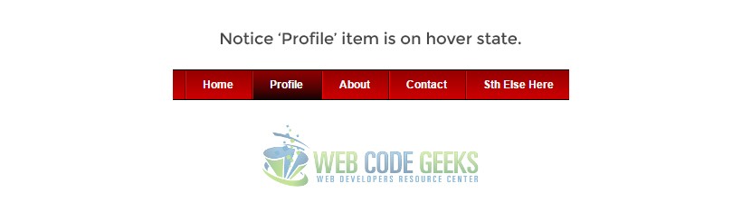
2.3 Box Hover Animation and Added Text
THe following example is something advanced brought in a simple way to you. It is a box that is going to be given attributes
for the normal state and then it is going to expand and show extra lines of text when on hover state.
<div class="box"><span class="element1">Hi Im not here at first, but only on hover.</span> I'm here for too long now.</div>
Applying some simple logics in css that would look like this:
.box {
	margin-top: 5em;
	width: 15em;
	height: 8em;
	font-size: 1.2em;
	font-family: "Montserrat";
	color: white;
	background-color: #464646;
	transition: width 2s;
}

span {
	display: none;	/* span should not be visible at first */
}

.box:hover{
	width: 25em;	/* box expanding on hover */
}

.box:hover .element1 {
	display: block;		/* span showing on hover */
}
The result, like you may have been wondering, would be: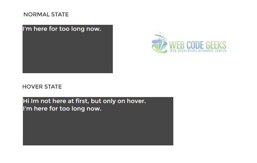
It all comes beautifully animated and adjusts the text according to the new width.
3. Conclusion
To conclude, we can say that hovering elements should be used to have your website better designed.
It comes to usage in an easy form, only by adding the :hover in css, but when considering more advanced stuff like animation or adding elements after mouse over, it can get complicated.
However, keep in mind to use these hovering effects using only css and not javascript because it is the lightest way not to overload your website with js.
4. Download
You can download the full source code of this example here: CSS3 Hover Effects

developer Web site