In this example, we’ll have a look at how we can style text inputs.
Text inputs are very common in websites nowadays like in sign up forms, contact forms, search boxes, survey answers and so on.
But you notice most of them are not styled, and you can see a bunch of text fields with the same default view accross different pages.
Well, the input type text already has a default/pre-styled view, but most of the times, you will be willing to change it.
As always, lets first look at the basics and then some custom stuff.
1. Prerequisites
First, go ahead and create a html file with its basic syntax inside like this:
<!DOCTYPE html>
<html>
<head>
	<title>CSS3 Text Input Styling Example</title>
</head>
<body>
<!-- STYLE  SECTION -->
<style type="text/css">

</style>

<!-- HTML SECTION  -->

</body>
</html>
</pre>
Set up an input with a type of text, a class of element and optionally a name of city:
<!-- HTML SECTION  -->

<input type="text" class="element" name="city">
Note that the name will be needed because the text input is going to be used under some form and referred to.
Look at the default styling of a text input:
input[type=text] {
  background-color: #ffffff;
  border: 1px solid #cccccc;
  -webkit-border-radius: 3px;
     -moz-border-radius: 3px;
          border-radius: 3px;
  -webkit-box-shadow: inset 0 1px 1px rgba(0, 0, 0, 0.075);
     -moz-box-shadow: inset 0 1px 1px rgba(0, 0, 0, 0.075);
          box-shadow: inset 0 1px 1px rgba(0, 0, 0, 0.075);
  -webkit-transition: border linear 0.2s, box-shadow linear 0.2s;
     -moz-transition: border linear 0.2s, box-shadow linear 0.2s;
      -ms-transition: border linear 0.2s, box-shadow linear 0.2s;
       -o-transition: border linear 0.2s, box-shadow linear 0.2s;
          transition: border linear 0.2s, box-shadow linear 0.2s;
}

input[type=text]:focus {
  border-color: rgba(82, 168, 236, 0.8);
  outline: 0;
  outline: thin dotted \9;
  /* IE6-9 */

  -webkit-box-shadow: inset 0 1px 1px rgba(0, 0, 0, 0.075), 0 0 8px rgba(82, 168, 236, 0.6);
     -moz-box-shadow: inset 0 1px 1px rgba(0, 0, 0, 0.075), 0 0 8px rgba(82, 168, 236, 0.6);
          box-shadow: inset 0 1px 1px rgba(0, 0, 0, 0.075), 0 0 8px rgba(82, 168, 236, 0.6);
}
And the default view of a text input as you might know is:

2. Styling a Text Input
In this section, we will style the above element with CSS3 to create a better looking input view. Look at the lines below:
<style type="text/css">

.element {
	font-family: "Montserrat", sans-serif;	/* custom font applied */
	width: 20em;							/* custom width */
	height: 3em;							/* custom height */
	border: 0.1em solid #ccc;				/* custom border */
	border-radius: 0.5em;					/* added border radius */
	background-color: #feffdc;				/* light yellow background */
	padding: 0em 1em;						/* right and left padding */
}

</style>
Let’s have a look at what we styled:
1. Broder – you will probably need a custom border for your input because the default one is really old inset shadow.
2. Border-Radius – most text inputs on pages have this non-zero radius on their borders, it makes them look better.
3. Background-Color – you may optionally use a bg color just to emphasize the input field, it is eye catching after all.
4. Padding – use paddings when width and height are changed and the text seems creepy starting from the very beginning.
We’ve pretty much given custom attributes to most of the properties. This would look like this:

Now lets see another styling of the input text.
<style type="text/css">

.element {
	font-family: "Montserrat", sans-serif;
	width: 30em;
	height: 4em;
	border: 0.1em solid #ccc;
	border-radius: 0.5em;
	background-color: #efefef;
	padding: 0em 1em;
	font-size: 1.2em;
	box-shadow: 0em 0.1em 0.5em #ccc;
}

</style>
In this second example, we did some noticeable changes to the input:
1. We are having a much larger input box which can be considered as comfortable for full page forms.
2. We added a box-shadow which gave our inputs a 3D-like view which made it more attractive.
3. Basically, you can change the bg color to whatever suits your needs according to your page design.
4. Remember to always use custom fonts and font-sizes to adjust the right properties of the input.
Have a look at what this looks like in the browser:
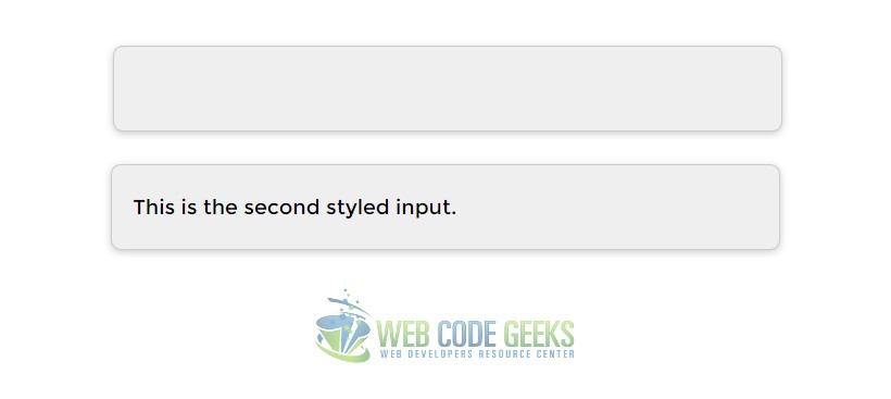
See how in the second example we added a box-shadow property on the input and that made it look more professional.
3. Advanced Input Styling
Notice that up until now, we have been styling the text input by giving it a class ( element ), but what if you want to style
all text inputs the same way? Well, there is a way. You can select all input type text like this in css: input[type=text].
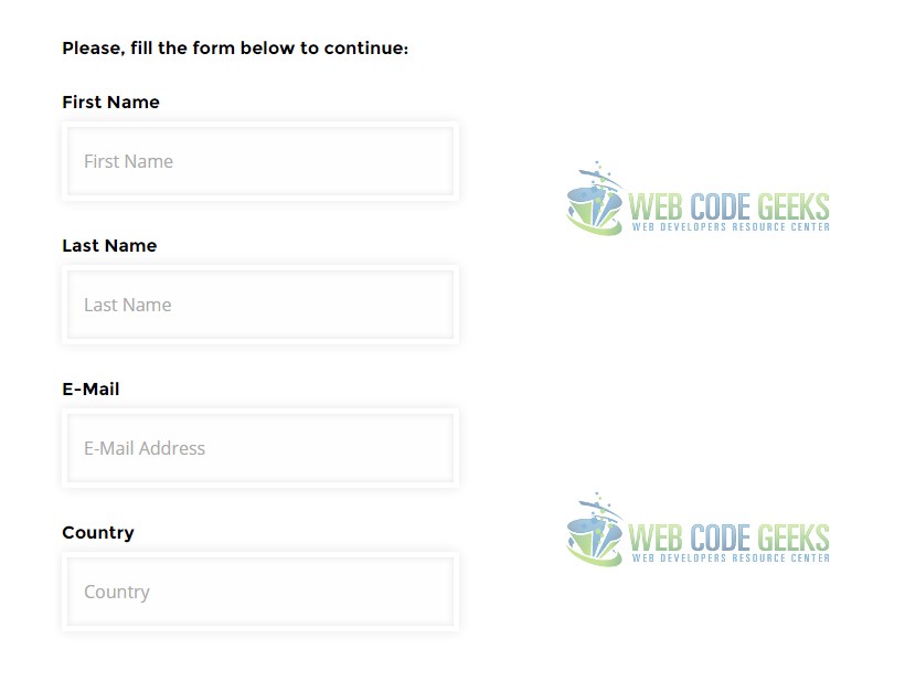
First lets add a few more lines create a form like view of the inputs and then apply styling using the selector.
<!-- HTML SECTION  -->
<h4>Please, fill the form below to continue:</h4>
<form class="form-group" method="post">
	<h4>First Name</h4>
	<input type="text" placeholder="First Name" name="first-name"><br />
	<h4>Last Name</h4>
	<input type="text" placeholder="Last Name" name="last-name"><br />
	<h4>E-Mail</h4>
	<input type="text" placeholder="E-Mail Address" name="email"><br />
	<h4>Country</h4>
	<input type="text" placeholder="Country" name="country"><br />
</form>
That gave a form view of several inputs. A more intense styling with advanced shadows and inset would be:
<!-- STYLE  SECTION -->

<style type="text/css">

input[type=text] {
	font-family: "Open Sans", sans-serif;
	width: 20em;
	height: 2em;
	border: 0.1em solid #ccc;
	border-radius: 0.2em;
	background-color: #f9f9f9;
	padding: 0em 1em;
	font-size: 1em;

	border: 5px solid white;
    -webkit-box-shadow:
      inset 0 0 8px  rgba(0,0,0,0.1),
            0 0 16px rgba(0,0,0,0.1);
    -moz-box-shadow:
      inset 0 0 8px  rgba(0,0,0,0.1),
            0 0 16px rgba(0,0,0,0.1);
    box-shadow:
      inset 0 0 8px  rgba(0,0,0,0.1),
            0 0 16px rgba(0,0,0,0.1);
    padding: 15px;
    background: rgba(255,255,255,0.5);
    margin: 0 0 10px 0;
}

h4 {
	margin-bottom: 0em;
	padding-bottom: 0.5em;
	font-family: "Montserrat";
}
The new, smart styled all inputs would look like this:
4. Conclusion
To conclude, there is a lot to explore while styling inputs of every type, especially text, and it is recommended to giveyour inputs a personalized view and keep a standard style that you create for later uses, just like we did with text inputs.
The default input view is kinda creepy and old-fashioned, so consider using your own styling when using inputs.
You could also take advantage of front end frameworks like Bootstrap to have pre styled inputs with nice animated hovers.
5. Download
You can download the full source code of this example here: CSS3 Text Input Styling
