In this example, we will consider image rotation using css.
CSS offers a specific property called transform to do this.
This property can take a lot of attributes, but we will only consider rotation.
Image rotation will be needed on certain occasions when you want to create your personalized view of image positioning and have a fancier look.
All browsers support the transform property, with their own prefixes:
-ms-transform for IE, -webkit-transform for Chrome, Opera, Safari etc.
Lets first look at the basics and then something more on it.

1. Basic Setup & Application
First, go ahead and create a blank html document and then add the basic syntax inside like so:
<!DOCTYPE html>
<html>
<head>
	<title>CSS3 Image Rotate Example</title>
</head>
<body>
<!-- STYLE  SECTION -->
<style type="text/css">

</style>

<!-- HTML SECTION  -->

</body>
</html>
</pre>
Now add an img tag in the html section with an image inside like this:
<!-- HTML SECTION  -->

<img src="image.jpg">
To apply rotation, follow this syntax: transform: rotate(10deg); where:
1. transform is the attribute given to the img
2. rotate is the value of the attribute
3. (10deg) specifies at what scale should the value be applied.
With this said, the basic image rotation application would be:
<!-- STYLE  SECTION -->

<style type="text/css">

img {      transform: rotate(10deg);        }

</style>
Now you should see a rotated image on the browser, by 10 degrees:
2. Cases and Examples
In this section, we will go through some cases where you can use and how the image rotation.
In the html area, I will add 5 images so that we can create a collage like view of the images.
<!-- HTML SECTION  -->

<img class="img1" src="image.jpg">
<img class="img2" src="image1.jpg">
<img class="img3" src="image2.jpg">
<img class="img4" src="image3.jpg">
<img class="img5" src="image4.jpg">
Lets wrap images inside a border and a shadow and give odd numbers a -10deg rotation and even numbers 10deg:
1. box-shadow – each image is going to have a light gray shadow surrounding it.
2. border – borders are going to be placed around images in a gray color.
3. transform: rotate – first image will have a -10deg rotation, second a 10deg rotation and so on.
Coding the css part would be easy:
<!-- STYLE  SECTION -->

<style type="text/css">

.img1 {
	transform: rotate(-10deg);
	border: 0.8em solid #f4f4f4;
	box-shadow: 0.5em 0.5em 1em #ccc;
}


.img2 {
	transform: rotate(10deg);
	border: 0.8em solid #f4f4f4;
	box-shadow: 0.5em 0.5em 1em #ccc;
}

.img3 {
	transform: rotate(-10deg);
	border: 0.8em solid #f4f4f4;
	box-shadow: 0.5em 0.5em 1em #ccc;
}

.img4 {
	transform: rotate(10deg);
	border: 0.8em solid #f4f4f4;
	box-shadow: 0.5em 0.5em 1em #ccc;
}

.img5 {
	transform: rotate(-10deg);
	border: 0.8em solid #f4f4f4;
	box-shadow: 0.5em 0.5em 1em #ccc;
}

</style>
The view of this nice photo collage in the browser would be: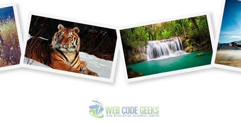
You choose positive values to rotate the images in the clockwise direction, and minus values to rotate counterclockwise.
Another example of the usage of image rotation would be a vertical gallery with inline descriptions. In this case, images are wrapped inside divs to display them in block view. Look at the html below:
<!-- HTML SECTION  -->

<div><img class="img1" src="image.jpg"></div>
<div><img class="img2" src="image1.jpg"></div>
<div><img class="img3" src="image2.jpg"></div>
<div><img class="img4" src="image3.jpg"></div>
<div><img class="img5" src="image4.jpg"></div>
Now the CSS will have very slight changes (in this case, only the degree has changed and some size elements):
<!-- STYLE  SECTION -->

<style type="text/css">

body {
	font-family: "Montserrat";
}

.img1 {
	transform: rotate(7deg);
	border: 0.5em solid #f4f4f4;
	box-shadow: 0.5em 0.5em 0.5em #ccc;
}


.img2 {
	transform: rotate(-8deg);
	border: 0.5em solid #f4f4f4;
	box-shadow: 0.5em 0.5em 0.5em #ccc;
}

.img3 {
	transform: rotate(7deg);
	border: 0.5em solid #f4f4f4;
	box-shadow: 0.5em 0.5em 0.5em #ccc;
}

.img4 {
	transform: rotate(-8deg);
	border: 0.5em solid #f4f4f4;
	box-shadow: 0.5em 0.5em 0.5em #ccc;
}

.img5 {
	transform: rotate(7deg);
	border: 0.5em solid #f4f4f4;
	box-shadow: 0.5em 0.5em 0.5em #ccc;
}

</style>
So you can have a vertical view of these rotated images and place your description inline: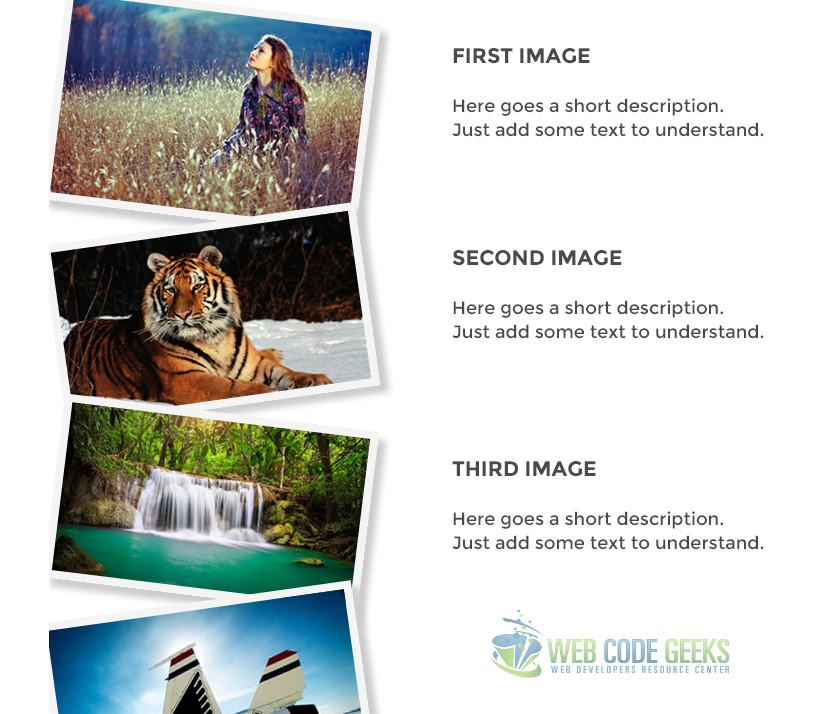
Well, that is a clue of what you can do using the image rotation in css.
3. Conclusion
It seems like a small part of css, and it is somehow, but the transform property with rotate(xdeg) value applied can fundamentally change the way you think of images inside a webpage and rethink ways you can organise them.
It is very easy to use and create beautiful gallery-like sets of images placed on various degrees.
A 180 deg rotation would mean an upside down view while a 360 deg would mean no changes in the view, a full rotation.
4. Download
You can download the full source code of this example here: CSS3 Image Rotate
