The aim of this example is to go through the table-layout property of CSS. The table-layout CSS property defines the algorithm to be used to layout the table cells, rows, and columns. The CSS table-layout property has basic support with the following browsers:
-Chrome
-Firefox
-Internet Explorer 5+ (IE 5+)
-Opera 7+
-Safari (WebKit)
Since the application of the property is fairly easy, we’ll go through some more advanced examples after understanding the basics.
1. Basic Setup & Application
Go ahead and create a new html document and add the basic sytnax in it like so:
<!DOCTYPE html>
<html>
<head>
	<title>CSS Table-Layout Example</title>
</head>
<body>

<!-- STYLE SECTION -->

<style type="text/css">

</style>

<!-- HTML SECTION -->

</body>
</html>
1.1 Syntax & Values
The basic application of the property follows this structure table-layout: value; and possible values are:
/* Keyword values */
table-layout: auto;
table-layout: fixed;
/* Global values */
table-layout: inherit;
table-layout: initial;
table-layout: unset;
The keyword values are the ones most used in our everyday experience, but what do they mean?
1. auto
An automatic table layout algorithm is commonly used by most browsers for table layout. The width of the table and its cells depends on the content thereof.
2. fixed
Table and column widths are set by the widths of table and col elements or by the width of the first row of cells. Cells in subsequent rows do not affect column widths.
Under the “fixed” layout method, the entire table can be rendered once the first table row has been downloaded and analyzed. This can speed up rendering time over the “automatic” layout method, but subsequent cell content may not fit in the column widths provided. Any cell that has content that overflows uses the overflow property to determine whether to clip the overflow content.
1.2 Application
So, after we saw the syntax and values of the table-layout, let’s now apply it somewhere in our code. Take a look at the code below:
<!-- HTML SECTION  -->

<!-- Table-Layout: Auto -->
<table class="ex1">
  <tr>
    <td width="5%">1000000000000000000000000000</td>
    <td width="95%">10000000</td>
  </tr>
</table> <!-- end table -->

<!-- Table-Layout: Fixed -->
<table class="ex2">
  <tr>
    <td width="5%">1000000000000000000000000000</td>
    <td width="95%">10000000</td>
  </tr>
</table><!-- end table -->
So, we’ve set up two tables to show the two property values in separate tables, inside we;ve added one table row for each of them and two table data, which will be the element affected by the property value set, reflecting the changes. Next, we’re giving the tables some basic properties and then the table-layout property, once with an auto value and then fixed.
<!-- STYLE  SECTION -->

<style type="text/css">
table {
    border-collapse: separate;
    width: 100%;
    border: 1px solid black;
}

td {
    border: 1px solid black;
}

table.ex1 {
    table-layout: auto; /* auto value for the first table */
}

table.ex2 {
    table-layout: fixed; /* fixed value for the second table */
}
</style>
This would look like this: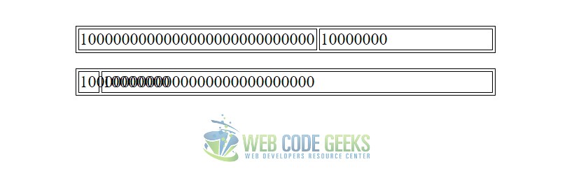
2. Fixed Value Complicated Example
Going deep into this, imagine you had a full consistent table with lots of data, and messy ones. You’d probably want to have disordered rows and columns becaouse of your very specific needs where, for example, you could have nested rows, stacked columns and so on and so fourth. Look at how such a detailed table would look like:
<!-- EXAMPLE 1 -->

<h1>Fixed Tables Solve Some Issues</h1>

<table class="sturdy">
  <tr>
    <td>I'm 25% wide.</td>
    <td>I'm 50% wide.</td>
    <td>I'm 25% wide.</td>
  </tr>
  <tr>
    <td>Text down here doesn't affect layout anymore.</td>
    <td>...</td>
    <td>This long sentence would probably have pushed this row wider.</td>
  </tr>
</table>

<table class="nobreak">
  <tr>
    <td>The table itself will not exceed</td>
    <td>the exact width you set the table to be, from content alone.</td>
  </tr>
</table>

<table class="wider">
  <tr>
    <td>Well, unless YOU force it wider by</td>
    <td>setting the cells wider (combined) than the table is wide.</td>
  </tr>
</table>

<table class="ignoreyou">
  <tr>
    <td>It won't go smaller though, it will do a calculation.</td>
    <td>...</td>
  </tr>
  <tr>
    <td>Set to 10px<br>Thus 25% of total 40px</td>
    <td>Set to 30px<br>Thus 75% of total 40px</td>
  </tr>
</table>

<table class="cut-off">
  <thead>
  <tr>
    <th>My favorite feature is being able to ellipsis text.</th>
    <th>It's great for user-generated text.</th>
  </tr>
  </thead>
  <tr>
    <td>Supercalifragilisticexpialidocious Something something something something attrotious</td>
    <td>1</td>
  </tr>
  <tr>
    <td>This little piggy went to market. This little piggy went to bed.</td>
    <td>1</td>
  </tr>
  <tr>
    <td>Lorem ipsum dolor sit amet, consectetur adipisicing elit. Blanditiis amet molestiae earum accusantium nostrum eveniet ipsum soluta ut reprehenderit vel incidunt laboriosam dolorum maiores! Earum deserunt sit unde? Sunt voluptatem!</td>
    <td>1</td>
  </tr>
</table>

<table class="hide">
  <tr>
    <td class="img-1">Overflow can be hidden.</td>
    <td class="img-2">
    <img src="https://s3-us-west-2.amazonaws.com/s.cdpn.io/3/dock-slice-2.png" />
    </td>
  </tr>
</table>

<table class="scroll-code">
  <tr>
    <td>Overflow can scroll. Except in Firefox.</td>
    <td><pre>
body.logged-in article > h2 {
  background: linear-gradient(rgba(0, 0, 0, 0), rgba(255, 0, 0, 0.2));
}
    </pre></td>
  </tr>
</table>
Things get a lot sturdier and more predictable with property/value in place. The layout is fixed based on the first row. Set the width of those, and the rest of the table follows.
/*EXMAPLE 1*/
td, th {
  border: 1px solid black;
}
table {
  margin: 15px 0;
  border: 1px solid black;
  table-layout: fixed;
  width: 100%; /* must have this set */
}
html {
  background: #ccc;
}
body {
  max-width: 400px;
  margin: 0 auto;
  background: white;
  padding: 10px;
}

.sturdy td:nth-child(1),
.sturdy td:nth-child(3) {
  width: 25%;
}
.sturdy td:nth-child(2) {
  width: 50%;
}

.nobreak {
  white-space: nowrap;
}

.wider td {
  width: 300px;
}

.ignoreyou td:nth-child(1) {
  width: 10px;
}
.ignoreyou td:nth-child(2) {
  width: 30px;
}

.cut-off th:nth-child(1) {
  width: 75%;
}
.cut-off td:nth-child(1) {
  overflow: hidden;
  white-space: nowrap;
  text-overflow: ellipsis;
}
.cut-off th:nth-child(2) {
  width: 25%;
}
.cut-off td:nth-child(2) span {
  display: block;

}

.hide td {
  overflow: hidden;
}

.scroll-code td {
  overflow: auto;
}
Well, some things are fixed, others just got messed up: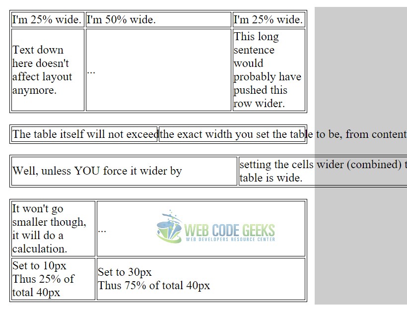
Since fixed is the only distinct value the property can get (because auto is just going to give cells the right space according to the text inside), you’ll just have to keep an eye on using the fixed value and notice where and when you can take advantage of it. It’s not that useful, however.
3. Conclusion
To conclude we can state that the table-layout property is a good way to set table cells to fixed widths, making it easier for cases when your content is limited/fixed to a specific width, while it is not recommended to be used when considering large piece of data and information being passed into the cell.
Such case, for example, might be the information coming from a user input, that needs to be added to a table. Obviously, in this case you are not sure about how much space the text is going to occupy, so an auto value would be your most preferable choice. Above, the example showed different cases of how the fixed value could be the wrong one to be used. However, it is always on you to decide.
4. Download
You can download the full source code of this example here: CSS Table-Layout
