With the new CSS3 Flexbox box model, you can now write more concise and maintainable code for various common layout tasks — such as vertical centering, taking up remaining space, or simpler grids. After this tutorial, you’ll be able to use Flexbox and understand exactly how it works.
1. Introducing Flexbox
The CSS3 Flexbox spec contains quite a few properties. It’s easiest to think of them in two categories:
- Properties for flex containers (the parent)
- Properties for flex items (the children)
You’ll learn all of them in this tutorial. But before you do, you should always think about browser support, so let’s see what caniuse.com has to say:
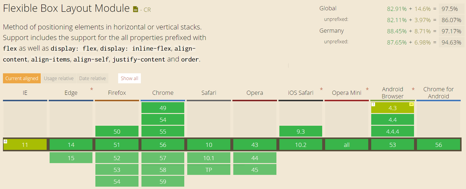
The most important info from this is:
- 97.5% of users worldwide support Flexbox (if you use prefixing)
- The main problems are IE11 and below, and older Android browsers
The standard has evolved since 2009 which unfortunately brought forth three different specifications. Therefore, browser prefixes often look a bit different because they are based on different versions of the spec. Here’s one example that also helps you spot outdated information on the web right away:
- Spec from 2009:
display: box - Spec from 2011:
display: flexbox - Spec from 2016:
display: flex
Nowadays, you make an element a Flexbox by setting display: flex (or display: inline-flex). This allows you to use all the properties discussed in this tutorial.
1.1 Main Axis & Cross Axis
It’s essential to understand the concepts of main and cross axis for everything you do with Flexbox. For row layouts, the main axis will be the horizontal axis. For column layouts, the main axis will be vertical.
The cross axis is always perpendicular to the main axis, thus vertical for rows and horizontal for columns. Keep this in mind for what’s to come.
2 Styling Flex Containers
Let’s take a look at the Flexbox properties to define the general layout of the flex container.
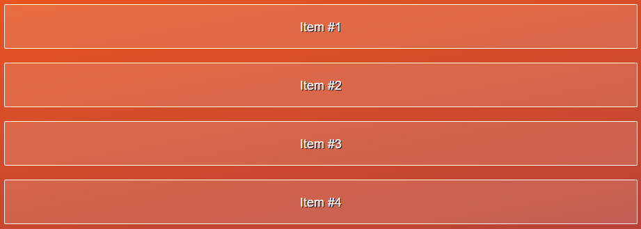
2.1 flex-direction
With Flexbox, you essentially have two choices for the basic behavior of your container: either row or column layout. Additionally, each can be “reversed”. Let’s see what that means.
flex-direction: row (default)

This is the default which behaves similar to left-floated elements in a container – but of course you’ll be able to use all of the power of Flexbox on this container.
flex-direction: column
In the column layout, elements will be aligned from top to bottom in a row. Each flex item will automatically take up the whole width.
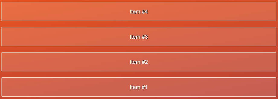
flex-direction: row-reverse

This is the same as row but items are inserted from right to left (from the end of the main axis towards the front).
flex-direction: column-reverse
This is the same principle as row-reverse but with the main axis now being the vertical axis.
2.2 justify-content
With justify-content, you can define the spacing of items along the main axis. Let’s look at an example for a row layout.
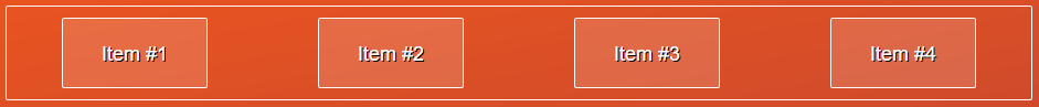
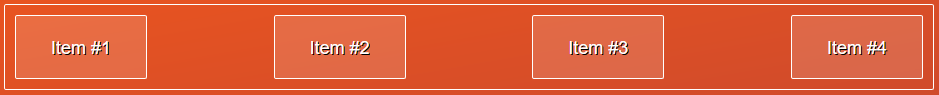
justify-content: flex-start (default)

Here, the flex items align towards the start of the main axis, which in this case is the left of the row.
justify-content: flex-end

In this case, items align towards the end of the main axis. For flex-direction: column, this would be the bottom.
justify-content: center

I guess this is what you expected, right? No surprises here.
justify-content: space-around
This distributes spacing between the flex items evenly, also leaving whitespace at the start and end.
justify-content: space-between
Works like space-around but without whitespace at the start and end of the main axis.
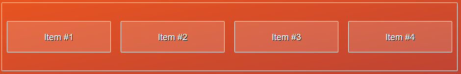
2.3 align-items
With align-items, you can change the alignment of elements along the cross axis.
align-items: stretch (default)
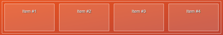
By default, all items in the flex box will stretch to take up all space available on the cross axis.
align-items: flex-start
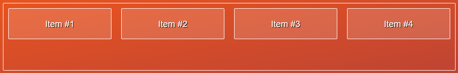
With this, all flex items will be aligned towards the start of the cross axis. Note that flex-start is not the default value here.
align-items: flex-end
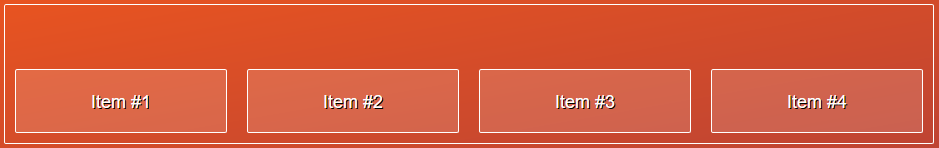
Using flex-end will accordingly align all items to the end of the cross axis.
What would that mean in the case where you have flex-direction: column? Then this would refer to the right-hand side of the container.
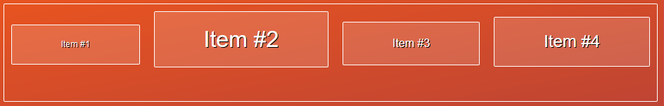
align-items: center
As you would expect, this will align all items to the center of the cross axis. This is key to vertical centering of arbitrary elements!
align-items: baseline
This slightly more exotic value will align the flex items in a way that each of their content’s baselines align. Thus, in the example above, the baselines of all texts align nicely.
2.4 flex-wrap
Use flex-wrap to let the container flow into multiple rows or columns.
flex-wrap: nowrap (default)
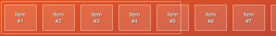
If you don’t tell it otherwise, the flex box will not wrap its items into multiple rows or columns. This can cause the container to overflow as depicted above. In these cases, you should either reduce the content inside the flex box or use wrapping.
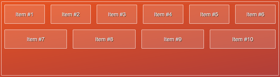
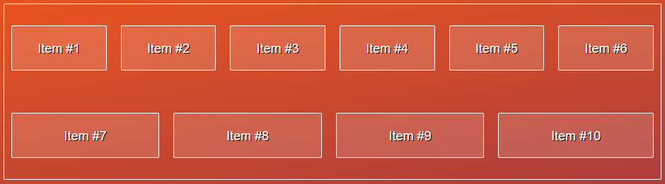
flex-wrap: wrap
With this simple line, you let the flex container wrap into multiple rows or columns if it would otherwise overflow. Note that this will create a very basic grid layout — but you cannot really control what it will look like yet. Later, you’ll learn how to control the sizes of each item.
flex-wrap: wrap-reverse
This one behaves like wrap, but rows and columns will be in reverse order — thus going from the end of the cross axis towards the start of the cross axis.
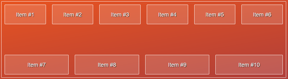
2.5 align-content
Once you have multiple rows or columns, you can easily define their alignment and spacing using align-content. For single row/column layouts, this will no effect.
The possible values are exactly the same as for justify-content, but this time it will define the alignment & spacing along the cross axis.
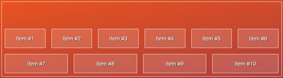
align-content: flex-start (default)
This looks similar to align-items. However, align-items would in this case define the alignments per row or column, not the alignment of all rows/columns inside the container.
align-content: flex-end
align-content: center
align-content: space-around
With space-around, all rows or columns will be spaced evenly. Note the spacing before the first and after the last row in this example.
align-content: space-between
Similar to above, space-between will space all rows/columns evenly but will not add any spacing at the very start and end.
Those are all properties that Flexbox has to offer to define the layout for flex containers. You can see how powerful and easy to use it is — it just takes a while to get used to all the different properties.
For that, I very much recommend Flexbox Froggy, a set of fun exercises to try out these new CSS properties. It will only take 5 minutes, and it’s a great way to try out Flexbox.
For levels 14 and upwards, you’ll need to be able to style flex items as well. So here goes.
3 Styling Flex Items
In addition to the basic styles for flex containers, there are many ways you can control the behavior of each flex item. Some override the general layout from the container, others define how items can grow or shrink responsively.
3.1 order
With Flexbox, you can change the order of the flex items independent from the HTML markup. This allows more flexible layouts with less coupling to the HTML.
order: 0 (default)
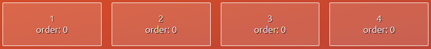
By default, all flex items will have the order property set to 0. In particular, they have the same order value — therefore, their order in the layout will reflect their order in the HTML markup.
order: -1 and order: 1
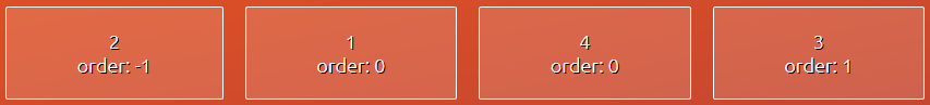
Since the default value is 0, you can use negative numbers to move an item to the front and positive numbers to move an item to the end (of the main axis).
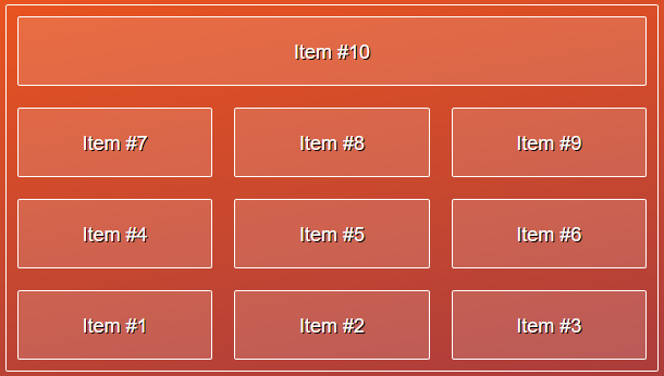
order: 1, 2, 3
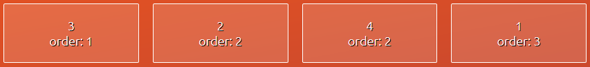
This way, you can also easily define a completely customized order by setting the order property for each item.
3.2 align-self
With align-self, Flexbox allows you to override the container’s align-items value. This is useful, for example, to make individual flex items stand out.
Naturally, align-self allows the exact same values as align-items. Thus, you already know all five possible values:
align-self: stretch (default)
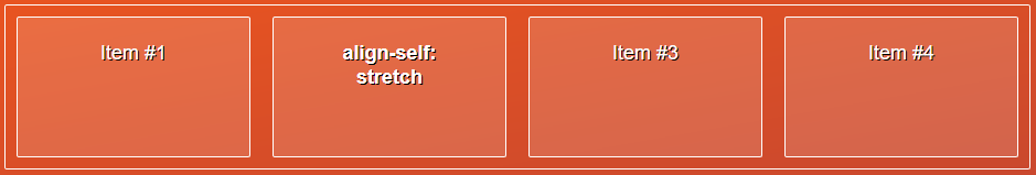
The item will stretch the whole cross axis, even if the container’s align-items property was set to a different value.
align-self: flex-start
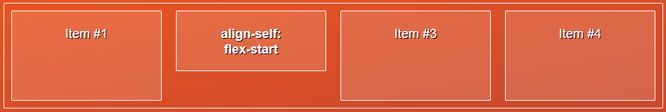
The selected item will be aligned to the beginning of the cross axis.
align-self: flex-end
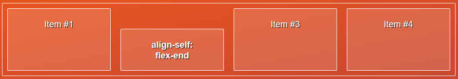
The affected flex item will be aligned to the end of the cross axis.
align-self: center
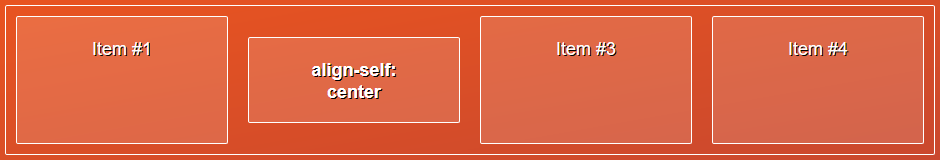
The selected item will be aligned at the center of the cross axis.
align-self: baseline
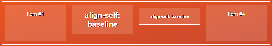
The selected items will be aligned so that their baselines are on the same height. This once will make no difference if only one item uses baseline (this would appear like flex-start).
3.3 flex-grow
Now we get to the more interesting, and slightly more complicated part, part of Flexbox.
The following three properties let you define the sizing of the flex items, depending on how much space is available. For instance, you can take up any remaining space, or let the items shrink if not enough space is available.
Firstly, flex-grow allows flex items to take up remaining space along the main axis:
flex-grow: 0 (default)
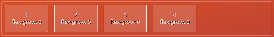
Unless specified otherwise, flex items will not be allowed to grow. This is reflected by the default value of zero.
flex-grow: 1
You can allow items to take up remaining space along the main axis simply by setting flex-grow to 1.
flex-grow - Growing Evenly
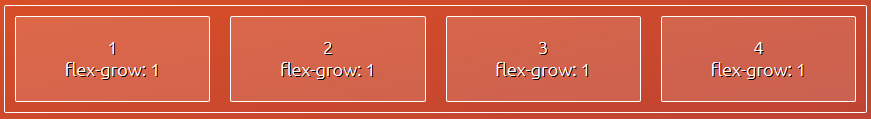
Setting flex-grow to 1 for all elements in a container will cause them to take up remaining space equally. This does not mean they will always have the same size.
Flexbox will first consider how large the item is based on its content, padding etc — only then will it distribute the remaining space between the flex-items.
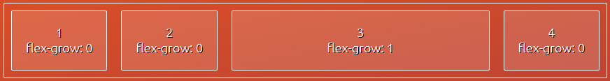
flex-grow - Stronger Grow
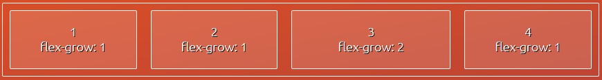
Setting a larger value for this property will make the affected item take up more space than the rest. More specifically, the third item here will get twice as much of the remaining space than the rest.
Again, this doesn’t mean the third item will be twice the size of the other items.
flex-grow - Another Example
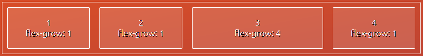
To exemplify this even further, consider the above example. Here, the third item will get 4/7 of the space that remains.
Why? Summing up all flex-grow values amounts to 7. So you can imagine that the remaining space is split up into 7 chunks which are then distributed between the items. Items 1, 2, and 4 will get 1 chunk each, whereas item 3 will get 4 chunks — reflecting their flex-grow value.
3.4 flex-shrink
This is the counterpart to flex-grow and allows you to let items shrink of the container is overfull.
flex-shrink: 1 (default)
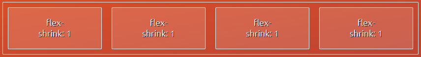
In contrast to flex-grow, flex items will shrink by default if necessary. This is reflected by the default value of 1.
flex-shrink: 0
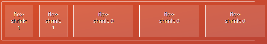
Setting the property to zero will tell Flexbox that this item is no longer allowed to shrink, even if there’s not much space.
This can cause the container to overflow faster. But even with shrinking, the flex container can overflow, as seen under flex-wrap.
flex-shrink - Example
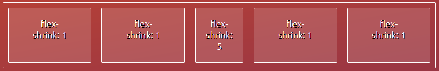
Similar to flex-grow, setting a larger value for flex-shrink will allow the item to shrink more than the rest.
However, Flexbox will always shrink items only to some degree. The more content and padding it has, the less it can be shrunk. This is important to keep in mind when items are not getting smaller even if you set flex-shrink: 999.
3.5 flex-basis
Instead of using width and height, the best practice is to use flex-basis when dealing with a flex box. For rows, flex-basis refers to width. For columns, it refers to height. In other words, it’s always the size along the main axis.
flex-basis: auto
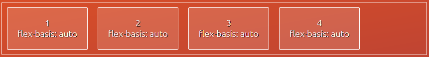
Just like is the case for width and height, the default value for flex-basis is called auto. This way, the size of each item is defined purely by its content, padding, border, and margin.
flex-basis - Pixel Values
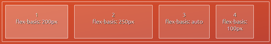
You can use any dimensional value for flex-basis — again just like width and height. In this example, the eventual size of the items is equal to their flex-basis because enough space is available and flex-grow is set to 0.
flex-basis - Percentage Values
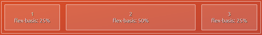
Similarly, you can use percentage values to define more fluid layouts, even without the help of flex-grow.
3.6 flex
At last, there’s the flex shortcut property. This one lets you define flex-grow, flex-shrink, and flex-basis in one line of code.
flex: 0 1 auto
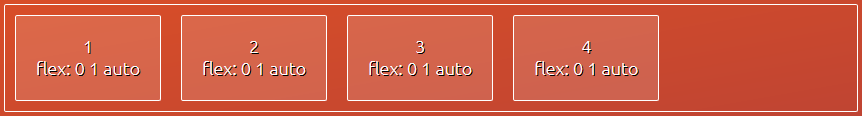
If you don’t set a value for flex explicitly, naturally it will be set to the defaults of flex-grow, flex-shrink, and flex-basis.
flex: 1
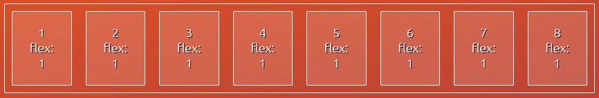
This is a very useful shortcut for flex: 1 1 0%.
What does it do? It’s a ridiculously easy and concise pattern to create a layout with equally sized column. This can be seen as one row of a grid. You can easily stack such rows below each other to create more complex grids, using only flex: 1.
flex - Example
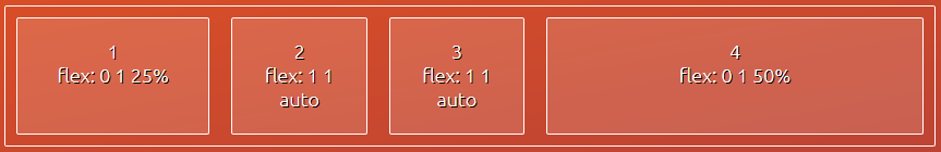
This is an example showing more different values you can use for this property. Essentially, just combine what you know about flex-grow, flex-shrink, and flex-basis.
4. Examples of Flexbox in Practice
All nice and good, but let’s see how all this will make your life as a designer easier.
4.1 Simpler Grids
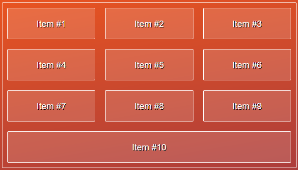
You already saw the very simplest solution for grids with Flexbox — using flex: 1. This is already all you need to create grids with columns of equal size like this:
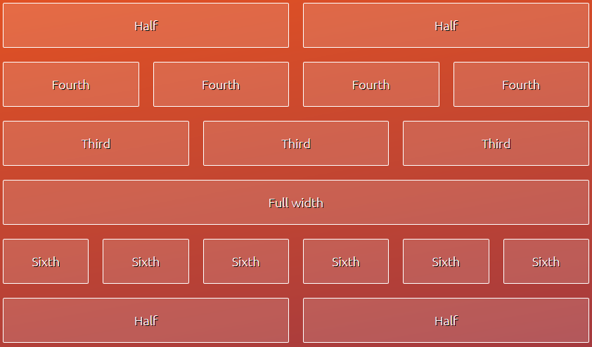
For more control over the layout, you can use flex-basis to define columns of different sizes.
4.2 Vertical Centering
Ever tried using vertical-align: middle but to no avail? I sure have. Unfortunately, it will only work for inline elements and table cells.
With Flexbox, you can finally center arbitrary elements vertically with just one line of code — namely align-items: center.

Similarly, horizontal centering can be achieved via justify-content: center.
4.3 Solved by Flexbox
There are more common CSS tasks that have been greatly simplified by Flexbox. Solved by Flexbox gives a good overview of some those.
To learn more implementing media objects, the holy grail layout, and other layouts, be sure to check out the section Really Dive Into Flexbox below.
5. Bonus: Flexbox Video Tutorials
Ready to dive into Flexbox? See it in action and code along to create your first layouts with CSS3 Flexbox.
6. Really Dive Into Flexbox – Where to Go From Here
Eager to learn all about Flexbox and reach proficiency?
You can get my full course on Udemy for $195 $10 — as one of my readers, you get it 95% off.
>> Check out the full curriculum
Reviews From My Students
Great course! Great instructor. Explains everything very clearly and easy to understand.
– Bryan
To the point and informative.
– Michael
Very good course…content is clear and well structured..explanation easy to understand.
– Martin
Dude sounds super nice and he’s been really thorough from the beginning. I look forward to taking the rest of the course!
– Aaron
Good, thorough explanations of concepts with a well-spoken, easy to follow format. The mini challenges were a good bonus too!
– Ben
>> Get the complete Flexbox course for $10
Of course, I’ll answer all your questions about Flexbox along the way. Also, you’ll get a 30-day money back guarantee on Udemy. I’d be super happy to welcome you inside the course!
7. Get The Flexbox Cheat Sheet
As a token of appreciation for making it this far, you can download my Flexbox Cheat Sheet. It contains all the Flexbox properties that are explained in this post in one PDF overview.
Please post your questions, suggestions, thoughts in the comments, I appreciate it!
| Reference: | The Ultimate CSS3 Flexbox Tutorial for 2017 from our WCG partner Peter Sommerhoff at the PeterSommerhoff blog. |
