One of the most expected features of HTML5 was the introduction of the canvas element, allowing to draw graphics on it. This tutorial will show how to draw graphs on it, starting from the lowest level, and ending with a JavaScript library.

As it is an HTML example, we won’t need any web server or back-end language installed in our machine, just a web browser.
For this example, the following browsers have been used for testing:
- Chromium 56.0.2924.76.
- Firefox 52.0.1.
- Opera 44.0.
Table Of Contents
1. The canvas element
The canvas element was one of the most expected novelties of HTML5. This element allows us to draw dynamically images in a webpage, usually done with JavaScript in combination with the canvas API.
As said, the element we have to use is canvas. So, something like the following would be enough to start:
canvas.html
<html>
<head>
    <meta charset="utf-8">
    <title>Graph - Canvas</title>
    <script src="canvas.js"></script>
    <style>
        #wrapper {
            width: 80%;
            margin: 0 auto;
            text-align: center;
        }
        #canvas {
            border: 1px solid black;
        }
    </style>
</head>

<body>
    <div id="wrapper">
        <h1>HTML5 Canvas</h1>
        <canvas id="canvas" width="400" height="400"></canvas>
    </div>
</body>
</html>
This will render a white canvas in the browser of 400×400 (with the black border set with the CSS). Nothing very exciting.
But, now that we have our canvas, we can draw on it. Let’s see how to draw a line to see the most elemental canvas functions.
canvas.js
document.addEventListener('DOMContentLoaded', function(event) {
    var canvas = document.getElementById('canvas'),
    context = canvas.getContext('2d');

    context.beginPath();
    context.moveTo(0, 0);
    context.lineTo(400, 400);
    context.strokeStyle = '#7142f4';
    context.stroke();
});
The first thing we do is to bind the piece of code that manipulates the canvas to the DOMContentLoaded listener, since we have to be sure that the elements are loaded before we access them.
Then, we get the canvas object from the DOM. But, for drawing on it, we need to get the render context of the canvas, the 2D context. This context offers the method for drawing in the canvas.
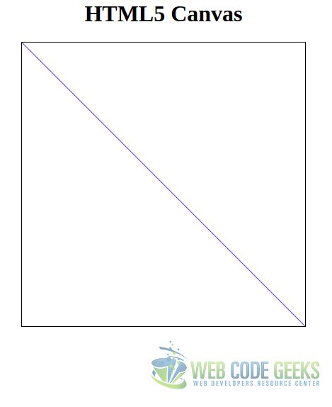
For drawing a line, the first thing we do is calling beginPath() method. This is for telling to the canvas that, effectively, what we are going to do is to draw a path (line).
Then, we have to set the beginning of the path in the coordinate system, with moveTo() method. We have to take into account that, in the pixel coordinate system, the (0, 0) is placed in the top-left corner, that is, the Y axis is inverted in regard to the cartesian coordinate system. So, the path will begin in the top-left corner of the canvas.
We can also set the style of the line, assigning a color to the strokeStyle property of the context object. The default color is black.
Finally, to draw the line for the defined path, we have to call the stroke() method. This is what we would see in the browser:
2. Drawing (more complex) graphics
Actually, we can consider a graphic what we have done above. But let’s see a more thorough example.
Let’s suppose that we want to want to show a graphic of the world’s population growth, per continent. We can use the following dataset for this:
| Continent | 1700 | 1750 | 1800 | 1850 | 1900 | 1950 | 2000 | 2050 |
|---|---|---|---|---|---|---|---|---|
| Africa | 106 | 106 | 107 | 111 | 133 | 221 | 783 | 2478 |
| America | 12 | 18 | 31 | 64 | 156 | 339 | 820 | 1217 |
| Asia | 441 | 502 | 635 | 809 | 947 | 1402 | 3700 | 5267 |
| Europe | 178 | 190 | 203 | 276 | 408 | 547 | 675 | 734 |
| Oceania | 3 | 2 | 2 | 2 | 6 | 13 | 30 | 57 |
| World | 710 | 791 | 978 | 1262 | 1650 | 2521 | 6008 | 9725 |
(Souce: Wikipedia)
Note: the values for the year 2050 are, obviously, an estimation. But this is not important for our purposes.
For this, we will use almost the same HTML base:
canvas_population.html
<html>
<head>
    <meta charset="utf-8">
    <title>Graph - Canvas</title>
    <script src="canvas.js"></script>
    <style>
        #wrapper {
            width: 80%;
            margin: 0 auto;
            text-align: center;
        }
    </style>
</head>

<body>
    <div id="wrapper">
        <h1>World population growth</h1>
        <canvas id="canvas" height="400" width="650"></canvas>
    </div>
</body>
</html>
The JavaScript would be the following:
canvas_population.js
var populationGrowth = {
    'africa' : [106, 106, 107, 111, 133, 221, 783, 2478],
    'america': [12, 18, 31, 64, 156, 339, 820, 1217],
    'asia' : [411, 502, 635, 809, 947, 1402, 3700, 5267],
    'europe' : [178, 190, 203, 276, 408, 547, 675, 734],
    'oceania': [3, 2, 2, 2, 6, 13, 30, 57],
    'world' : [710, 791, 978, 1262, 1650, 2521, 6008, 9725]
};

var xScale = 50;

function initCanvas() {
    var canvas = document.getElementById('canvas'),
        context = canvas.getContext("2d");

    context.strokeColor = '#7142f4';

    return context;
}

function plotDataset(context, dataSet) {
    var canvasHeight = context.canvas.height;

    context.beginPath();
    context.moveTo(0, dataSet[0]);

    for (var populationIndex = 0; populationIndex < dataSet.length; populationIndex++) {
        var population = dataSet[populationIndex],
            xCoordinate = populationIndex * xScale,
            yCoordinate = canvasHeight - population;

        context.lineTo(xCoordinate, yCoordinate);
    }

    context.stroke();
}

function draw(context, dataSet) {
    for (var continent in dataSet) {
        var population = dataSet[continent];

        plotDataset(context, population);
    }
}

document.addEventListener('DOMContentLoaded', function(event) {
    var context = initCanvas();

    draw(context, populationGrowth);
});
Let’s examine the code:
The first thing we do is to define an object with our data. Nothing very special.
Then, we define, in line 10, a scaling value for the X axis. This is for defining the “distance” between each value in the X axis. As you can see, this is a complete arbitrary value. We will leave as it is for the moment.
The function for initializing the canvas doesn’t do anything we don’t know already.
The one for plotting the dataset (the dataset will be the array of values for each continent) is the most interesting one. Note that the first thing we do is to save the height of the canvas. After beginning the path and moving the initial point (which is the (0, <first-value>)) for the dataset in question, we start looping each value of the dataset. For the X coordinate, we multiply the value itself with the scaling value, as explained above. And, for the Y coordinate, we have to “invert” the actual value because, remember, the Y axis in the pixel coordinate system goes “top-down”. To display the actual value in the system, we just have to subtract the value in question to the canvas height.
The last function is just for iterating the object with the datasets and calling to the method described in the paragraph above.
Finally, when the DOM is loaded, we just init the context, and draw the data.
The result will be the following:
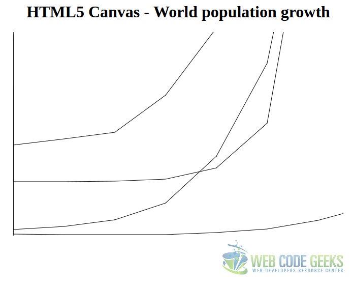
Perhaps results quite disappointing. Apart from the frankly improvable style, not even all the datasets are displayed. And, for those being displayed, not all the data is shown.
Instead of investing our time and efforts in drawing ugly charts, we will see how to draw stunning charts with a JavaScript library.
3. Chart.js
We have already seen how to draw a graphic natively, defining several datasets and building our own functions to draw the data in the canvas. But the functions we have coded are just applicable for a specific kind of graphic, a line chart. At the moment we would need to display another kind of graphic, we would have to build the functions from the scratch.
Fortunately, there’s available a library for drawing beautiful charts, with a very huge variety, named Chart.js. In this section, we will see how to draw several types of graphics with this library.
For using it, we can load it from a CDN, or download it to our workspace. It’s available in cdnjs.com. In this tutorial, we have used the version 2.5.0.
3.1. Line chart
The best way to begin using Chart.js is using the same chart type we have build manually.
The base HTML will be almost the same, as usual:
chartjs_line.html
<!DOCTYPE html>
<html>
<head>
    <meta charset="utf-8">
    <title>Chart.js - Line chart</title>
    <script src="https://cdnjs.cloudflare.com/ajax/libs/Chart.js/2.5.0/Chart.bundle.min.js"></script>
    <script src="line.js"></script>
    <style>
        #wrapper {
            width: 60%;
            margin: 0 auto;
            text-align: center;
        }
    </style>

</head>
<body>
    <div id="wrapper">
        <h1>Chart.js - Population growth</h1>
        <canvas id="canvas" width="400" height="200" ></canvas>
    </div>
</body>
</html>
The JavaScript will be the following:
chartjs_line.js
var years = [1700, 1750, 1800, 1850, 1900, 1950, 2000, 2050];

var population = {
    labels: years,
    datasets: [
        {
            label: 'Africa',
            borderColor: "rgba(220,180,0,1)",
            pointColor: "rgba(220,180,0,1)",
            lineTension: 0,
            fill: false,
            data: [106, 106, 107, 111, 133, 221, 783, 2478]
        }, {
            label: 'America',
            borderColor: "rgba(94,5,115,1)",
            pointColor: "rgba(151,187,205,1)",
            lineTension: 0,
            fill: false,
            data: [12, 18, 31, 64, 156, 339, 820, 1217]
        }, {
            label: 'Asia',
            borderColor: "rgba(151,187,205,1)",
            pointColor: "rgba(151,187,205,1)",
            lineTension: 0,
            fill: false,
            data: [411, 502, 635, 809, 947, 1402, 3700, 5267]
        }, {
            label: 'Europe',
            borderColor: "rgba(46,103,219,1)",
            pointColor: "rgba(151,187,205,1)",
            lineTension: 0,
            fill: false,
            data: [178, 190, 203, 276, 408, 547, 675, 734]
        }, {
            label: 'Oceania',
            borderColor: "rgba(189,50,189 ,1)",
            pointColor: "rgba(151,187,205,1)",
            lineTension: 0,
            fill: false,
            data: [3, 2, 2, 2, 6, 13, 30, 57]
        }, {
            label: 'World',
            borderColor: "rgb(3,202,103)",
            pointColor: "rgba(3,202,103,1)",
            lineTension: 0,
            fill: false,
            data: [710, 791, 978, 1262, 1650, 2521, 6008, 9725]
        },
    ]
};


document.addEventListener('DOMContentLoaded', function(event) {
    var context = document.getElementById('canvas').getContext('2d');
    var populationChart = new Chart(
        context,
        {
            type: 'line',
            data: population,
        }
    );
});
That’s it. All we have to do is define an object, with that structure, and then instantiate a Chart.
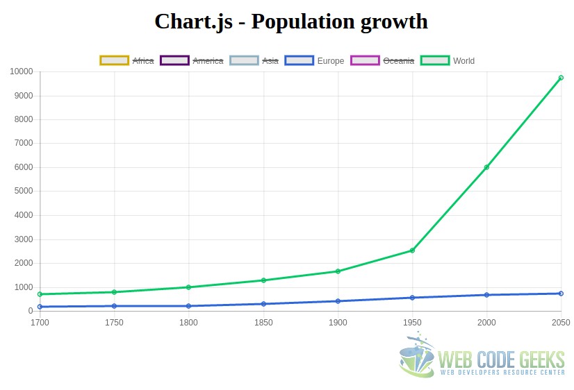
Setting the lineTension to 0 will make the graphic lines straight, otherwise, they will be curved; and we set the fill to false not to fill underneath, since in this graphic wouldn’t make much sense. Leaving it as default, would result on a different chart type, an area chart.
And, with this, the output would be the following:
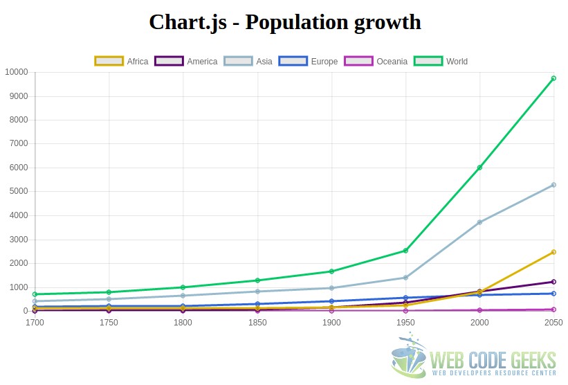
Beautiful! And without the need of coding any JavaScript, besides the data definition.
But that’s not all. We can interact with the chart. For example, if we click the top labels, we can hide/show them:
And, if we place the cursor on each of the value points of the graph, the exact value will be displayed.
3.2. Bar chart
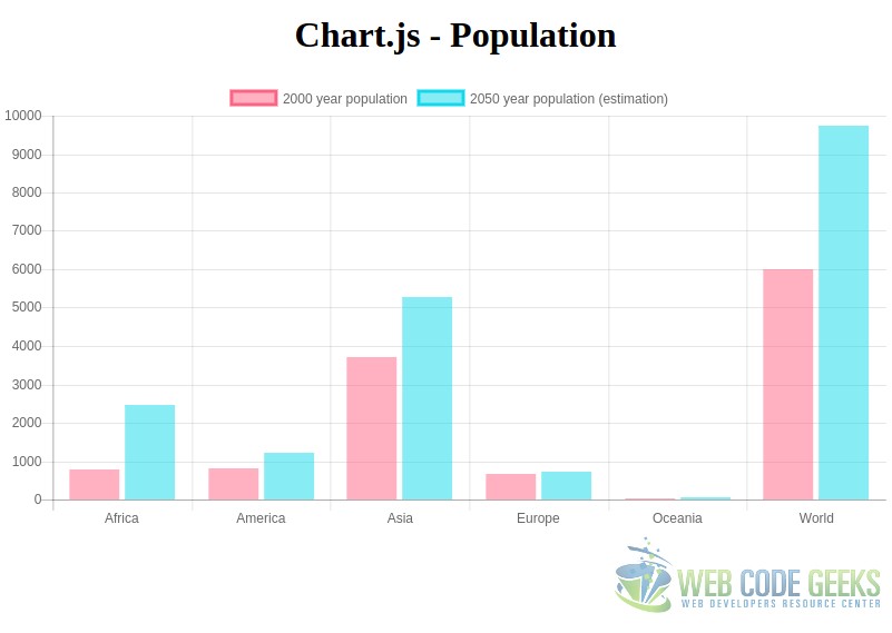
The bar charts are used for representing graphically a dataset of quantitative, or qualitative, discrete data. The X axis represents the different modalities or concepts, and the Y axis the frequency of each one.
So, yes, a bar chart may also be used for displaying the population of different areas. But, in this case, will reduce the number of years to display the population of, to 2, not to have an excessively huge graphic.
With this, the JavaScript would be the following:
var population = {
    labels: ['Africa', 'America', 'Asia', 'Europe', 'Oceania', 'World'],
    datasets: [
        {
            label: '2000 year population',
            data: [783, 820, 3700, 675, 30, 6008],
            backgroundColor: [
               'rgba(255, 99, 132, 0.5)',
               'rgba(255, 99, 132, 0.5)',
               'rgba(255, 99, 132, 0.5)',
               'rgba(255, 99, 132, 0.5)',
               'rgba(255, 99, 132, 0.5)',
               'rgba(255, 99, 132, 0.5)',
           ],
           borderColor: [
              'rgba(255,99,132,1)',
              'rgba(255,99,132,1)',
              'rgba(255,99,132,1)',
              'rgba(255,99,132,1)',
              'rgba(255,99,132,1)',
              'rgba(255,99,132,1)',
          ],
      }, {
          label: '2050 year population (estimation)',
          data: [2478, 1217, 5267, 734, 57, 9725],
          backgroundColor: [
             'rgba(17,216,235, 0.5)',
             'rgba(17,216,235, 0.5)',
             'rgba(17,216,235, 0.5)',
             'rgba(17,216,235, 0.5)',
             'rgba(17,216,235, 0.5)',
             'rgba(17,216,235, 0.5)',
         ],
         borderColor: [
             'rgba(17,216,235,1)',
             'rgba(17,216,235,1)',
             'rgba(17,216,235,1)',
             'rgba(17,216,235,1)',
             'rgba(17,216,235,1)',
             'rgba(17,216,235,1)',
         ],
      }
   ]
};


document.addEventListener('DOMContentLoaded', function(event) {
    var context = document.getElementById('canvas').getContext('2d');
    var clientsChart = new Chart(
        context, {
           type: 'bar',
           data: population
       }
    );
});
Note that, in this case, even if the data is the same, in the dataset has to be grouped by year, instead of by continent.
For this, the rendered chart is this one:
3.3. Pie chart
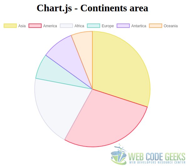
The circular or “pie” chart is commonly used for displaying percentages and proportions.
This means that our previous examples are not applicable for this type of chart, so we will have to change the data we are going to represent. For this case we could use, for instance, the area extension percentage of each continent (omitting the sea).
chartjs_pie.js
var continentsArea = {
    labels: ['Asia', 'America', 'Africa', 'Europe', 'Antartica', 'Oceania'],
    datasets: [
    {
        backgroundColor: [
           'rgba(234,223,74, 0.5)',
           'rgba(252,21,56 , 0.2)',
           'rgba(211,213,232 , 0.2)',
           'rgba(75, 192, 192, 0.2)',
           'rgba(153, 102, 255, 0.2)',
           'rgba(255, 159, 64, 0.2)'
       ],
       borderColor: [
           'rgba(234,223,74, 0.8)',
           'rgba(252,21,56 , 0.8)',
           'rgba(211,213,232, 0.8)',
           'rgba(83,210,189, 0.8)',
           'rgba(153, 102, 255, 0.8)',
           'rgba(255, 159, 64, 0.8)'
       ],
       data: [30, 28, 20, 7, 9, 6]
     },
   ]
};


document.addEventListener('DOMContentLoaded', function(event) {
    var context = document.getElementById('continents').getContext('2d');
    var continentsChart = new Chart(
       context,
       {
           type: 'pie',
           data: continentsArea
       }
    );
});
The output would be the following:
Note: for pie charts, we can also “nest” data. Applying it to the previous example of the population growth through the time, would consist on, first, assigning the population percentage to each continent per year; and then, display the data of several years. The resulting chart would be a pie of several circles, with the data of each year for each circle.
Note 2: if, instead of “pie”, we instantiate the chart as “doughnut”, we would have the same chart, but with a “donut” appearance.
4. Summary
This tutorial has shown how to draw charts with HTML5, starting from the scratch with the key element for this, the canvas element. This element allows us to draw figures with JavaScript, being able to draw graphics form a dataset. But the effort it requires is pretty high for the results we would obtain. That’s why we have seen how to use the Chart.js library, the JavaScript library for drawing beautiful charts in an incredibly easy way. We have seen that, with this library, we can draw any of the most common graphics without programming, apart from, obviously, declaring the dataset objects.
5. Download the source code
This was an example of HTML5 Graphs Tutorial.
You can download the full source code of this example here: HTML5GraphsTutorial

Yes! Chart.js provides a nice visual representation of data. I always prefer this when working on complex data manipulations.