Developing Front-End Microservices With Polymer Web Components And Test-Driven Development (Part 4/5): Styling And Communication
In the previous article we developed our second Polymer Web Component. With two of them functionally finished, we’ll apply styles and create a way for users of our components to have partial control of the look and feel. Once that is done, we’ll improve our Demo page and create proper communication between our components.
This article is part of Developing Front-End Microservices With Polymer Web Components And Test-Driven Development series:
- The First Component
- Polishing The First Component
- The Second Component
- Styling And Communication
- Using Microservices
You can continue working on the code we wrote in the previous article. If you had trouble completing it, please checkout the polymer-books branch of the books-service repository. It contains all the code from the previous article.
git checkout polymer-books
If you have trouble following the exercises in this article, the complete source code can be found in the polymer-styles-events branch of the books-service repository.
Styling
 Styling inside Web Components works in the same way as anywhere else. We create styles and apply them as classes on HTML tags. One of the features of Shadow DOM (part of Web Components) is shadow boundary that, among other things, features style encapsulation. Styles defined inside Shadow DOM are available only inside the Web Component. They are completely isolated from the rest of the DOM. How can we allow others to style our Web Components? There are few different styling options provided by Polymer.
Throughout this article, we’ll use Custom CSS Properties. Instead of exposing component’s internal implementation for styling or theming, we’ll define few custom CSS properties. For example, we can define two types of “special” buttons; main and warning. First one will be the main button of the component and the second one will represent those that should be clicked with caution. We will not define how those buttons look like but let those who use our components decide that.
[client/components/tc-books/tc-book-form.html]
<style>
    .mainButton {
        color: var(--button-main-color);
        background: var(--button-main-background);
    }
    .warningButton {
        color: var(--button-warning-color);
        background: var(--button-warning-background);
    }
</style>
In the code above, we defined two styles (mainButton and warningButton) and custom properties that can be used to set color and background of those button types.
Now we can apply the button elements we created earlier.
[client/components/tc-books/tc-book-form.html]
<template>
    ...
    <paper-button id="delete"
                  raised
                  on-tap="_delete"
                  class="warningButton">[[deleteText]]</paper-button>
    <paper-button id="submit"
                  raised
                  on-tap="_submit"
                  class="mainButton">[[submitText]]</paper-button>
    ...
</template>
With styles defined and applied, we can add the properties to the demo page.
[client/components/tc-books/demo/index.html]
<style is="custom-style">
    ...
    :root {
        --button-main-color: white;
        --button-main-background: var(--paper-blue-900);
        --button-warning-color: white;
        --button-warning-background: var(--paper-red-a700);
    }
</style>
Polymer’s (experimental) <style is=”custom-style”> custom element is used to define styles in the main document. Selector :root is a custom property that applies to all Web Components built with Polymer.
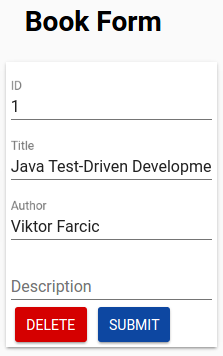
The result is the Delete button with red background and the Submit button with blue. Text color of both buttons is changed to white.
We kept our immutable with exception of Style Properties that are the only parts that can be changed from “outside”.
We should define similar styles in the tc-books component as well.
[client/components/tc-books/tc-books.html]
<style>
    .button {
        color: var(--button-color);
        background: var(--button-background);
    }
    .button:hover {
        color: var(--button-background);
        background: var(--button-color);
    }
</style>
In here we defined only one style since we don’t have any “special” type of buttons in this component. As before, we should also apply those styles.
[client/components/tc-books/tc-books.html]
<template>
    ...
    <paper-button id="newBook"
                  raised
                  on-tap="_newBook"
                  class="button">[[newBookText]]</paper-button>
    ...
    <paper-button id="{{item.title}}"
                  on-tap="_openBook"
                  class="button">[[item.title]]</paper-button>
    ...
</template>
The only thing left is to utilize the new properties in the Demo page. The code with styles for all three types of buttons is following.
[client/components/tc-books/demo/index.html]
<style is="custom-style">
...
:root {
--button-color: #0d47a1;
--button-background: white;
--button-main-color: white;
--button-main-background: #0d47a1;
--button-warning-color: white;
--button-warning-background: #d50000;
}
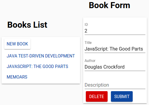
</style>The end result should look like this.
With custom styles defined, it is time to get rid of (temporary) elements we created earlier.
Connecting Web Components
To connect the two components, we should utilize custom events that we developed earlier. In the Demo page, we should capture events from tc-books and perform actions in tc-book-form and vice versa.
When any of the book buttons are clicked in tc-books, notification should be sent to tc-book-form. Similarly, when submit or delete operations are performed in the tc-book-form, we should notify the tc-books to refresh the list.
The complete <body> section of the Demo page is following.
[client/components/tc-books/demo/index.html]
<body>
<div class="layout wrap inline center-center">
    <div>
        <h1>Books List</h1>
        <div class="demo">
            <tc-books id="tc-books"></tc-books>
        </div>
    </div>
    <div>
        <h1>Book Form </h1>
        <div class="demo">
            <tc-book-form id="tc-book-form"></tc-book-form>
        </div>
    </div>
</div>
<script>
    var tcBooks = document.querySelector('#tc-books');
    var tcBookForm = document.querySelector('#tc-book-form');
    tcBooks.addEventListener('openBook', onOpenBook);
    tcBooks.addEventListener('newBook', onNewBook);
    tcBookForm.addEventListener('putBook', onUpdateBook);
    tcBookForm.addEventListener('deleteBook', onUpdateBook);
    function onOpenBook(e) {
        tcBookForm.open(e.detail._id);
    }
    function onNewBook() {
        tcBookForm.open(0);
    }
    function onUpdateBook() {
        tcBooks.refresh();
    }
</script>
</body>
We removed (temporary) HTML and script that we used before to open an existing or a new book. We also removed the paper-toast element that was used to demonstrate custom events before we built the second component.
Inside the script tag we did following.
- We added selectors for both components and declared that selection as variables tcBooks and tcBookForm.
- We added event listeners for all custom events we’re interested in. Those listeners are calling functions we specified whenever one of those events is fired from our Web Components.
- Finally, we wrote three functions that will notify components to open a book or refresh the list of books.
If, for example, you add a new book or update an existing one from the tc-book-form, the list of books in the tc-books will be refreshed. Similarly, if you click the New Book button or a book in the listing of the tc-books, data will be populated or cleared in the tc-book-form.
Building Loosely Coupled Components
This approach to design allows us to build truly loosely coupled Web Components. Each of them is in charge of one or few closely related functionalities (one for listing and the other for update/delete operations). Neither component knows about the others and it is up to developer who imports those components to decide where to place them or how they should interact.
By packing front-end Web Components with back-end server we are keeping all horizontal layers together in the same microservice. Unlike many other approaches to microservices that tend to be built only around APIs, this one includes all vertical layers. At the same time, since we limited ourselves to a single business scenario (listing and administration of books), this service is still relatively small.
While same proponents of microservices architecture prefer to have them smaller than is the case in this series, my opinion is that the size we built is adequate. We could, for example, split them (both front-end and back-end) into two. One for listing books and the other one with operations related to a single book (GET, PUT, DELETE). However, that would mean that they would need to share the same database adding undesirable coupling between them. On the other hand, adding more features to this one would move us towards a monolith. If, for example, we decide to develop authentication (both front-end components and back-end server), it should be placed in a different microservice.
Having front-end Web Components placed in the same microservice adds a benefit of being able to develop a full feature (or a related set of features) with full independence. While working with front-end, there is no need to wait for the back-end to be finished or use test doubles in order to work in parallel. One person (or a small team) can be in charge of the complete (set of) feature(s) from the beginning to the end.
Downside of this approach is that both front-end and back-end development experience is required (even though in this series we worked only on the client side). This is usually not a problem for front-end developers since JavaScript can be employed for both (for example Polymer with NodeJS). Traditional back-end developers would need to learn to work with front-end as well. While I see it as a big benefit to be able to work on both sides of the story, some do find it difficult or counter-productive.
To Be Continued
Now that we have both Polymer Web Components fully developed and tried out with both automated unit tests and manually through the Demo page, we can focus on importing those components into the separate Web Application and setting up proxy and deployment. The story continues in the Using Microservices article.
| Reference: | Developing Front-End Microservices With Polymer Web Components And Test-Driven Development (Part 4/5): Styling And Communication from our WCG partner Viktor Farcic at the Technology conversations blog. |
