In this article, we’re going to go through a quick introduction of the carousel functionality in Bootstrap.
1. Introduction
The carousel is a neat component which – as its name suggests – allows you to cycle through a list of given HTML elements (if you don’t think the name suggests that, go find out what a carousel is :)). The most obvious use case perhaps is cycling on images, but of course it can be used for other elements. I like keeping my samples as concise and clear as possible, so in this example we’ll have only text inside the elements we cycle on.

For this same reason, we will be focusing on using “data-*” attributes to create our carousel. We won’t be writing any JavaScript code to do this.
One final note (and then we’ll get started – promise!): The carousel is not supported in Internet Explorer 9 and earlier. If you need to support IE9, you may want to use JavaScript to detect the browser+version and replace the carousel with a simpler version which doesn’t use CSS3 transitions.
2. Getting started
2.1. Setup
Let’s get started by creating a basic Bootstrap project. We’ll do this by including the Bootstrap CSS and Bootstrap JS libraries, as well as jQuery (required by Bootstrap).
Setup.html
<!DOCTYPE html>
<html>
<head>
	<link rel="stylesheet" href="https://maxcdn.bootstrapcdn.com/bootstrap/3.3.7/css/bootstrap.min.css"></link>
	<script src="http://code.jquery.com/jquery-3.1.1.min.js"></script>
	<script src="https://maxcdn.bootstrapcdn.com/bootstrap/3.3.7/js/bootstrap.min.js"></script>
</head>
<body>
</body>
</html>
Our page doesn’t display anything yet. Not very exciting – let’s spice things up a bit.
2.2. Basic carousel
Basic.html
<!DOCTYPE html>
<html>
<head>
<link rel="stylesheet" href="https://maxcdn.bootstrapcdn.com/bootstrap/3.3.7/css/bootstrap.min.css"></link>
<script src="http://code.jquery.com/jquery-3.1.1.min.js"></script>
<script src="https://maxcdn.bootstrapcdn.com/bootstrap/3.3.7/js/bootstrap.min.js"></script>
</head>
<style>
.item {
width: 80%;
height: 400px;
margin: auto;
}
#firstElement {
background-color: yellow;
}
#secondElement {
background-color: green;
}
#thirdElement {
background-color: red;
}
</style>
<body>
<div id="sampleCarousel" class="carousel">
<div class="carousel-inner">
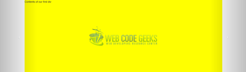
<div id="firstElement" class="item active">
Contents of our first div
</div>
<div id="secondElement" class="item">
Contents of second div
</div>
<div id="thirdElement" class="item">
Contents of third div
</div>
</div>
<a class="carousel-control left" href="#sampleCarousel" data-slide="prev">
<div class="icon-prev"></div>
</a>
<a class="carousel-control right" href="#sampleCarousel" data-slide="next">
<div class="icon-next"></div>
</a>
</div>
</body>
</html>
There’s a lot going on here. Let’s explain what we just did.
- In the body, we added a div with class=”carousel”. This defines our carousel. We must also give this div an ID, in our case “sampleCarousel”.
- In the carousel, we added a div with class “carousel-inner”. The “carousel-inner” class identifies the children of this div as being the elements to be cycled on by the carousel.
In this div, we added three more divs with class “item”. The “item” class identifies this div as being an item of the carousel. We will also assign the first div to a class called “active”, which identifies this element as being the element to be displayed by default by the carousel. - In the carousel, we also added two links with class “carousel-control”. This class identifies the links as navigation buttons. We then assigned the class “left” to the navigation button on the left, and class “right” to the nav button on the right. Finally, we give the navigation button on the left an attribute “data-slide” with value “prev”, and we give the navigation button on the right an attribute “data-slide” with value “next”. This determines which direction the carousel should cycle in when a navigation button is pressed.
Inside each link, we display an icon (as shown by class “icon-prev” and “icon-next”). - We gave each item of the carousel an ID, then write some CSS for each item at the top of the page, to make the example more clear.
We now have a basic carousel working, but we’re going to make it even better.
2.3. Indicators and finishing touches
Completed.html
<!DOCTYPE html>
<html>
<head>
<link rel="stylesheet" href="https://maxcdn.bootstrapcdn.com/bootstrap/3.3.7/css/bootstrap.min.css"></link>
<script src="http://code.jquery.com/jquery-3.1.1.min.js"></script>
<script src="https://maxcdn.bootstrapcdn.com/bootstrap/3.3.7/js/bootstrap.min.js"></script>
</head>
<style>
.item {
width: 80%;
height: 400px;
margin: auto;
}
#firstElement {
background-color: yellow;
}
#secondElement {
background-color: green;
}
#thirdElement {
background-color: red;
}
</style>
<body>
<div class="container">
<div id="sampleCarousel" class="carousel slide" data-interval="1000">
<ol class="carousel-indicators">
<li
data-target="#sampleCarousel" data-slide-to="0"
class="active">
</li>
<li
data-target="#sampleCarousel" data-slide-to="1">
</li>
<li
data-target="#sampleCarousel" data-slide-to="2">
</li>
</ol>
<div class="carousel-inner">
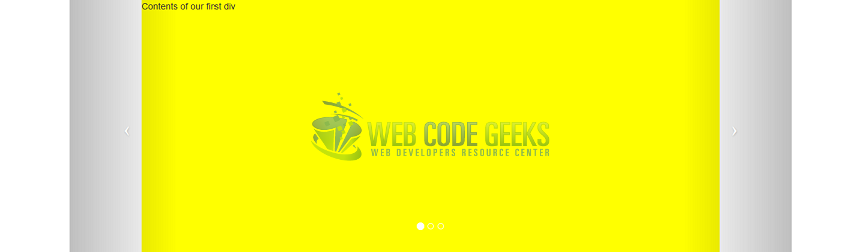
<div id="firstElement" class="item active">
Contents of our first div
<div class="carousel-option">
<p>
<i>This is a caption</i>
</p>
</div>
</div>
<div id="secondElement" class="item">
Contents of second div
</div>
<div id="thirdElement" class="item">
Contents of third div
</div>
</div>
<a class="carousel-control left" href="#sampleCarousel" data-slide="prev">
<div class="icon-prev"></div>
</a>
<a class="carousel-control right" href="#sampleCarousel" data-slide="next">
<div class="icon-next"></div>
</a>
</div>
</div>
</body>
</html>
We added a few extra things here.
- In our carousel, we added an ordered list with class “carousel-indicators”. This class identifies the list items in the ordered list as being indicators. Indicators are little white icons in the carousel which indicate which item is currently displayed. You should have as many indicators as you do items in your carousel.
- For each indicator we have, we set the following attributes:
- data-target=”#sampleCarousel”. This attribute must have the value of the carousel ID.
- data-slide-to attribute: indicates the index of the item to be displayed when the indicator is pressed. 0-based (index 0 for the first item)
- class=”active” for the indicator to be selected by default.
In addition, we added a few touches to make our example nicer.
- We assigned the carousel to an extra class called “slide”. This adds a nice little transition when the carousel scrolls.
- We gave the carousel an attribute called “data-interval” with a value of 1000. This attribute is used to set the interval in milliseconds between item changes. You can also set this attribute to “false” to disable automatic scrolling.
This covers our walkthrough of the carousel component. Let’s have a look at a few more options.
3. A few more options
- To specify whether the carousel should continuously cycle through all the items or not, give the carousel the attribute “data-wrap”. Default is true: when the carousel reaches the last item, it will start scrolling from the first again.
- To add a caption to an item: create an HTML element inside the item and give it a class called “carousel-option”.
4. Summary
In this example we created a simple carousel in Bootstrap using data-* attributes and explored the different options available.
5. Download the source code
You can download the full source code of this example here: Bootstrap carousel
