In this example we’re considering Bootstrap dropdown menus. Sometimes referred to as a pull-down menu, drop-down list, or drop-down box, a dropdown menu is a list of items that appears when clicking on a button or text selection.
For example, many programs have a “File” drop down menu at the top left of their screen. Clicking on the “File” text generates a new menu with additional options.
Bootstrap has created it’s own dropdown menu, which is normally toggleable, contextual menu for displaying lists of links in your page. Bootstrap 3 is focused in offering the basic elements in a functional manner and providing essential styling that you’ll most probably need. However, if that’s not enough for you, feel free to browse the web for even fancier designs.

1. Project Setup
The following setup is required in order to continue with this tutorial.
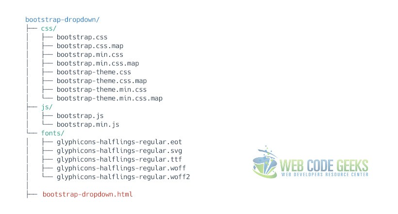
1.1 Boostrap Folder Structure
First, download bootstrap from here. Next, create a new HTML document and make sure you have the following folder structure in you project folder:
1.2 HTML Setup
To start coding, include Bootstrap’s basic template code inside your main HTML. This will include basic HTML tags and links necessary to link Bootstrap’s libraries.
<!DOCTYPE html>
<html lang="en">
  <head>
    <meta charset="utf-8">
    <meta http-equiv="X-UA-Compatible" content="IE=edge">
    <meta name="viewport" content="width=device-width, initial-scale=1">
    <title>Bootstrap Dropdown Menu Example</title>

    <!-- Bootstrap -->
    <link href="css/bootstrap.min.css" rel="stylesheet">
  </head>
  <body>

    <!-- jQuery (necessary for Bootstrap's JavaScript plugins) -->
    <script src="https://www.webcodegeeks.com/wp-content/litespeed/localres/aHR0cHM6Ly9hamF4Lmdvb2dsZWFwaXMuY29tL2FqYXgvlibs/jquery/1.11.3/jquery.min.js"></script>
    <!-- Include all compiled plugins (below), or include individual files as needed -->
    <script src="js/bootstrap.min.js"></script>
  </body>
</html>
2. The Default Example
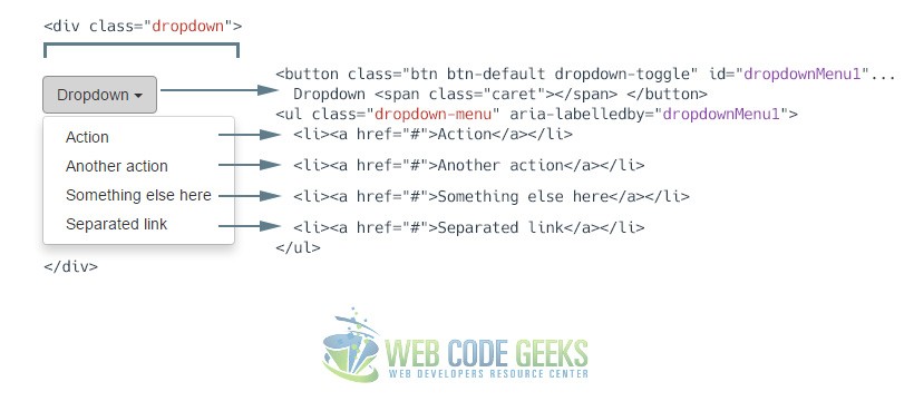
The most basic dropdown that Bootstrap offers is the one the wraps the dropdown’s trigger and the dropdown menu within .dropdown, or another element that declares position: relative;. Then add the menu’s HTML.
<div class="dropdown">
  <button class="btn btn-default dropdown-toggle" type="button" id="dropdownMenu1" data-toggle="dropdown" aria-haspopup="true" aria-expanded="true">
    Dropdown
    <span class="caret"></span>
  </button>
  <ul class="dropdown-menu" aria-labelledby="dropdownMenu1">
    <li><a href="#">Action</a></li>
    <li><a href="#">Another action</a></li>
    <li><a href="#">Something else here</a></li>
    <li><a href="#">Separated link</a></li>
  </ul>
</div>
And this is how the dropdown looks like:
3. Cases and Examples
The following section expands the default basic options of the dropdown by adding new elements to it.
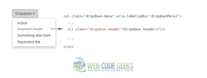
3.1 Dropdown Headers
You can optionally add a header to label sections of actions in any dropdown menu.
<ul class="dropdown-menu" aria-labelledby="dropdownMenu1">
  ...
  <li class="dropdown-header">Dropdown header</li>
  ...
</ul>
The header will look like this:
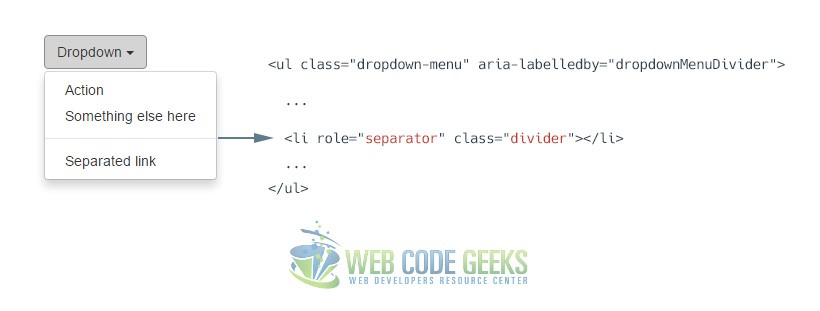
3.2 Dropdown Dividers
To group links, you can add a divider to separate series of links in a dropdown menu.
<ul class="dropdown-menu" aria-labelledby="dropdownMenu1">
  ...
  <li role="separator" class="divider"></li>
  ...
</ul>
The separator will look like this:
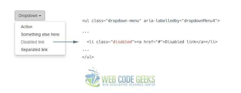
3.3 Disabled Menu Items
Add a .disabled class to a <li> in the dropdown to disable the link.
<ul class="dropdown-menu" aria-labelledby="dropdownMenu1">
  ...
  <li class="disabledr">Disabled link</li>
  ...
</ul>
The disabled link will look like this:
4. Did you know?
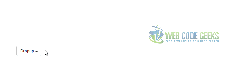
It might seem surprising, but there is also a dropup, apart from the traditional dropdown. The markup is somehow similar:
<div class="dropup">
  <button class="btn btn-default dropdown-toggle" type="button" id="dropdownMenu2" data-toggle="dropdown" aria-haspopup="true" aria-expanded="false">
    Dropup
    <span class="caret"></span>
  </button>
  <ul class="dropdown-menu" aria-labelledby="dropdownMenu2">
    <li><a href="#">Action</a></li>
    <li><a href="#">Another action</a></li>
    <li><a href="#">Something else here</a></li>
    <li><a href="#">Separated link</a></li>
  </ul>
</div>
As expected the dropup would show above the button:
5. Conclusion
To conclude, Bootstrap dropdown is an easy way to group links and menu items in a compact but effective way. By default, a dropdown menu is automatically positioned 100% from the top and along the left side of its parent. If you want to override these settings, use the dedicated classes .dropdown-menu-right and .dropdown-menu-left.
6. Download
You can download the full source code of this example here: Boostrap Dropdown Menu
