The Bootstrap Modal is a responsive JavaScript popup used for many purposes, such as log in/signup forms, videos, images and alert dialog boxes. It can even be used for showcasing dialog prompts for terms and conditions, and one of it’s best features is being responsive and customizable.
Modals’ structure:
Theoretically, modals have a three-part structure, formed by a header, a body and a footer section; though you can’t really trigger a modal without a handle, which can be a button or a link.
You might find yourself asking: Can’t we go on without the handle? The answer is actually a surprising yes, you can. But you won’t be able to trigger the modal, which by default stays hidden until triggered, so it’s pointless to write the code for it.
In the header section, usually we only place the title of the modal, and maybe even a close button. In the body section we place whatever we wanted to showcase, be it terms and conditions, log in forms, videos, or even a single question. The footer section is where we usually place the button which take the user to the main page, or save changes or anything we want the user to do next.
We will use:

HTML markup for modals
Linking and scripting
First of all,after creating an HTML file called index.html in our project’s directory, we have to give a name to our HTML document and link Bootstrap’s CSS file and script Bootstrap’s JavaScript file. So we put the name between the <title> </title> tags, and after it we place this code:
 <link rel="stylesheet" href="css/bootstrap.min.css">
 <script src="js/bootstrap.min.js"></script>
Trigger on the document…
Now we can go on with creating our modal. First we create the trigger button, which can be placed anywhere in the document’s body.The code will look like this:
<!-- Button trigger modal -->
<button class="btn btn-primary btn-lg" data-toggle="modal" data-target="#myModal">
    Launch modal
</button>
You may have guessed by now that the class attribute just makes the trigger button look big and blue. You will see there that the button also has two other data attributes which are data-toggle and data-target. data-toggle is the one to tell the button what to toggle when the button is clicked (in our case it’s a modal), while data-trigger tells it which one to trigger as there can be multiple modals.
Where is my modal?
Time to tell the browser that I’m building a modal right in the place where I’ll place the following code snippet:
<div class="modal fade" id="myModal" tabindex="-1" role="dialog" aria-labelledby="myModalLabel" aria-hidden="true">
    <div class="modal-dialog">
        <div class="modal-content">
        </div>
    </div>
</div>
So let’s explain what we’ve written there:
The class modal fade makes the modal fade into and out of view. The id which in our case has the attribute myModal should be the same as the id we placed in the button. You may even add a description to your modal by adding the aria-describebdy attribute. Furthermore, I’d like to address the issue of modals disappearing when the backdrop (back overlay area) is clicked. You can make this default property go away by adding data-backdrop="static" as an attribute.
The new guys in town are aria-labelledby and aria-view. These attributes are used to make the modal more accessible (you can learn more about web accessibility here). The other classes you see are self-explanatory.
Let’s structure it!
Right after the <div class="modal-content"> tag, we place the whole code for the content, which is divided in three parts (remember the structure of a modal?): header, body and footer.
You will find the code for the header looking like this:
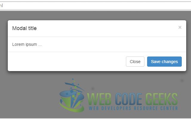
<!-- Header--> <div class="modal-header"> <button type="button" class="close" data-dismiss="modal"> <span aria-hidden="true">&times;</span> <span class="sr-only">Close</span> </button> <h4 class="modal-title" id="myModalLabel">Modal title</h4> </div>
While you already understand that the <h3> tag contains the title, you also have to know that the button represents the small typical X which closes the modal when clicked. The span element inside the button contains the icon and the hidden description for it’s function, when you hover your cursor over it.
On to creating the body. After writing the code for the header, you write the code for the body, which should look something like this:
 <!-- Body -->
 <div class="modal-body">
      Lorem ipsum ...
 </div>
The only thing you need to do is create a <div> element with the class modal-body and then do your thing.
Just as simple is the code for the footer, which in itself is just a <div> element with a modal-footer class, containing two buttons, doing whatever you want them to do. In the following code snippet, the buttons just save changes or close the modal:
<!-- Footer -->
<div class="modal-footer">
        <button type="button" class="btn btn-default" data-dismiss="modal">Close</button>
	<button type="button" class="btn btn-primary">Save changes</button>
</div>
And that’s it. You can now see your modal.
But…
It doesn’t work!
If you wrote the code being really careful, or even copy-pasted it and your modal still won’t show, then you’re as unlucky as me (and many others). There are some cases that the modal just won’t show. This can be for two reasons.
The first is that boostrap.min.js doesn’t work properly without jQuery, which can be solved by adding this part of code before bootstrap.min.js:
  <script src="//ajax.googleapis.com/ajax/libs/jquery/1.10.1/jquery.min.js"></script>
  <script src="//ajax.googleapis.com/ajax/libs/jqueryui/1.10.3/jquery-ui.min.js"></script>
If it still doesn’t work then the problem is with your version of Bootstrap: some versions’ hide class has the property display: none; which makes your modal disappear. To fix that you can instead use the custom class hide-block with this code:
.hide-block{
    display: none;
}
Now your modal is up and running, and looking like this:
Customize your modal
You are now able to create a modal with basic properties, but we’ll show you more: CUSTOMIZING. You can make your modal multifunctional and fancy. Here’s how:
Changing it’s size
Modals have two available classes: large and small. You can activate them by placing modifier classes on the modal-dialog class. The modifier classes in question would be modal-lg and modal-sm.
Removing animation
By default, modals appear by fading into the view. You can remove this animation by simply removing the fade class from your modal markup.
Cool, huh?! Now on to even cooler stuff!
Embedding Youtube videos
We mentioned earlier that you can use modals to showcase videos. If I want to embed a Youtube video, how exactly do I do that? Here’s how:
As I’ll be building a modal that plays the video as soon as it is triggered, I will be adding this attribute to the launch button:
data-theVideo="http://www.youtube.com/embed/loFtozxZG0s" .
Then we place this code in the modal’s body:
<iframe width="100%" height="350" src=""></iframe>
And then we script the function to get and autoplay the video from Datatag, and also the function call like this:
<script>
    //function to get and autoplay youtube video from datatag:
    function autoPlayYouTubeModal(){
        var trigger = $("body").find('[data-toggle="modal"]');
        trigger.click(function() {
            var theModal = $(this).data( "target" ),
                    videoSRC = $(this).attr( "data-theVideo" ),
                    videoSRCauto = videoSRC+"?autoplay=1" ;
            $(theModal+' iframe').attr('src', videoSRCauto);
            $(theModal+' button.close').click(function () {
                $(theModal+' iframe').attr('src', videoSRC);
            });
        });
    }
    //the function call:

            $(document).ready(function(){
                autoPlayYouTubeModal();
            });
</script>
That is, if you’re as lazy as me you can script it like that. If you’re not, you can place the code in a different file, and just script the file.This is what you get:

Using JavaScript
Call a modal with id myModal with a single line of JavaScript:
$('#myModal').modal(options)
Same as with calling modals, you can do a number of actions on modals using JavaScript. Some of the most important are toggle, show and hide.
Now you can go and conquer the Twitter Bootstrap’s modal.
Download the source code for Modals
This was an example of Modals using Twitter’s Bootstrap.
You can download the source code for this example here: Modals

This was a big help thank you!
This was the only one that worked for me I’ve been trying for days thank you so much!! It looks beautiful on mobile too!!
Visiting webpages, I commonly find modals that auto load on pageload (that is, onload is the trigger not a mouse click) – including this webpage!! But I am having trouble finding how to code this, especially vanilla JS. How is this done WITHOUT a mouseclick?
Thank you.
Hello, would you mind insisting a little on the prerequisites ?
I dowloaded and dezipped the demo projects on two machines.
Firefox displayed the button on both machines, not the modal.
Idem for IE9.
IE8 was longer but told me more : Bootstrap error : Javascript requires jquery.
Well, jquery is declared with the Google repository, isn’t it ?
You know what ?
On my machine it works *much* better with http: at the beginning of the address of each repository.
<script src="http://ajax.googleapis.com …
nice work!